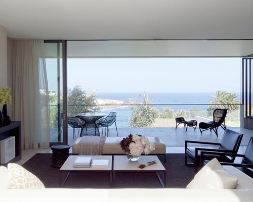
Gordons Bay is one of the jewels on the coastal walk between Bondi and Coogee in Sydney’s Eastern Suburbs. The secluded bay has a small sandy beach, sheer sandstone headlands and rows of local fishing boats. When you’re given such a stunning location with which to work, views simply have to come first. Madeleine Blanchfield Architects designed this six-bedroom family home on a steep waterfront site overlooking Gordons Bay, and from the entrance to the living room to the bathrooms, there are plenty of windows to take in the views. “This was non-negotiable,” Blanchfield says.
.jpg)
.jpg)
Seaside 1: Robert Walsh, original photo on Houzz
Photos by Robert Walsh
Houzz at a Glance
Who lives here: A couple and their three children under age 10
Location: Gordons Bay, Sydney, New South Wales, Australia
Year built: 2013
Size: Six bedrooms, two bathrooms and an en suite
Architect: Madeleine Blanchfield Architects
To find their architect, the owners held a limited design competition from which Madeleine Blanchfield Architects came up with the winner. “They had a detailed spatial [plan], but we developed the look and feel of the house together,” Blanchfield says. “They wanted a house for the family to stay in forever. It has an amazing pool, hideaway spaces for kids’ toys and lots of windows to take in the views.”
From the street, the house appears as a humble single-story abode with a generous garden entry. But don’t be fooled.
As the top level of the house cantilevers over the steep site, with two levels built underneath, it takes maximum advantage of the coastal views and location. The building is oriented on the lot to face north as much as possible, and louver screens are used to control heat, glare and privacy.
Concrete and stained wood are the predominant materials, chosen for their honesty, durability and softness. The southern walls, floor and roof slabs are concrete, while the infill is cedar siding and louvers. “These were treated with a preservative stain that can either be reapplied or the [wood] left to age naturally, but looks good in both conditions,” Blanchfield says.
Brighten a Bath With the Reflective Powers of These Bathroom Mirrors
.jpg)
.jpg)
Seaside 2: Robert Walsh, original photo on Houzz
The house is spread over three levels and has four bedrooms on the top level, along with two bathrooms and an en suite for the master bedroom. The main living areas, dining area and kitchen are on the middle level, and there’s a more casual lower level that opens onto the garden.
Smoked oak floorboards: Precision Flooring; wall paint behind bed: Thoroughbred, Porter’s Paints
.jpg)
.jpg)
Seaside 3: Robert Walsh, original photo on Houzz
Behind the headboard wall of the master bedroom lies this picture-perfect bathroom. The magnificent views of Gordons Bay are made even more so with a mirror that doubles the expanse.
Calacatta marble vanity and Kaldewei Vaio Duo bath: Reece
Pivoting louvers, to control sun and privacy, are just some of the sustainable design principles used throughout the home. “The house employs German solar hydronic technology for in-floor hot water and pool heating,” Blanchfield says. Glass-evacuated tubes heat the water to very high temperatures — it is stored in a subterranean plant room and runs through pipes throughout the house. “The thermal mass of concrete floors was essential for this to
function,” she says.
Photovoltaic solar cells are also positioned on the roof to generate electricity, which is sent back to the grid. Rainwater tanks housed under the ground floor harvest water from the roof, which is used to water the garden and flush toilets.
The exterior palette of concrete and wood continues through the inside of the home to break down the delineation between inside and outside.
.jpg)
.jpg)
Seaside 4: Robert Walsh, original photo on Houzz
The kitchen is truly the heart of this home, positioned in the center of the middle level. It is flanked by a loosely formal living and dining area to the right and a more informal living area to the left. It looks out onto a sunlit courtyard.
Charred veneer woodwork: Eveneer, Elton Group; Pietra Grigio marble countertop: The Rock Masonry; Scala faucets: Reece
.jpg)
.jpg)
Seaside 5: Robert Walsh, original photo on Houzz
The more formal living and dining space opens to views of the bay. “Borrowed views through courtyards and other spaces bring clarity to the design and ensure that there is always a connection to the garden and the bay,” Blanchfield says.
Belgian sisal rug: International Floorcoverings; linen-look wallpaper: South Pacific Fabrics
The interiors are understated and elegant, using neutral and natural colors and woodwork to offset the garden and ocean views.
The living and dining area extend onto the balcony, which has custom-designed angled cedar blades that shroud the house and manage sunlight and privacy. The angle of the blades changes around the house depending on the view, and they are grouped together in bays to form big motorized louver panels. “This means that the views can be fully opened up and the position of the louver is flexible for different times of day,” Blanchfield says.
.jpg)
.jpg)
Seaside 6: Robert Walsh, original photo on Houzz
Outside, the property is just as spectacular, with a lap pool on the right side, lush grass and vegetation, and a pathway to the left, which leads to the foreshore, the area between the ocean’s high and low water marks.
Frameless glass pool fencing, dark-tinted special aggregate concrete decking and sun loungers were custom-made by Bellevarde Constructions.
A 65-foot foreshore setback zone has been maintained, which means a 65-foot-deep area owned by the residents covers the full frontage of the site and is being regenerated as native foreshore.
This family home has been designed with thoughtful attention to its site and the family’s lifestyle. “The fact that you can stand at the street entrance and take in the bay views through the house is testament to a well-considered coastal home, reveling in its local environment,” Blanchfield says.


