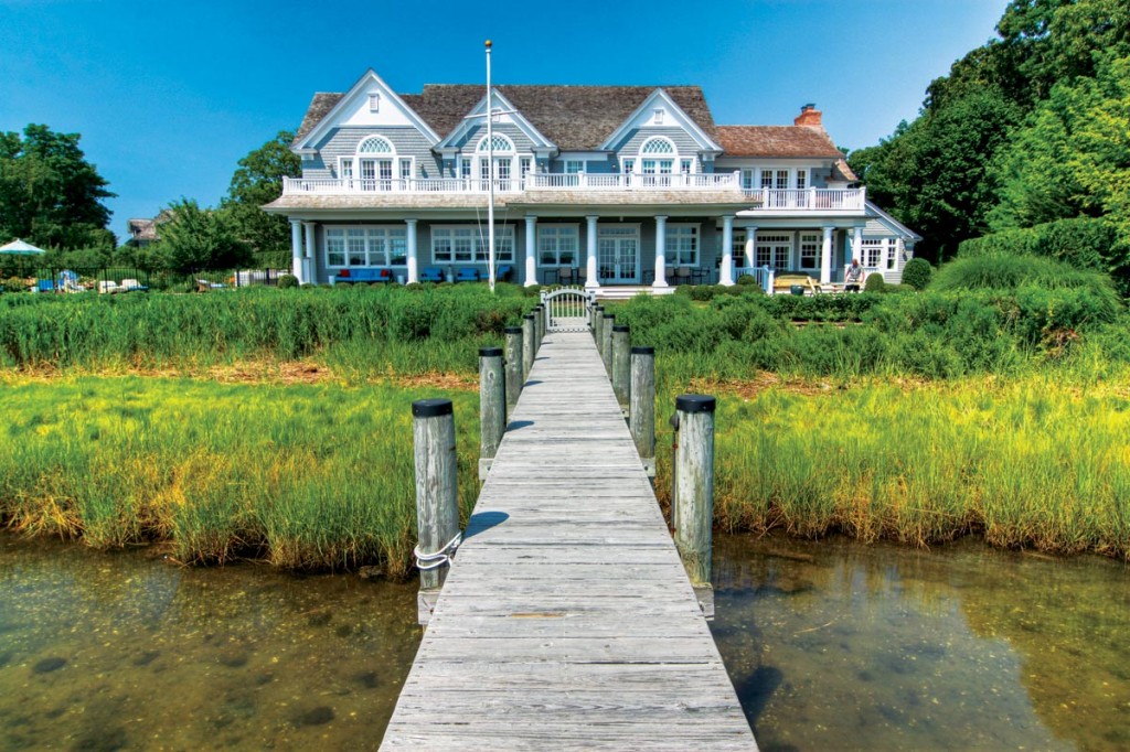
It took a collaborative effort between an inventive interior designer and an expert architect to transform an ordinary gray Shingle-style cottage into a modern retreat.
The shimmer of the water reflects on the walls of the sea-colored living room, and light pools in the white and sand-colored coffers of the ceiling. Through the geometric latticework of two divider screens, an oasis of comfort beckons. Beyond, floor-to-ceiling mullioned windows frame French doors leading to the deck overlooking the water of Upper Sag Harbor Cove.
But it wasn’t always like this. For a client who wanted something a little more edgy and modern than a typical beach house on the water, it took the teamwork of interior designer John Willey of Willey Design, Inc. and Scott Fisher of Mitchell Wilk Architects to transform a decade-old gray cedar Shingle into a showcase Coastal Colonial reminiscent of the grand summer cottages stretching along the coastline from Rhode Island to Maine.
The original structure didn’t have a layout conducive to the indoor-outdoor lifestyle the family envisioned, as the deck and pool area couldn’t be accessed from inside the house. “The task was to look at the entire first floor and reconfigure spaces to maximize the ability for them to live in it as a summer home,” Fisher says.
After gutting the first floor, they relocated the kitchen and created a media room, a breakfast room, and a living/dining room that flow seamlessly from the airy inside to the natural beauty of the outside site. Along the way, every detail was examined, dissected, and discussed.
“It was a good collaboration with the clients,” says Willey. The images they brought to some of the early meetings offered a sneak peek of the general look they were going for. “How we do our job best is we take those images and read between the lines. And then we like to step it up to the next level and show them what the bigger possibilities are.” 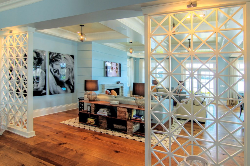

A modern entryway gives way to a light-filled living room with coffered ceilings.
The designer also offers a little creative guidance. Willey felt strongly that there needed to be a division between the front foyer and the living area, but the client was afraid it would obstruct the view. “The divider screen design went through about 10 different iterations,” says Willey. “Finally, we came up with a kind of peek-a-boo screen effect that gives a suggestion of the water beyond.”
In the living and dining room, the bland, sheetrock ceiling was transformed with the construction of nine coffers on top of a beadboard ceiling designed to add layers and depth. “The beadboard actually changes direction in each coffer, forming a basketweave pattern,” says Willey. “It creates a subliminal beach basket motif when you look up at the ceiling.”
The lighting throughout the house is dramatic and unique. Not a fan of what he calls the “Swiss cheese” effect of recessed lighting, Willey used suspended globe lanterns in polished nickel and smoked glass in the living room to add an ethereal suggestion of lights at sea. To brighten the mudroom at the side of the house, pendants made from resin cylinders and wrapped rattan act as a beacon, while the bold light fixture anchoring the breakfast area is based on actual fishing traps from the Caribbean.
The living room sofas, designed to provide as much seating as an unwieldy sectional, were customized with rustic platform wood bases meant to invoke driftwood. The play of materials is seen in the contrasting white bone inlay cocktail table, while the geometric shapes of the Willey-designed “Moroccan” area rug, the hand-carved wood side tables, and the lacy design of the antique brass-and-wood table lamps all resonate with the white crosshatching of the divider screens.
The attention to detail can be seen in the design of the fireplace wall. “Instead of just having a featureless wall, I used ribbed plaster with a little reveal,” says Willey. He found the blue-gray travertine of the surround at the stone yard. “It hit that right moment of casual elegance. The lines are very simple, but it was meant to become a subtle, classic, and clean element in this room.”
Stone is also an element of the main dining area. The custom Datcha rectangular table by David Sutherland has teak legs and an X-cross-base design in polished aluminum. “The top is rough granite with a texture like a stone pulled out of a quarry,” says Willey. It’s meant to be seen from the side, where the play of the stone’s shimmer echoes the metallic gleam of the base. The first piece of furniture purchased for the house, it set the organic tone for the rest of the rooms. It’s paired with Palecek rattan-and-leather dining chairs customized with blue iridescent leather.
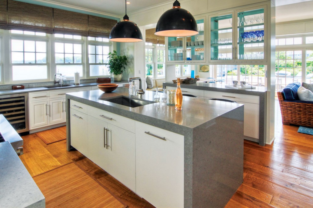

Bright and airy kitchen.
Relocating the kitchen allowed the design team to create it from the ground up. Willey designed a storage unit based on a freestanding bookcase with enough transparency to act as a pass-through. “The see-through hutch on the top was painted a pale blue on the inside, so it feels watery and clean,” Willey explains.
For countertops, he chose durable, pebble-colored polished Caesarstone, a quartz composite with a velvety quality. The backsplash is constructed from Artistic Tile’s glistening Jazz Glass. “It’s timeless and elegant, and it has a watery effect that echoes what’s going on outside the door.” To offset the paleness of the palette, Willey threw in a wildcard: playful cowhide barstools that are also comfortable and kid friendly. He paired them with black overscaled pendants above the island.
The breakfast nook continues the casual comfort of the interior, with an 18-foot custom-made banquette and driftwood dining table that provides an intimate place for a meal in a room backed by boats and the bay outside a wall of windows. Classic Wishbone chairs by Hans Wegner in bright blue mirror the interiors of the cubbyholes that flank retractable patio doors. The banquette and adjacent sitting area are upholstered in indoor/outdoor fabric so that wet bathing suits are never a problem.
In the large media room, Willey designed the carpet in a chevron pattern and the blue lacquer cabinet with gray wash veneer dividers. To add a whimsical element, some of the cubbyholes have little collages done in shades of blue. The Willey-designed sectional is tufted in a wave pattern that echoes the wave pattern on the rug and provides generous group seating
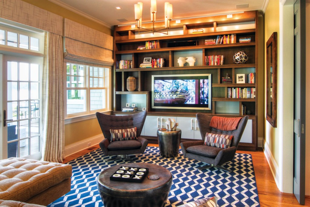

Newly created media room, which allows access to the outdoors.
Even the hallways were put under a microscope. Upstairs, a very long corridor leading to the bedrooms had a dark, claustrophobic feel. To open it up, Fisher suggested creating a pitched roof to create drama in the windowless space. Lined with large antique brass globe pendants, the light reflects against the angled white ceiling and illuminates the blue, shimmery grass cloth. “It has a summery, timeless feel to it,” says Willey. Working with Beauvais Carpets, Willey designed a colorful, 30-foot striped wool runner that provides contrast with the interlocking circles of the modern art on the walls.
When it was finally complete, the clients showed up at sunset. “They said it was beyond what they ever thought was possible for this house. When you’re looking at plans on paper, it’s not the same as walking through and discovering the materials and finishes and all the final touches that we like to do beyond the main components,” says Willey. Enlivened by it all, the family walked through the house to the deck and went for a sunset swim.
Image Credits: Scott Fisher.
