“Having a beach house was my dream,” says Richard Landry, the founder of Landry Design Group, an award-winning high-end custom residential architecture firm based in Los Angeles.
With the recent completion of his magnificent oceanfront home in Malibu, the internationally renowned and Canadian- born architect’s yearning became reality. The three-story, 4,500-square-foot home that he built for himself and his 14-year-old daughter Samantha features a bar, home theater, and indoor-outdoor dining and living spaces overlooking the blue expanse of the Pacific Ocean.
Landry, a recipient of the Pacific Design Center’s “Stars of Design” Award, has been on the coveted “Architectural Digest” AD100 list of pre-eminent architects and designers since 2000, and his high-profile clients have included Rod Stewart, Tom Brady and Gisele Bu?ndchen, Kenny G, Sugar Ray Leonard and Mark Wahlberg, among others.
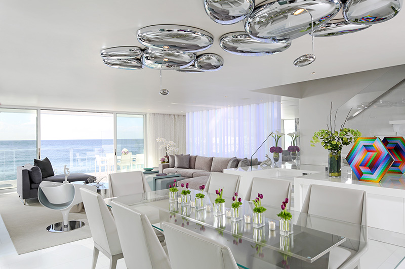
But when it came to his own home, his design goals were simple – to design a comfortable space that complemented his lifestyle, whether working, relaxing or entertaining. He sought to showcase his impressive art collection, and most importantly, he wanted to maximize the dramatic water views.
“With the ocean at my feet, I didn’t want to compete with the incredible setting,” he says. “I love the view, I love the ocean, and I like to look out and see something special. Wherever I am in the house, I want to see the ocean.”
He achieved this goal by “stripping everything down to the studs,” he says. He reconfigured the layout, opened up the floor plan, added an outdoor terrace, and installed lots of glass. And though the home is narrow – just 24 feet wide on a 30-foot lot – it has a relaxed and spacious feel due to his strategic use of color and light.
The original home, whose previous owners have included Hugh Hefner and Katharine Hepburn, had low ceilings and was compartmentalized into rooms with ordinary doors and windows.
“It had an odd layout,” Landry muses, explaining that the house didn’t maximize the gorgeous views just below. “From the kitchen, you could not see the ocean, and the stairs were in the middle of the house.”
As he contemplated “two little stained-glass windows” at the top of the stairs, he thought, “What a missed opportunity!” His idea was to open the space, flood it with light, and take advantage of the oceanfront location. “The opportunities were there,” he says. “I just had to figure out how to play with such a narrow width to make the home more interesting.”
 |
In designing the space, he thought carefully about his lifestyle and how he would use the home. “I work a lot, so I wanted to be able to feel and see the ocean from my office,” he says. “I don’t have my daughter full time, so when I am in the house alone, I don’t want to feel isolated in a closed-off room. I like to have friends over, and I wanted my home to serve as a great background for art.”
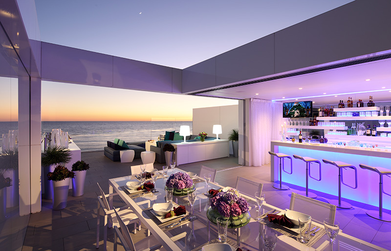
His solution was to convert each floor to an open plan. He added a third-floor media room space with a bar, cutting a corner open to create a terrace above the ocean that’s perfect for entertaining. Glass sliding doors pocket into the wall, so the indoor-outdoor spaces feel like one large relaxation room.
“It’s a multi-purpose environment,” Landry says. “With the doors open, it flows out to the deck, barbecue and fire pit. We’ve entertained groups of 80 people and weren’t crowded.” Clean lines, white stone and plaster walls contribute to the light, airy feeling. Landry chose Nano glass countertops for their “perfect white, clean color – like pure milk.” The white is contrasted with large stone slabs for the two fireplaces.
“The home is simple in its detailing for an effect that is uncluttered, relaxing, cleansing and pure,” Landry adds.
But the entire mood of the home – interior and exterior – can be changed with the touch of a button thanks to specialty RGB lighting features. “I can play with light, so the house takes on a whole different vibe,” he says. “Depending on my mood, I may add soft blue lights against the beautiful white, or a lavender or red. The house is different every day. I wanted to make it fun and playful.”
Ask Landry what he thinks is most interesting about his design, and his answer may surprise. “The driveway,” he insists. “I really had fun with the driveway.” He explains that his home has no front yard – as is typical of many Malibu beach homes – so the driveway becomes an important part of the home’s design.
When Landry purchased the home, that entrance wasn’t quite so grand. Garage doors and a septic system manhole cover were the most prominent features – not a great first impression.
“I didn’t want to look at that,” he says. Using powder coating, enamel paint, black absolute granite and silver granite slabs, he cleverly turned the driveway into a swirling, cheery work of art.
The steel manhole cover is completely disguised, becoming part of the colorful montage. He chose bi-folding panels to conceal the garage doors. Rows of palm trees flank the entrance, and with the flick of a switch, RGB lights accent the simple fac?ade with glorious color.
The result is stunning. “I took something that was very ugly and made it beautiful,” Landry says. “And in the entrance, I introduce the concepts of light, color and art, which are the primary themes throughout the house.”
Inside, glass ‘walls’ (with automated shades that close for privacy) and strategically placed mirrors drench the home with light and make the most of the ocean views.
“Raising the height of the doors and windows opened up everything, so you don’t feel the low ceilings,” he says. “The master bedroom in the old house had a closet before the bathroom. By flipping that, and installing glass between the bathroom and bedroom, I can see the ocean from the shower.”
His teenage daughter loves her suite, complete with a walk-in closet, separate study, large comfy sofa, and television. “She picked the art in her room, and she was involved in the decision-making process for the fabric and furniture,” says Landry.
His favorite space is his home theater. “I don’t have a lot of time to watch TV and movies but when I do, I love the media lounge with its 103-inch TV,” he says. “The sound is amazing, I designed a fantastic sofa on which a person can lie every which way and be comfortable.”
In fact, “comfortable” is the first word uttered by many of Landry’s guests. “Even my traditional clients, who are not into modern architecture, like it. But the art, light and colors, along with being on the ocean, give the house a relaxed and peaceful feel.”
For more informtaion on Richard Landry, visit landrydesigngroup.com.
Image Credits: Photos by Erhard Pfeiffer.


