Over the course of three-plus years, a Maine architecture firm collaborated with a savvy client to create a stunning summer escape where details reign supreme.
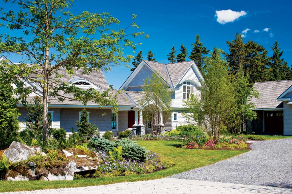
It took the Knickerbocker Group of Boothbay, ME, three and a half years to create this remarkable summer getaway on tiny Pratts Island. With breathtaking water views and a surprise interior that recalls aspects of the Gilded Age, the Shingle-style exterior keeps the splendor under wraps. As architect Rick Nelson of the firm explains, the concept and design evolved over time with the owner and team sharing ideas along the way. Like a precious work of art, this came without creative constraints. “It was mostly a free-flow creative process where we had weekly meetings to review every detail,” he says. While so many of the design details come from the hands of talented craftsmen, technology-driven 3-D computer modeling helped determine if certain aspects, like the ultra-complex ceiling forms, would actually work in the space.
  |
The project started off set on a 2.4-acre site, but the owner then bought an adjacent property on which to construct a guesthouse; another property on the southern end of the island was later purchased. Nelson’s team partnered with interior designer Tracy Davis of Urban Dwellings (urban-dwell.com) in Portland, ME, from the start to conceptualize as well as to execute.
Today, there are five buildings on the property, with a collective total of 17,000 square feet. These include the 8,770-square-foot main house with an attached garage, exercise room, and guest apartment; a barn/game room complete with a pinball machine and pool table for rainy-day activities; a three-bedroom guesthouse; and a caretaker’s cottage.
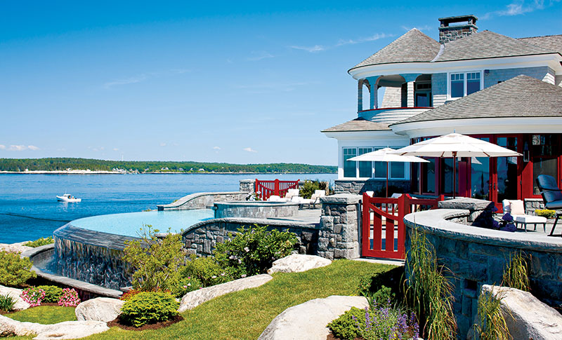
“The property has remarkable ledge outcropping,” Nelso says. “It sits 25 feet above water and then rolls down to the water. The idea was to create a home that walks right out to the ledges.”
From the inside, the rooms are laid out so each frames an interesting water view. Various first-floor rooms also have access to a 17-foot-wide terrace that leads to outdoor living space, as well as the pool. With the terrace flush with the ledges, a stunning view out to the ocean is uninterrupted. Poolside, a freestanding porch enclosure, cabana, and outdoor grill and bar provide a mix of components that make entertaining easy.
“In Acadia National Park, there is a natural formation called Thunder Hole where, when the tide comes in, there is a huge crashing sound. Here, we sited the living room to take in a similar view where waves also come thundering inward; we call it our Thunder Hole,” Nelson says.
While the exterior design of the home recalls a more modern version of the classic Shingle style that is so familiar in New England, the interior leaves the casualness of this style literally at the shingles. Swing open the front door and suddenly you are in space that feels rather regal. “[The design] calls upon the age of craftsmanship, the era of JP Morgan, the Rockefellers, and the Vanderbilts, when things were intentionally designed and crafted, and when there was scrupulous attention to detail,” Davis says. “This is what makes this house so amazing. There was a person behind every detail.”
There are handcrafted mahogany banisters, walls with gold-leaf details, custom fabrication of silk draperies and carpets—the list goes on. The architectural team and Davis spent countless hours researching and traveling here and abroad for materials and design accents, as well as locating artisans who could execute their concepts. One of those specialty craftsmen was a faux-finish painter who can expertly replicate leather and suede.
The owner’s office ceiling was painted to look as though it were wrapped in leather, while other walls in the living room appear to be covered in suede. The inspiration for the head-turning foyer design came once the team observed the newly constructed staircase. The high, domed ceiling and the staircase suggested that more might just be better. “As the building was being erected, it became very clear we had an opportunity to enhance the space,” Davis says. “When it’s on paper, you don’t fully understand. When it starts to go up, you see its potential.”
So, in came snow white, hand-picked (slab by slab) marble floors, a colorful, embedded medallion—just as you would expect in the entry of a palace—and a custom 24-karat-gold lantern measuring four feet by six feet hanging above. “The sweeping staircase draws your eye up, and as you look up, you see the chandelier and then the hand-finished ceiling dome—and you see this amazing glow off the lantern,” Davis says.
The living room and entry walls are also faux finished, with portions created from many colors combined, but remain soft in hue and echo the cream tones of the marble; the kitchen is painted soft gray, and the master suite is bathed in a warm golden tone.
Most furnishings were custom made on the mainland, while others were imported from European manufacturers; the majority of lighting fixtures came from England and France. “The owner and I went to a lot of custom fabricators,” Davis says. “The living room sofas, for example, are custom designed for the space.
The palette was chosen to enhance the space, not overwhelm it. “We didn’t want anything in [the living room] to conflict with the sea and sky, but instead wanted to pull it in gently,” Davis explains. “We wanted a neutral palette so the sunsets of pink and orange would not compete with fabrics.” Davis even kept the seven-foot-wide, 16-foot-tall living room fireplace in pale cream limestone.
“The limestone was hand selected in Portugal by our vendor, Morningstar, who traveled there and fabricated it based on drawings Rick and I generated. We later hung a late-19th-century hand-gilded mirror from France above the mantel,” Davis notes.
Many of the rugs are custom-designed patterns with custom-fabricated yarns. “We used a lot of silk in the rugs because of the reflective property,” Davis says. “With light changing, we could get that bounce of light. But silk also lifts the furniture off the floor.”
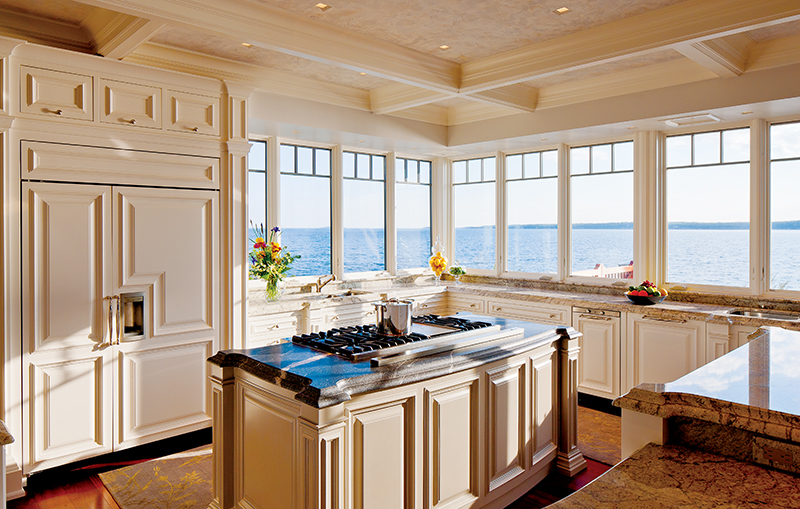
The kitchen and dining rooms were designed as open spaces so that guests could mingle as well as be a part of the kitchen activity. “[The homeowner] has a chef who works here, so it’s a wonderful experience to come to dinner and be brought into the preparation,” Davis says. The kitchen cabinetry was also custom designed, and as Davis puts it, the mantra was “the more detail, the better.”
Stone is a focal point in the kitchen. “[The owner] loves thick stone, and we got to use it in unusual ways,” she adds, explaining its placement as a thick band across the kitchen island. “We expressed the stone on the apron, and that carries right through to the to bar area. For paint, we used two colors for the island and coffee bar—both are warm gray tones with slight glazing to highlight the trimmings and show off the lines of the moldings,” Davis says.
  |
When it came to designing the owner’s study, the idea was to create a warm, woody, masculine space. Davis originally wanted part of the ceiling wrapped in leather, but because of the dampness that is inherent to a seaside location, it was replaced with the faux-paint technique. Exotic wood veneer accents behind the desk and above the fireplace add an unmistakable richness to the room. Marble surrounding the fireplace was imported from Italy, and the team worked with stone excavators to locate slabs that would form mirror duplicate columns. Even the volumes of books on the shelves were chosen for their uniform color tones.
The master bedroom, with its domed ceiling, high detail moldings, and tufted fabric-backed wall, continues the elegant feeling that abounds throughout the house. The fabric behind the bed came from New York, and Frank Gagnon’s Upholstery, Inc. of Maine executed the design. Raw silk surrounds the panels, trims, and piping, with covered buttons from Houlès of Paris centered in the tufts.
Deciding on the final golden fabrics of silk and satin took a dozen fabric samplings and testing out the tones in the changing light of day. “The idea was that we wanted the color to reflect the outside environment in both the morning and late-day light, so we needed a color not too green or red and one that worked with the gold leafing,” Davis says. An arctic white marble bath suite accented with lighting and platinum and porcelain fixtures from Paris completes the master suite.
Today, the owner has a home that celebrates his successes in business with a glorious getaway he can share with family, friends, and clients year-round.
Image Credits: Brian Vanden .
