The owners of this house at Makorori Beach, 20 minutes north of Gisborne on the East Coast of New Zealand, have known architect Jeremy Smith a long time, and they’ve had the land a long time. The grandfather of one of the owners bought the land and built a little bach, or beach house, on it after World War II.
Very little has changed in this ramshackle collection of houses in decades. There is the beach and the water, the steep hills and a tightknit community. Unlike many beach-side settlements around New Zealand, many of the houses are occupied year-round. Everyone knows everyone, and they drift in and out of each other’s houses all summer long. There’s a shared beachfront esplanade for games of cricket, plus a skate ramp, and the surf break is across the road. The area is renowned for having some of the best East Coast breaks in the country.

Patrick Reynolds Photography, original photo on Houzz
?
Houzz at a Glance
Who lives here: A family of surfers with two children
Location: Makorori Beach, Gisborne
Architect: Jeremy Smith of Irving Smith Architects
The owners had wanted to rebuild the small, rickety beach house for many years. “It was a little shed,” Smith says. “It couldn’t be a shed any longer — it was a failing shed.” They had designs drawn up by two architects, but neither design stuck. The property is small and most of it is steep, and it has no services. It is very narrow, and the view is to the south, with a driveway running up one side to houses behind. Sometimes in winter there’s a storm surge, which sends the water rushing over the dunes and across the road to the bottom of the land.
When Smith came on board, the thing that struck him about Makarori was that it was one of the last places in New Zealand where the beach still felt like it was communally owned, and the houses were still small and ramshackle, collections of buildings and additions rather than large, singular houses. “You feel quite nostalgic going to Makarori,” Smith says. “It’s how a lot of New Zealand coast was before greater emphasis came on building on the front near the water, and having your own piece of paradise.”

Patrick Reynolds Photography, original photo on Houzz
After the first two architects’ estimates came in higher than the owners wanted, the family called on Smith, an old friend based in Nelson — 300 miles away at the top of South Island.
Smith points out that cost was only part of the issue. Whatever they built, it had to be neighborly and unpretentious — after decades spent in the bay, they knew almost everyone. The house needed to be open, casual and humble, but still private. And it needed to function as a home year-round rather than a summer beach house. “Our approach was more about the community that they live in,” Smith says, “and solving what they needed to live there — and not any more.”
For practical reasons, Smith defined a space in the middle of the site that was suitable to build on. The site has some geotechnical issues, but he wanted the house to be in line with the neighboring homes so that it didn’t stick out too much, and he wanted to excavate as little of the site as possible.
Houzz Tour: Three Pods Make a Beach House in New Zealand

Patrick Reynolds Photography, original photo on Houzz
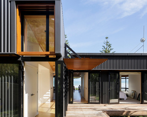
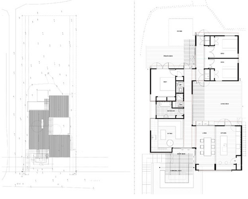
He designed a collection of three black sheds around a courtyard, offsetting them so that the two smaller boxes — one at the back containing two bedrooms and one at the front with the kitchen — didn’t line up with a third, longer box containing a living room, bathroom and master bedroom. In between, a series of decks connect and define the different sheds.
The house is set half a level up, on a concrete block base that contains a small single-car garage, which is mostly used for surfboards. “Cars are pretty waterproof, anyway,” says Smith of the arrangement. The concrete block base is practical — it sets the house up well above the storm-surge level — and it makes the view better. But it also means the interior of the house is just high enough that people walking along the road outside only get an oblique view of the place.
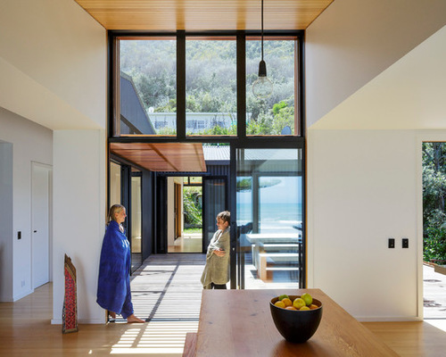
There is no front fence, and the house feels open and casual, encouraging visitors to drop by on a fine summer’s evening with a couple of beers. Visitors access the place via a set of stairs off the front lawn, and then across a deck that leads onto another deck, which leads into the living area. There really isn’t a front door.

Patrick Reynolds Photography, original photo on Houzz
“Making everything read smaller was really important,” Smith says. “That, as much as anything, invited the house into the community.”
The layered approach creates a distinct sense of privacy, without anyone really noticing. The long shed has its back to the driveway that runs up the side, while the bedrooms at the back run out to their own little deck and will eventually connect to a fourth shed. You don’t realize it when you get to the house, but you’re being taken on a bit of a meandering path, which provides that much-needed privacy.
“By offsetting it we gave them this great big sequence of spaces,” Smith says. “You follow your nose diagonally through the living area to get to the outside space, and then diagonally again through to the bedrooms.”
In summer, you move through the house across and through courtyards and decks. The doors to the house stay open almost all of the time, so the place feels much bigger than it really is. In winter, it closes down a little and feels cozy and contained. Even then, Smith says, “they’ve got places to go, which meant we could build a substantially smaller footprint.”
The sheds are clad in black corrugated aluminium on both the roof and the walls — a cost-effective material for a house so close to the beach that won’t rust or degrade. Practicality aside, it’s a humble approach that harks back to the corrugated-iron baches of old.
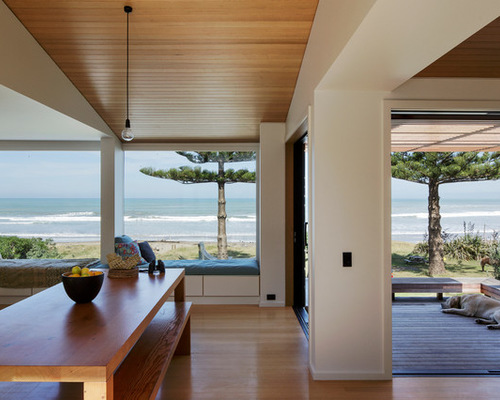
The interior of the house is deliberately pared back and simple — with a view like that, there’s no need for fireworks. “It’s really just honing down a set of similar buildings, which allows us a kind of efficiency in the building of it,” Smith says. “Everything about the spot is so beautiful that we were just trying to fashion a way of living in it. The color’s all coming from outside.”
Building the house around these circulation spaces also meant Smith could define them with subtle changes of material and ceiling height. Any place that is a circulation space has a wooden ceiling: Inside, the ceiling is made of Tasmanian oak — the same wood that is used on the floor.
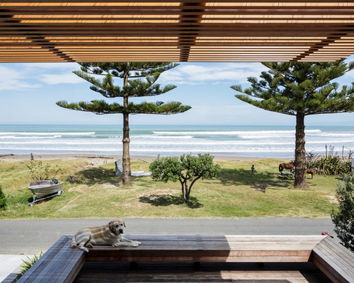
Outside, the wood continues with a series of slatted cedar pergolas, features the family is slowly saving up for and adding as they go.
Anywhere that sunlight enters the building, Smith specified wood around the windows to subtly warm things up.
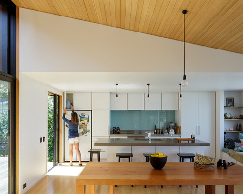
Other spaces — bedrooms, kitchen, living areas — have white plasterboard ceilings to match the walls. It’s a nice touch: The house expands and contracts both vertically and horizontally. It also meant that Smith could make use of standard trusses in these areas rather than creating soaring ceiling heights.

Irving Smith Architects, original photo on Houzz
There are white walls and simple materials including stainless steel benches in the kitchen. There are three bedrooms but no en suite bathrooms. Instead, Smith designed a sort of deconstructed bathroom, which includes a large room with a bath and a vanity, a room with a toilet, and a room with a shower. “It’s the same setup as I have at home,” he says of the arrangement, which makes one bathroom go much further for the family without adding substantial cost. “It’s about working out what’s important,” Smith says.
The courtyard deck performs multiple functions. As well as being circulation and outdoor space, it also brings plenty of northern light into the living room. Here, you can see how it makes a sheltered, warm spot in the middle of the house.
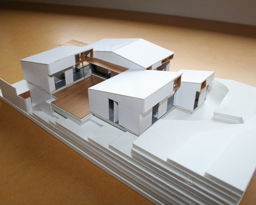
Once the design of the house was nearly complete, Smith sent the owners a model to explain how the place would work. At that point, the family was living a few doors down from their future home. The children sat down and mapped the house out at their old kitchen table so they could understand how it worked.
At the rear of the house, you can see a fourth shed, which wasn’t built for cost reasons but will be added as the family’s need for space grows. “That’s the other thing about the offset design,” Smith says. “It’s stageable. When we were getting out of the ground, we had some in-built contingency.”

Irving Smith Architects, original photo on Houzz
?
Here’s the plan, which shows clearly how the offset sheds in the house zigzag along the site in layers — a little bit like rolling sets of waves in the sea, Smith says.

Patrick Reynolds Photography, original photo on Houzz
?
The view from the house is fabulous. From here, the family can see the surf breaks. If the surf is up, family members come home from school and work, drop their bags and change into wetsuits, heading straight over the road for a surf.
“Everyone’s out enjoying it, and that’s what it should be about, really,” Smith says. “I think they’ve got it about right.”
