When a world-class entrepreneur decided to buy another home for his family – adding to their highly curated collection in New York City, Florida and Paris – he wanted a knockout beach house, plain and simple.
When he discovered a modern condominium, with scintillating views of Miami’s South Beach and the Atlantic Ocean, he was hooked.
The residence is unique in that it’s part of a two-unit townhome, one of only five radiating from the base of a luxury condo high-rise.
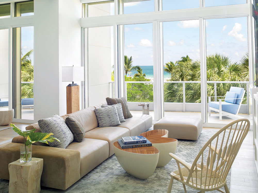
It was a prize find, high enough to deliver three delicious layers of sea, sand and sky, yet tucked into the landscape to exude that priceless “on the beach” feel.
Its setting is so coveted that Madonna herself once owned the unit. But that was more than a decade ago, and its 1990s-era interior had become dated.
The 3,000-square-foot beach retreat was ripe for a renovation, particularly since a portion of the new owner’s extensive modern art collection was earmarked for the home.
The owner turned to Paul Fischman, a principal at top architecture firm Choeff Levy Fischman, for a kitchen redesign initially, and a more extensive remodel of the two-bedroom, four-bath unit grew from there.
The client also enlisted Michael Wolk of Michael Wolk Design Associates to craft a modern, clean- lined interior filled with informal yet still intriguing furnishings and artworks.
Both based in Miami, and equally well versed in the design languages of tropical modern and midcentury modern, architect and interior designer faced the same daunting challenge.
The home had to be livable by the season’s start, when the building’s condo association no longer allowed construction. The design duo had roughly three months to accomplish their goals, and every day counted.
“The home is all about lightness,” says Wolk of his initial impressions of the project. “You can’t stand in that two-story volume, infused with all that sunlight and staring out at sky and ocean and beach, and think of any driving color palette other than white and cool pastel accents.
“Plus,” he continues, “a white interior makes you feel like you are plunging into a swimming pool; it’s just refreshing,” he adds.
Placement of art was extremely important to the owner and he was very involved in that process,?says Wolk. In the master bedroom, for example, the designer collaborated with the owner and art gallery on how best to position images of a Wyoming landscape.
Rather than one long horizontal, they opted?to stretch five distinct canvases wall to wall for a panoramic effect. Underneath, Wolk’s custom- designed ebony-stained bed and headboard – oriented to take in as many visual degrees of South Beach as possible – also runs wall to wall.
No stranger to fine art, Wolk, a Brooklyn native, studied at Pratt Institute and quickly found that his strengths lay in three-dimensional models.
One summer during college, he joined a friend in building a spec house in Connecticut, a transformative project that led him to further focus his studies on industrial design.
After running a successful renovation company in New York City, he moved to Miami to help launch a furniture showroom.
That was 40 years ago, and he has called the city home ever since, overseeing his eponymous firm as well as designing and licensing furniture under the Michael Wolk Collection brand.
Wolk’s focus on craftsmanship drives his interior design, which is why custom features and furnishings are his trademark. With such a tight deadline on this South Beach project, however, the designer danced a fine line between “ready to wear” finds and signature selections that were, in his opinion, well worth the wait.
On the whole, the interior nods to midcentury modern, with standout, heirloom-quality pieces drawing the eye at every turn. From the living room’s Wendell Castle coffee table to the Michael Thonet dining table chairs, the furnishings are front and center in Wolk’s ode to iconic interior design.
Like Wolk, Fischman also picked his battles due to time constraints and focused on opening up any possible interior space to the views. “It was all about connecting with the beach,” says the architect. “I wanted the family to feel like they were at the beach in every room.”
Faced by the unit’s envelope of unalterable common elements, Fischman employed a variety of problem- solving tactics, from the removal of an enclosing wall in the kitchen to the creative inclusion of an interior window that allows views from the second-floor master closet.
To make the interior feel even more modern and light, the architect employed a base reveal on all interior walls. “Instead of baseboard, which proudly projects, we opted for the opposite effect: a small black recess to make the drywall look like it’s floating,” he explains.
One of the owner’s favorite rooms is his office, which enjoys sweeping ocean views in both directions thanks to its central position on?the second floor. The room’s show-stopping glass-topped Cavour writing desk, designed by Carlo Mollino, is a fitting design investment for an art-loving businessman.
Per the owner’s wishes, the office lacks doors, even glass. To mitigate the only obstacle to his sightline – the upper landing’s railing – Fischman employed a frameless Starphire glass version. “It’s a superior choice for its clarity and lack of hue,” he says.
Fischman transformed the former small, enclosed kitchen into a serene modern oasis. Its features include white lacquer cabinets; Statuary marble counters, whose waterfall edges add a sculptural effect; and a backsplash of solid white Avonite, an acrylic surface produced by one of the owner’s companies.
Just where the kitchen meets the double-story main living areas, the architect carved out enough room for a full-height wine display, custom wine bar and tasting table. An illuminated backdrop of turquoise Avonite behind the wine display and a towering aquarium in the living room infuse a little sex appeal after dusk.
Completed in August 2015, the beach house is now a full expression of its new owners’ lifestyle and their own personal South Beach experience. “It’s an intoxicating mix of art, architecture and light,” says Wolk, “Finally, for this family, it’s a true original.”
For more information, visit wolkdesign.com and clfarchitects.com.
Image Credits: Photo by Troy Campbell .


