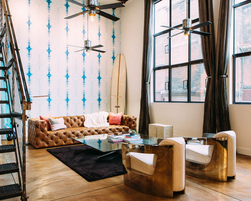
While buying a glass-topped propeller coffee table from HD Buttercup in San Francisco, this homeowner asked design consultant Daphne Steinberg if she’d have a look at his loft and make some design suggestions. “He had a huge black leather sectional and a huge TV and not much else,” Steinberg says.
After hearing her out, the homeowner, a forensic accountant, hired Steinberg and her former collaborator Briana Nix to work their magic, which focused on using the homeowner’s love of surfing as inspiration. “He was one of those dream clients, open to everything from crazy wallpaper to pink pillows,” says Steinberg, who jokes that the vast improvement to the loft might have even affected the homeowner’s love life. “When we met him, he was just a bachelor; by the time we finished, he was engaged,” she says. “I like to think that our work was influential in that department.”
Cool Off in a Loft With New Ceiling Fans
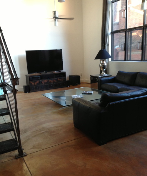

SF Loft 1: Before Photo, original photo on Houzz
Houzz at a Glance
Location: SoMa neighborhood of San Francisco
Size: 2,000 square feet (186 square meters); 1 bedroom (loft style), 1½ bathrooms
BEFORE: The first thing you saw when you entered the old loft was a nearly 20-foot wall with a TV and a large trunk against it. “My first thought was that that wall is such a showcase wall,” Steinberg says.


SF Loft 2: Daphne Nauleau Interior Design, original photo on Houzz
She had been wanting to use Eskayel wallpaper in a project and seized on the opportunity to introduce a bold graphic blue design. She chose wallpaper rather than art because of the size. “A big piece of art is very expensive,” she says. “With a wall that size, even a gallery wall would look too small. You’d have to have something so huge. Wallpaper just made sense.”
At one point Steinberg noticed that many times when she visited the homeowner during the design project, he was in another room watching TV, so she pressed him on the need to have a large TV in the living room. She eventually convinced him to move it elsewhere. “We set it up more for entertaining, not for lounging,” she says. “It’s more buttoned up and formal.”
She also noticed that the homeowner had six surfboards leaned up against another wall, and used this as inspiration for incorporating blues, aquamarines and teals. “This guy wouldn’t do Shabby Chic wicker furniture, and it being a loft, we wanted to keep it pretty edgy,” she says.
She had considered mounting the surfboards horizontally, but the homeowner didn’t want to put holes in the wallpaper. “So we decided to just lean them up,” she says. “It really helps balance out the whole wall and volume of the space.”
The updated chesterfield-style sofa also helped fit the scale, while the caramel color complements the blues used throughout and the warm brown stain on the poured concrete floors.
The table is the glass-topped antique-propeller table the homeowner had bought at HD Buttercup, where he met Steinberg. (She now has her own design business.)
The fans were already there but had frosted glass covers. Steinberg replaced those with simple Edison bulbs.
Steinberg put together pillow options and made suggestions to the homeowner, who went with a couple of salmon-pink pillows on the living room couch. (They read more orange in the photographs.) “It’s wonderful when a guy isn’t afraid of pink,” she says.
Steinberg is a firm believer in adding as many plants as a client is willing to take care of. Because the homeowner travels for work a lot, she chose a succulent arrangement for the table and a ficus tree in a nearby corner.
Fill Narrow Spaces With Convenient Console Tables


SF Loft 3: Daphne Nauleau Interior Design, original photo on Houzz
The console looks like it’s made of riveted airplane metal, which works with the metal of the stairs and the propeller coffee table.

SF Loft 4: Daphne Nauleau Interior Design, original photo on Houzz
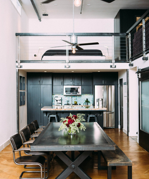
The kitchen cabinets originally had a cherry-red finish. Steinberg refinished them in matte black to correspond with the TV-room cabinets. “It makes everything flow more,” she says.


SF Loft 5: Before Photo, original photo on Houzz
BEFORE: Steinberg thought the black sofa and cherry-colored built-ins in this space didn’t work. Because the owner would be using this as his main TV and lounging room away from the main living room, she imagined it as more of a dark, moody sanctuary.

SF Loft 6: Daphne Nauleau Interior Design, original photo on Houzz
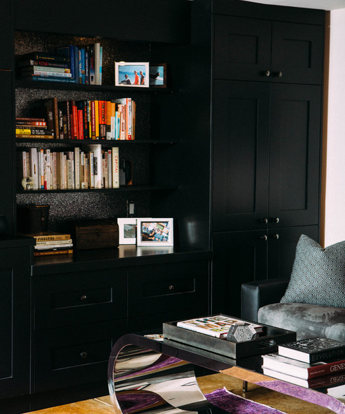
AFTER: Steinberg changed the cabinets to dark black and introduced some touches of pink and purple through a throw blanket (not pictured) and rug. The sofa is a custom sleeper sofa from American Leather in leather and suede.
She added a Phillip Jefferies wallpaper behind the shelves that almost looks like shimmery, silvery fish scales.

SF Loft 7: Daphne Nauleau Interior Design, original photo on Houzz
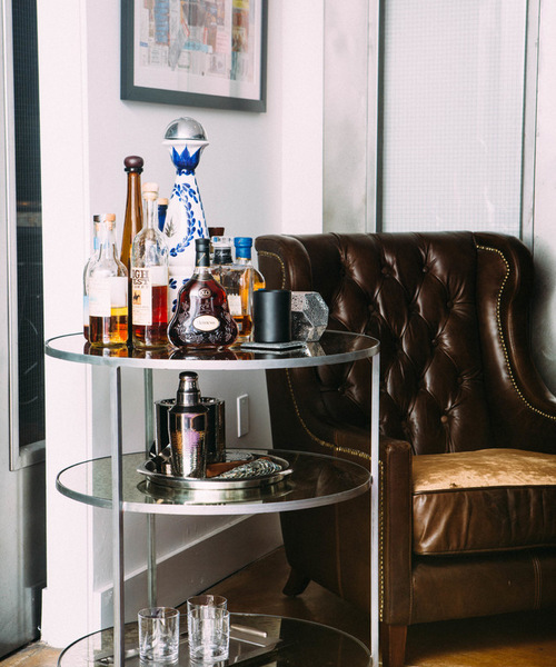
Opposite the new sleeper sofa is a leather chair that belonged to the homeowner. Sliding metal doors separate the TV room from the kitchen and a small hallway that leads to a bathroom.

SF Loft 8: Before Photo, original photo on Houzz
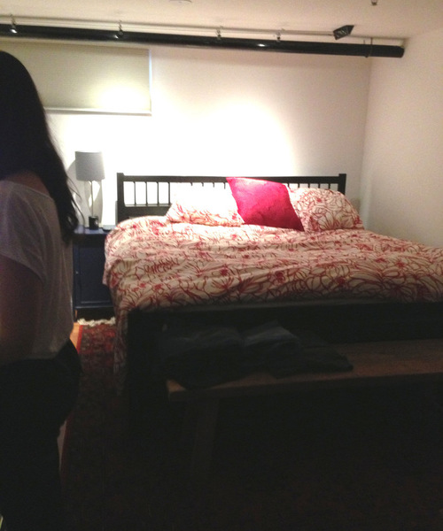
BEFORE: Originally the bed was pushed into the loft corner.

SF Loft 9: Daphne Nauleau Interior Design, original photo on Houzz
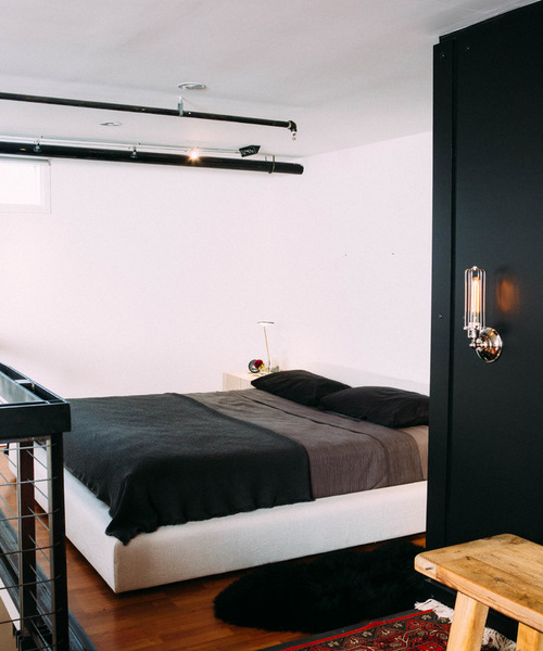
AFTER: Steinberg rotated it to face the living space below. Black sheepskin provides texture and softness. “A large rug would have made the space feel even more small,” she says.
“When he came into the shop to buy that propeller table, he didn’t act like he was someone interested in doing an entire apartment redo,” she says. “He more or less gave us free rein but was very involved too, sitting on the floor with us going over rug color samples and looking at inspiration photos on the computer together. I think that’s why there’s this expression of who he is, and it looks great.”
San Francisco Travel Guide for Design Lovers


