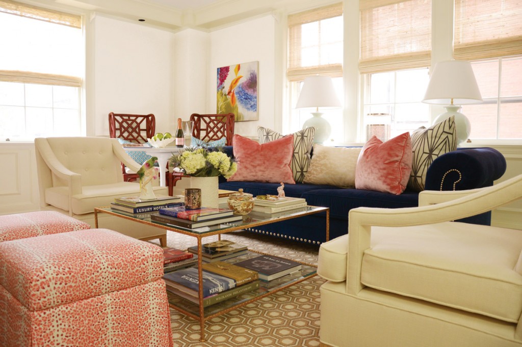
Interior design expert Julie Richard dishes on summer color trends and what goes into the choosing of superior shades.
When it comes to paint colors for that long-overdue interior makeover, consider those hand-selected by Julie Richard, owner of Shelter Interior Design in Salem, MA, has much to say on the subject of “color concepts.”
Describing the process by which she and a panel of experts chose Ace Hardware’s Clark+Kensington 2013 summer color palette, Richard points to a number of determinants. Client input and color forecasting from Pantone—a recognized authority on color—as well as what is occurring culturally and creatively in the world all factored in to the panel’s choices. Lifestyle trends often influence a palette’s appeal, as do design styles.
Richard notes a few accent shades usually join the ranks for “a bit of drama and contrast.” Her personal color preferences are inspired, in part, by fashion trends. “What is fresh and new in theatre, Hollywood, and the fashion world often trickles down to home décor,” she says, predicting that Pantone’s choice for color of the year will be a hot hue.
No matter the source for its inspiration, a winning color deck ultimately comprises colors that include varying shades and values of classic neutrals, as well as updated accent colors. “The [current] overall design trend,” says Richard, “is to paint rooms with livable neutral shades. Tans were more popular a few years ago, but shades with gray undertones are now in the forefront.” She sees colors inspired by the ocean—like warm greys, blues, and emerald green—as well as Art Deco neutrals making their way into people’s homes this summer.
Color trends, in general, seem to follow a pattern, says Richard. “Often, I find clients desire cooler colors in the summer and warmer tones in fall and winter.” In fact, the season has great bearing on what’s in vogue in the color kingdom. “I [see] clients go into a nesting mode in the cooler months,” says Richard, “[and] they crave richer, cozier spaces. In the summer, [they] tend to want to keep their spaces light, fresh, and fun.”
Richard demonstrates a successful color combination or, as she calls it, a “cohesive interior color story,” by way of example. She says, “Mixing shades of blue, gray, and green [like] Clark+Kensington’s Apple Grove, Crisp Linen, Beach House, and Sapphire create a serene palette. The Sapphire shade would add just the right amount of contrast and depth to the mix.”
As to how she determines successful unions, Richard explains, “I really don’t follow too many rules while designing spaces.” She does, however stick to some basics, using one primary color, one secondary, and a third to serve as a complementary accent shade. With neutral tones as the base, incorporating “pops of color” readily reflects seasonal changes. Richard suggests using trendy hues for easily altered design elements, like a front door. Throw pillows, window treatments, and other fabrics also lend themselves to quick changes that can have a powerful effect on the mood a room evokes. For somewhat more permanent statements, Richard suggests opting for crisp white walls that are accented with colorful pieces of furniture.
People are creatures of habit, so they generally gravitate toward certain shades. Richard has seen a definite preference for the “safer” calming shades belonging to the family of earth tones. “Neutral colors,” she says, “[that are] inspired by nature are always a favorite.” Of bolder, more unusual choices, Richard says, “A fresh, unexpected paint color is truly transformative.”
Rooms painted with Clark+Kensington Lamp Shade #3046. Richard says favorite objects and destinations should serve as inspiration when choosing paints.
To combat the tendency toward traditional colors, Richard encourages her clients to explore unchartered waters. “I ask my clients to look to what they love for inspiration. I suggest choosing objects or destinations [that] they are drawn to when [picking] paint colors. I also [talk about] the importance of taking risks; 90 percent of the time they find [the] risk was worth it.”
Before dipping a brush, however, interior makeovers should include considerations like the type of lighting used in the space, the room’s location in the home, and the amount of “traffic” to be expected. “I’d approach a playroom differently than [I would] a master bedroom,” says Richard. Sun exposure, too, plays a hand in color selection; shades will appear cooler in north-facing rooms and warmer in those facing south. And, of course, a room’s function matters. Kitchens and living rooms, for instance, tend to be highly active spaces and require particularly careful planning. Richard says, “High traffic areas obviously take more abuse…that’s a good place to consider not only the color for the space but also the finish.”
Taking notes and thinking hard about all such matters is commendable, but in the end, committing color to walls takes guts. Fear can prove a debilitating obstacle, but Richard proffers a solution: “I always suggest painting a two-foot-by-two-foot sample swatch on a wall before painting an entire room. Live with this color for a few days. It’s amazing how the shade will change in different light and at various times of the day. It’s really the best way to make the right choice.”
Of how to use colors most effectively Richard says, “I try to vary the shades. I’ll pair a bright, high-gloss object next to something quieter and lighter.” She also suggests playing up contrasts, no matter how slight. The variations in texture of materials, for example, can be the starting point for color choices. That same subtlety exists in the ceiling. Richard regards it as “a fifth wall” and says, “It doesn’t always have to be white; even if you slightly tint a white shade with a complementary color…or paint it a few shades lighter than the wall color, it will feel as if you’ve considered the entire environment, and it will add a beautiful sense of depth to the space.”
Color is a complex décor component, but following seasonal trends and giving thought to a few key design concepts can yield a surprisingly pleasant pick from the old box of crayons.
The Dos and Don’ts of Choosing Color
Do
- Devise a color palette that feels fresh and complements the season
- Look for inspiration in cultural/lifestyle trends, favorite objects, and destinations
- Consider lighting, sun exposure, function, and traffic volume in a space
- Play up contrasts
- Vary the shades
- Use trendy colors in easy-to-change elements, like throw pillows and window treatments
- Test colors with small sample swatches left on the wall for a few days
- Take chances
Don’t
- Use predictable thematic schemes
- Forget the ceiling
- Choose colors only viewed in a store
- Dismiss nearby colors and patterns


