Architect Richard Landry moved to Los Angeles in the mid-1980s to be where the action is.
The Montreal native drove down from recession-plagued Alberta without a green card or visa. He promptly landed four job offers within a week, so he got his visa and stuck around. “My timing was good; there was a lot of potential out there,” he says. “Then I was on my own at 30 years of age and I thought: Yeah, I can do this.”
It was an era when postmodernism was all the rage, coast to coast. In 1986, Michael Graves designed his Pantheon-inspired Team Disney building in Burbank, following the debut of Philip Johnson’s 1984 Chippendale-capped AT&T tower in Manhattan. But Landry skipped that kind of history-referencing design. Instead he embraced modernism—and later turned his attention to other portals to the past.
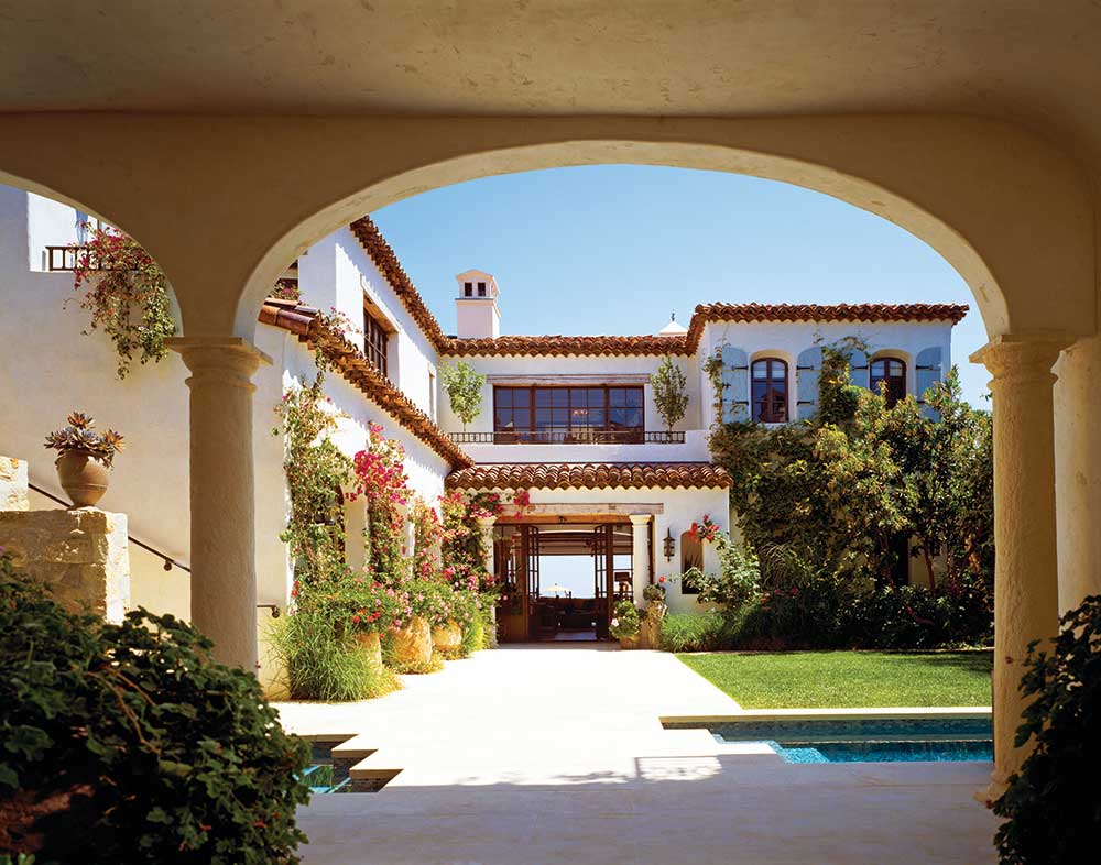

He looked to French Provincial, Spanish Colonial, and Tuscan Rustic: a variety of classical styles that appealed to a well-heeled clientele. “I didn’t want to create a signature look but to listen to the clients and their needs, to what the site says, and to not limit myself,” says Landry. “We approach every project without preconceived notions. It’s about being open-minded.”
He did his homework, too, rigorously researching European scale and proportions and tracking down the most authentic materials. Soon he was designing houses for Hollywood’s super rich and super stars alike. At last count, the 60 year old had designed 400 homes in 12 states and 17 countries, and he’s just beginning to hit his stride.
“Richard has developed an incredible reputation for the quality of the homes he delivers to his clients,” says Noah Fedosh, design director at Landry Design Group. “He’s not only attentive to them by listening at the conceptual stage but has a level of attention at every point of the process.”

The Landry Brand
A Landry home can range in size from 2,000 to 50,000 square feet and take up to four years from concept to completion. His attention to detail ranges from the overarching design down to the quality of the door jambs. “There’s just this feeling that the home has been there for ages.” Fedosh says. “It feels timeless.”
Placement is site-driven and acknowledges all existing physical attributes. “When I walk the site, it’s really practical,” Landry says. “Where is the access, how do we position the house to take advantage of the views, and how do we mask the noise? Where are the winds and the storms and where does the snow pile up?”
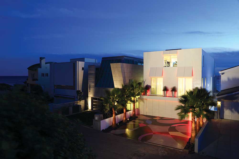

From there, the process is client-focused. “At conception, Richard likes to be involved heavily, delving into the minds of the clients, finding out what they like, and delivering an unspoiled idea of what they’re asking for,” Fedosh says. “They’ll bring in magazines, but Richard delves in deeper and is able to visualize early on.”
He’ll also use his sense of humor to establish client relationships. “My wife handed him some magazine pages, and he wadded one up and threw it over his shoulder and said, ‘What else you got?’ ” recalls client Bob Byers. “Then she pulled one out, balled it up, threw it over her shoulder, and said, ‘Never mind.’ ”
The Richard Landry brand is flexible, with different kinds of architecture to accommodate different kinds of people. But at its core, it’s about a personal, enjoyable experience. “At the end of the day, each home is an expression of the client,” says Brian Pinkett, a partner in the firm. “You can see the personality of each client and family—everything we do is personalized and customized.”
Classical and Modern
Designs by the firm today are trending toward modern architecture, in part because of the expansive window systems that open up to dramatic views, but also because of the potential to merge kitchen, dining space, and living areas into one flowing space. “People like that openness from an entertainment standpoint,” Fedosh says. “You can cook and not be isolated from everyone else; there’s the attraction of that open-concept living.”
At one point, the ratio of architectural work at the firm was 75 percent traditional to 25 percent modern. Now it’s more like 40 percent classical to 60 percent contemporary. “People want a cleaner lifestyle—devoid of goop and stuffiness, in terms of life in general and their surrounding environment—a stripped-down look,” Fedosh asserts. “Traditional is for an older generation; the younger generation wants a more modern aesthetic.”
But the lessons learned from classical scale and proportion carry over into contemporary design. “Our firm’s strong base in traditional design contributes to us being strong designers when it comes to modern architecture,” says Fedosh.
Villa del Lago
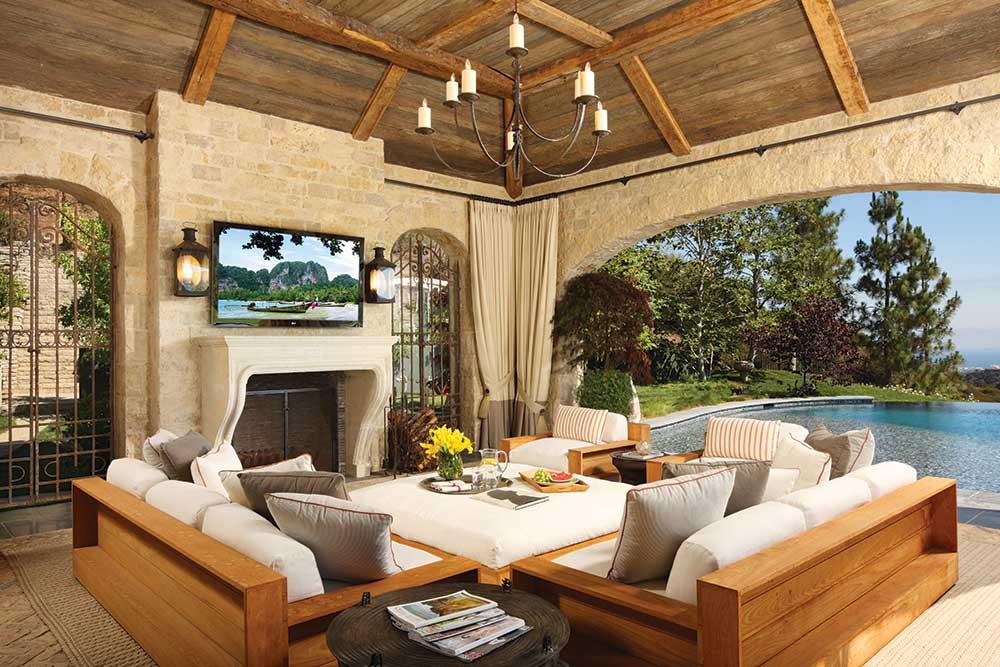
That base is nowhere more self-evident than in the home that Landry designed for Bob Byers at Lake Sherwood in the Santa Monica Mountains of Southern California. Byers and his wife, big fans of Tuscany and the Amalfi Coast, approached Landry with the idea of a home inspired by that region. “We wanted a home overlooking the lake like Lake Como,” Byers explains, “and we wanted it to look old, like an Italian villa.”
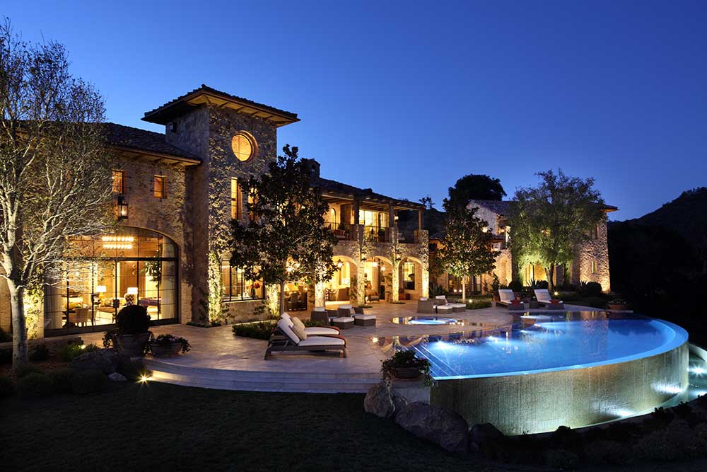

They also had a contact in Italy who could provide them with authentic materials from Tuscany, including 400 260-year-old wooden beams, 21,000 copper tiles, and 150-year-old clay tiles, once formed on the thighs of Italian women’s legs. “We were trying to achieve a villa on the hill that looks like it’s been there for 100 to 200 years,” says the owner. “Richard mixed in old brick with stone from Mexico and New Mexico.”
Their 23,000-square-foot Villa del Lago sits on a knoll overlooking lake and valley. An existing building pad onsite was extended with hardscape and pool elements—the infinity pool overlooks the lake for a feeling of expansion over the water. That led to a linear design where every room has a lake view, connected through a long spine. “The program and the site melded perfectly,” says project architect Todd Riley.
Composed of two levels with a full basement, the home took 30 months to complete. “They wanted something that would be comfortable living in day to day,” says Riley. “The square footage added up incrementally because they wanted it to feel homey from a daily living point of view, with spaces they would use clustered together on the same floor.”
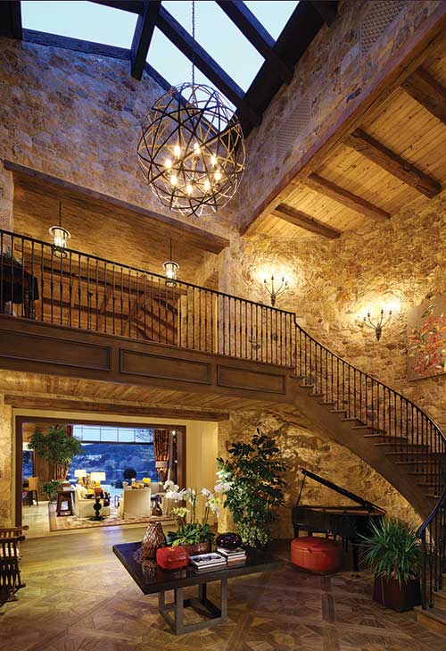

A kitchen, living space, family room, bar area, library, home theater, and master suite are on the main level. Four guest bedrooms are above, and in the basement lies Byers’ classic car collection: a Packard, DeLorean, Studebaker, Lamborghini, a pair of Porsches, and a number of Chevrolets.
“I want to have a 20-car garage,” Byers announced to Riley at the start of the project. Asked how many he had at that point, he responded, “Two, but I plan to have 20 by the time it’s finished.”
“He actually did come up with 20 cars, and it’s a fun space,” Riley says. “We had the idea of having the theater room over a couple of parking spaces, so we put a glass floor right above them, and he places his best car there so you can see it.”
The garage’s central spine is a dramatic arched ceiling, composed of brick and heavy beams. “The garage is the best part. The man cave is where it’s at,” Byers says. “My wife said there were too many televisions down there—I had four—and Richard said, ‘You’re right: he needs five.’ ” And he got them.
Byers instructed all of the contractors to bring their best ideas to him, and says that the result is a better building from Landry and his team. “He was open to that—and he designed our dream home,” Byers says. “He knew I liked automated features, so when I get out of bed at night and put my feet on the carpet, the lights come on.”
Sentosa Island Residence
On the manmade island of Sentosa in Singapore, a more contemporary approach was called for. When client Kara Kandarskis and her husband purchased their canal-front lot there in 2007, they looked forward to living in what she calls a comfortable and modern home. The only drawback was the prevalent architectural styles in Singapore.
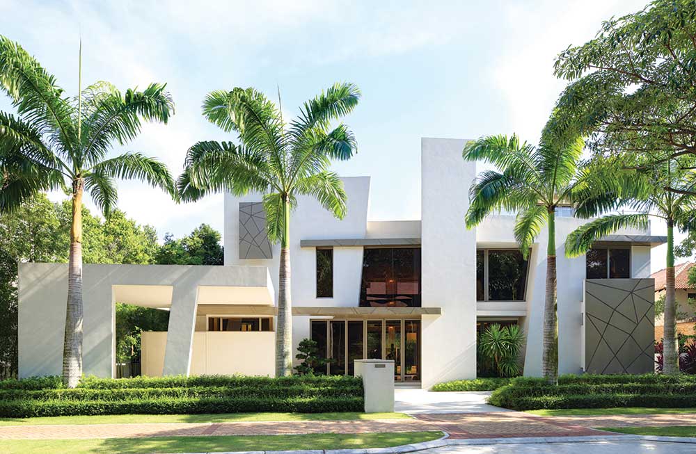

“The homes are all generic; I wanted something unique,” says Kandarskis. “And Richard is amazing—I saw his book at a bookstore, loved a couple of his modern houses, and said, ‘I have to contact this guy!’ ”
Their gated community on Sentosa Island, which she compares to old Newport Beach or Palm Beach, was just getting started when they broke ground in 2008. “There was nothing there,” she describes, “but it’s completely developed now with restaurants, hotels, and a casino.”
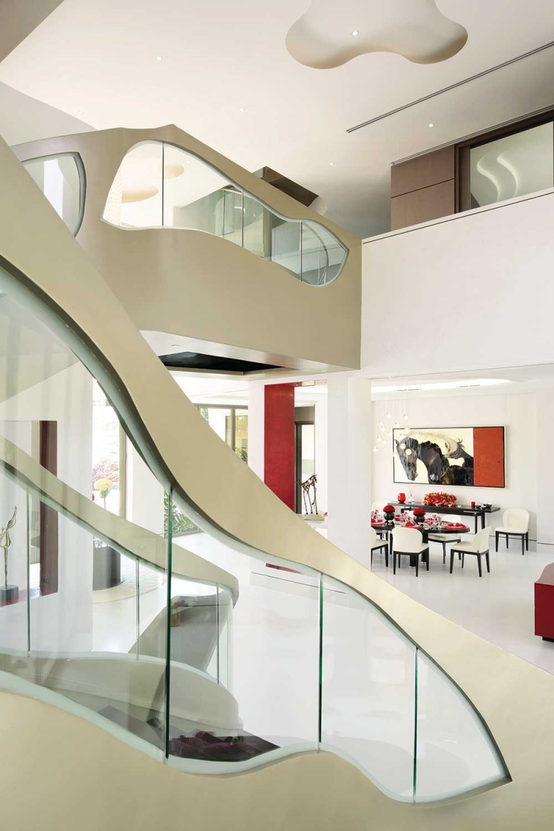

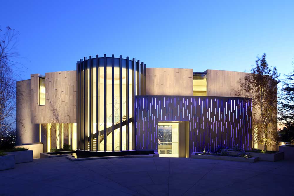
The couple’s 15,000-square-foot site overlooks their boat, tied up to a dock on the canal that leads to the ocean. The site is trapezoidal, which inspired the form of the house. “It was a blank slate; there was nothing to react to except the shape of the site,” says William Mungall, associate architect at the firm.
Because their clients clearly leaned toward contemporary architecture, Mungall and his team researched precedents across Singapore. “We looked at some with poor flow and also thin materials,” he says. “We tried to do something more grounded, more solid, and more robust.”
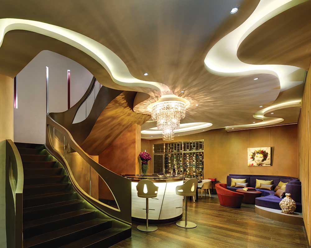

The resulting house is trapezoidal in shape and 9,500 square feet on two levels, with six bedrooms, 10 baths, an attic, and a basement movie theater and wine room. It’s solid as a rock, with fixed steel frames around all doors and windows, floors of manmade stone, and thick, plastered walls.
“There’s a seven-degree angle used in both plan and elevation as a kind of underlying concept for a slightly odd shape,” Mungall says. “That allowed us to open up the front to the back and generate a more dynamic architecture from façade to rear.”
A central stairway, built of solid metal panels, is a focal point and a fluid sculpture. “It’s simplified—he made it into an artwork that’s a spiral and beautiful to look at,” says Kandarskis.
The Landry Legacy
Reluctant to boast of his accomplishments, Landry is quick to point out the efforts of others, particularly the 45 employees at his firm, who work together on 10 to 12 projects a year.
His clients are important as well: “I learn from every client and every project, and I transfer that knowledge to the people around me, to elevate their thinking and their approach,” he says.
Over the past three decades, Landry’s made one thing abundantly clear: if he knows anything, it’s how to find where the action is.
For more information, visit landrydesigngroup.com
Click here to see more of our Top 50 Coastal Architects 2017
Image Credits: Photos courtesy of Landry Design Group.
