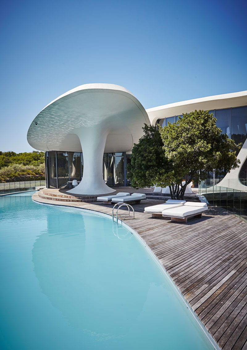
A remarkable sight greets visitors to the rolling coastal dunes of Keurboomstrand, north of Plettenberg Bay in South Africa’s Western Cape Province. Some liken the pristine white and organically shaped building to a space station, others to a ship afloat.
Architect Lesley Carstens, who, together with husband Silvio Rech, designed the remarkable form, offers a different take. “It looks as if it has been eroded like a piece of whalebone on the beach.”
Rech suggests that, from certain angles, you might discern the forms or motion of a pair of swimming whales. “It has the feeling of an organic object or being,” he adds.
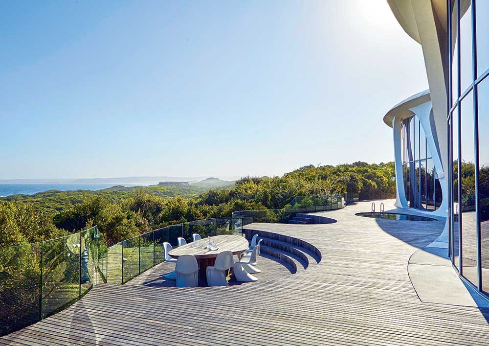
The eye-catching building is something of a contradiction: it stops people in their tracks, yet its wavelike form is remarkably unobtrusive and sensitive to its natural surroundings.

Dubbed K Cottage – although, at three stories high, it’s substantially larger than a beach cottage – it is the vacation home of South African-born, UK-based activist investor/fund manager Julian Treger.
A prominent art and design collector, Treger is also passionate about architecture. Although he originally considered a highly minimalist design, he switched his decision to organic architecture “given the undulating nature of the hills, the mountain behind and the wave motion of the sea.”
At the same time, because he is interested in the history and DNA of the designs he loves, the concept was also to be an exploration of the roots and development of organic architecture.
Treger, Rech and Carstens found themselves exploring the futuristic art and architecture of the 1960s, such as Oscar Niemeyer’s 1968 design for Villa Mondadori in Cap-Ferrat, France, Eero Saarinen’s early ’60s TWA Flight Centre at JFK Airport and John Lautner’s futuristic California homes, with more than a nod to the more recent organic architecture of the late Zaha Hadid. “It was a bit of a love letter to the architects of that era,” says Rech.

Rech and Carstens are renowned as architects of some of the most luxurious lodges and island resorts in Africa and around the world.
They have refined their approach to architecture as a mediator between man and nature, and have pushed the envelope of the art of architecture as experience, as an adventure in itself, and integral to the experience of nature. And they brought this philosophy to bear in their design for K Cottage.

In response to the constantly changing weather and light in Plettenberg Bay, Rech and Carstens infused a kind of dynamism into the building’s forms.
“You sense that the home is ever moving, and it’s just frozen at the moment you see it,” says Rech. “As you move away, you almost feel as if it is about to rise and swell and move. The sense of motion it evokes is part of what prevents it from imposing on the landscape.”

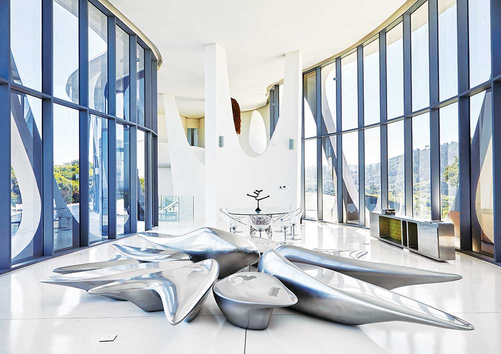
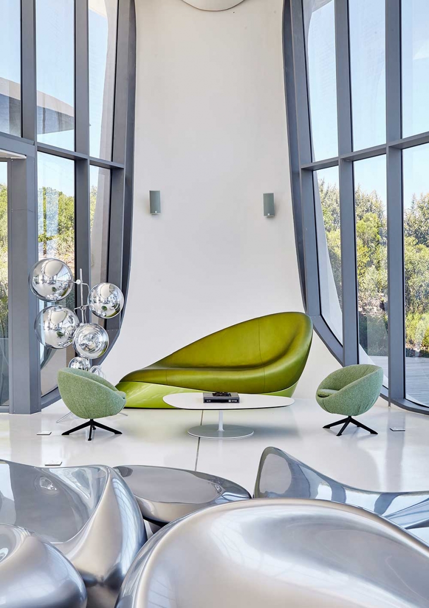
The other purpose of the home is to function as a gallery for various signature pieces from the owner’s large collection of furniture and art.
“I have hundreds of pieces in the collection,” says Treger, who selected items that were “appropriate to the architecture” and reflected some sort of organic design, entering into a dialogue with the architecture.
“Most of it is mid-century modernism,” he says. But he also selected work by the Brazilian Campana Brothers, for example, because of the beach-like organic feel of their materials.

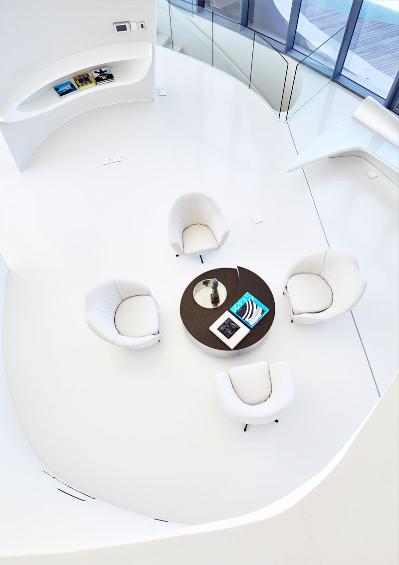
Several bespoke pieces were designed by Rech and Carstens, including a number of tables, counters, shelves and cabinets. “They were built into the walls themselves, as if parts of the architecture just morphed out,” says Rech.
One of Rech’s favorite pieces is the built-in desk at the top of the stairs, which forms a type of balcony protruding into the double-volume living room.
The white-on-white interior, more than a nod to Stanley Kubrick’s sets for 2001: A Space Odyssey, not only captures the light but forms a neutral, restful backdrop for the contents of the house and its views.
“The landscape, architecture and furniture are a lot to take in,” says Treger. “The eye can’t take much more stimulation, so we decided it’s better to keep the color scheme completely neutral as a backdrop.”
Treger notes that it adds simplicity to the space, which is appropriate for a beachside home.
Just as the interiors of 2001: A Space Odyssey evoked something heavenly for Treger, so K Cottage captures some of that purity for him. “It has a very spiritual quality,” he says. “You feel very grounded and it’s very restful somehow.”
production by Sven Alberding
For more information, email [email protected]
Image Credits: Photographs by Greg Cox.
