A weekend home on New York’s Fire Island gets a thoughtful makeover, bringing the island’s coveted seascape into full view from nearly every stylish nook and cranny.
When you’ve got waterfront property on the dreamy lick of land known as Fire Island, a popular escape for city dwellers in New York, the relationship you create with your home and that endless ocean view is really what it’s all about.
“And when we create that perfect harmony of home and place, as we did here, we call it ‘oceantricity,’” says R. Scott Bromley of Manhattan’s Bromley Caldari Architects.
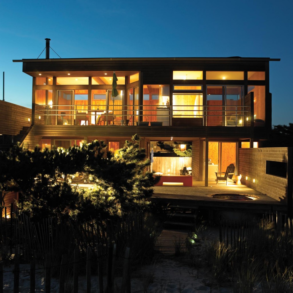
Bromley and his business partner, Jerry Caldari, get kudos from their clients for achieving that perfect harmony with their simple, thoughtful architectural solutions. In the case of this Fire Island home, those solutions took a charming, if slightly dated, little getaway and stripped away all of the barriers between it and the magnificent light and intoxicating views of sand, sea grass, and water that surround it. The answer was as simple and pure as the setting—glass goes up and walls come down.
The homeowners—Susan, Pamela, and their daughter, Lea—could not be happier with the results. They make the pilgrimage from their year-round home in TriBeCa every weekend from May through October, and then intermittently through the first of every new year. “Basically, when we are away from our house, we experience withdrawal,” Susan says.
  |
When the couple first went to look at it when it was for sale, upon entering the front gate they saw the house, but it was the cutout of the breezeway—basically a hole in the middle of the house—that caught their attention. “It is an amazing view that leads you to the ocean,” Susan says, “ …like a pathway to serenity.” She notes, too, that she and Pamela love the simplicity of this little beach box of a house.
“It’s not too big and it’s not too small,” she says. “It’s sleek, modern, and functional, but most of all, we love that it opens to the ocean from every room; you can get stereo sound of the ocean everywhere here.”
When it was time to find an architect to work with, they turned to Bromley’s firm. “I heard amazing things about [Bromley], and [those things] turned out to be understatements,” Susan says.
The couple’s goal was to preserve the integrity of the original vision for the structure but also to bring in more light. “We wanted to see the ocean from every southern window, even if we were sitting down,” she says. The firm accomplished all of this by introducing larger window surfaces, removing what Bromley characterizes as “a lugubrious deep soffit,” and transforming a tiny three-foot balcony into more comfortable, usable space by doubling its width.
“It was an interesting-looking home, but it did not give you access to the water views,” Bromley says. “There were 10-foot ceilings, but then little slits for windows.”
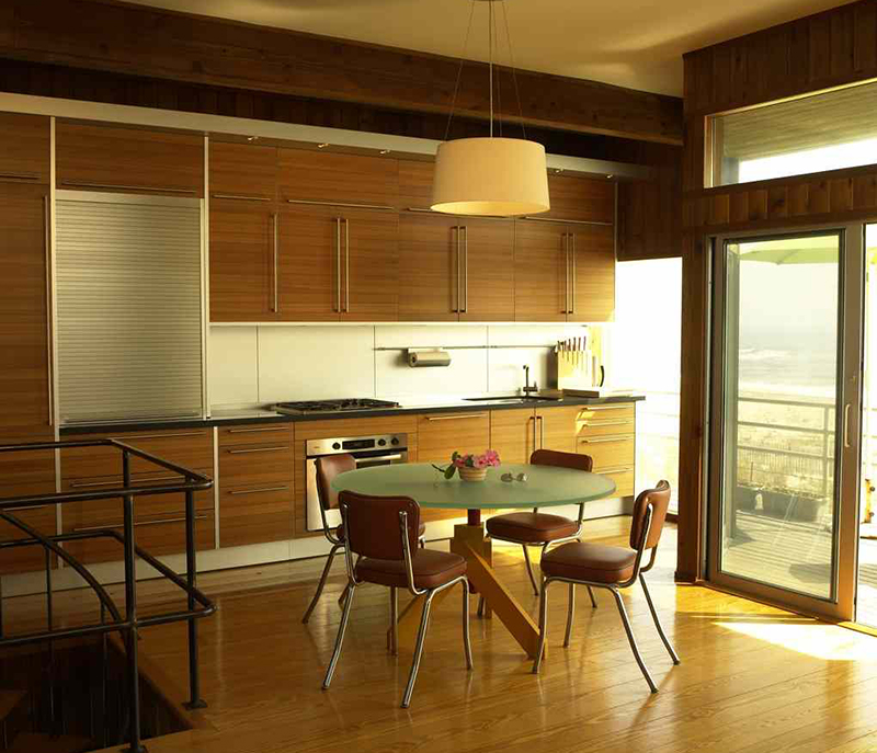
There are two bedrooms on the lower level, which now maximizes beach views. The main living space, including a reconfigured, updated kitchen and bath and a master bedroom and living room, comprise the upper level. The two floors are joined by an open spiral staircase.
With the lower-level bedrooms a mere 10 feet wide, Bromley created the illusion of expanded space by building out a bay window in each. Now, when you bed down for an afternoon post-beach nap, the sky, sand, and rolling foam are framed in the view.
The original architect for the vintage ‘60s house, Bromley explains, was the New York firm Bates Masi Architects. “[Principal] Harry [Bates] is the original upside-down architect, known for putting the bedrooms on the lower level to capture views,” Bromley says. Inside rooms got a bit of a makeover, one that updated with sensitivity to a lifestyle that cherished the casualness planted so firmly in the bones of the place.
The plan for updating the kitchen was tied to opening views, as well as improving views and space in the master bath. Ultimately, the two rooms were reconfigured so as to also expand the bathroom and put the shower and deep tub center stage so that occupants could enjoy the beach view. A place for the shy and inhibited? Not so much.
.jpg) .jpg) |
The multi-toned green glass tiles were the homeowners’ choice. “They sometimes winter in St. Bart’s, and this earthy combination reminds them of how the deep green-blue waves lighten up just as they hit the shoreline,” Bromley says. “Before we joined the tiles together, we chopped the squares so the pattern would look more organic,” he adds.
In the new layout, the kitchen, which had taken up a big square of the second-level space, became a smaller, compact, more functional galley workspace. It is open to the dining area and the living room, and those all-important views in the frame left to right, room to room.
To accommodate the limited square footage, and to avoid having a door swinging into the space, pocket doors were installed to segregate the five-foot-wide bathroom from the adjacent space. Other updating details included a new knotty pine floor, the addition of a multi-colored slate floor in the foyer, refurbishing the backyard swimming pool, and re-siding the house in cedar.
“We used stacked panels for the siding and attached them with screws placed in a pattern,” Bromley says, adding that the technique lent a bit of texture and visual interest to the frame.
The house will weather well with the sun, sand, and four seasons, blending more and more into the beach scene as time passes. And inside, this family will continue to clock the short season of summer days with visiting friends—Bromley among them—and simple goals, like beach walks and picnics in the sand.
Image Credits: Christopher Weil.


