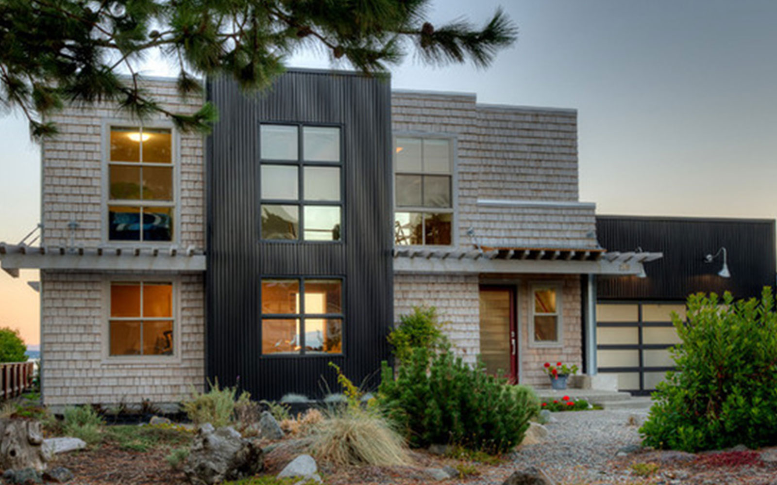
“This house was notorious along the beach for being so ugly,” architect Dan Nelson says. But thanks to an intrepid beach-house-hunting couple and their talented architects, after the renovation was complete, most of the locals on Camano Island, Washington, thought the original house had been torn down and replaced with a new one. Even the tax assessor was a bit perplexed by just how extensive the renovation was. In truth, the scope of the project was mostly a facade face-lift, as the original pleasing and functional interior layout had stood the test of time much better than the exterior had.
Houzz at a Glance
Who lives here: Empty nesters with grown children
Location: Camano Island, Washington
Size: 1,850 square feet (172.8 square meters); three bedrooms, two bathrooms
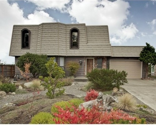

Before photo, original photo on houzz
BEFORE: The biggest move was getting rid of the giant mansard roof, seen here, and creating a pleasing composition on the outside. The layout inside the house worked well and didn’t need much work, but new larger windows opened up the home to the views of Port Susan Bay and the Cascade mountains.
A commercial building in Cannon Beach, Oregon, that mixed dark corrugated metal with shingles and arbors had caught the homeowners’ eyes, and that particular material palette stuck with them. Nelson sat down to do initial sketches with them with this in mind. Here is the initial sketch from their first meeting.

DAN NELSON, DESIGNS NORTHWEST ARCHITECTS, ORIGINAL PHOTO ON HOUZZ
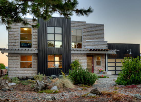
AFTER: Here you can see how the massing breaks up the facade and provides proper scale to the home (which the mansard roof didn’t). Nelson replaced the existing bay in the middle of the facade with a large box sheathed in corrugated charcoal-gray metal and added large windows to it. The charcoal metal around the garage balances out the composition. The rest of the home is covered in Western red cedar shingles. The team replaced the windows with Pella vinyl windows.
The front door remains in the same place but now has a new small porch formed by the arbor. The part over the door has additional corrugated metal, which offers protection from the weather. A new garage door adds a modern touch, and its strong lines suit the rest of the architecture, with glass panes breaking up the scale.

BEFORE PHOTO, ORIGINAL PHOTO ON HOUZZ
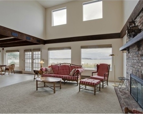
BEFORE: The original windows offered good views of Port Susan Bay, the mainland and the Cascade mountains.

DAN NELSON, DESIGNS NORTHWEST ARCHITECTS, ORIGINAL PHOTO ON HOUZZ
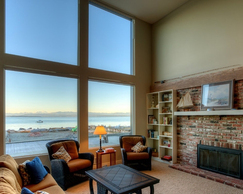
AFTER: But it was possible to make the views even better. A grid of large windows opens up the great room to expansive vistas of the bay and gives the room a more modern feel.
“The original beams were very dark, and it made the interiors feel heavy,” Nelson says. A tromp l’oeil artist lightened up the beams to give them a beachier look.
The fireplace and surrounding bookcases are original, and the mantel was simply lightened up with paint.
The second-level loft also benefits from the new windows, with wide views out across the bay.

BEFORE PHOTO, ORIGINAL PHOTO ON HOUZZ
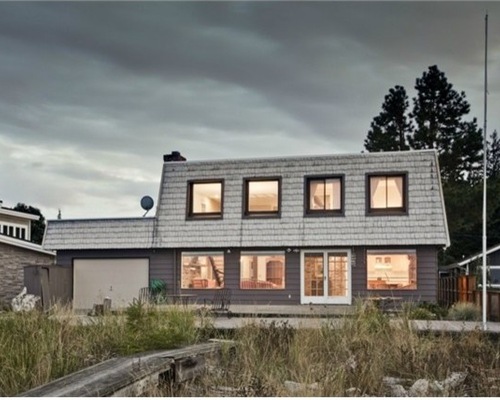
BEFORE: On the bay-facing side of the house, you can see how the giant mansard roof dictated the window sizes and shapes.

DAN NELSON, DESIGNS NORTHWEST ARCHITECTS, ORIGINAL PHOTO ON HOUZZ
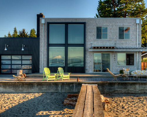
AFTER: The architects replaced the windows and doors. Here you can see how the four large framed-in windows help create a balanced composition on the facade.
A garage door on this side of the house provides convenient storage for small boats and is an interesting part of the composition. Another arbor with a metal overhang over the doors provides shelter from the weather and breaks up the facade.
On all sides of the house, balance was key, which is easy to see here in the pleasing proportions and composition. This angle shows how the metal-wrapped frame around the four large windows projects out about 9 to 10 inches. This adds interest to the facade and keeps it from feeling flat.
.jpeg)
.jpeg)
DAN NELSON, DESIGNS NORTHWEST ARCHITECTS, ORIGINAL PHOTO ON HOUZZ
Here is the first-floor plan. As you can see, all of the big changes were made on the exterior. The original layout and flow work well for the couple and their guests.
.jpeg)
.jpeg)
DAN NELSON, DESIGNS NORTHWEST ARCHITECTS, ORIGINAL PHOTO ON HOUZZ
Here is the second-floor plan.
Architects: Dan Nelson, principal, and Matt Radach, project architect, Designs Northwest Architects
Contractor: Justin Hamlin, Impel Construction
Interior designers: Garrett Kuhlman and Wendy Kennedy, H2K design
Related Links:
Browse Thousands of Beach-Style Photos on Houzz
Elements of Classic Coastal Style
Create the Perfect Beach House With Adirondack Chairs
Image Credits: dan nelson, designs northwest architects.
