Filmmaker and screenwriter Alejandro Landes, whose work has debuted at both Sundance and Cannes Film Festivals, has developed a finely tuned appreciation for drama.
“The type of film I’m interested in has relationships – it takes you through a series of evocative experiences that, as a whole, create a transformation,” he says.
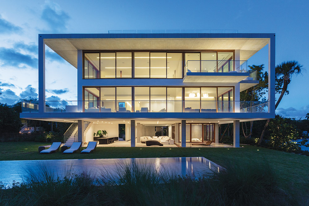
Now he’s applied that cinematic narrative to architecture in a scene-stealing home he calls Casa Bahia, in Miami, Fla. The 20,000-square-foot residence – overlooking Biscayne Bay from Coconut Grove – is his first design project.
Spare and minimal, with an exposed exoskeleton wrapped in teak, glass and stucco, the home could be likened to a Hollywood tour de force. “A friend said this house is more like a shot list than a floor plan,” he says.
Just as he might assemble a movie crew for a film, Landes gathered up a handpicked team of architects, builders, interior designers and landscape architects, and for two years they worked mightily to interpret his vision.
Among them were Bernard Zyscovich, who provided the schematic design; the architect of record Jerry Gavcovich; and renowned landscaper Raymond Jungles, one of Ocean Home’s Top Coastal Landscape Architects of 2016.
Landes’ mother, Catalina Echavarria, an award- winning furniture and interior designer who has worked with Donna Karan and Cher, created all of the home’s bespoke and handcrafted interiors.

Landes says the construction process also recalled similarities between filmmaking and architecture. “It’s kind of like being on the set with a cinematographer who’s studied philosophy and a cameraman with no high school diploma,” he says.
“We had a structural engineer in an office a long way away working with someone pouring concrete who had no degree, but they were both working together.”
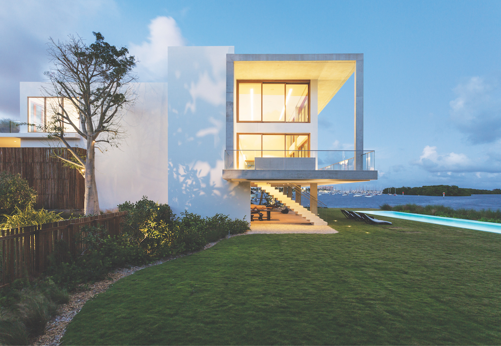
The filmmaker was intent on exploring the tension of using load- bearing materials – stone, wood and concrete – in ways that make them seem light. In essence, he directed them to provide a framework for open spaces, inside and out.
“I was trying to play with these?polar opposites and create a?handmade home,” he says. “I wasn’t?trying to push any formal ideas, but rather something very honest in the materials of the structure.”

The best architecture, he says, is site specific and this site presented one doozy of a challenge. It’s basically?a peninsula with a cul de sac that creates a bottleneck, yielding a footprint that looks much like an hourglass.
But it does offer 500 linear feet fronting Biscayne Bay, and that’s one asset that Landes and his design team used to full advantage. “There are seven bedrooms and eight and a half baths,” he says, “and almost every bath is on the water.”
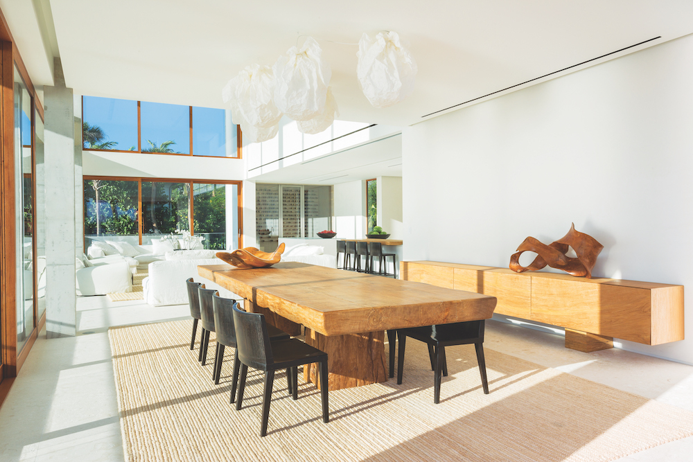
The home is open on its lower level, with a number of balconies that provide shade during the day and constant cross ventilation, effectively eliminating the need for 24/7 air conditioning.
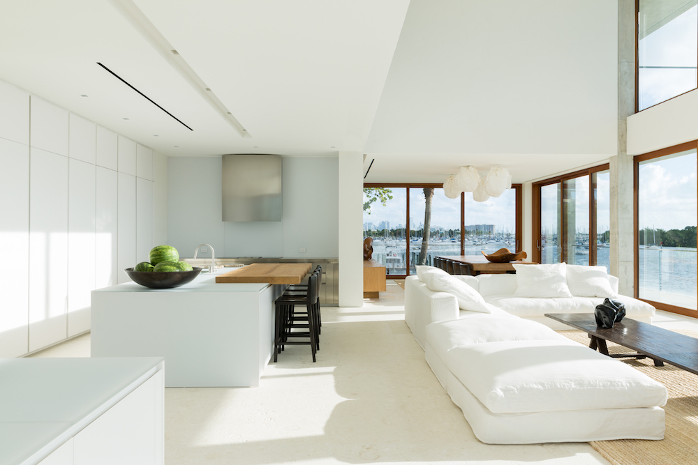
Southeasterly breezes, cooled by the waters of Biscayne Bay, flow through the home’s open floor plan, which showcases panoramic views to a sailboat harbor in the distance

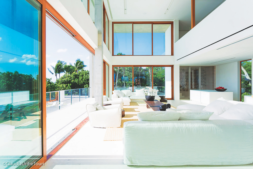
And its design deliberately blurs any strict lines between inside and out. “You can open up the skin of the building and enjoy it all,” he says. “The balconies stretch out on nine-foot-wide cantilevers, so most of the time there are great shadows and it’s pleasant to be outside because of the breezes.”
Most of the home’s glazing is on the east and north sides, with a corner scenario for the bay. That contrasts sharply with the south and west façades, opaque because of the intensity of the sun and a Florida energy code that’s becoming increasingly strict.
Inside, Landes created a waterfall with a backdrop of charcoal-colored Spanish slate, first laying out the pieces on the floor to define a pattern, then numbering each slab before mounting them on a wall.
“The water trickles down them unevenly,” he says. “It gives you sound and an element for a cinematic experience, so it’s not just what you see but what you hear too.”

Eschewing paint for interior walls, he opted instead to work with a painter experienced in applying a micro- plaster – a lime-based wall treatment.
Elsewhere, his material palette is almost palpable. By design, it deliberately encourages people to reach out and touch. “What’s great about it all is that it’s a work of art. I want you to touch the oxygen holes in the exposed concrete,” adds Landes. “The steel is porous and the teak is unvarnished.”
For a first-time architect, Landes boldly succeeds at creating dramatic emotional responses from nearly every scene and space – despite his lack of experience. “I don’t know what I’m doing,” he admits, “but I’m having a fabulous time doing it.”
Alas, there are no Oscars for architecture, but Casa Bahia is sure to win its share of design awards.
Image Credits: Photos by Claudia Uribe.
