Out near the village of Quogue, on the south shore of Long Island, lies a beach house that can’t be seen from either ocean or bay. It was deliberately designed that way in a collaboration between landscape architect Edmund Hollander and architect Oliver Cope.
Their clients, a multigenerational family in search of a place to gather for weekends, vacations and holidays, gave the designers a rare and coveted assignment: a free hand to design and deliver their vision on a double lot.
“They said, ‘Give us a great beach house and all that comes with it,’ ” Hollander recalls. “Then they let us do that for them.”
“It was important that it be a welcoming family place,” Cope says. “We particularly focused on how the home would work its way into the coastal landscape, and the tremendous views of the ocean, with its constantly changing world.”
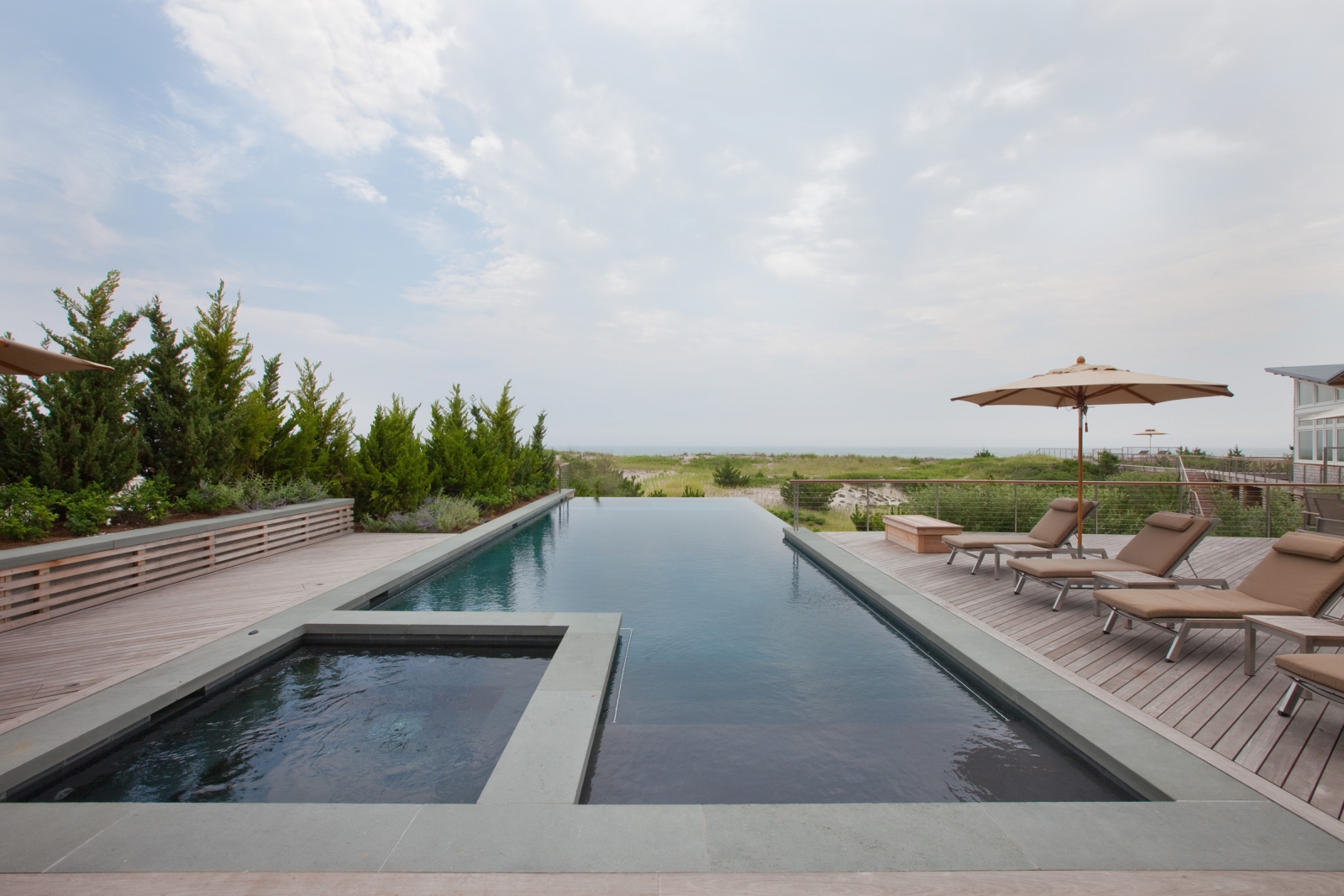

Photo by Charles Mayer
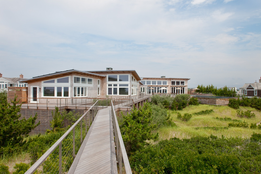
To do that, they tucked the two-story, 11,000-square-foot house behind a dune line on the ocean side, and then hid it with raised, contoured plantings on the bay side. The effect is to shield it from passing cars and obscure it from the beach behind the dune scape.
They also reversed the traditional functions of the home’s two levels, yielding extraordinary, second-story panoramas in the process. Cope turned the house upside down, placing sleeping quarters on the lower level and the living spaces atop.
He added a 12-foot-high swimming pool between dune and house, connecting it to the home’s lower level via a deck, and then inserted walkways out to the beach.
“We broke down the mass, so the walkways are floating out above the dune, and you’re walking at the top of small trees and bushes,” Cope says. “Ed’s design is fantastic; this is a marvelous, beach-y landscape.”
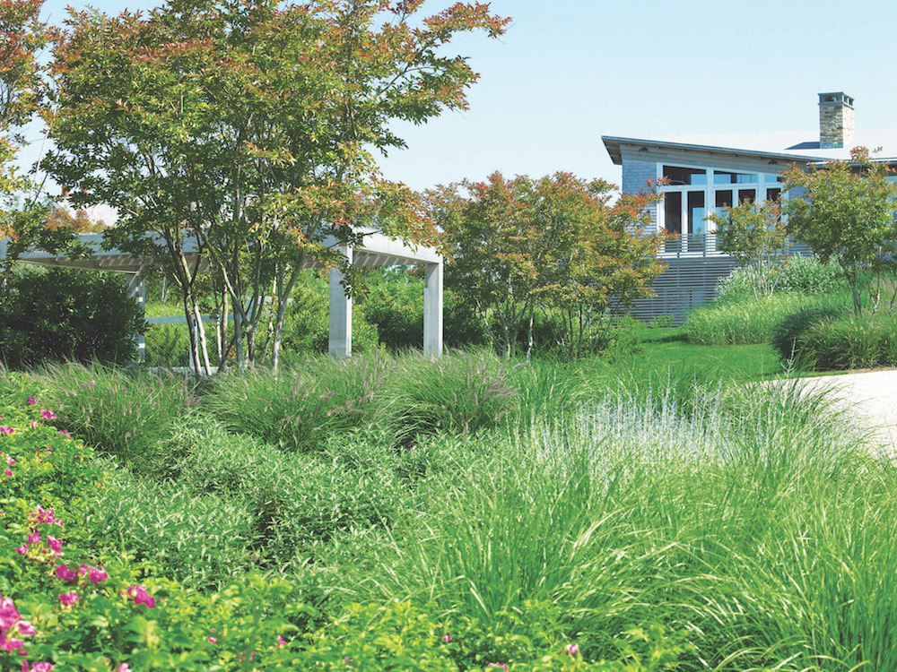

Photo by Charles Mayer
A series of thoughtful design gestures by Hollander – one of Ocean Home’s Top 50 Coastal Landscape Architects of 2017 (see page 70) – took the entire site into consideration, so the house becomes an integral part of the overall design.
“It’s not like there’s landscape and architecture. The entire property is their home,” Hollander says. “You look at all of the property and the components within it: driveway, tennis court, home, pool and dunes. It’s designed from the outside in and the inside out.”
He achieved that by carving spaces out of the existing landscape, rather than imposing a new regime on the ecologically sensitive area.
On the ocean side, he planted native beach grasses – bluestem, bayberry and beach plum. On the bay side, where gray tones dominate, he inserted lavender and blue plants like Vitex (chaste trees) and butterfly bushes.
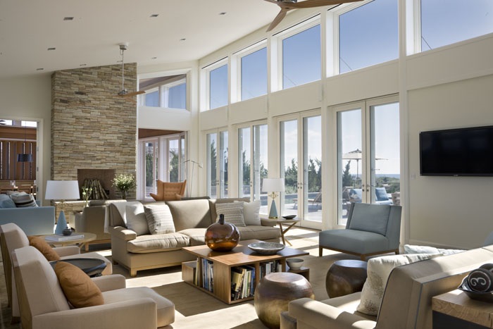

Photo by Durston Saylor, Courtesy of Eve Robinson
“We were looking for a landscape that felt appropriate within the setting that was there,” Hollander says. “There’s a natural beauty on the ocean side, and the bay side has a marshy feel to it.”
Hollander views his profession’s commitment to every landscape as akin to the Hippocratic Oath: First, do no harm. He seeks to work with the natural ecology of a site, the human ecology of his client and the architectural ecology of the building.
“Each one informs what we do,” he says. “We work with contemporary architects like Steve Holl, and traditional architects like Bob Stern, but those three ecologies inspire all our designs.”
Here, Hollander had to consider a salty maritime landscape with its abundance of deer (thus the butterfly bushes, which deer will not touch), as well as a client with an extended group of family and friends.
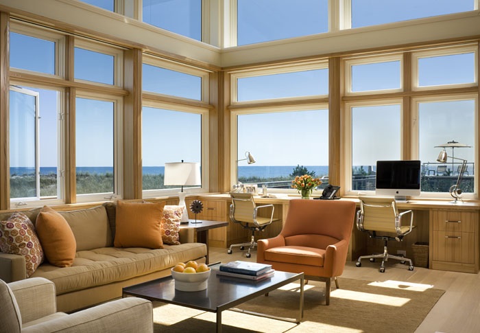

Photo by Durston Saylor, Courtesy of Eve Robinson
As for the home’s architecture, it needed to be contemporary in look and feel. And though its series of linked pavilions are clad in cedar, they bear no resemblance to the region’s traditional Shingle-style vernacular.
“The client wanted to achieve a coherence that a lot of modern houses don’t have – and without the tradition, things are a bit haphazard – so it’s not a traditional house, but it is concerned about that coherence,” Cope says.
“At the end of the day, we made a point of planning all these competing elements and gave him an absolute sense of coherence and repose.”
Inside, interior designer Eve Robinson took her inspiration from colors outside. Her palette includes sandy tones from the beach, blues from the sky and water and orange echoes from the sun.
“I wanted to create a comfortable, interesting, special retreat for the family,” she says. “It’s light and airy, and you can see the sky.”
A screened porch off the living room offers a cool gathering space on hot days and warmth from a fireplace on chilly ones; another fireplace graces the living room, an extremely large space that’s designed with two seating areas. “It works for small family gatherings and large parties,” she says.
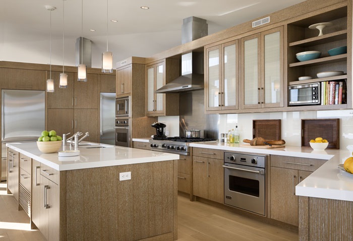

Photo by Durston Saylor, Courtesy of Eve Robinson
“And there’s an easy flow between the living room and the dining room, with an open flow to the kitchen, so no one is ever cut off from being part of the conversation,” Robinson adds.
That sensitivity to human interaction is extended outside, beyond the site’s boundaries. When Hollander and Cope were deciding where to position the house, they looked to the neighbor’s views too and carefully chose not to obscure them.
It was a gesture that paid off in spades. “At the review board hearing, the only people attending were the neighbors from the left and right,” Cope says. “They were the only ones who spoke, and they spoke in favor.”
Surely, that’s a testament to the value of site-specific design, created by outstanding designers.
THE DETAILS
For more information, visit hollanderdesign.com, olivercope.com and everobinson.net.
Image Credits: Photo by Charles Mayer.
