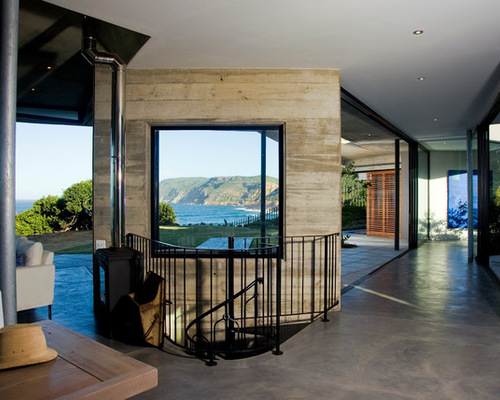
Crashing waves, a rocky slope, rolling sand dunes, a milkwood forest and jagged mountains form the landscape of Plettenberg Bay, South Africa. Rather than choose just one or a few of these elements as design inspiration for his client’s house, architect Paul Oosthuizen embraced them all, creating a home that’s both curved and sharp, hidden and exposed.
Capturing ocean views to the east and blocking the sea winds while bringing in northern light were tricky issues that also dictated the layout. But perhaps the architect’s most interesting inspiration was not visual at all, unless you’re Oosthuizen. He says that when he closes his eyes and listens to music, he interprets the sounds in his mind and actually sees volume, shape and texture.
His client, a chef and psychologist, took this seriously. She compiled a CD for Oosthuizen with a variety of music for different occasions and weather conditions; it ranged from classical music to Bob Marley and everything in between. He listened to this repeatedly before ever putting pen to paper. After the client moved in, he invited musicians into the space to use the structure to influence their playing; even the structure itself was used as a percussion instrument. Check out the video after the tour.
Browse Thousands of Green Roofs for Inspiration Here
Houzz at a Glance
Who lives here: This is a vacation home for a chef and psychologist whose parents live here full time.
Location: Plettenberg Bay, South Africa, about five hours east of Cape Town
Size: 500 square meters (about 5,300 square feet); 5 bedrooms, 5 bathrooms
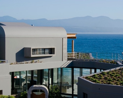

South Africa 1: Paul Oosthuzien Architects, original photo on Houzz
Originally a holiday and vacation home, the house is now used full time by the client’s parents.
Basically, a sand dune was removed to create a site for the home. Oosthuizen used the sand and plants from the dune to create parts of the roof. The vertical elements of the house structure are brickwork that’s been plastered over. The curves are formed concrete placed onsite.
The curved forms mimic the rolling dunes and waves, while the pointy forms were inspired by the crashing of the waves. “There’s some brutality involved where sea and land meet. Some of that is captured in those pointy aspects,” Oosthuizen says.
He worked with well-known South African landscape designer Patrick Watson to plant hundreds of trees and plants endemic to the area.
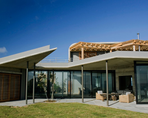

South Africa 2: Paul Oosthuzien Architects, original photo on Houzz
Weather and sunshine also dictated the design. In South Africa, and the Southern Hemisphere in general, architects look to capture northern light. But because the ocean views were to the east, Oosthuizen had to twist the house to open it up to the sea. He then added multiple skylights to help bring northern light into the bedrooms.
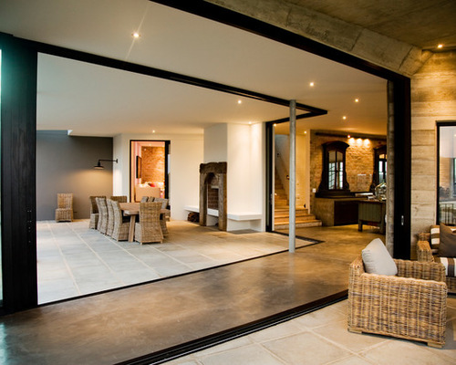
Wind is also a factor. He designed the house around a central courtyard that can be closed off on particularly windy days. Massive glass panels slide to create a seamless indoor-outdoor design perfect for the moderate climate.
A shutter screen on the left surrounds the main bedroom and slides to open the space. “It’s pretty much like sleeping on the dune,” he says.


South Africa 3: Paul Oosthuzien Architects, original photo on Houzz
This view is from the kitchen looking down the glass-lined hallway that opens the house to the outdoors. A lounge is to the left, and a picture frame concrete wall shows board-formed concrete markings, a common element in the house. The staircase is a salvaged Victorian piece the client brought in. It leads to an underground bedroom that pops out on the side of the dune.

South Africa 4: Paul Oosthuzien Architects, original photo on Houzz
A courtyard with a fireplace greets guests as they enter the house. The arched mirrors in the kitchen beyond are cast iron from 17th-century France, repurposed here as cabinets against the raw brick wall.

South Africa 5: Paul Oosthuzien Architects, original photo on Houzz
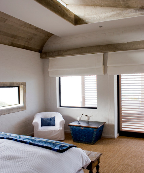
More board-formed concrete on the bedroom ceiling has wood-grain imprints. The brickwork was painted white to preserve the texture. Oosthuizen plastered and painted part of the ceiling white to create a “measure of control and show that the raw concrete was intentional,” he says. “The method softens the feel of the house. You get the texture, but it’s also refined.”
A skylight brightens the room and adds volume to create a better sense of space. The carpet is sisal.

South Africa 6: Paul Oosthuzien Architects, original photo on Houzz
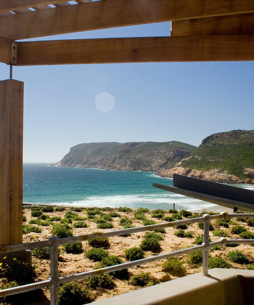
All the sand and plants on the roof were taken from the dune and don’t require any watering. Oosthuizen says many guests who’ve walked onto this balcony have gotten confused about which floor they were on, thinking they were walking onto a dune.
Take in the View From These Outdoor Rocking Chairs
