Interior Designer Christopher Grubb first visited the master bath of this 1959 home in the Hollywood Hills, it was very compartmentalized with an extremely dated design. Severely lacking in fluidity, not to mention style and function, the bath was in dire need of a modern makeover. By removing walls, opening up the space, and creating a connection to the outdoors, Grubb and his team transformed it from a dark and dreary space into a clean, sophisticated, and timeless master bath for two.
Individual closets originally flanked the bathroom entrance. Inside, there was a single vanity and adjacent, a room with a tub/shower combination and a toilet. The owners had a laundry list of elements they desired in the new space, including his-and-hers vanities, a whirlpool tub, a shower with a bench, and a water closet. For Grubb, the project’s biggest challenge was to fit all of these items into the 131 sq. ft. space in a way that was not only symmetrical and stylish but also, above all else, functional.

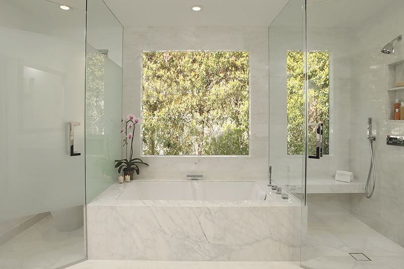
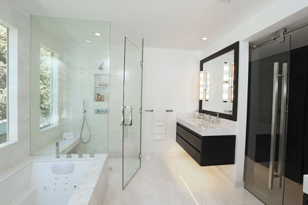
“First, we removed all of the interior walls to create an open floor plan. Next, we added windows to flood the room with natural light and visually incorporate the green space outside. Now, when entering the bath, the eye is drawn to the whirlpool tub centered between the water closet and a sleek, modern shower,” Grubb explains. To further unify the space, the marble tub deck flows seamlessly into the shower, serving as the bench. A dramatic deck mounted tub filler makes a great focal point and a zero threshold shower, inclusive of a concealed shower drain, creates an even more expansive feel to the room.
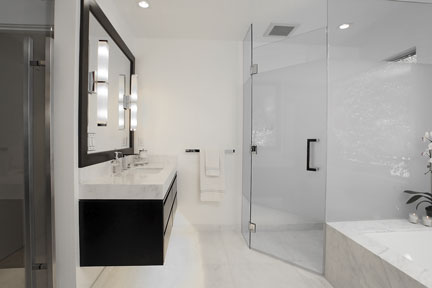
Another key visual element in the bath is the wall-mounted his-and-hers vanities. Topped with oversized quartz countertops, they’re constructed from alder wood with a warm espresso finish. The vanities feature drawers within drawers instead of traditional cabinets. Grubb notes that drawers offer superior organization for small toiletries kept in the bath. Architectural sconces add vertical height to the room, plus aid with make-up application and shaving, while under-cabinet lighting adds drama and serves as a nightlight.

“The homeowners were drawn to a crisp, elegant white look, but not necessarily pure white. So, to fulfill their vision while keeping the space warm and inviting, we used Calacatta marble as the primary surfacing material,” notes Grubb. “It marries the desired white concept with the visual interest of veining in the stone. Plus, it provides beautiful contrast to the espresso vanities.”
Other unique elements of the project include a glass entry door installed on exposed barn door hardware and exterior motorized shades for privacy. The final result is a sophisticated and modern design that exceeded the owners’ expectations. The project recently won “gold” level awards from Qualified Remodeler and Professional Remodeler as well as a Chrysalis Award.
