A new Miami Beach condo is the product of a rich pool of continental talent.
A Seattle-based architect, a Washington State woodworker, their bi-coastal clients, and two interior design firms—one on each coast—mingled their skills to create this stunner of a home.
At 6,000 square feet, it’s now occupied by the clients—a couple and their four children. It was two-and-a-half years in the making, and designed to take advantage of sweeping views of the Atlantic. And its architecture and interiors were deliberately muted in service to those views.
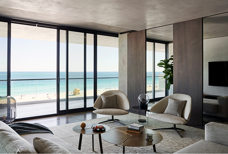

“The palette is very minimal and natural,” says architect Eric Walter, co-founder and principal at Seattle’s mwworks. “We wanted to get away from the scene of Miami Beach.”
Walter and co-founder Steve Mongillo started their firm back in 2007, fresh out of Bohlin Cywinski Jackson’s Seattle office. There are nine at the firm now, focusing mostly on residential work—with a fastidious belief in getting finishes precisely right. “The stuff we love is highly crafted, in details and the material palette,” he says.
Their clients were based in Seattle and first hired the architects to design a home for them there—then suddenly shifted gears and decided to build on the sixth floor of a Florida condo building instead. Still, they sought a Seattle sensibility inside. “They wanted quality finishes and quality construction, and it was very important that it was very detail-oriented,” says Drew Giblin, principal at Seattle-based Dowbuilt.
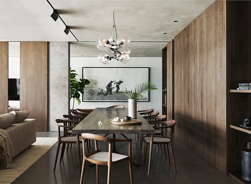

Giblin was brought in at first for construction management, but later for his fabrication expertise. “We have a wood shop in our office and we ended up producing a large amount of the materials for the project, particularly the wood components,” he says.
He’s not talking about any ordinary wood. The interiors of this condo are clad in an African black limba, known for its dark figuring and use in making musical instruments. Giblin estimates that his firm used between 10,000 to 12,000 square feet of it for flooring, cabinetry, wall and ceiling panels, and furniture. “We had a container of it and pulled out all the grained wood,” Walter says.
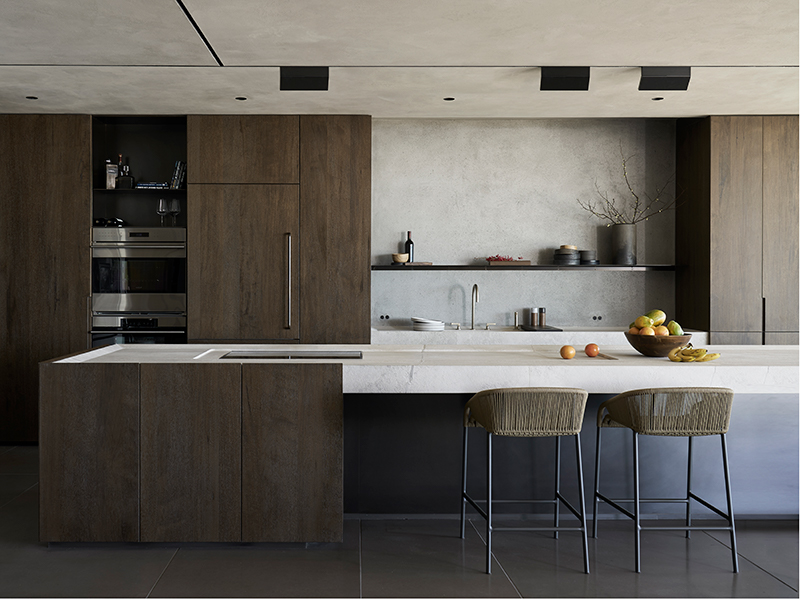

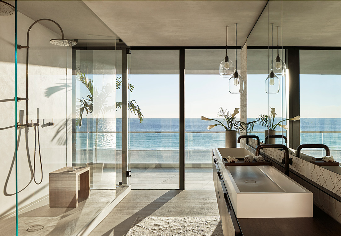
The home is actually two separate apartments combined into one when a wall between them was demolished. An elevator core lies at its center, so creating bedroom corridors between spaces was one of the first challenges. “Then there are the views—we had to mask the bad ones so the eye wanders away,” says Matt Anthony, principal in Miami-based M. Anthony Designs. “Overall, it was a clean palette so the eye goes to the outside.”
Anthony spent time and energy tracking the sun, assuring that what happened outside also happened inside. “Mockups were done for the sunlight, especially for the master suite,” he says.
While Anthony’s role was working with the architect on layout, materials, furnishings (one bedroom table is shaped like a sea urchin), and flow of spaces, Seattle-based architect and interior designer Suzanne Stefan honed in on finishes, art, rugs, and accessories. “Then there were the linens, curtains, accent blankets, and pillows,” she says. “It was easy because at one point I was part of the architecture team.”
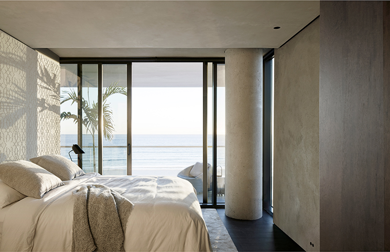

The material palette Walter chose is minimal and natural. There’s the lightly colored plaster that mimics the color of the beach—including the master bath’s bas relief in an Islamic pattern—executed by a Seattle artisan flown into Miami. There are the large-format concrete tiles—raw and natural—for the floors, and the stone slabs carved in Italy for shower pans, sinks, and the oversized kitchen island.
Stefan’s color palette matches the architect’s chosen materials, though she looked to the environment as well. “My biggest inspiration was capturing the mood of the sea and the sky, but what’s within those elements too—like the golden sea grasses and the native flora,” she says. “The banyan trees and mangroves look like they’re lightweight and woven into the landscape, so all the textiles need to have this feeling of lightness so that things could breathe.”
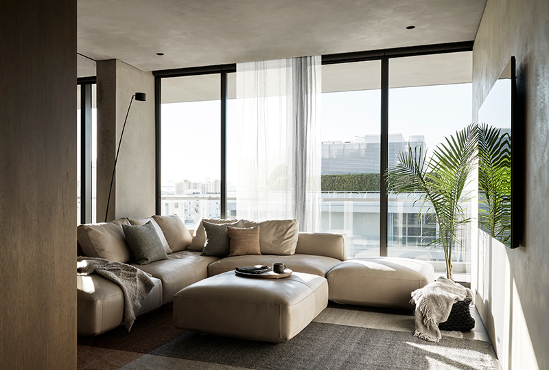

One striking result of the removal of that wall between the two apartments was the creation of spaces with strong panoramas at each end. “It created horizontality,” she says.
On the back side, there’s openness to the sky and to Miami. On the front side, the interiors and furnishings work quietly to emphasize the ocean. “You walk in and think: ‘Whew—that’s why we’re here!’” she says.
It may sound simple, but it’s actually the result of a highly complex meeting of the minds.
For more information, visit dowbuilt.com, mwworks.com.
