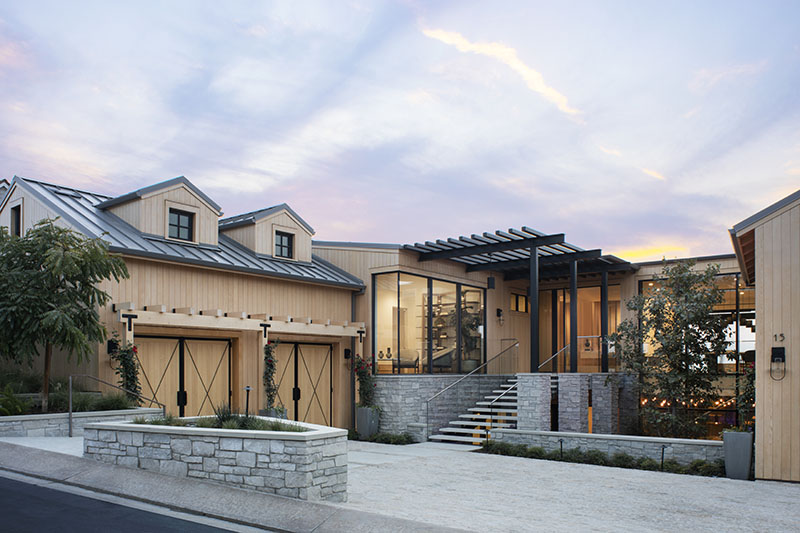
Although located on a cliff above the Pacific Ocean, in Southern California—at The Strand at Dana Point, to be exact—this split level would feel right at home nearly 500 miles north in California Wine Country. “The project was inspired by the Napa region,” architect Chris Brandon of Brandon Architects says. “I characterize it as modern rustic design.” The hallmarks of the style featured in the architecture include natural materials, from vertical cedar siding to a textural stone veneer, as well as numerous contemporary accents, such as the blackened steel pergola and open stairs with minimalist glass stair rails.
Summer Jensen pulled the Napa vineyards theme though the interiors too. “We used an austere palette of natural materials with longevity,” the Hawk & Co design principal says. To Jensen, who cites Italian architect Carlo Scarpa as a major influence, that meant staying true to the natural character of each material. “Scarpa honored materiality,” Jensen says. “You don’t make a material look like something it’s not by altering it; you let them be what they are to keep the character intact.”

The designer typically starts with wall veneers, even examining individual logs. In this home, with its high ceilings and vast living spaces, Jensen uses a lot of wood, namely rift sawn white oak, to infuse warmth. It also echoes the look and feel of the cedar siding on the exterior façade. She pairs the light wood with Venetian plaster. “Lime cleans the air and makes spaces feel cooler, which is necessary by the coast,” she says.
A floor-to-ceiling, blackened steel pivot door opens onto the large-format, gray limestone floor tiles that define the foyer, where smooth, white oak wall panels turn the corner. The ceiling pops in the seating area, where staggered board and batten oak walls flank a three-sided linear fireplace with a concrete hearth and surround.

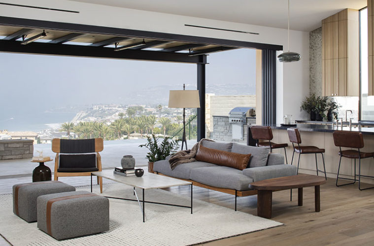
The focal point, however, is the expansive view looking north to Laguna Beach. Glass pocket doors open the entire back wall to the terrace and craggy, ocean landscape beyond, providing a seamless connection between indoors and out. “Because the terrace isn’t particularly large, it was important that it really feel like an extension of the inside,” Jensen says.
At the room’s peak, an exposed, structural steel beam runs from the fireplace wall to the kitchen opposite. “If there’s a beam, we want it to look like a beam,” Jensen says. “It’s also part of the Napa aesthetic, not being afraid to show the industrial nature of a space.” The beam terminates at staggered board and batten oak front cabinets. On this side of the room, the board-and-batten cabinets flank tall, skinny windows that stretch from the countertops to the cathedral ceiling. “It was an opportunity to design within the architecture,” Jensen says.
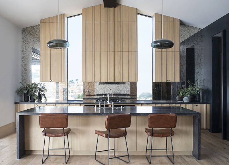

The wall behind the cabinetry is lined in antiqued mirror. The material nearly melds with the windows, seeming to extend the room past the home’s physical structure. Jensen picks up the smoky tones with the pitted black limestone countertops and the hand-burnished, black plaster walls with metallic wax that wrap to anchor the dining area. “I want the artist’s expression as part of the home; the hand complements the space,” Jensen says. The blackened steel pendant light over the dining table by John Beck Steel accentuates the sensibility. “I love the gradient feel and articulation of the metal,” Jensen says of the custom fixture. “It looks like cold rolled steel; it’s sexy and cool.”
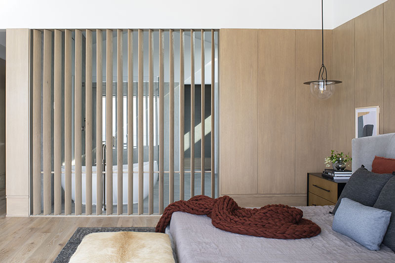
On the other side of the foyer, white oak paneled walls lead to plastered walls with oversized white oak baseboards in the bedroom wing. Jensen brings down the scale of the primary bedroom, which has a vaulted ceiling and a glass corner that opens fully to the outdoors, by using oak wall panels that are just nine feet high. “Not going to the top of the room makes it feel more personal,” she says. “If you take the wood to the ceiling in a 14-and-a-half-foot tall space, you lose intimacy.”

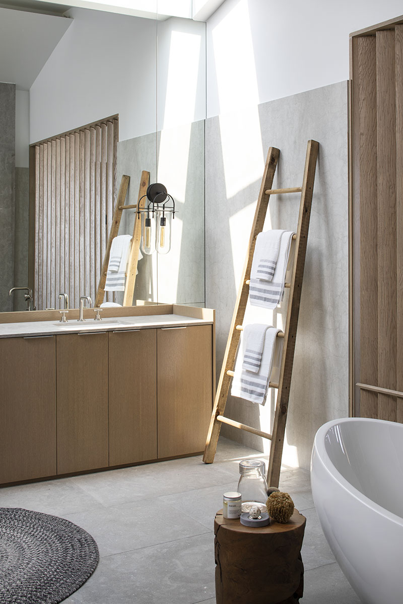
Jensen also applies this principle in the spacious en suite bath. Here, ceramic slabs that resemble concrete to conjure that Napa Valley vibe climb just nine feet up the wall despite the sky-high ceiling. The mirror behind the furniture-like vanities, however, extends much higher, offering an infinity effect that delights the designer. “I love playing with reflection,” she says.
In the same vein, Jensen plays with the idea of translucency between the bedroom and bath. A nine -foot-wide-by-eight-foot-high louvered opening allows the soaking tub to capture the ocean view. The white oak fins pivot for privacy too. “Creating that connection to nature is critical; the views are the reason people buy these properties,” she says. “Plus, I’m a total bath person, so the opportunity to see the ocean from the tub is my all-time dream.”
Learn more about the project team
Architecture: Brandon Architects
Interior Architecture & Design: Hawk & Co
Builder: Genova Construction | Development
Cabinetry: Thoemmes Cabinet Makers
