The Surf Club is an icon of the Miami social scene. Upon opening its doors on New Year’s Eve in 1930, it was the place to be—and to be seen—for legends and luminaries alike. It was a glamorous refuge, with both a ballroom and a beach, for those seeking “proper impropriety,” as the club itself describes.
A recent Four Seasons-led redevelopment revived the clubhouse back to its Spanish Colonial glory. Now a glistening Richard Meier-designed hotel and residence tower rises from the property, contrasting the Mediterranean-style club with contemporary lines. “The club is all stucco, terra cotta tiles, and ornamental metalwork. The tower is quintessential Meier architecture—it’s a sleek composition of metal and glass,” explains interior designer Phillip Thomas, who was introduced to the property by long-term clients.
As one of the first to buy into the building, his clients were uniquely positioned to mold the interior to their liking. Taking full advantage, Thomas dug in and reoriented the entire layout, even taking down walls, to better embrace the views.

After turning a New York City apartment into a chic interlude of taupe and silver, both clients and designer were ready for a new direction on their third collaboration. The Miami residence, which floats alongside panoramic ocean views like a ship at sea, called for something clean and crisp. One of Thomas’s most ingrained design tenants is that a home should always reflect its owners’ personalities. In his own words, “These clients are very social and love a festive environment; they’re effervescent.”
Besides protecting sightlines out to the Atlantic—which changes color every two minutes depending on the clouds—Thomas’s charge was to create a sophisticated, well-crafted backdrop for the couple’s contemporary artwork. The resulting ethereal interior glows with light colors and reflective materials. “I call it 50 shades of white,” he says.
Eschewing the developer’s travertine floors, he opted instead for custom opaque resin floors, creating a perfectly smooth blank canvas of white. (For the entry hall and bathrooms, broken mirror shards were mixed in for an extra fun “disco on the water” effect.) The furnishings are carefully curated and contemporary, some deceptively simple and others purposefully striking.


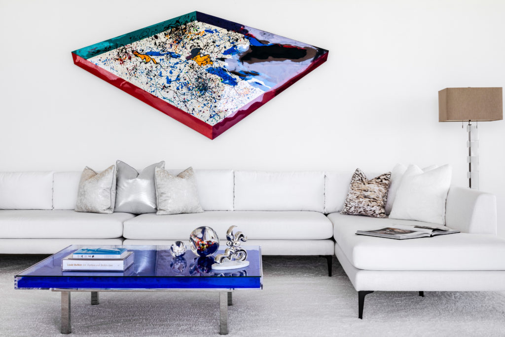
“Some are art pieces themselves,” states Thomas, who commissioned the family room’s Yves Klein coffee table, assembled onsite like performance art. Craftspeople mixed dry pigment with clear synthetic resin to achieve “Yves Klein Blue,” the artist’s patented process and signature color. This mixture then solidified inside a Lucite box and was topped with glass.
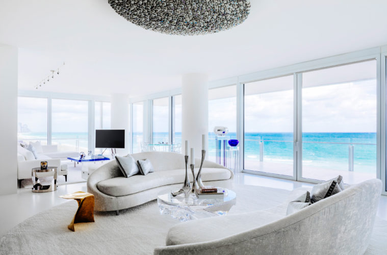
For Thomas, the interior’s greatest challenge was balancing openness and intimacy: “I had to create moments that felt intimate, otherwise the apartment would end up feeling cold and disjointed.” A circular seating area nestled up close to the view is just one of these moments. Like a rotary circle, it winds to another seating on the left and the kitchen on the right.

Its central cocktail table—a remarkable Lucite piece by Patrik Fredrikson and Ian Stallard—changes with the light. Surrounding it are two Best & Lloyd settees (inspired by 1960s Italian versions) upholstered in a cream fabric with metallic threads. The fabric’s sheen, the Lucite table, and the mirror-polished stainless steel candleholders by Georg Jensen all reflect light in different ways. Overhead, a 60-inch Best & Lloyd chandelier bubbles with iridescent bulbs.
Custom Italian cabinets deliver a functional but quiet kitchen. “It was important that this room be very simple since it’s open to the other spaces,” says Thomas.
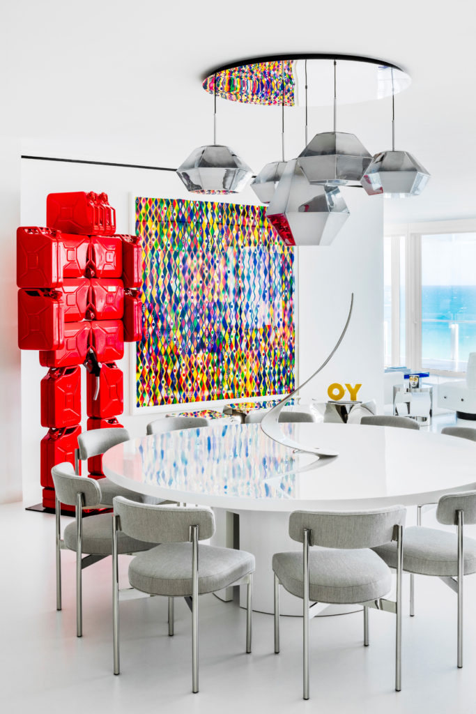
Set back from the view, closer to the entry is the glamorous dining room, where Jerry lingers off to the side. This nearly nine-foot-tall sculpture by Nys Hervé is comprised of 18 jerry cans. “Once the apartment door opens, all people want to do is experience him. He creates quite the social media moment,” says Thomas. Just past Jerry, a painting by Polly Apfelbaum, who employs hand-dyed fabrics in high-octane colors, is striking in its own right.

The pedestal dining table, which seats 16, has a shiny lacquered top that reflects the ocean. Meanwhile, five geometric lights hang from a mirrored ceiling in a custom arrangement. “I wanted guests to look up and feel like they’re looking through the ceiling, that the ceiling has depth,” Thomas explains. “The lights have a little disco feel and donate energy and dynamism.”
Another entertaining zone is the sexy lounge area, where polished steel cocktail tables cozy up to a long white sofa. “It’s a very glamorous, monumental sofa,” says Thomas, who conceived of the wall-mounted light fixture above as as a modern interpretation of flames (a fireplace was once considered but nixed). The cool metal contrasts the warm light.
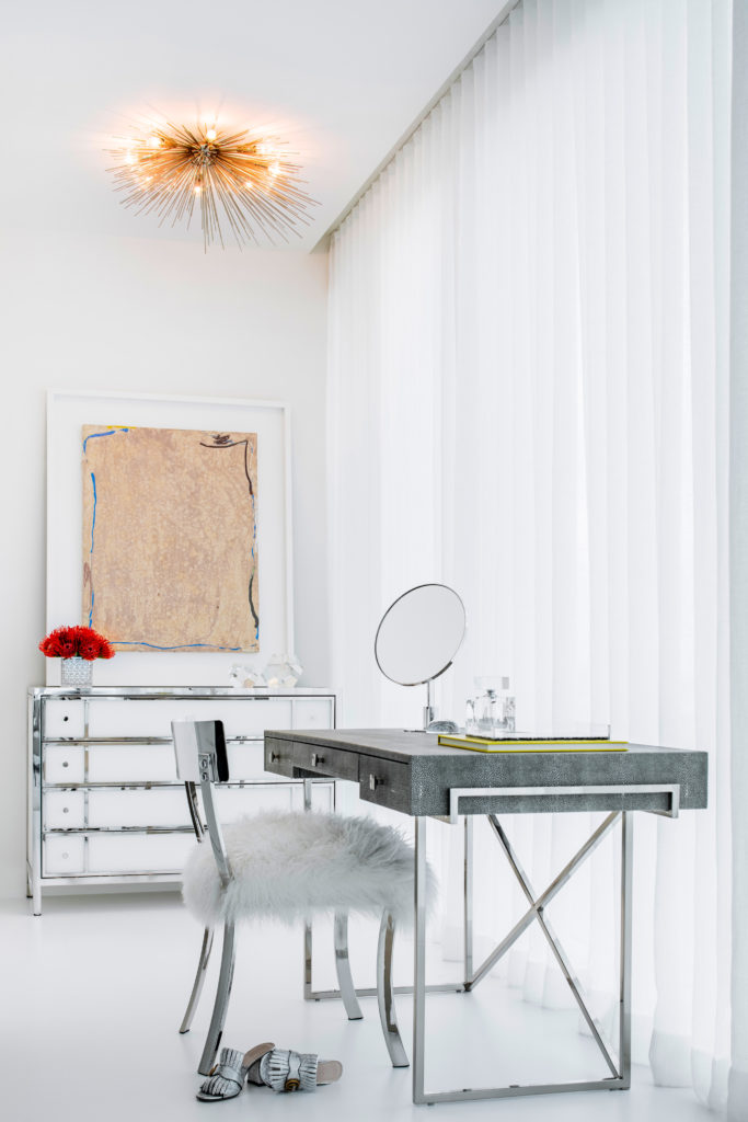
The interior’s dynamism calms down many degrees in the master suite, where gauze sheers filter the sunlight and a luxurious shag carpet warms the resin floor. Behind the faux leather and polished steel headboard is a mirrored wall—“It’s like a jewelry box,” says Thomas of the atmosphere. A chair upholstered in Mongolian lamb fur draws the eye in the dressing room, as does a resin-paneled painting by Jules Olitski over a mirrored dresser.
With furnishings demanding as much attention as the fine art, this interior is no less than a living museum. It’s creative and suggestive. Sculpted and painterly. Thoughtful and thought provoking. It’s a piece of art itself.
