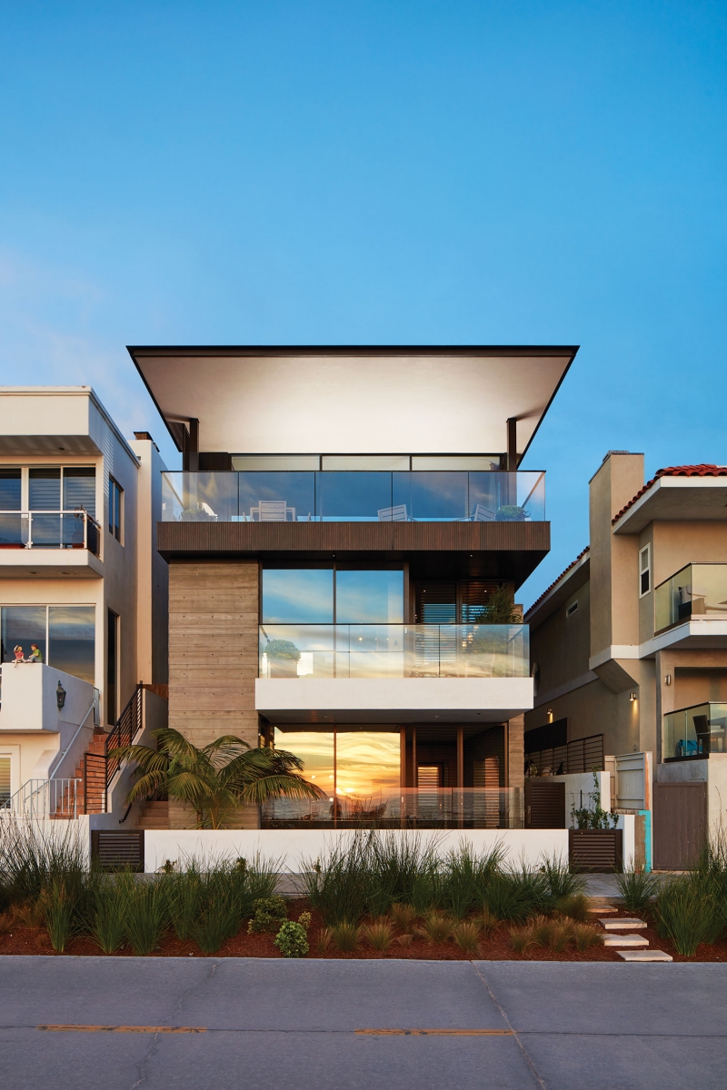
At a slim 33 feet wide by 105 feet long, the site in the Sand Section of Manhattan Beach in Southern California posed a dilemma: how could someone possibly build an 8,000-square-foot home there for an active family of five, including three teenagers?
There was a challenge, too, where the site faced the ocean. Nudging right up to it is The Strand, a busy public sidewalk and bike trail where thousands of joggers, walkers, and bikers pass by on a daily basis. Beyond this—across 200 feet of clean, white sand—beckons one of the most sought-after views of the Pacific Ocean.

What’s a team of architects, interior designers, and landscape architects to do?
If you’re Los Angeles-based KAA Design Group, you go vertical, designing a home on four levels—each coming in at about 2,000 square feet—three of them above grade and one below. And you mix up the exterior materials, using dark-stained cedar, bright white plaster, and board-formed concrete in a light gray, for visual punctuation.
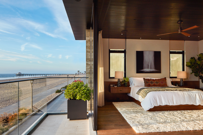
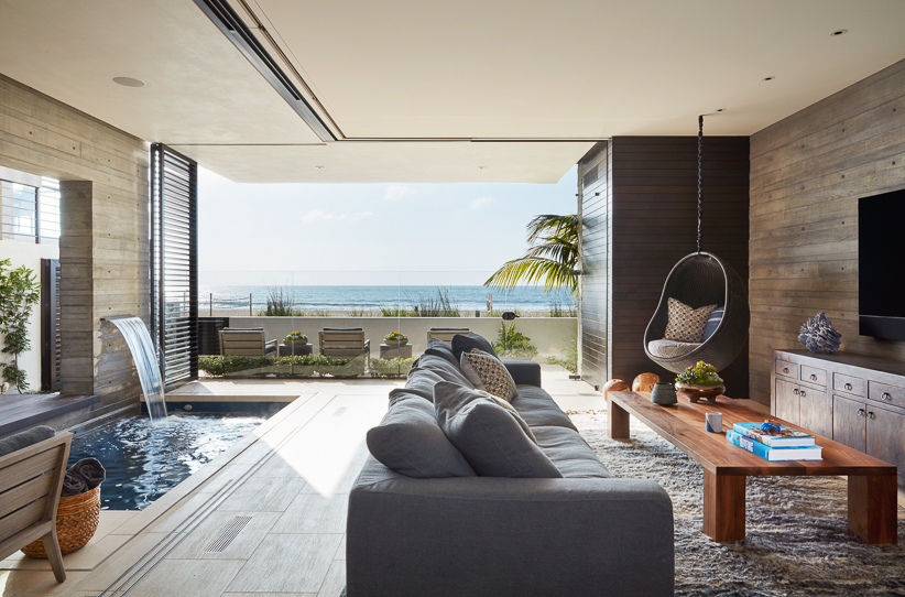
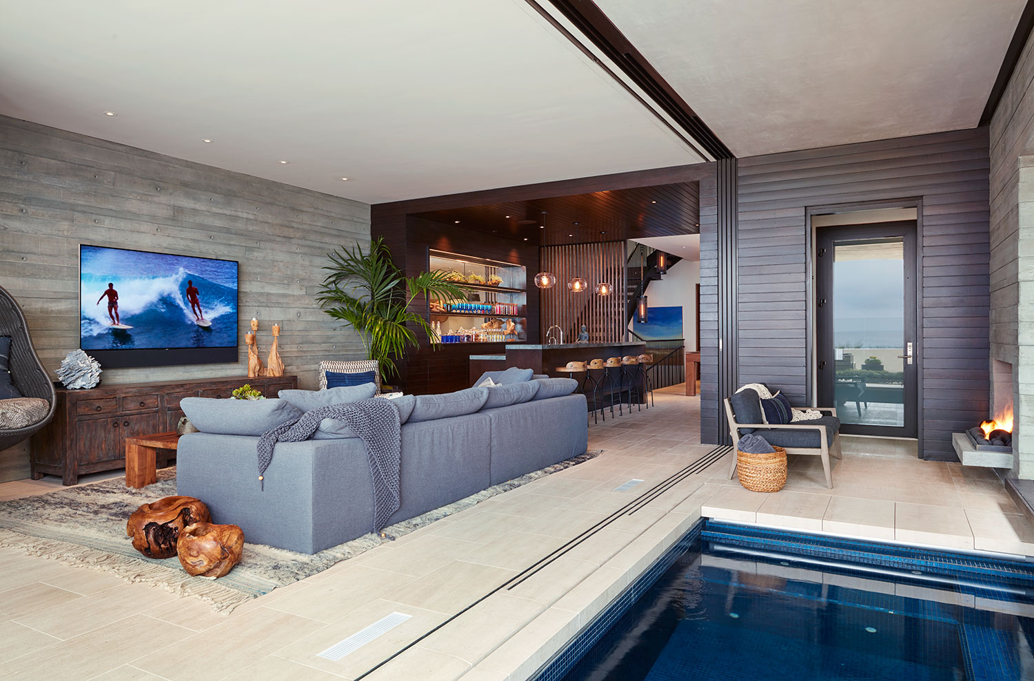
You float the primary, ocean-facing living and dining area atop all the rest, ensuring that it’s full of sunlight during the day and glows like a lantern at night. You place the master suite and main entry on the next level down. At ground level, you create a beachfront room, with pool, sauna, and windows with moveable louvers for privacy from passersby on The Strand. Tuck three bedrooms behind that and you’ve almost got a teenager’s paradise. Add a home theater and gym to the basement level, et voilà: you’ve actually done it.

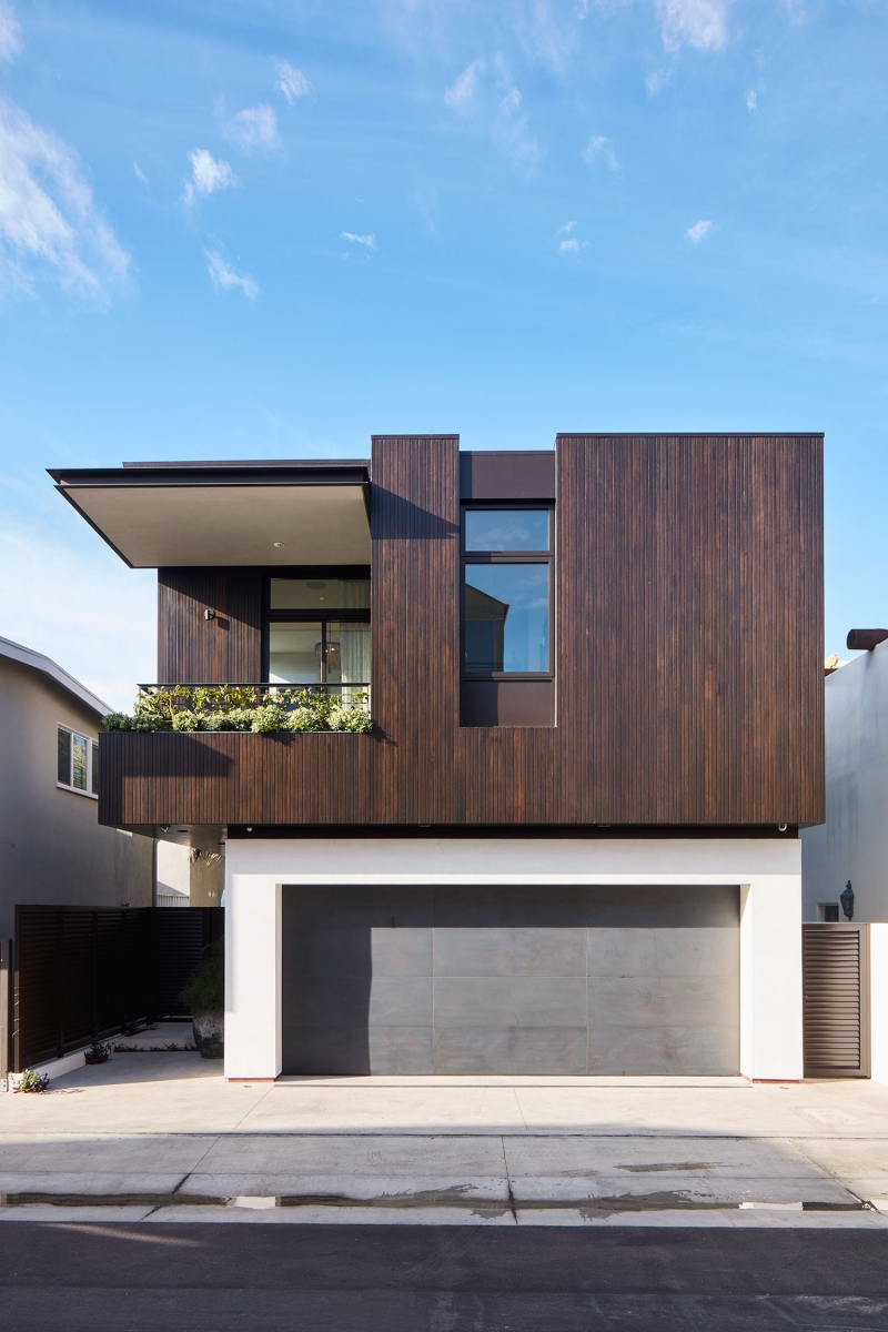

“They’re a family with kids bringing their friends over, a big, well-connected family,” says Patti Baker, KAA Design principal. “They were moving to the beach to be closer to the ocean, and wanted a family home that was not pretentious, a beautiful beach house where kids can run around.”
Baker cites architectural influences such as groundbreaking California modernists Rudolph Schindler and Richard Neutra, and a trained eye will confirm that. But the firm’s founding partner, Grant Kirkpatrick, says the clients themselves originated the design. “We spent a lot of time with them, so they could tell us their lifestyle story,” he says. “It’s not architecture—it’s a process, like making a movie or finding the script.”
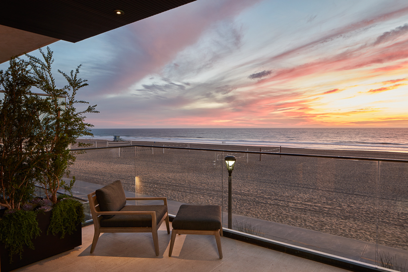

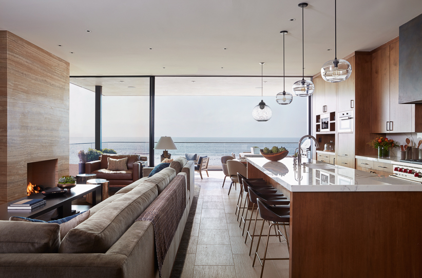
The family’s primary set today is the black-stained, cedar-clad main living space, cantilevered over the rest of the house, where their collective energy is focused on meals and entertainment. It’s the home’s one “rockstar moment,” the clients say.
“It’s almost a ship-like level above all the others,” says Kirkpatrick. “It allowed us to create the best views, break the massing up, and play with natural and manmade lighting.”
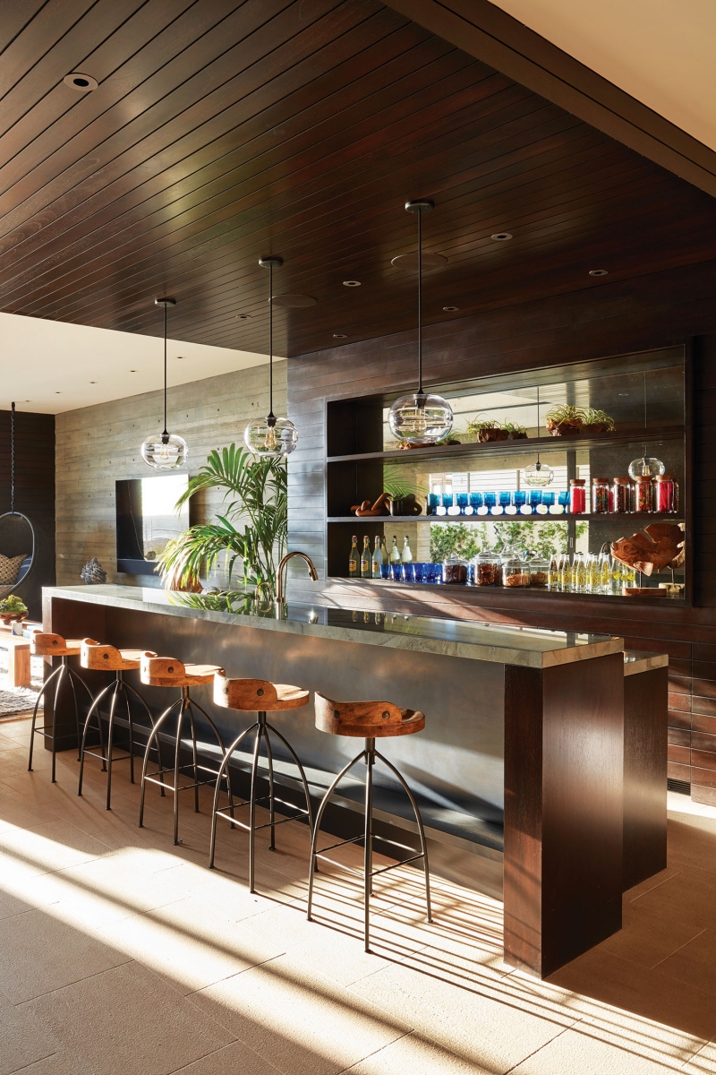

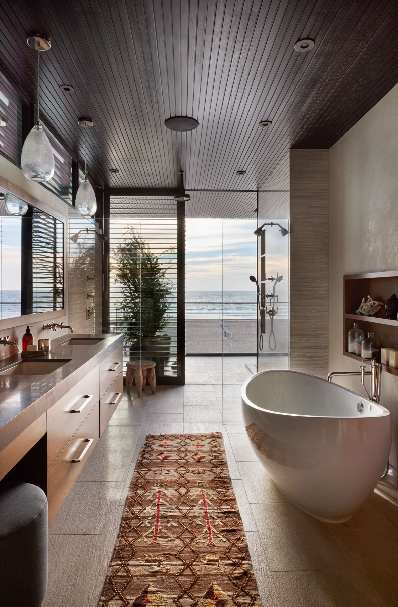

Interior designer Alana Homesley developed all of the kitchen, living room, and dining area cabinetry, making it floor to ceiling so the room seems as large as possible. “The great room is a cocoon of walnut cabinetry on three sides,” she says. “It directs everybody’s eye to why they bought the property in the first place: the Pacific Ocean.”
Homesley understands the importance of interior alignments and creating spaces with focal points where the eye can rest. Not every space can be a star, she asserts. “I’m looking carefully so that everything is thought out and becomes one seamless space—the architecture, the interiors, and the landscape—so at the end you have a beautiful home where one is not stronger than the other.”
Challenged by the narrowness of the lot and the rooms themselves, she sought to create spaces that appear larger than they are. “I’m always working on scale and proportion to achieve spaciousness,” she says. “I don’t want overflow, and I don’t go overboard on embellishment or decoration.”

Michael McGowan, KAA’s landscape studio director, faced similar challenges, including a side yard that’s five feet wide and a neighbor located just ten feet away. “You have to take the eye to the front door or somewhere else, so it doesn’t go to your neighbor’s property,” he says. “There’s a lot of screening, and moments along the journey that your eye alights onto, to pull you along to your destination.”
The home’s main entry is at dead center. When the door is open, guests move into a garden area with a fountain carved from rock, tall plants that screen views of the neighbors, and natural light trickling down from upper levels. “We achieved a maximum of light by bringing it to the middle of the home,” Baker says. “The plants get a dappling of natural light—there’s a whole different light to the entry area that you might not get on a Strand lot like this.”
Outside, McGowan found his inspiration for the home’s plantings in the work of Florida landscape architect Raymond Jungles. “The primary focus was to create a color palette that’s soft, calming for the owners, and that speaks to the coastal conditions,” he says. “That palette is pale to medium greens, and all the flowers are a soft lavender hue.”

The Manhattan Beach microclimate can be a challenging place to plant because of the wind, salt, sun, and shade from homes clustered together. McGowan mixed grasses and palms together for a tropical feel. “Along the coast, where plants get the most battering, they become less tropical, with more grasses and small-leaf plants,” he says. “In protected areas where they can handle the shade, we used large-leaf tropical plants.”
He aimed for plantings that were actually engaged in their environment, beyond just landscape design. “One of the best things about the ocean is the gentle breezes, so the plants that move with the breeze are beautiful and calming in your realm of vision and experience,” he says.
The design team’s collective efforts realized their clients’ vision for the home, interpreting their story—one of family, indoor/outdoor experiences, natural light, and vistas—in a three-dimensional way. “It’s beachy, modern, and light-filled,” Kirkpatrick says.
Sure, the site was small. But the designers delivered in spades, with architecture that’s clean and crisp, an interior that’s soft and inviting, and a landscape that pleases the eye.
Image Credits: Photographs by Roger Davies.
