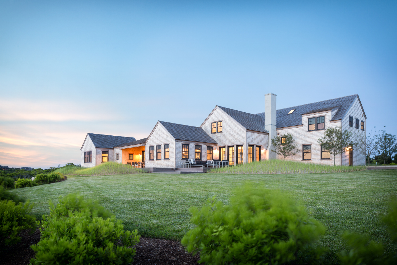
Out on Madaket Beach on the western end of Nantucket, there’s no shortage of design restrictions, to be sure. But in designing a family’s summer retreat there, architect Andrew Kotchen, a partner in New York’s Workshop/APD, responded deftly to them all. And he did it with style and restraint while drawing on the island’s history.
Let’s start with Nantucket’s Historic District Commission (HDC). On the island, every home, every landscape, and every detail of the built environment must be reviewed by this elected board of architects, builders, and preservationists. And they’re picky.
“It’s not a limiting board—it’s just part of the process,” says Kotchen, who’s designed 100 homes on the island. “You have to do your homework to know what you can do in the local context.There’s a mini-regional aesthetic to the island.”
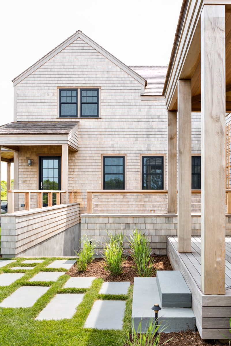
On Nantucket, clapboard cladding is de rigueur, window styles and sizes are prescribed by the commission, and color choices for trim tally up to a grand total of seven. “They want it to be the quaint Nantucket that it’s always been,” says builder Rob Reid, who’s lived on the island for 35 years, working with Kotchen on 30 homes during much of that time.


For the architect, that meant research into the island’s early legacy as a Quaker fishing village. The Quakers lived and worked in a series of stripped-down 18th-century fishing shacks with a look that designers today might call modern. It was a simpler form of architecture—a style that Kotchen and his firm have emulated and evolved over the years.
“I’m not sure everybody embeds all of that into their architecture,” he says. “But only when you take a deeper dive do you see the details, and that’s where the sweet spot is.”
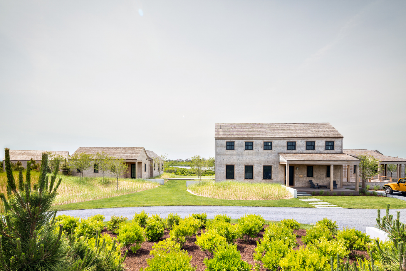
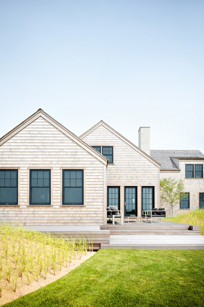
Doing his homework for this project paid off in spades for Kotchen. It was approved at its first and only HDC meeting, which is a rarity. Usually, as many as eight sessions are required before a home is green-lighted for construction. “This one is respectful of its context—it deals with the landscape effectively,” he says. “It’s a one-story home that’s a series of pavilions, with only one two-story portion.When things are smaller and simpler, the board responds well.”


Site Restrictions
Even after it was approved, the architect and his landscape designer had to deal with wetlands boundaries where the 2.6-acre site meets the waters of the Atlantic Ocean. “The hardest part of the project was to work with the limited space available for development,” says Miroslava Ahern of Ahern LLC / Landscape Design Studio. “A large portion of the property is protected wetlands that have to remain undisturbed.”
As Ahern, Reid, and Kotchen worked to adapt the project’s three buildings to the site, they also began to modify the landscape. “Placing the infrastructure on top of a rolling sand dune was a little complex,” Reid says. “That was the most interesting part: integrating it into the landscape and topography.”
Ahern describes the site as an undisturbed, pristine, native landscape with an amazing view of Madaket Beach, and she worked mightily to keep it as beachy as possible. “Bringing the dunes closer to the structures, as if shaped by the wind and the sea, and setting the structures within these organic forms—the goal was to have a seamless transition between the created and the natural,” she says. “The entire intent was to translate the feeling of the Madaket seaside into the design.”
Landscape materials and plantings were kept to a minimum, with bluestone for pavers and exposed concrete for walls. Ahern selected bayberry and beach grass for the sand dunes, using pines and hawthorns for screening. “The simple collaboration of elements helps create an elegant and unique seaside landscape,” she says.
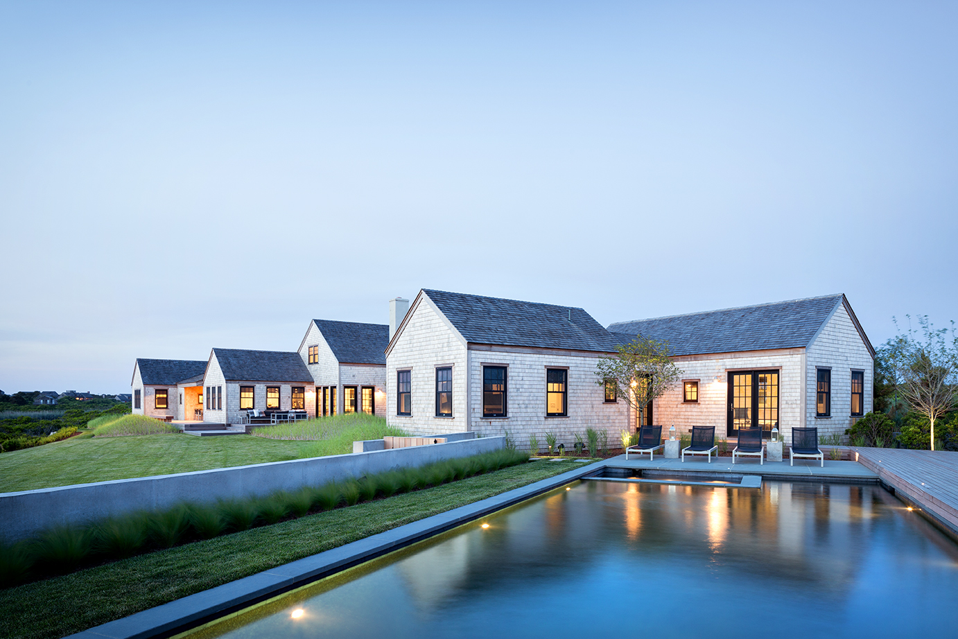

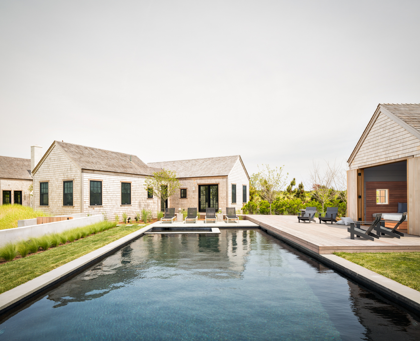
On top of challenges from the HDC, the wetlands, and the landscape, the home’s orientation had to complement future construction next door. “Another, adjacent new home was to be built, so we had to make sure that it wouldn’t be looking into the private pool space or impact the views,” Kotchen says. “We positioned the house, guest house, and garage/cabana so that the neighboring house was never going to be in that plane.”
The site absolutely drove the design, the architect says. There are views to the ocean and to a nearby pond, so every room enjoys water vistas. “That’s a large part of how we oriented the home to the site; the boxes are lined up to maximize the views,” he says. “We’re pretty keen on that for all our projects, but this is an extremely site-specific home.”
The three buildings are clad in white cedar shingles from New Brunswick and a western red cedar roof from British Columbia, Canada. They total 9,500 square feet—with seven bedrooms and eight and a half baths—and are all connected by a wooden boardwalk.
“We were limited in materials, so the question was: How to connect them?” says Kotchen. “The boardwalk is like a dock running through the landscape of dune and beach grass. We sculpted that contextual, beach-like setting.”


A Modern Interior
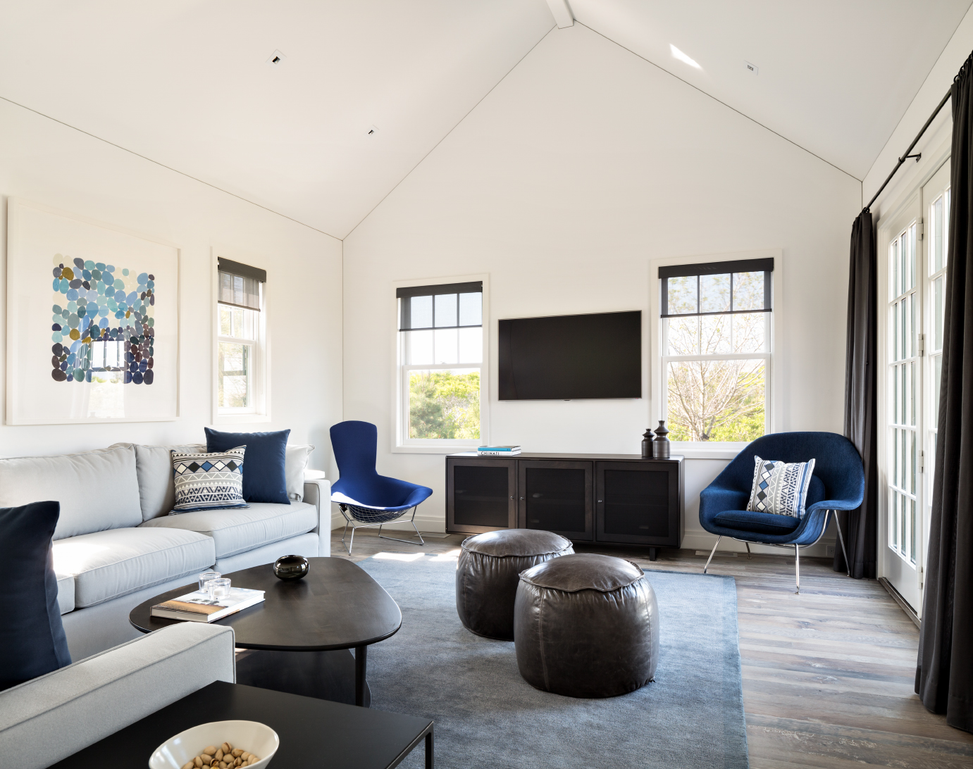
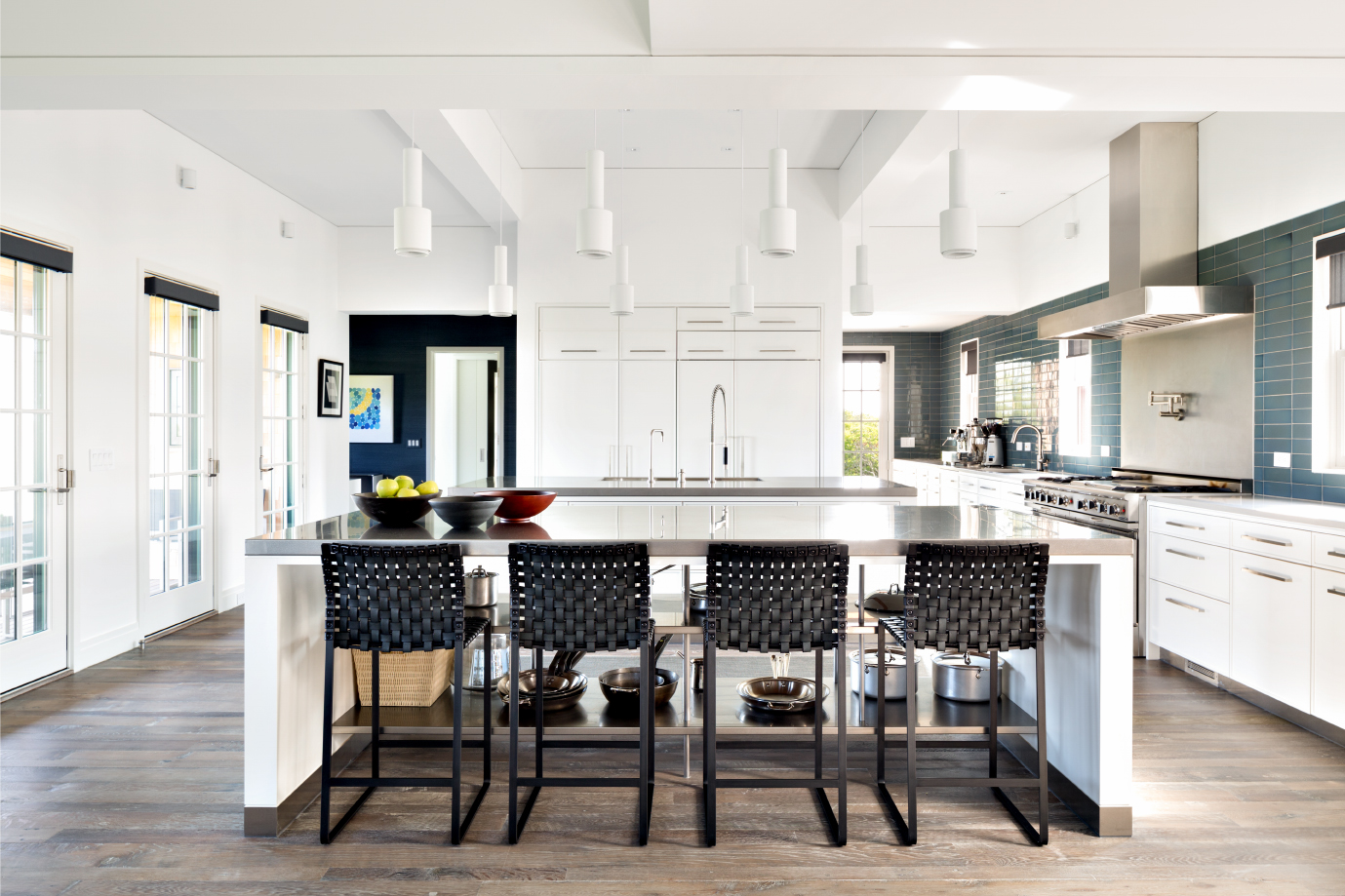
The architect sculpted the interiors of the three pavilions too, unleashing a contemporary aesthetic. “He really embraces the modern look inside, because he’s so limited in what he can do with the exteriors,” Reid says. “There’s a lot of hands-on creativity, rather than boilerplate—it keeps the interest up, from a contractor’s standpoint.”
The floors of sawn-from-beam oak, reclaimed from a barn in Maryland, were laid out to be deliberately less than perfect, with some roll to them. Countertops and floors in the kitchen and baths are a black Italian marble called Pietra Cardosa.
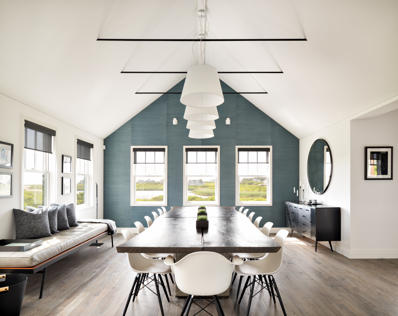

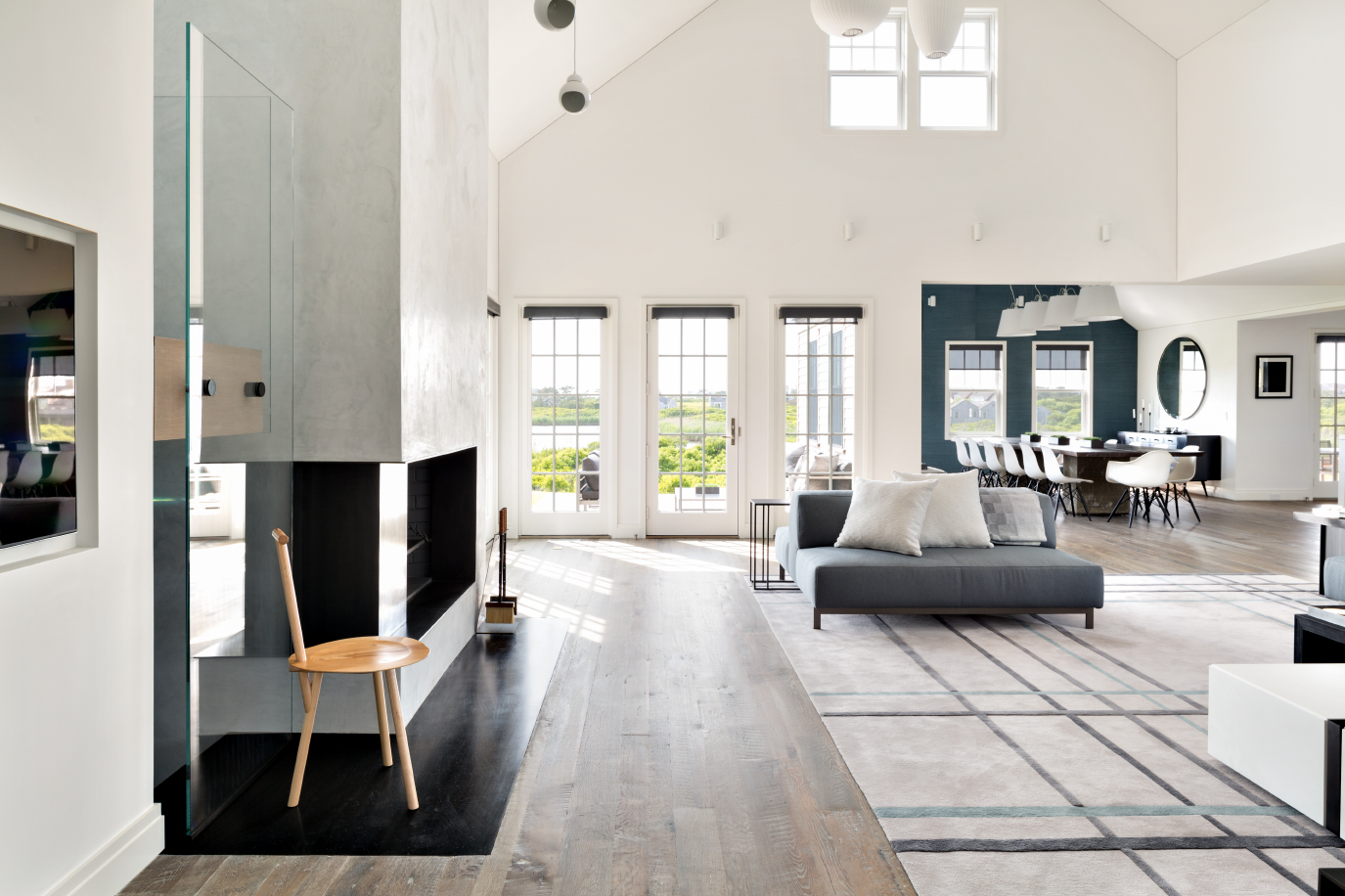

“The ambiance and modern flair look really simple, but are actually very complex,” the contractor says. “That makes it stand out for me.”
From a color palette standpoint, the flooring is the dominant feature, with its gray wash standing out against white plaster walls. Living spaces feature one color accent—a teal for wallpaper, tile, and fabric—while custom-designed rugs and tables harmonize perfectly with one another. Each bedroom has its own color accent and is numbered.
“Restrained is absolutely the right word that we strive for,” says Kotchen. “Clients don’t always buy into that, but here they did. We thought about how to move the eye through the architecture in a very simplistic way.”
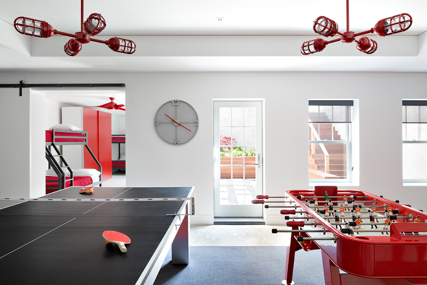

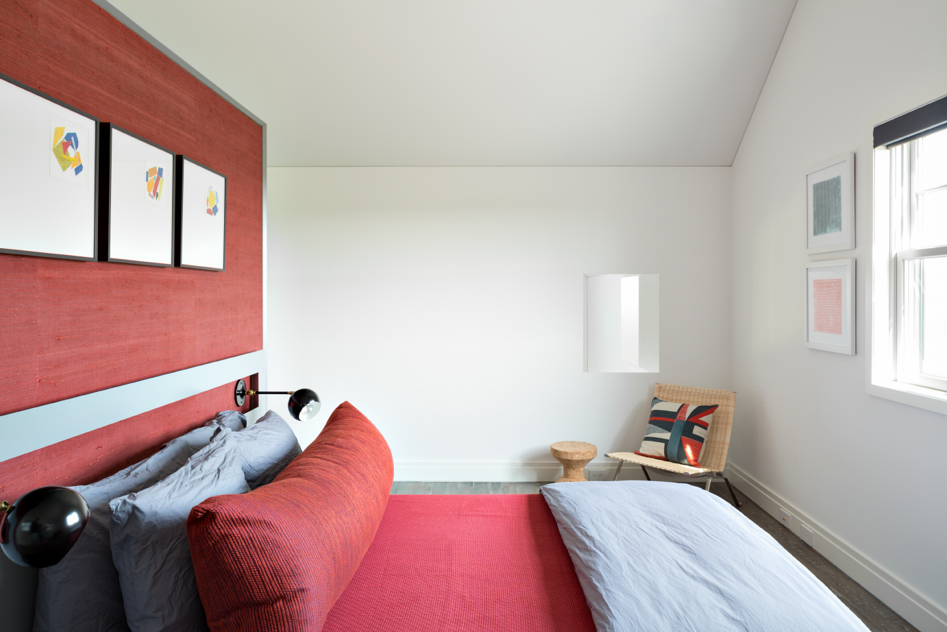

Just as Ahern sought to reflect the site’s beachiness in the landscape, Kotchen sought to bring it inside. “I love Nantucket so much, and I’m focused on making sure the outdoor conditions are woven into the house by pulling exterior colors and tones in for a very soothing environment,” he says.
Kotchen’s been honing his honest, pared-down aesthetic on Nantucket for the past 20 years, and he’s begun to exert an influence elsewhere on the island. “I can see in others’ work a shift in the past seven to 10 years,” he says. “I’ve seen the change happen, and it’s great—a lot of people are doing modern.”
But in Madaket, his “seaside modern” retreat offers a touch of history too.
Image Credits: Photos by Donna Dotan.
