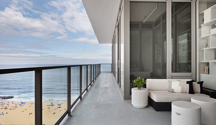
What to do when your clients eschew color, pattern, and contrast? “We focus on playing with textures and tones,” says Deana Della Cioppa, senior designer at Workshop/APD. The owners of this three-bedroom condo in Asbury Park, New Jersey, are a hip couple in their seventies who favor minimalistic design. Since it’s a weekend beach home, they asked for a clean feel and a bright, monochromatic palette. “They were very ‘less is more,’ which was challenging because we typically like to layer,” Della Cioppa says.
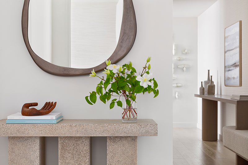

Della Cioppa and Matt Berman, a founding principal of the architecture and design firm, started with shades of milky whites, beige, cream, and taupe. Then they brought in elements of warm, whitewashed oak followed by pops of black metal that tie to the architecture.
Curating the just-right tones was tricky given the expanse of floor-to-ceiling windows that wrap the unit. “The colors reflected from the sky and the water drastically influence the tones,” Berman says. He and Della Cioppa both note that although their office gets plenty of sunlight, the condo is bombarded to such an extreme that the colors looked completely different in the two spaces. “In the condo, all the colors looked pink,” Della Cioppa says. “There was a lot of trial and error.”



The designers play off the understated approach to the luxury high-rise with a restrained lead-up to the ocean wow. “You enter the building on a side street with an urban feel, step onto the elevator, and travel down a long, windowless corridor,” Berman says. “As you walk into the unit, you’re drawn down the gallery towards the natural light.” A woven wallcovering with a nubby stripe adds dimension to a long wall. Then, the big release. “You step around the corner into an amazing fishbowl surrounded by water,” Berman says.
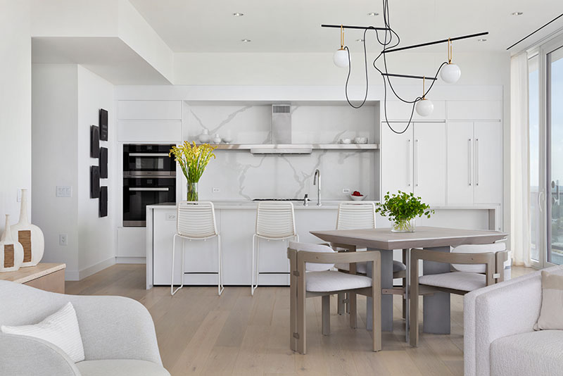
The team left the sleek kitchen intact, ensuring that the finishes coordinate with the design of the open living space. White stools enliven the island with a horizontal rhythm, while a black slash-and-scribble of a chandelier anchors the extension table in the dining area. “They wanted a small-scale square table for playing cards that also worked for entertaining,” Della Cioppa says. Curved chairs with a low profile maintain the view and circulation path.

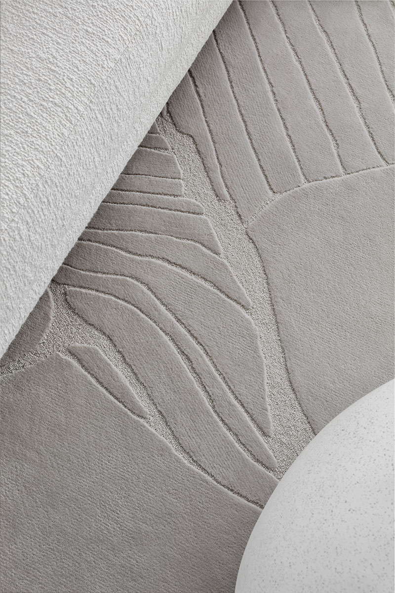
A bi-level wool rug grounds the seating area dotted with white furnishings in curved forms, including a sectional sofa upholstered in bouclé performance fabric and two smooth, pebble-shaped coffee tables. “We went through many rounds to get the rug right,” Della Cioppa says, noting that the original version, a two-tone, jute and wool design, had too much contrast. “This is all one color in a cut-pile wool with an incised grain detail of wool loops,” she says.

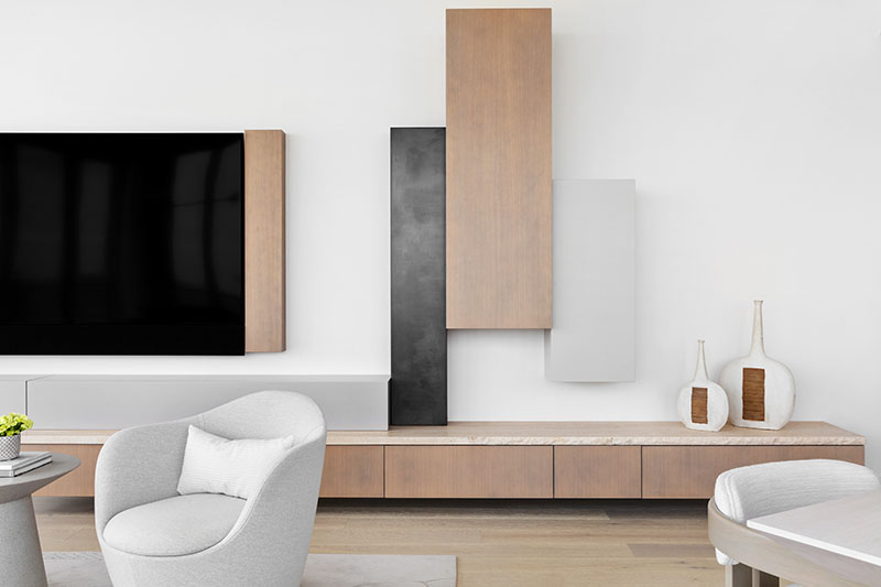
An asymmetrical configuration of bespoke cabinetry surrounds the television like an art installation. The tableau is based on an inspiration image of a floating credenza from the wife. “It was super contemporary and very glossy,” Della Cioppa says of the Italian-designed piece in the picture. “We adapted the concept by making it softer and warmer, and giving it some texture.” The result is an eye-pleasing arrangement of whitewashed oak, matte gray lacquer, and blackened pewter-wrapped boxes that serve as storage and decoration.
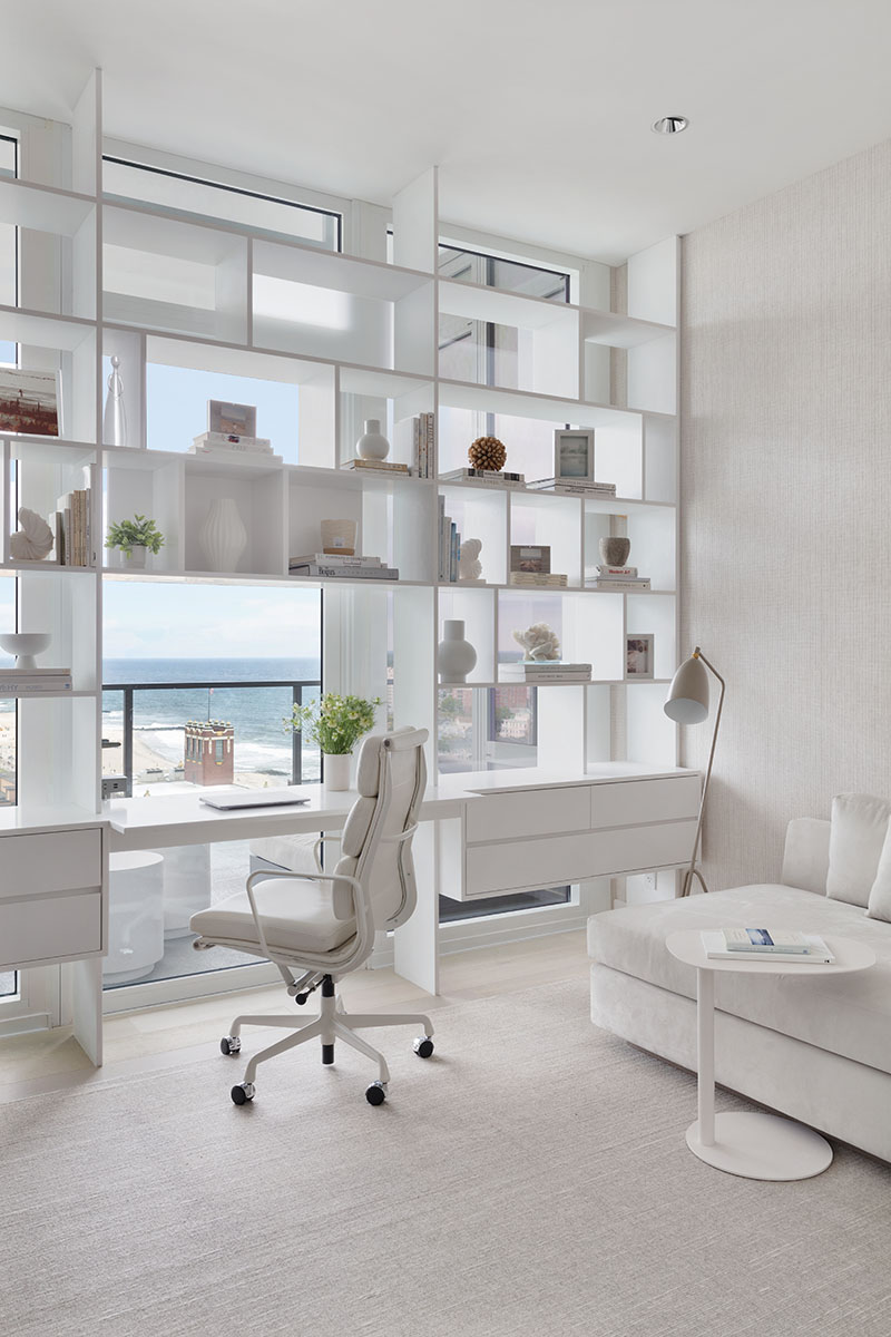
The team came up with a stylish storage solution for the husband’s office too: a desk with a shelving unit that doesn’t block the view. “Figuring out the placement of the blocks was like playing Tetris,” Della Cioppa jokes. The see-through piece is fabricated from white Corian, a sturdier material than wood when cut so thinly. A simple chaise sits against the subtly cross-hatched wallcovering on a strie rug with bits of white thread. “He didn’t want too much of anything in here, so we just used a deep chaise and a small metal table he can pull up to it,” Della Cioppa says.
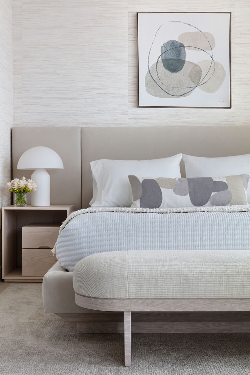

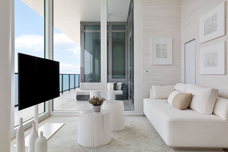
A long hallway on the other side of the entryway leads to the primary suite, a serene room, done in the same white, cream, and taupe tones as the rest of the condo, but a touch more layered. Velvety rugs feel luxe underfoot, and an upholstered headboard with vertical channels is a comfortable backrest for reading in bed. A chaise tucks perfectly into a corner across the room, where a TV on a barely there stand can also easily face the bed.
As the designers’ first project to be completed during the pandemic, it presented some predicaments. Early on, Della Cioppa traveled to a warehouse in another city to retrieve parts for the living room light fixture. “We navigated uncharted territory and completed an authentic design in a creative community for this very in-love couple,” Berman says.
For more information, visit workshopapd.com
