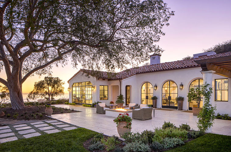
Anthony Grumbine, senior principal architect at Harrison Design, likens the process of remodeling a 1960s pseudo-Mediterranean style house in Santa Barbara to pulling a thread on a sweater and watching the whole thing unravel. “As we opened up the house layer by layer, we found that it was in a lot worse shape than we originally thought, and the project mushroomed,” he says. “There was really nothing that we felt warranted saving.”

The poor condition of the house—antiquated infrastructure, outmoded aesthetics, and ill-advised upgrades—were actually a blessing in disguise. “Because it was in such bad shape, we were able to do the beautiful things we wanted to do,” Grumbine shares. “Officially, it was a remodel, but in the end, it was the equivalent of rebuilding the whole house,” which was taken down to the studs and rebuilt with all new doors, windows, roof tiles, eaves, and cornices, among myriad other elements large and small.

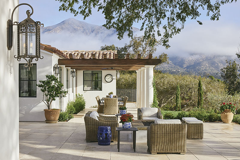
Located in Montecito, just north of downtown Santa Barbara, the house had one critical saving grace: the view. Nowhere else in the area offers such a wide-ranging perspective of the entire cityscape and beyond, with unsurpassed views of downtown Santa Barbara, the Pacific Ocean, and the Channel Islands. This house is unique in that it also has views of the Santa Ynez Mountains. “Not many properties have both, especially not so close to the ocean,” explains Grumbine. Previously, the best views were blocked by walls and oddly placed small windows.
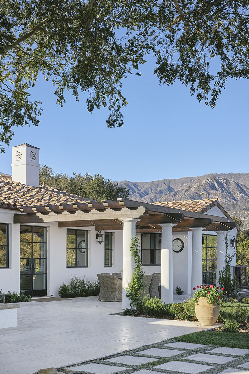



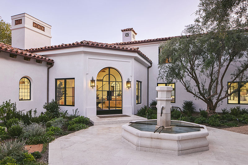
Keeping the overall outline of the building, Grumbine and his team, with William Hull as project architect and builder Giffin & Crane, began by stripping everything down, knocking out walls, and changing openings. “Stylistically, we wanted it to be classic Santa Barbara but also wanted it to be timeless and have the house respond to the location,” says Grumbine. “The Spanish Colonial dial can be adjusted up or down as far as level of detail and ornamentation.” In this case, the owners asked the architect for “elegant simplicity,” so the frills were kept to a minimum. Nevertheless, judicious details—columns, pilasters, wrought-iron handrails, and plaster moldings—imbue the house with a Spanish Colonial presence, however subtle, starting with the arrival sequence.
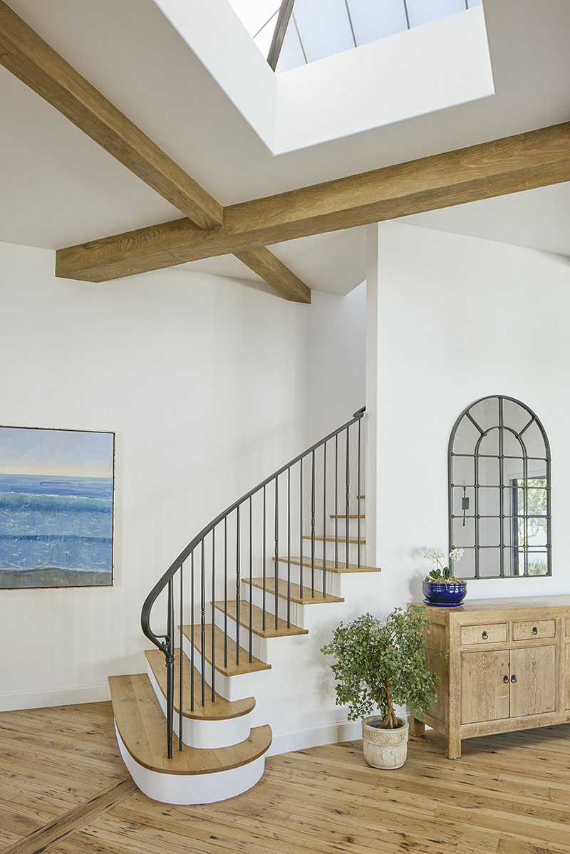
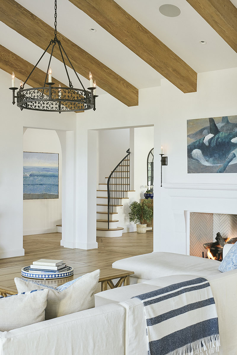
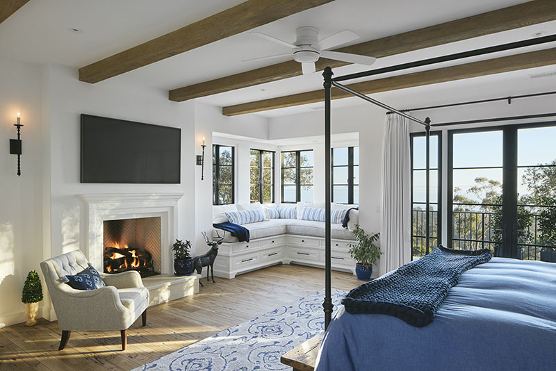
Once you pass from the auto court and through an opening in an outdoor accent wall, an entryway featuring a patio and fountain—both octagonal in shape—greets you and ushers you into the main foyer, where a skylit custom iron stair leads to the master suite, which occupies the entire second floor. The rest of the house is on one level. While the rooms here are quite large, “it’s not an open plan where people are in each other’s space,” explains Grumbine. “Each room—living room, dining room, and kitchen—has its own parameters, but they’re strongly connected so you can flow through them nicely.”




The architect’s favorite room, connected to the living room by a five-foot-long hallway, is what he calls the “man cave that’s not so cave-like,” a high-ceilinged entertainment room, outfitted with an antique pool table and a bar, and with the biggest glass opening in the house.
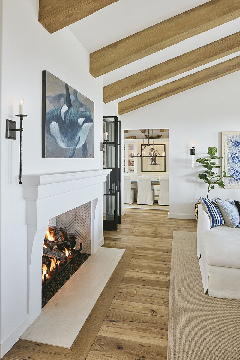
Collaborating with interior designer Shannon Scott of Shannon Scott Design, Grumbine says the house is “meant to be very livable, relaxed, and beautiful.” In the living room, an awkward black tray ceiling was replaced by a more symmetrical ceiling vaulted in both directions and detailed with nonstructural distressed beams. The fireplace in this room, one of several in the home—each one different and custom designed for its respective setting—is plaster with classical moldings. “The furniture and the finishes become the interior, which is calm and uses simple materials,” notes Grumbine.
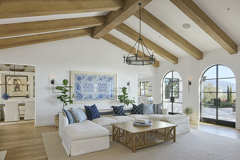

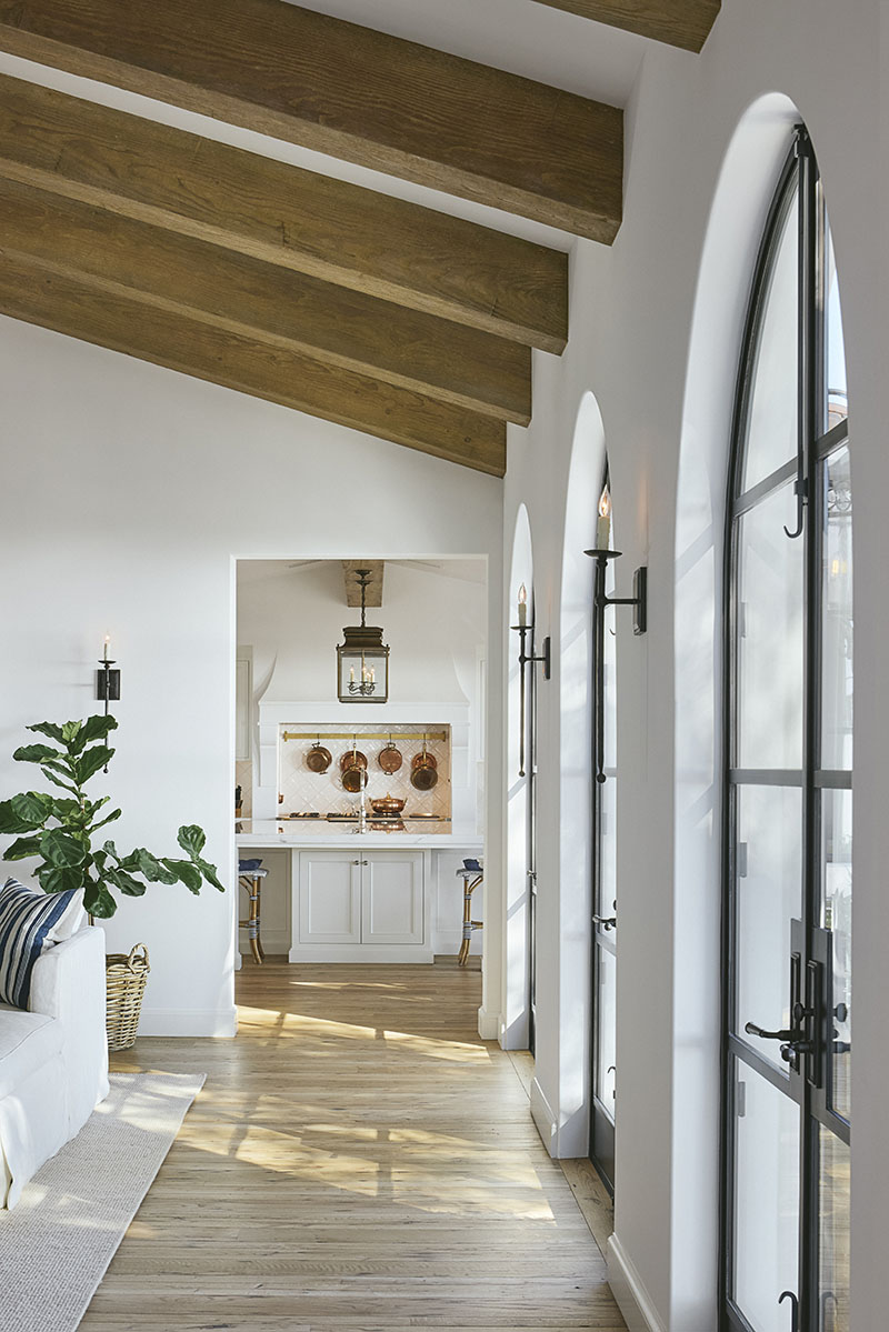
Off the living room in one direction is a reading nook with a leaded window crafted by a local artisan, and in another direction, a trio of stately arched doors leads to the main terrace. Situated next to the reading nook, the dining room looks out to the fountain.
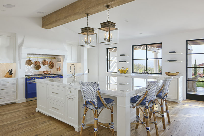
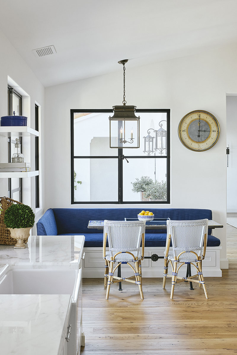
The combination of wide-plank wood floors, white walls and black steel windows and doors is carried throughout the house and, in the big, central kitchen, this motif is complemented by pops of bright blue that nod to the custom Lacanche range in that color. A generous marble-topped island with custom built-ins sits below a decorative beam, a beefy horizontal piece of wood whose shape and reclaimed texture are echoed by a trellis just outside. Visible from the kitchen, whose windows stretch down to meet the countertop, this shaded dining area with columns and aged limestone pavers entices people to go outdoors. Similarly, an open-air fire pit off the main terrace beckons you to step out through the living room’s arched doors.

“We asked ourselves how we could maximize views and outdoor living,” says Grumbine. “This house is a great example of the particular Santa Barbara Spanish classical language in which indoor-outdoor living isn’t about having a blurred line between the two. Instead, it’s about big views and the things and spaces that draw you out visually. It’s all about baiting people outside with beautiful things.”
For more information, visit harrisondesign.com; shannonscottdesign.com
