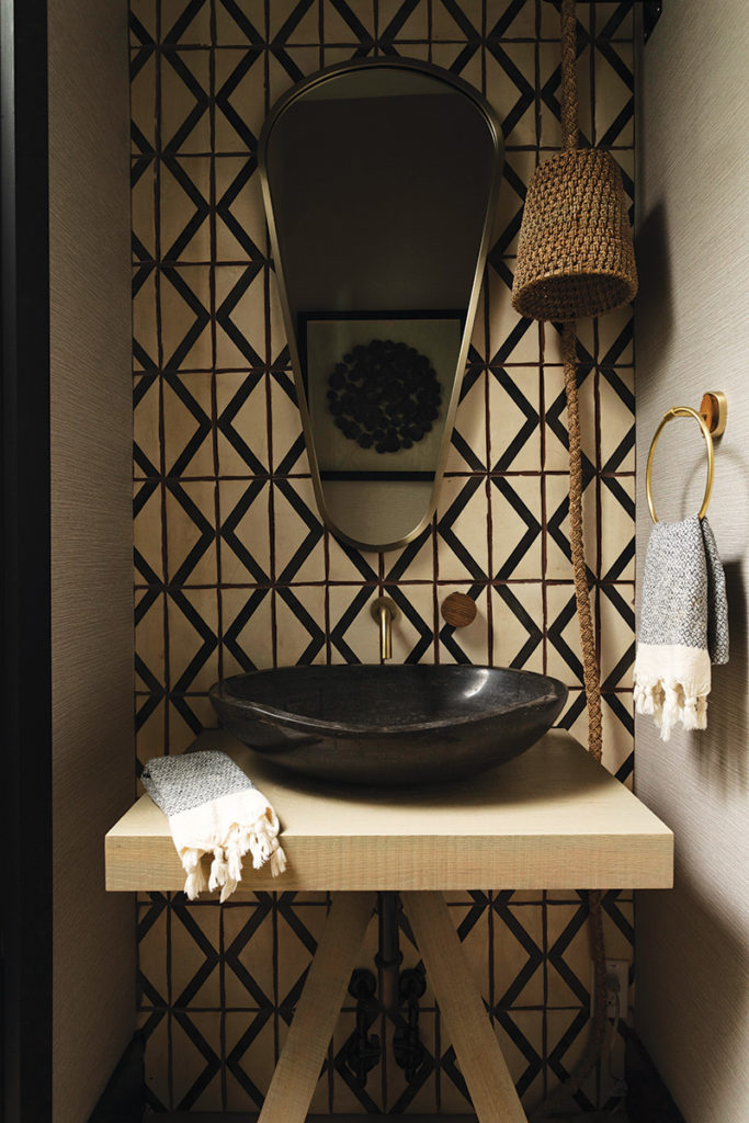
An interior designer in St. Petersburg, Florida, helps a couple and their daughter create a modern retreat in a neutral palette while honoring family heritage.
Photographs by Amy Lamb
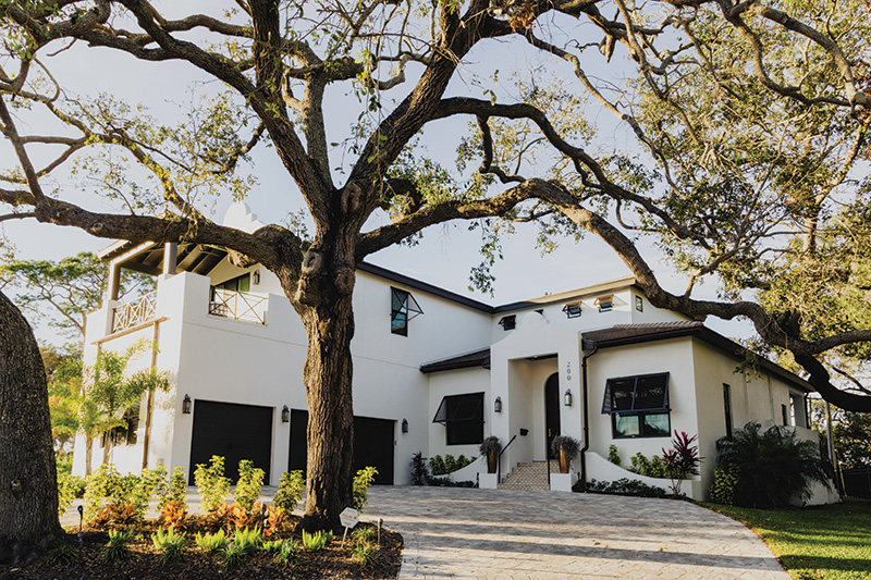
When St. Petersburg, Florida, residents Danielle O’Sullivan Flynn and James Flynn had their daughter, Peyton, seven years ago, they ultimately discovered the layout of their existing residence wasn’t conducive for their needs. “It became quite apparent that we’d outgrown that home, and although we absolutely loved our street, we decided that we would at least remain in the same neighborhood,” says Danielle of the idyllic enclave, Snell Isle. “We looked for a home to buy in our neighborhood for over a year, and unfortunately, never found ‘the one,’ so we decided to tear our original home down and rebuild on the same lot. We were ecstatic that we were able to remain surrounded by the same neighbors we’d grown close to.” During the process, fate played a big role when the lot across the street from their existing house became available. Later, a developer and friend of James (who had purchased the two lots next door) recommended Peregrine Construction Group to help build their custom home.
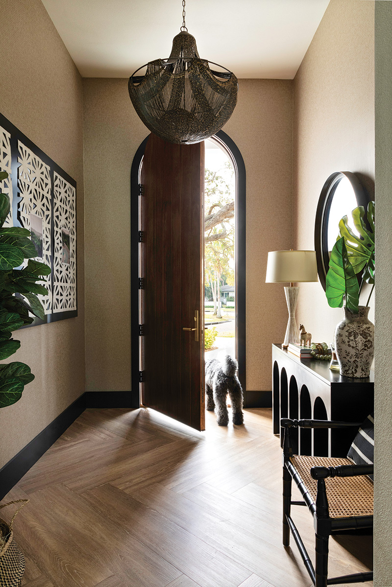

But the Flynns also knew they would need help from an interior designer to bring their vision to life with a wink to Danielle’s roots (she was born in Jamaica and still has family there) and James’s favorite memories of family trips to the Caribbean and the Bahamas. At the recommendation of Matt Foster from Peregrine, who had worked with Lisa Gilmore, principal designer and CEO of Lisa Gilmore Design on previous projects, they had their first meeting. “From the very beginning, we felt as though Lisa completely ‘got’ us and the feel and style of home we wanted to build,” remembers Danielle. “There were things we initially thought we really wanted, but she knew needed to be elevated, and that’s exactly what she did. From her first vision board, to her hand-drawn illustrations of each room, we quickly realized she is a talented artist who was more than capable of designing our dream home.”
It was also equally essential to the Flynns to create a sense of design departure from quintessential Florida homes commonly clad in hues of blue and white, and reflect their affinity for architecture in the Caribbean. “Since many of the luxury resorts and homes we’ve stayed in while visiting Caribbean islands reflect design from their various colonial histories, we really wanted to incorporate these elements and honor my heritage,” explains Danielle. “It was equally important to us to create a style for our home that we would not see elsewhere. We wanted to go in a completely different direction for our color palette, stepping away from the ‘Florida beachy’ vibe.”
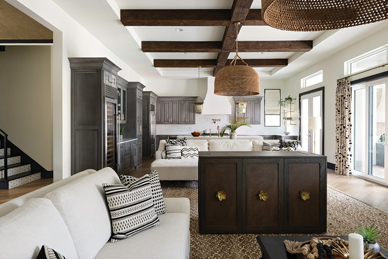
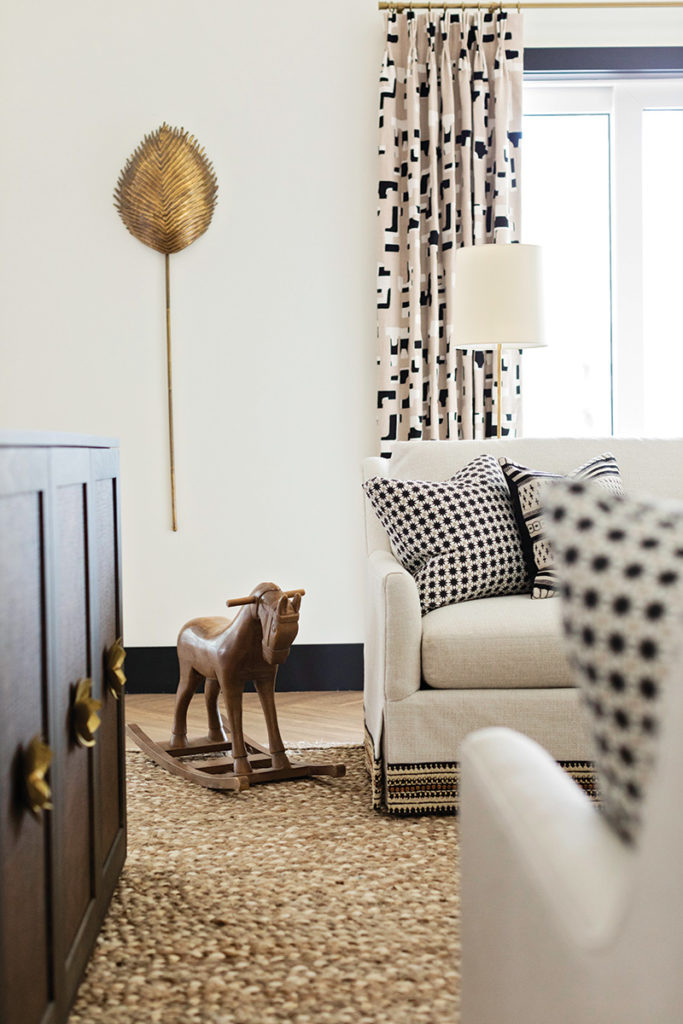
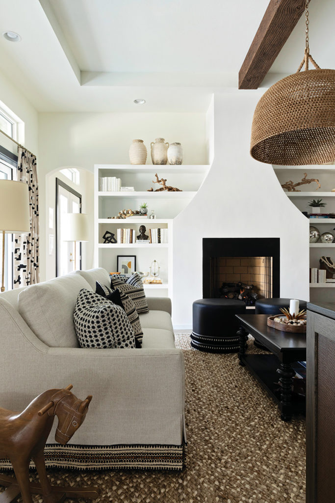
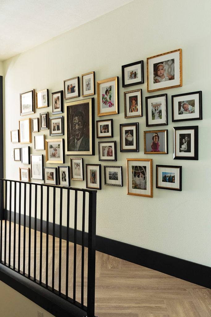
Combining the couple’s love of the islands, entertaining, and a burgeoning art collection—including a pair of Salvador Dalí prints; a painting by French artist Davina Shefet; and pieces from James’s family by artist William Pleasant—Gilmore devised a design plan with a neutral palette skewing more in high contrasts of black-and-white with layered touches and textured materials throughout. “They really wanted to try and create that feeling of relaxed luxury and have an island style without being a direct derivative of the islands,” says Gilmore. “We wanted to make it approachable and leaned heavily on textures.”
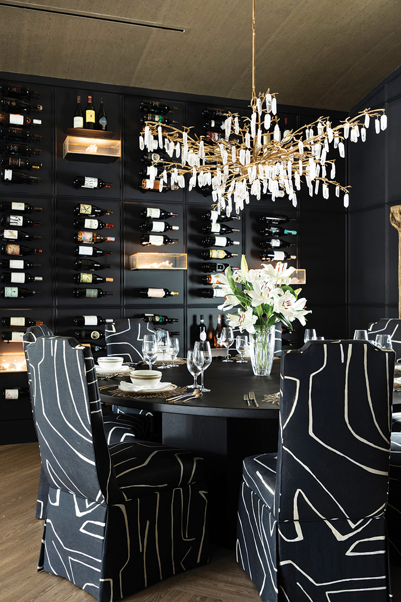

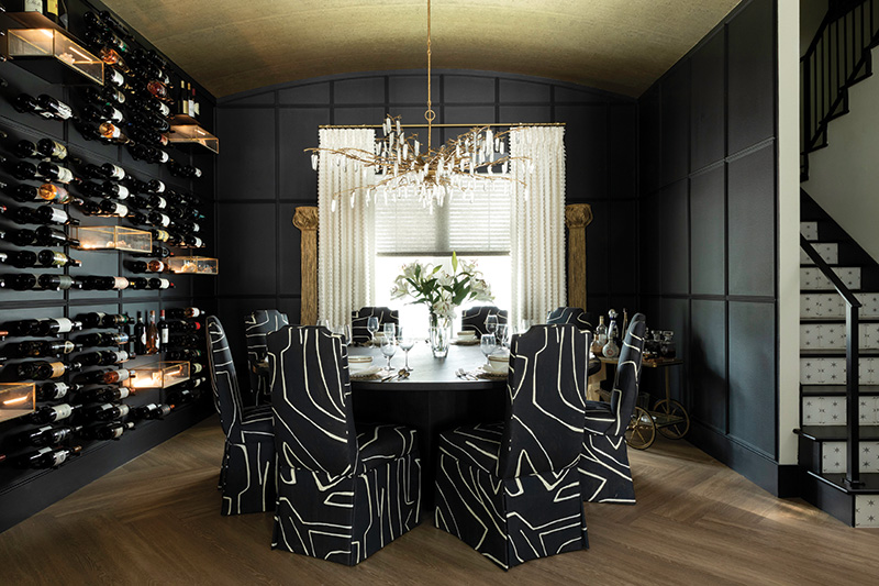
The dining room, one of Danielle’s favorite rooms (and admittedly Gilmore’s), is a classic example of an artful mix of textures. “It has so much grandeur and wow factor with the wine wall and the beautiful chandelier,” says Gilmore of the custom wall and wainscoting done by T2the2, a local millwork company, and a chandelier by Currey & Co. “Picking the chair [upholstered in Kelly Wearstler’s “Graffito” for Lee Jofa fabric] for the dining was huge, and if we would have done a traditional framed chair it would have completely changed the look. It’s modern, but earthy, without being there too much.”
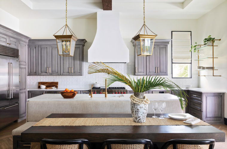
In the nearby kitchen, Gilmore pulled from her recent travels to South Africa and Wine Country. “A lot of the architecture is colonial-driven, and my trip really drove the aesthetic including the backsplash tile [a handmade tile from Tabarka Studio], and it’s meant to have a weathered look,” says Gilmore of the kitchen she designed along with Bee Studios who designed the kitchen layout, function, and cabinetry, while Peregrine Construction crafted a custom hood and fireplace details. “The soft gray cabinetry with interesting streaking detail reminds me of oxidized metal.”
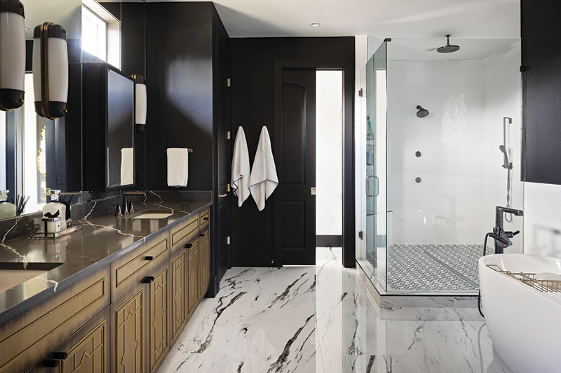

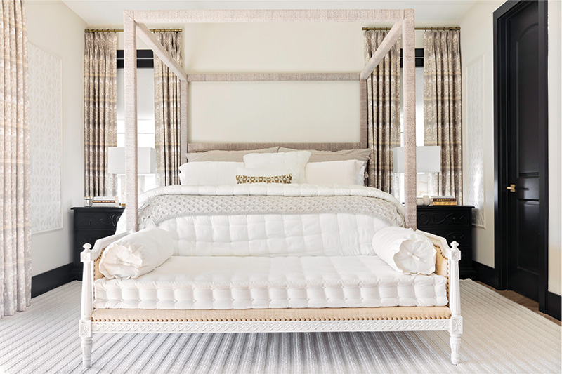
The concept for the master bedroom, however, was initiated by a specific request. “James said to me that he wanted to feel like he was at The Ritz, and that’s literally how I came up with this design with a beautiful seating area and rattan-wrapped bed from Palacek,” says Gilmore of the elegant space adorned with wallpaper panel inserts by Lori Weitzner and a cozy, nubby area rug by Surya.

Now, the design effortlessly reflects the family, and their dog, a Kerry Blue Terrier, named “Mac” after James’s favorite scotch, Macallan. “It is so chic, and they are so calm and approachable, and it really comes off in their residence,” says Gilmore.

And, it’s clear the Flynns are right where they are meant to be. “The design fits our style needs and is also functional for our entire family,” says Danielle. “It provides us with the feeling of being on vacation while still being at home.”
For more information, visit lisagilmoredesign.com
