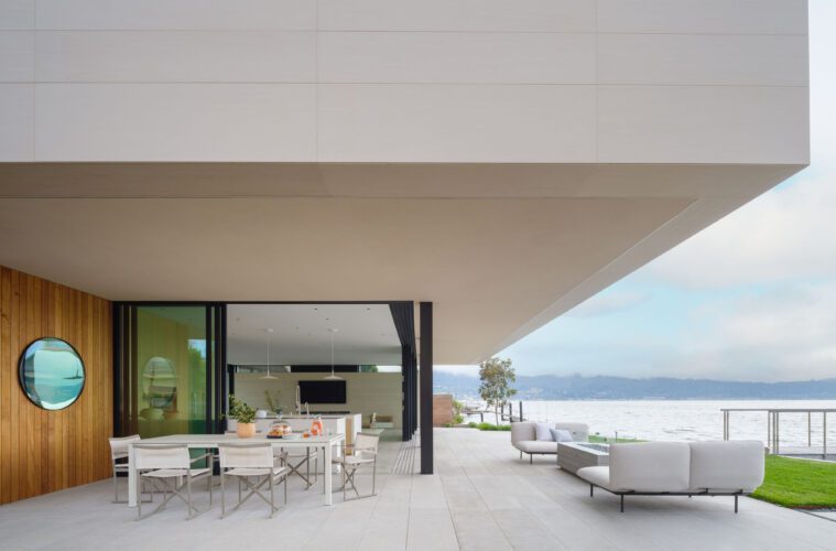
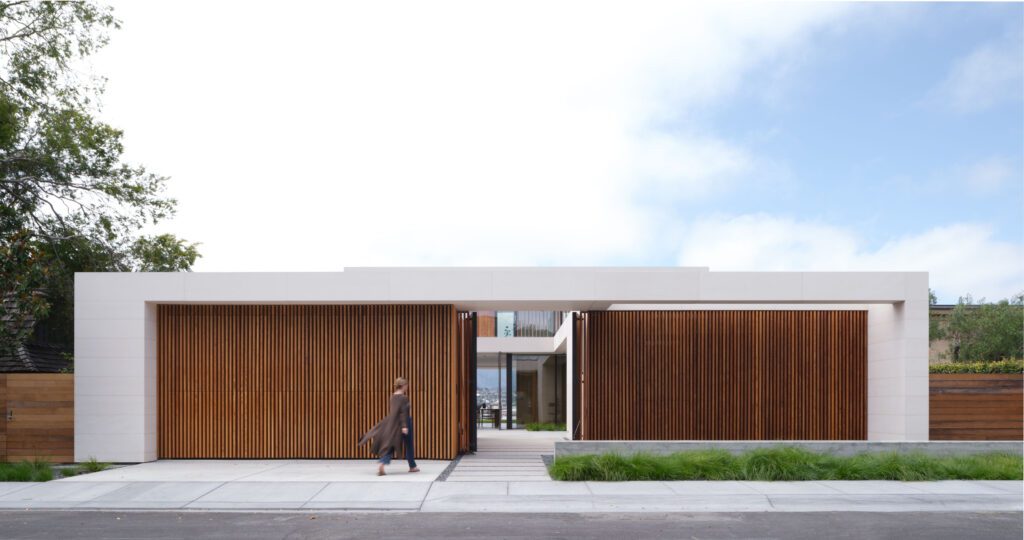
Limited by neighbors and traffic on three sides, a new home on San Francisco Bay opens up on its fourth to spectacular waterfront views. Federico Engel, principal in Butler Armsden Architects, skipped the windows where the home faces those beside it. He gave it privacy on a streetside entry that’s packed with people and cars. Then he directed the eye from the front door through a courtyard and living area to bayfront vistas. “It needed privacy at the front, and action at the back,” he says.
Engel kicked off the design and construction by tearing down a 1965 Midcentury Modern with a fatal flaw. The site was an infill lot mired in mud from the bay. “That doesn’t lead to the best foundation,” he says. “The home had settled beyond repair, and we had to take it down.”

In its place is a two-story, 3,500-square-foot masterpiece that’s an ode to both transparency and opacity. Started in 2019, its construction endured supply-chain challenges provided by the pandemic and took 28 months to build. It was finished in February 2022. The client is a Scandinavian whose family’s in the shipping business.
He has a wife and two children—and a passion for developing properties around the world. In the States, he has homes in Montana, Southern California, and another that looks down to San Francisco. This home, though, is on Belvedere Island in Marin County, between Sausalito and Tiburon. It offers the area’s Mediterranean climate, but its high winds have to be dealt with too.

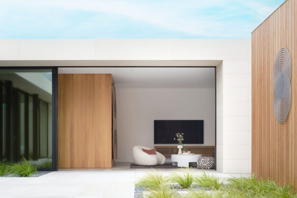
Here, the types of houses that are most successful are either L-shaped or courtyard-based. “This one’s laid out in a courtyard way, so it’s protected from the winds but still has the views,” Engel says. “On windy afternoons you need a protected area, so the interior courtyard is an outdoor sitting room.” The courtyard is essentially a sculpture garden with low sofas, chunky rugs, and leather sling lounge chairs.
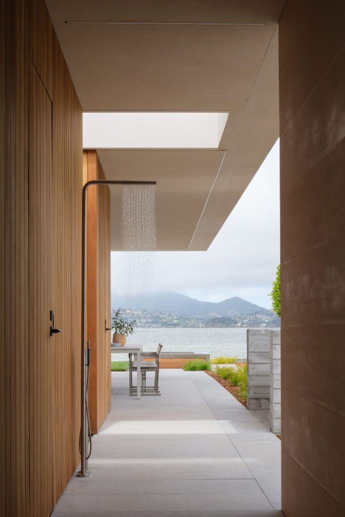
And the overall design reflects the textures of the site, with water glass, clouds, and landscaping. “I was trying to reiterate the emotional quality of late afternoon on the water at the end of the day—reflection, shimmer, back-lit shapes, and a quiet mood,” he says. A series of connected rooms all look out to the bay and blur the indoor/outdoor boundaries for different weather and environmental conditions.
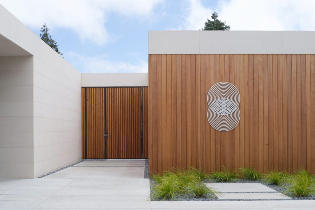

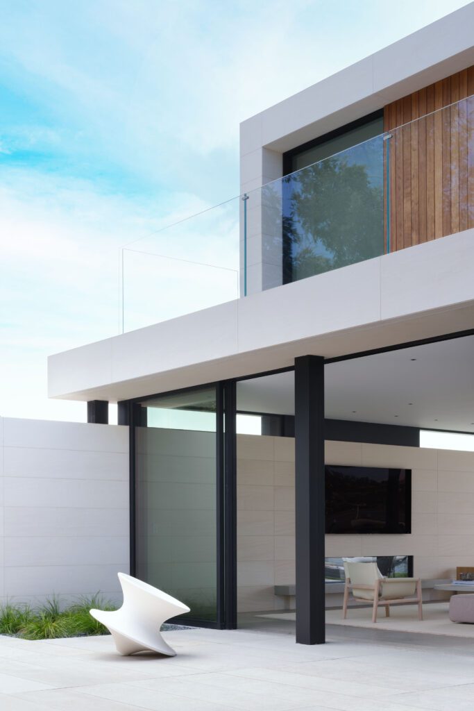
“On a super-nice morning you could be outside looking at the views, or in the courtyard, depending on the weather,” he says. “All provide different experiences but relatively unobstructed views.” His material palette here is simplicity itself. He used two types of Portuguese limestone—a gray/blue for the floors, and light green for the walls. He started out with the intent of using cedar for cladding out front, but strong demand and high supply-chain pricing pointed him in another direction.
He substituted another product called Thermory—a heat-treated natural hemlock. All its moisture’s been removed, and it offers a resistance to harsh exterior conditions. “It’s the same light color as cedar, with the same warmth that balances the limestone,” he says. “It came to us pretreated with that honey/amber color, and we sealed it to preserve that, but it will gray out eventually.”
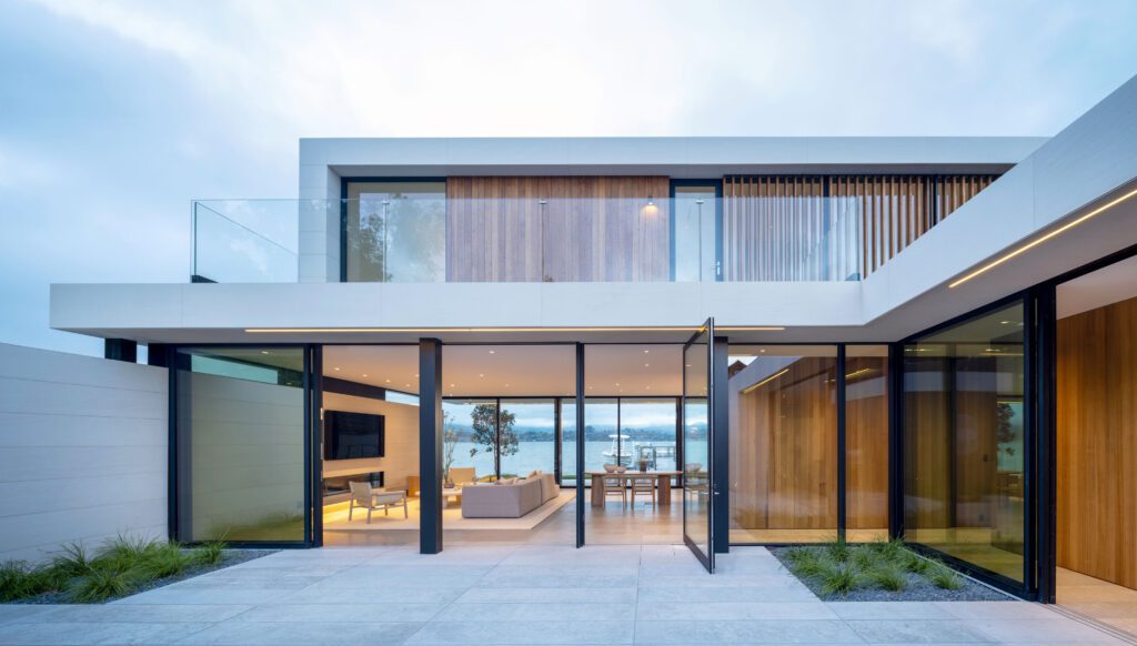

For furniture, textures, and artwork, Engel turned to Sabra Ballon, principal in ballonSTUDIO, a veteran collaborator with Butler Armsden. She’s an interior designer with a master’s degree in architecture from the University of California, Berkeley, so she was aligned with what Engel sought to achieve. And she listened closely to the client. “There’s a Scandinavian aesthetic in the way he was brought up, which was very pure,” she says. “So we used leather, wool, cotton, and stone in very straightforward ways.”
She eliminated veneers for all the furniture—every piece is solid wood, even a bowl carved from a single chunk. “There’s a minimalism, and the building comes first—the furniture is there to sit on, and it’s a continuation of the architecture.”


The bedrooms upstairs are small, with a built-in desk for each child, along with a bed and trundle for sleepovers. “It’s like a cruise ship up there—with only enough room to come out and tiptoe around,” she says. “And there’s a sliding partition that can open up or close off the bedrooms.”
In the primary bedroom, the clients’ bed faces the water, so the designer added a dresser on the back side of the headboard, with bedside tables too. There’s room for one chair with wool upholstery and one table. In that bedroom and the family room, the designers eschewed framed art, and opted for art-like textiles on the walls instead.
“There aren’t a lot of tiny pieces, but larger rugs providing color, pattern, and a focal point, but not ‘Look at me!’” she says. After all, it’s the views of the bay that beckon.
