Photographs by Karyn Millet
An architect known for his “romantic” modernism and an interior designer known for her “organic” modernism joined forces in 2019 to create a dynamic home in California’s Corona del Mar.
“I blend romance with modern design,” says architect Geoff Sumich. “There’s always warmth with wood or stone.”

Trained in modernism in his native New Zealand, the architect arrived in California during the 1980s, only to find clients demanding Tudor and French Country homes. For 15 years, he cut his teeth on classical architecture. “When I finally broke out to do the modern work that I wanted to, I hid the traditional work from my clients for three or four years,” he says. “Then I put it on my website—because it actually informed my modern work.”

Interior designer Lisa McDennon earned a degree in fine arts from UC Irvine and another in interior design from the Interior Designers Institute in Newport Beach. When she set up her firm in 2000, she began to explore a contextual, coastal style of her own. “It reflects the surroundings and natural organic elements,” she says. “I balance the architectural structure of the house with the client’s personal style.”

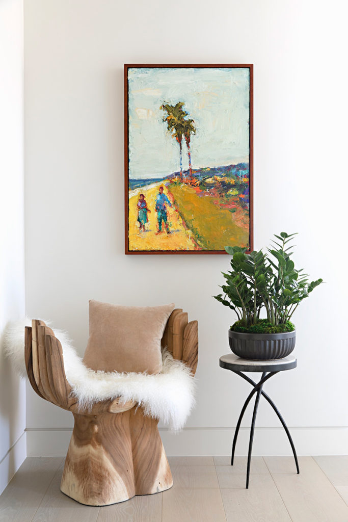
Interior designer Lisa McDennon selected all furnishings; Artwork was curated by Jeanne Denholm of Scape Gallery.
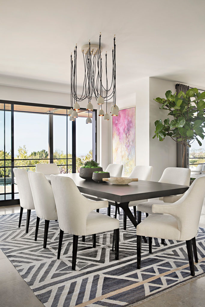
Dining room chairs and table are custom; chandelier is from the Lisa McDennon Collection for Hinkley. 
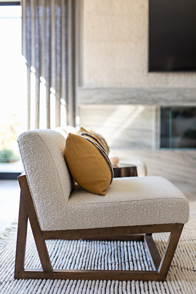
Living room chairs are from Nuance Home. 
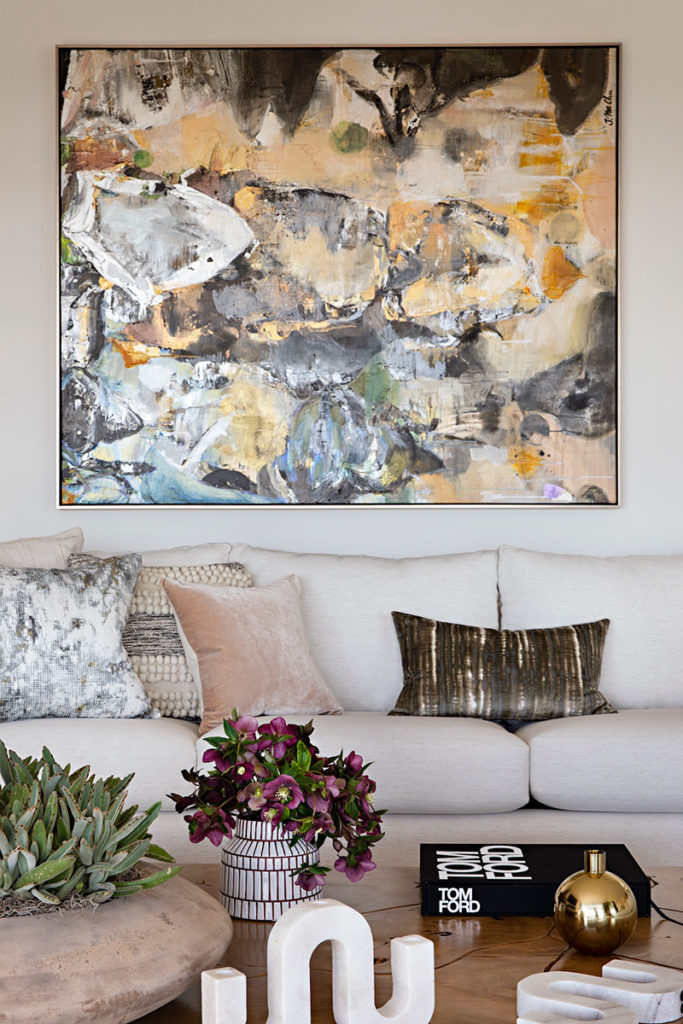
Living room sectional sofa and pillows are custom. Coffee table is from Nuance Home
In this case, the client was developer Tom Nicholson, whose work is well known in Newport Beach and Corona del Mar. While the building’s bones were designed first by architects at Toblesky Green in Yorba Linda, Nicholson asked McDennon and Sumich to finish the home for himself and his wife. Halfway through the design process though, the couple elected to sell it.
Still, the architect and interior designer created a stunner of a house together. “We work on a lot of projects together—so I know that Geoff is passionate,” McDennon says. “He’s incredibly creative, he’s an out-of-the-box thinker, and he embraces collaboration.”

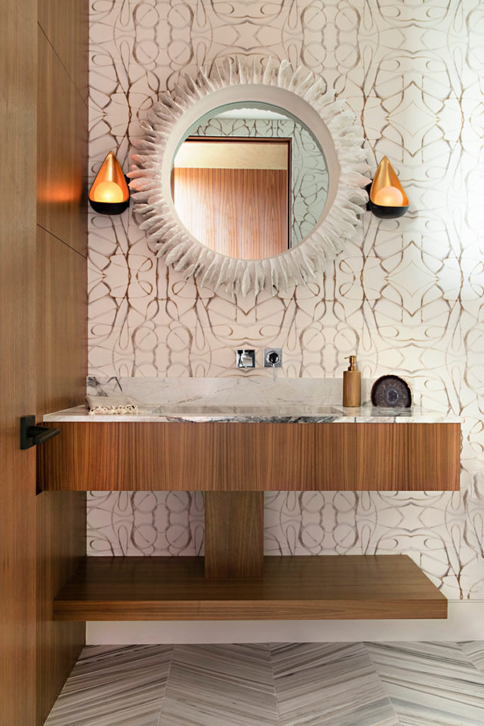
In the master bath, a vanity floats off the wall below a custom mirror. 
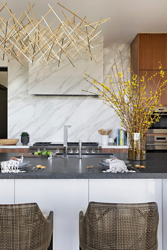
Kitchen barstools are by Palecek; chandelier is from Y-Lighting. 
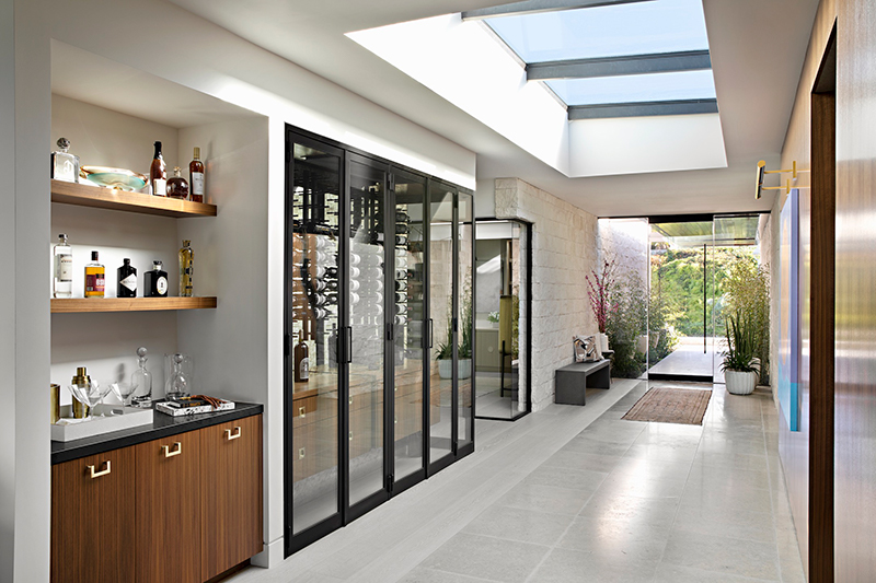
Custom-stained, white oak floors line the hall and bar area.
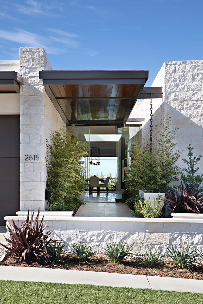
Sumich looked at the house from the street side first, creating a strong presence with a tall stone wall that splits the home in two. Over that, he designed a cantilevered canopy that follows a walkway and delivers owners and guests to the front door. For it all, he chose a warm material palette. “It’s Texas limestone for the axial walls, copper for the canopies, with wood soffits that are cedar tongue and groove,” he says.
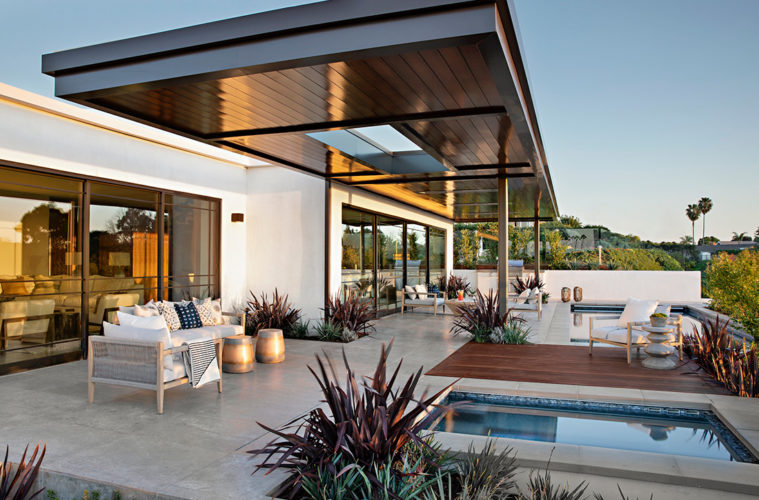
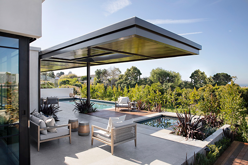
At the rear, the architect created two axes to take advantage of natural and manmade vistas. One’s an elevated view of a sweeping Pacific coastline. Sumich framed it with cantilevered canopies borrowed from his vernacular at the entry—for no small amount of drama.
The other is a view to Fashion Island, the high-rise retail mall in Newport Beach. “This house had an incredible view of that on the diagonal, so I cut out the window corners to capture the view,” he says. “I was most interested in the commanding views of the skyscrapers rising up, so I was analyzing the biggest resource for the view toward those buildings.”
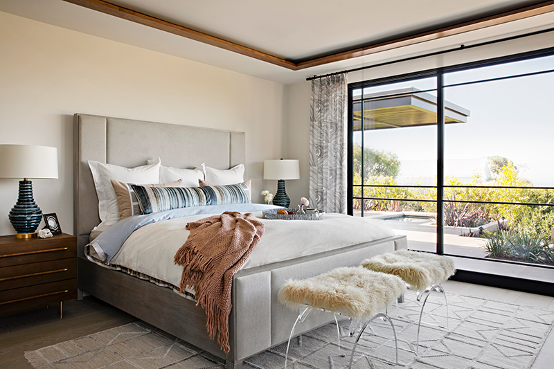
The architecture established, McDennon walked into the home, inspected the plans and began working out the layout of spaces between kitchen and family room, then master bedroom and bath. “I did the architectural detailing and worked closely with Tom for interesting design layouts for big windows and doors and custom design for the property,” she says.
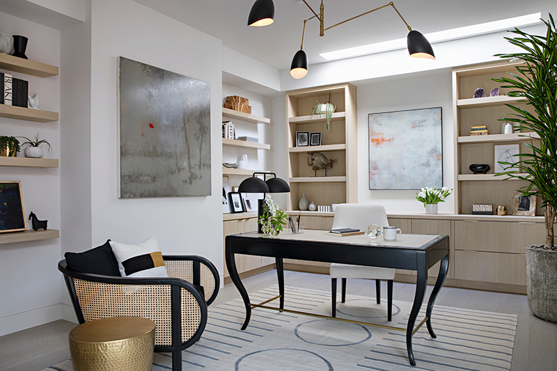

She also worked through all interior details in the house—the finishes, including stone and tile, the cabinets, and the plumbing fixtures. “Initially I spring-boarded off the design established by the architect and design programming—it was a great way to keep the warmth in the project with natural organic materials,” she says. “I was given a shell and I sculpted And sculpted it into a calming, serene, environment.”
The exterior’s split-faced stone flows into the entryway, then the study. “It’s balanced with warm walnut paneling,” she says. “There’s an earthy, sandy color palette—I had fun playing with the color too, in subtle ways.”

A taupe limestone floor runs from the front door through the hall, then dining room, kitchen and living room. On its right-hand side is a strip of white oak that follows along to an office and wine room. “The floor pattern is unique. The team questioned the design,” she says. “But I just knew it was right.”
She repeated the warm-wood theme with a teak slat in the shower of the master bath, where walls are clad in blackened steel wainscoting. “What I like is that even though we have all those industrial materials, the bath is really soft,” she says. “It’s both masculine and feminine—a nice balance. It’s comfortable and relaxing.”
When all was said and done, McDennon staged the home, prepping it to put it on the market. Finished just weeks before the pandemic hit, it sold within months.
That’s a testament to timing, talent, and collaboration.
For more information visit geoffsumichdesign.com; lisamcdennon.com
