PHOTOGRAPHS BY AARON USHER
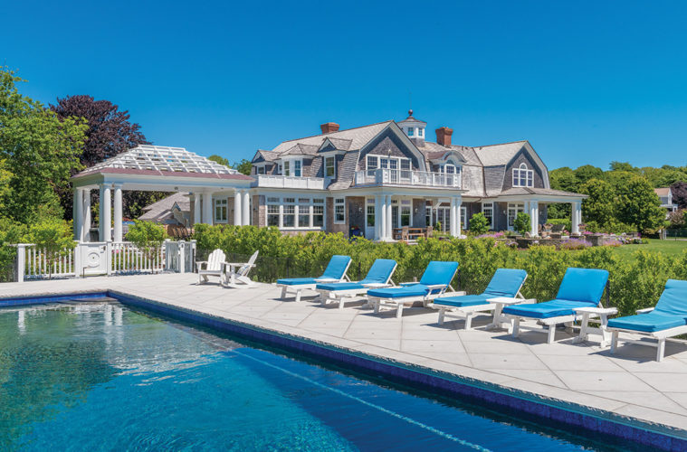
In the late 19th century, architects and builders began to embrace the Shingle style, a classic yet informal look for seaside retreats in tony enclaves like Nantucket and the Hamptons. Newport, Rhode Island, another bastion of these rambling wood-clad manses, is where architect David Andreozzi, a devotee of the Shingle style, was tapped by Jeanne and Bob LeDuc to renovate a home they’d lived in for 15 years. His charge: Bring the home up to its full potential, both as a paradigm of its architectural genre and as an optimally functional house for the family.

“The bones of the house were nice, but it was designed as a spec house,” says Andreozzi, explaining that it cried out for better proportions and the type of detailing that could raise the home’s caliber from adequate to astonishing. Looking at it more romantically, Andreozzi, current president of the New England Institute of Classical Architecture and Art, deduced that the house was missing its soul. By the time he and his collaborators—Parker Construction, Mather & Page Landscape Architects, Linda Black Interiors, and Christopher Foster Glassworks—were finished, the LeDuc home expressed the Shingle style’s inherent sense of place. Moreover, it embodied the warm spirit of the family residing there.
Shares Andreozzi, “For me, to be able to take something like this [house] and put on the finishing touches—moldings, brackets, handrails, columns, and even a finial—was a wonderful opportunity.”
As it happens, it was an opportunity he almost didn’t have. When the LeDucs bought the home, they were attracted to the ocean-view setting and beautiful grounds as much as to the house. But as their family expanded (they now have five grandchildren), the primary living areas seemed less and less suited to their lifestyle. “Even though it’s a large home, the space that we all spent the most time in just wasn’t comfortable,” says Jeanne, describing one big great room with a galley-style kitchen. They seriously considered moving but, says Bob, “Even the realtor told us we wouldn’t find a better location than what we had.”
Addressing Jeanne’s most ardent wish, the initial plan called for just a spacious kitchen/family room addition, but then it blossomed into a much more comprehensive project. “In the end, almost the entire house was renovated,” says Jeanne, adding that, as a lifelong gardener, “It was definitely important for me to have a pretty outdoor space as well.”
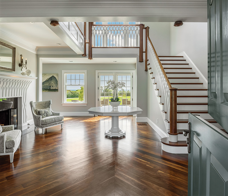

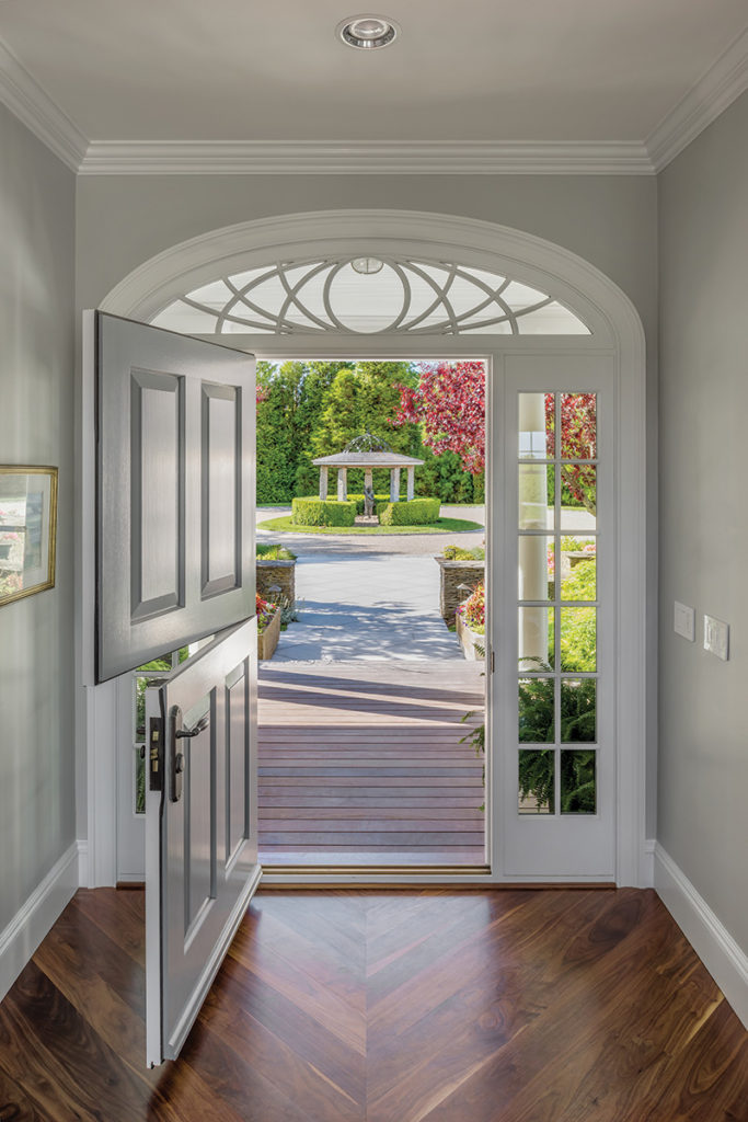
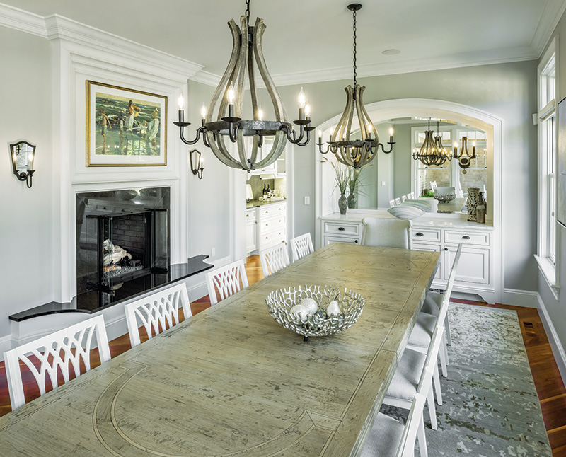
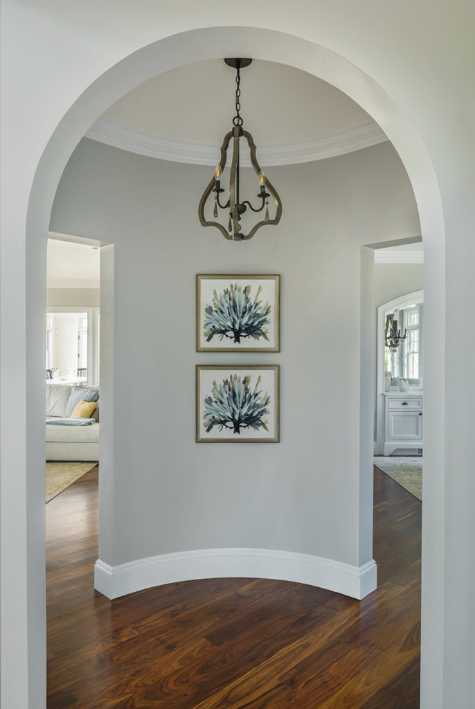
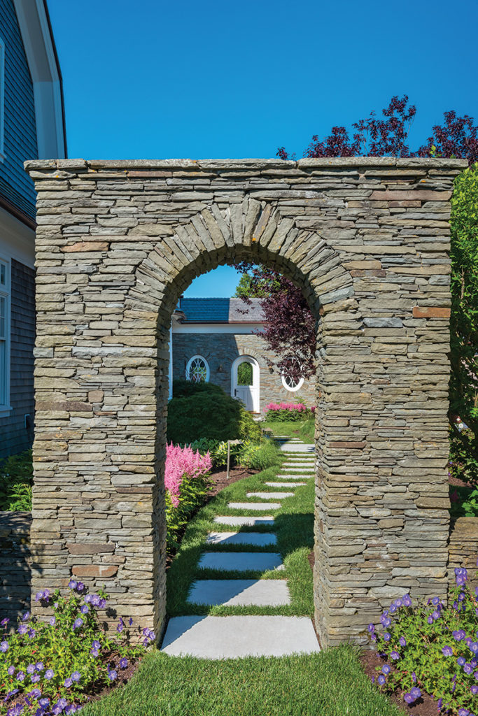
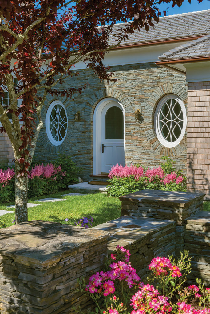
Now, amid bursts of Mather & Page gardens, a more ordered, classical entryway designed by Andreozzi integrates a symmetrical courtyard, reproportioned and new columns, and new oval windows with fretwork that relates to the stairway panel design in the stunning revamped foyer. Welcoming Dutch doors and windows stripped of heavy drapery bring the outdoors into what was once a dark, dated interior and is now the light, bright, airy space Jeanne hoped for. “Restful,” is the aesthetic interior designer Linda Black says was her goal, and which she achieved with Sherwin Williams Passive Gray walls, light-painted and weathered-look furniture, and a neutral palette of textured fabrics.
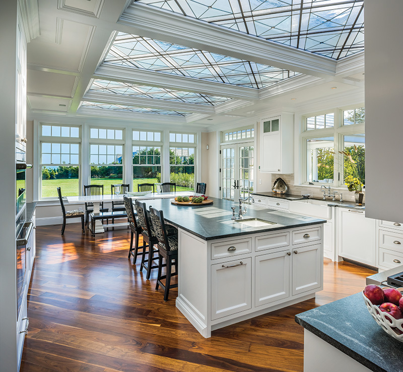
Nowhere is the home more flooded with natural light than in the kitchen, which was imagined to evoke the greenhouse-like ambiance of an orangerie. In addition to windows on two sides, the room is illuminated by four large skylights positioned above a geometric-patterned leaded glass ceiling designed by Andreozzi and crafted by Rhode Island artist Christopher Foster, who often collaborates with the architect. Using nearly 100 pieces of both clear and seeded glass, some of it hand-blown and imported from Germany, the painstakingly wrought ceiling exemplifies the high level of detail that Andreozzi prioritizes. “Local artists, local labor, local materials,” is the architect’s trifecta for achieving an exemplary Shingle Style home.
On the exterior, decorative molding covers the skylights to conform to Historic District guidelines. With the new kitchen and family room, Andreozzi says, “We’ve created a center where the family wants to be all the time.”
In his work, says Andreozzi, the balance he’s always trying to achieve is between “beautiful and welcoming” and “formal and informal.” For example, choosing to lay the wide-plank walnut floorboards diagonally throughout the entire house may seem disconcerting at first, says the architect, “but it all comes together and connects at the axis of the front door, so there’s an order to the entire design.”
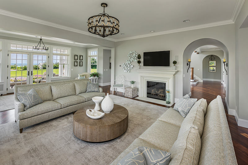

Before the architecture team and their collaborators sensitively refashioned the LeDuc’ residence, it was just another very nice, big house. Now, says Andreozzi, “it relates to the context of its setting and in doing so it pays respect to a culture and a community. It says, resoundingly, ‘Welcome to coastal New England!’”
For more information Visit andreozzi.com
