At 19 years old, architect and visionary Paul McClean, principal of McClean Design in Orange, California, became fascinated with bridges. “It’s funny how these little things happen,” says the Dublin, Ireland native who attended The Dublin Institute of Technology.
“I was visiting the University of East Anglia, in Norwich, England, and it’s one of those Brutalist, kind of concrete university campuses that they built in the 1960s and 1970s. I was walking along, and then suddenly almost out of nowhere, I was on this bridge that had basically been made of a metal grid material and you could see through it, [and it was leading into the Sainsbury Centre that Norman Foster designed] and you just literally felt like you were floating through the trees. I had such a rush at that time to leave all the heavy concrete behind and be on such a light bridge, and you come in on a diagonal into this contemporary building and it just made such an impression. So, I’ve always enjoyed bridges and I feel like bridges just change your perspective.”


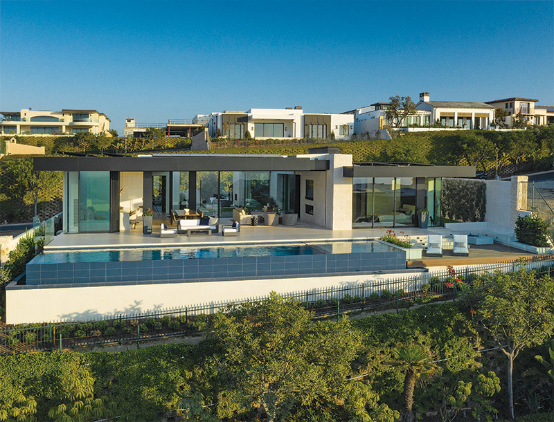

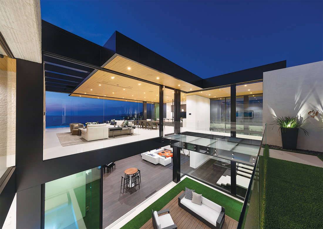
So, it’s no surprise, McClean—who has designed for the likes of Calvin Klein, Jay-Z, and Beyoncé and conceived homes in locations including Los Angeles, Canada, Hawaii, and Thailand—incorporated a jaw-dropping glass-and-steel bridge that leads to the front door of a recent project for a couple in Dana Point.
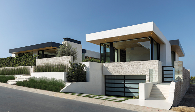
Situated in a 120-home private community (with a beach and clubhouse accessible via golf carts), the 7,900-square-foot, five-bedroom residence is replete with an infinity pool; a museum-like, glass wine cellar with approximately 500 bottles; vertical grain, clear cedar ceilings with a custom stain; retractable glass walls; a basement for entertaining; and a living wall and water feature.
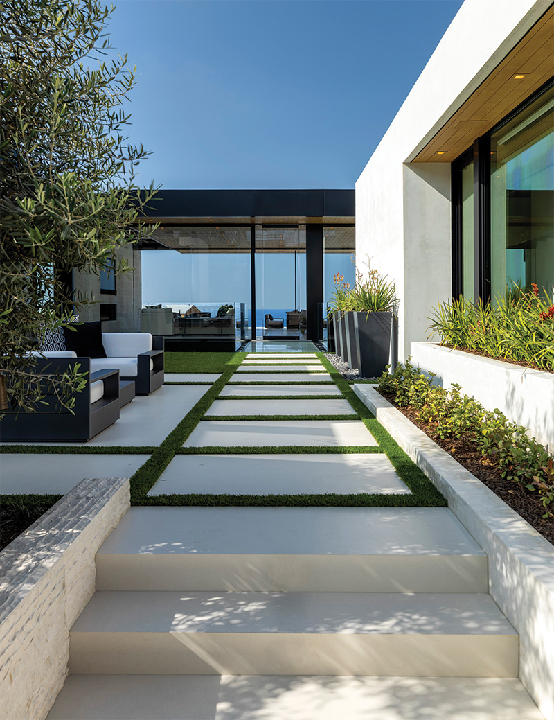
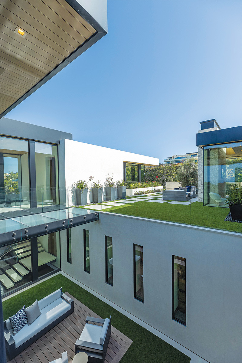
“Because it’s a relatively deep lot, we thought that introducing a courtyard into the middle of the house and then dropping a light well into the basement as a way to handle the amount of program and allow more rooms to have natural light, and also maximize use of the view,” explains McClean, who worked with builder Jake Winkle of Winkle Custom Homes and interior designer Michael Fullen of Michael Fullen Design Group.
“It allows light to penetrate from both sides deeper and you can get some relief from the ocean breeze. It also creates this really pretty entry sequence where you come up off the street through a series of walls, and as you cross the courtyard you come to a bridge, and the bridge itself [it’s a glass bridge], so it’s an event. You really feel a sense of excitement coming to that front door, and a change in your environment away from the street.”

For the initial design concept, it was important to fulfill all of the basic requirements for the couple with an open living plan, separate office entrances, and an informal dining room. “They are moving into a different stage of life with both children grown,” says McClean. “So, it was planning a family home that will work better for them and encourage family gatherings when they come home.”

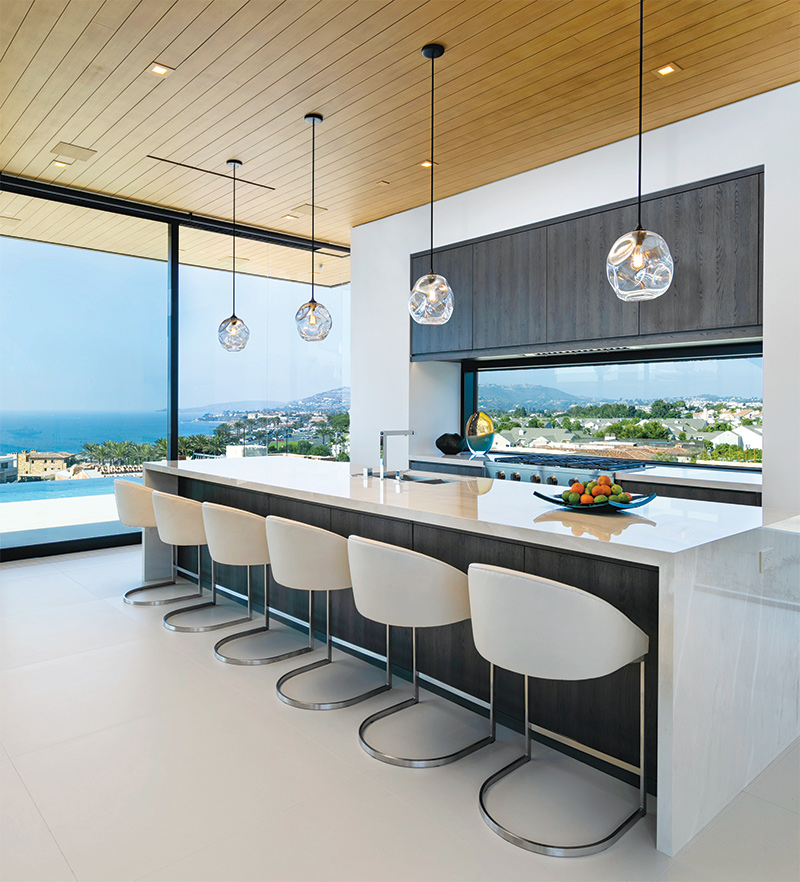

They also wanted to take advantage of the surrounding ocean views. “Paul did an amazing job in accomplishing that with the architecture,” adds Fullen. “It was important to the couple that whatever was done on the interior would not take away from the view. They also wanted a clean livable interior that reflected them and wasn’t a typical look.”
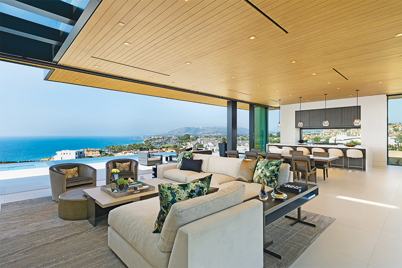

The indoor/outdoor space features a striking blend of unexpected materials such as a powder room with a Bluette du Fond onyx polished slab from Venetian Tile & Stone, and a Vitraform sink in Starphire Pearl; a kitchen appointed with WOLF appliances; Marmi Estremoz Crema Polished Porcelain countertops from FMG Fabricca Marmi e Graniti; “Infinity” pendants by John Pomp; and Holly Hunt stingray counter stools in Daybreak.
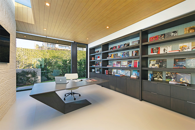
The downstairs office is lined with the couple’s album collection, “Horsehair” wallpaper by Phillip Jeffries, and a sculptural “Furtif” desk by Roche Bobois. “There are a few spaces that are at the top of my list,” explains Fullen. “The main level great room is first for the seamless design, and second is the office because it reflects them completely. They have great stories about the album collection and what each means to them. I also love the clean visuals both inside and out and how the building doesn’t create a separation between the two. They live in harmony with one another.”
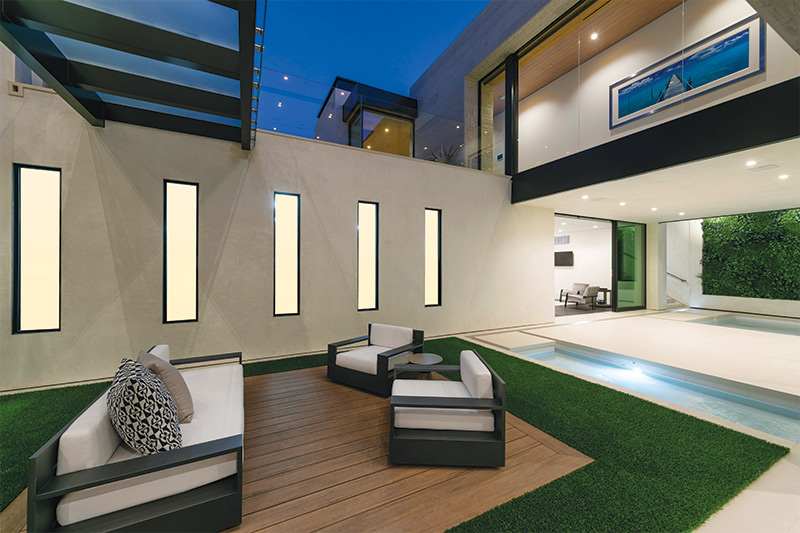

But, equally as noteworthy as the interiors and the architecture, McClean carefully considered the couple, the way they live now, and transitioning to the future. “They were such enthusiastic clients, and we were always trying to seek out the things that made it more personal to them,” explains McClean. “A common theme in our design is that feeling of transparency and trying to figure out how to give people the privacy they need, but keep things as open as possible, and have it connect between levels. The goal is not to shut everyone away in little boxes. A home is the background to your life, it’s not your life. It’s there to provide a beautiful environment for the life that’s happening in it, not to be a thing in itself.”
For more inspiration, visit mccleandesign.com.
