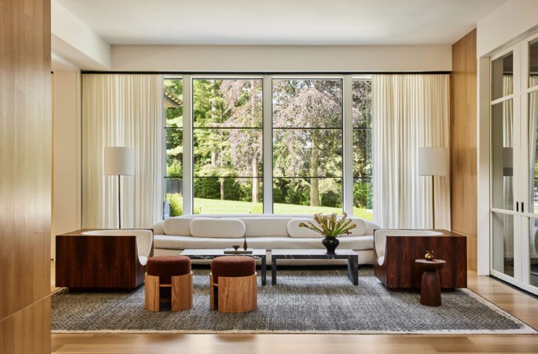
A family of five’s new home on Long Island, with interiors that took nine months from start to finish, opened its doors just as its newest member arrived. “Our client moved in the week they had their third child—a sweet baby girl,” says interior designer Monica Fried of the New York firm that bears her name. The clients wanted a home that would grow with their family, but that didn’t feel like it was built for three children. Instead, they sought to strike a balance between luxury, style, and the younger set.
The thirty-something couple first turned to architects at Mojo Stumer Associates, who sited the home carefully on a cul de sac at the edge of a golf course, then screened it so it’s barely noticeable. That was a deliberate gesture, since this family cares about its privacy. “It’s a big home, but we’re under-the-radar people,” the client says. “On the outside, you’re not sure what to expect when you pull up—it looks traditional, but inside it’s so modern.”
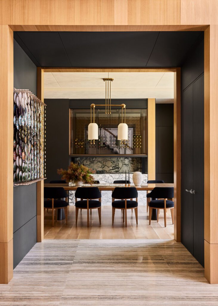

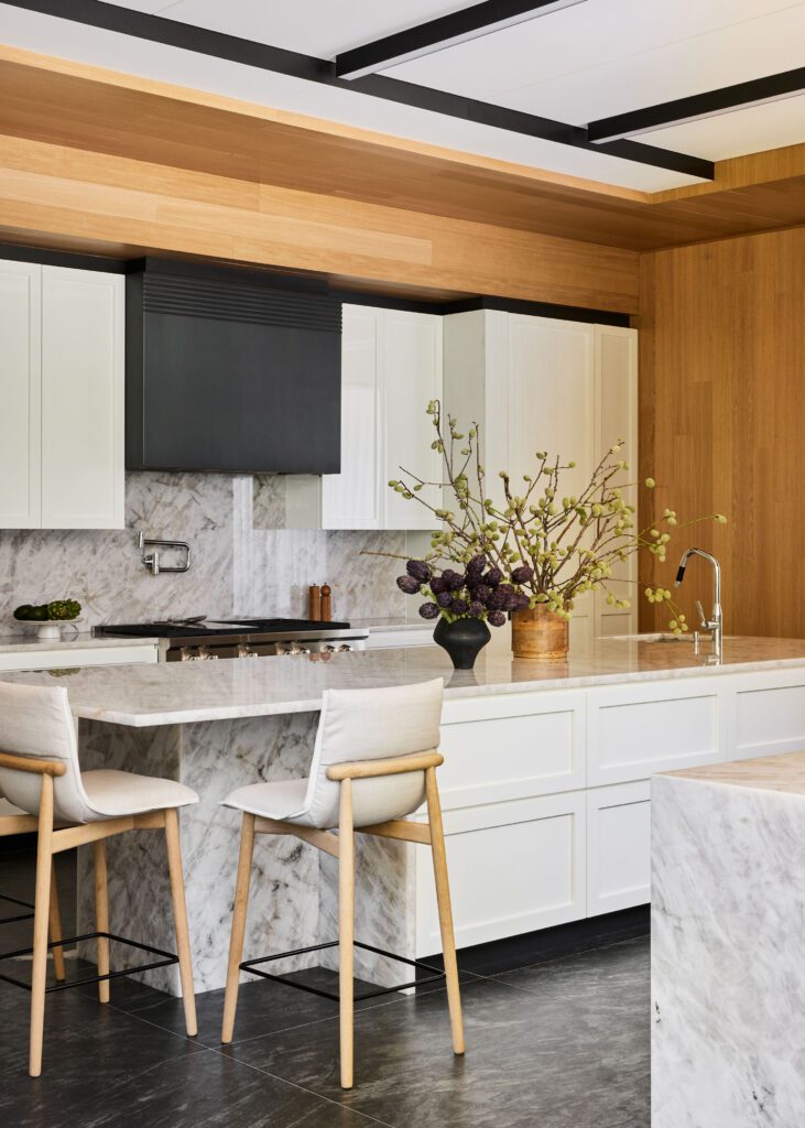

That’s because interior designer Fried, who was called in when Jon Bijari Custom Homes was halfway through the project, understood how to close the gap between conservative and contemporary. Her clients wanted interiors that were transitional, modern, and clean, but in no way trendy. “She gave us four or five choices for everything, and I loved each one,” the client says. “It’s smart and warm—and it just works.”
Fried says the design process was a two-way street, with clients who gave her freedom to present the best possible ideas. Their directive was to be timeless, to be young-feeling and to be modern, and in 15 to 20 years, to be still relevant.
Toward that end, she worked with the builder and clients on material finishes like white oak paneling for gallery walls, travertine marble for entry floors, and onyx quartzite for kitchen counters. “The powder room has a marble, a beautiful Calcutta Viola, with fluted tile walls and a matching vanity,” Fried says. “The floors in the main living room are white oak, and the kitchen has tile floors, a dark granite.”
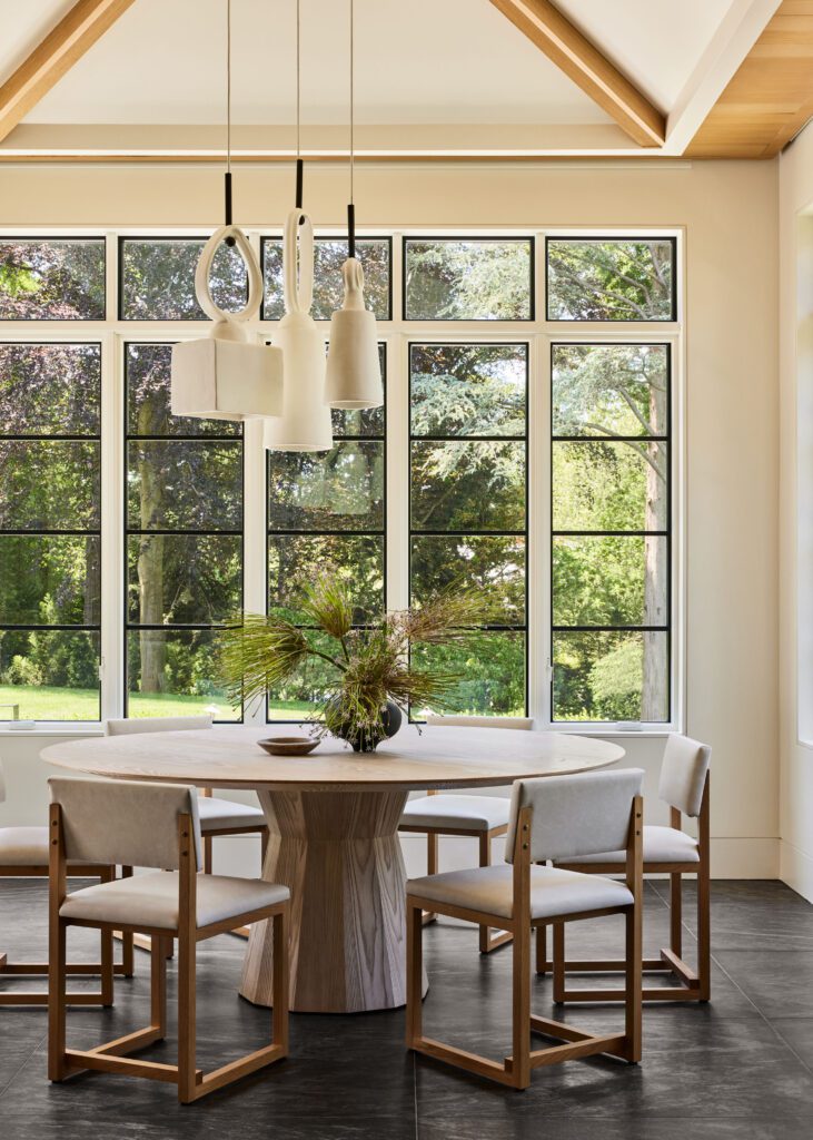

The oak-paneled front entry leads to a formal living space, with the dining room, kitchen, and family room flowing off that entry. Upstairs are five bedrooms and a large playroom. Below grade is a full basement, with a walkout to a swimming pool behind the house.
Fried chose subtle tones throughout the interior, with wood and stone that create depth and interest for each space she designed. “The homeowners are interested in collecting art, and the neutral tones give them more flexibility as their collection continues to evolve,” she says. “They’ve already acquired several contemporary pieces by Jacob Hashimoto and Orly Maiberg.”
The home is 7,500 square feet, so one of the designer’s challenges was to bring it down to human scale. “That’s one of our strengths—creating a warm environment in a large home,” she says. “And we create intimate spaces by using warm materials and window treatments to make it feel cozier.”
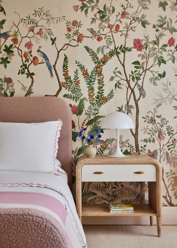

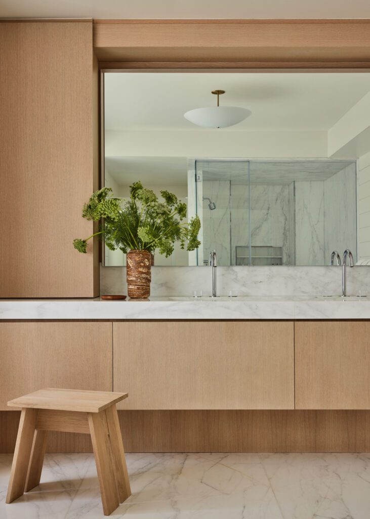

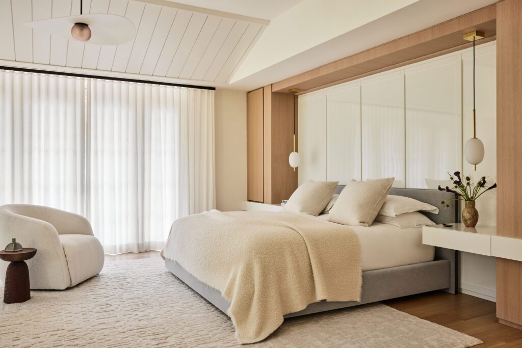

She sought out curated furnishings that were both functional and chic. The Brazilian lounge chairs by Jorge Zalszupin in the living room are excellent examples; they also offered a refined influence to help guide remaining selections. “There are some beautiful pieces that don’t feel like throwaways,” Fried says. “They feel really good, and are heirlooms in the making.”
Still, this is a house that’s designed to be home to three young children. It’s modern, to be sure, but it’s meant to be practical and super-livable, too. The designer used an abundance of indoor/outdoor materials for fabrics and rugs. Passing from the family room to the kitchen means moving through the living room—something that might have proven a challenge for any other designer anticipating children’s steps along the way. But not Fried.
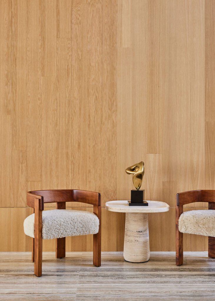

She managed to make it childproof and stylish, while paying attention to her client’s tastes. “It can stand up to some wear and tear. but it’s elegant and feels more sophisticated too,” she says. “She has an elevated sense of style that we homed in on here—I chose an aesthetic with things she would react well to.”
That meant presenting some of her own favorites—Pierre Frey, Dedar, Mokum, and Crosby Street Studios—but focusing on finding durable and forgiving pieces that would work for a young family. “Nothing’s too precious here,” she says.
Her thoughtfulness wasn’t lost on the homemaker she collaborated with. “She can walk into a space and make it feel cool, and that you are important,” her client says. “She can bring in warmth so it’s doesn’t feel like a museum.” That’s because Fried knew from the start that this would be a forever home for a family of five.


