For years, Susan Smith longed for a beach house where she could hang out with and entertain family and friends. Her husband, Jay, wasn’t so keen on the idea. A second house, he reasoned, wouldn’t be relaxing: It would mean more work and responsibility.
But when they discovered Georgia’s Sea Island, an idyllic, ride-your-bike-everywhere community within a comfortable driving distance from their Atlanta home, his doubts dissolved.
“Sea Island is beautifully remote and beautifully not remote at the same time,” Susan says. “It’s a quiet residential area in a hotel setting.”

Originally, the Smiths were going to expand and renovate the existing house, but after consulting Bulent Baydar, the principal architect in Harrison Design’s Atlanta office, they decided to erect a new house. His team, in collaboration with the firm’s St. Simons Island office, executed the design, and Joe Bowles Construction, based in St. Simons Island, Georgia, built it.
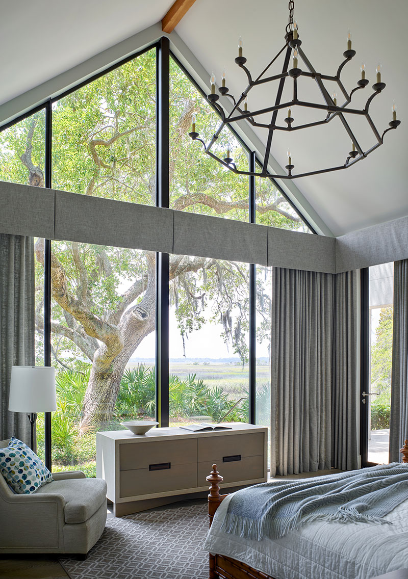
The couple added one large caveat: They wanted to preserve the live oaks that dot the 1.2-acre wooded property and to take advantage of the views of the marsh.
“Most of the trees are over 100 years old,” Susan says, adding that “it’s a house of the trees.”
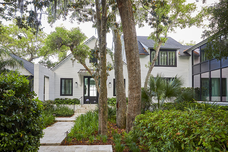

The L-shaped farmhouse weaves around the live oaks, including the magnificent one outside the living/dining area that is the centerpiece of the home’s original wooden deck.
Although Sea Island requires residences to be in a traditional style, the Smiths envisioned a more contemporary aesthetic, which is why the Harrison team decided to design a farmhouse that “creates the impression of generational architecture” that evolved over time, Baydar says.
“We wanted a place where we can kick back and relax,” Susan says. “And we didn’t want it to look like our main house, which is traditional. We wanted clean lines and lots of windows to take in the great vistas.”
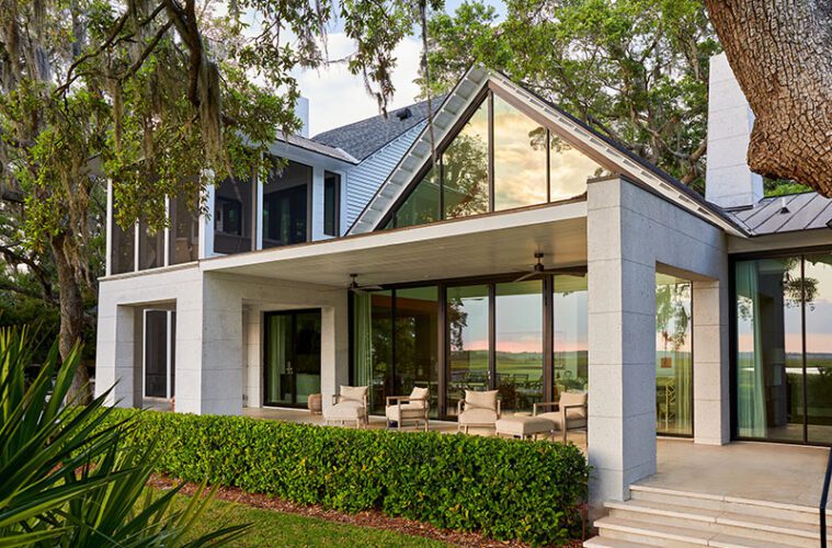
The materials Harrison Design selected—masonry, wood, and glass—define three distinct yet complementary time periods in the farmhouse’s fabricated past.
As a gesture to history, the contemporary farmhouse is erected around a new massive, open wall of masonry with a chimney that looks as though it’s from a much earlier structure. The so-called “older” elements of its façade are defined by a subtle tabby stucco treatment, whose stenciled grooves mimic cut stone, a rustic feature.
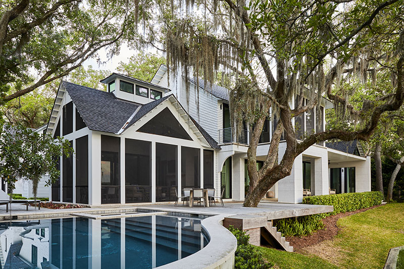

The farmhouse, which is clad in five-inch clapboard siding and has a standing-seam metal roof and wooden purlins, gets its contemporary edge from dramatic glass A-frames.
The L shape of the house allowed Baydar and his team to continue the illusion of a compound that had, indeed, been created over generations.
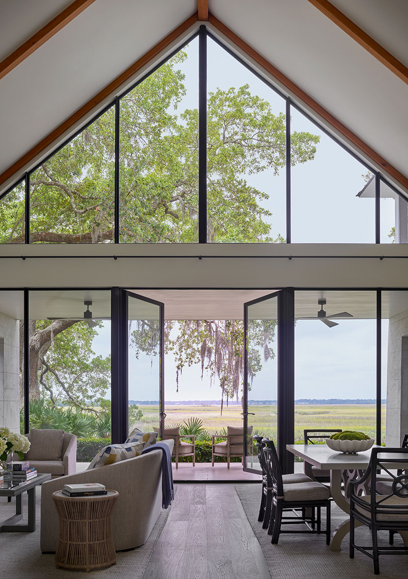
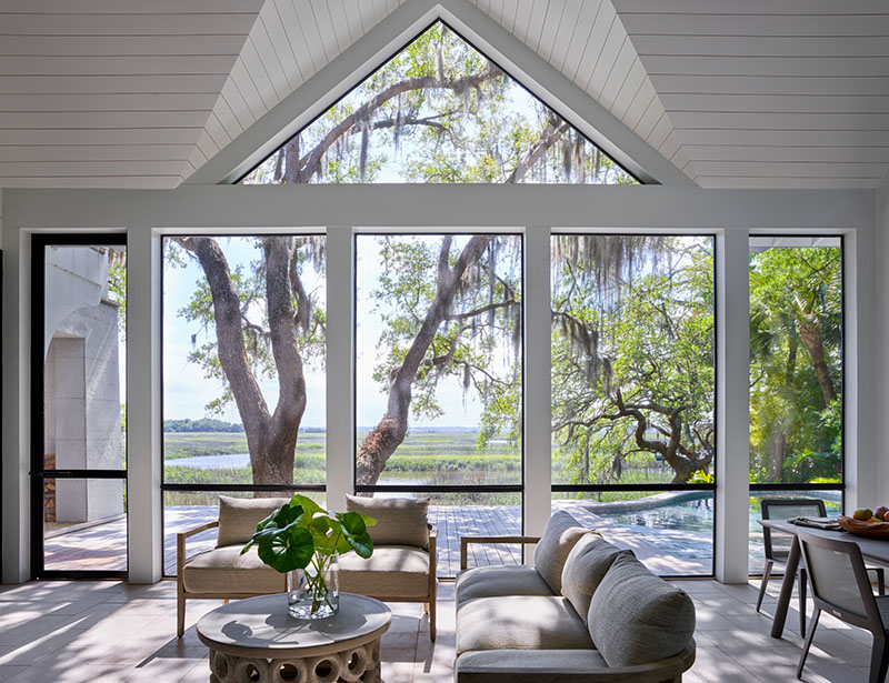
The L’s one-story long leg, the more traditional section of the farmhouse, has vaulted ceilings and contains the major rooms—the living/dining area, the primary suite, the family room, the kitchen, the office, and the screened porch, which is illuminated by a clerestory window in its cupola.
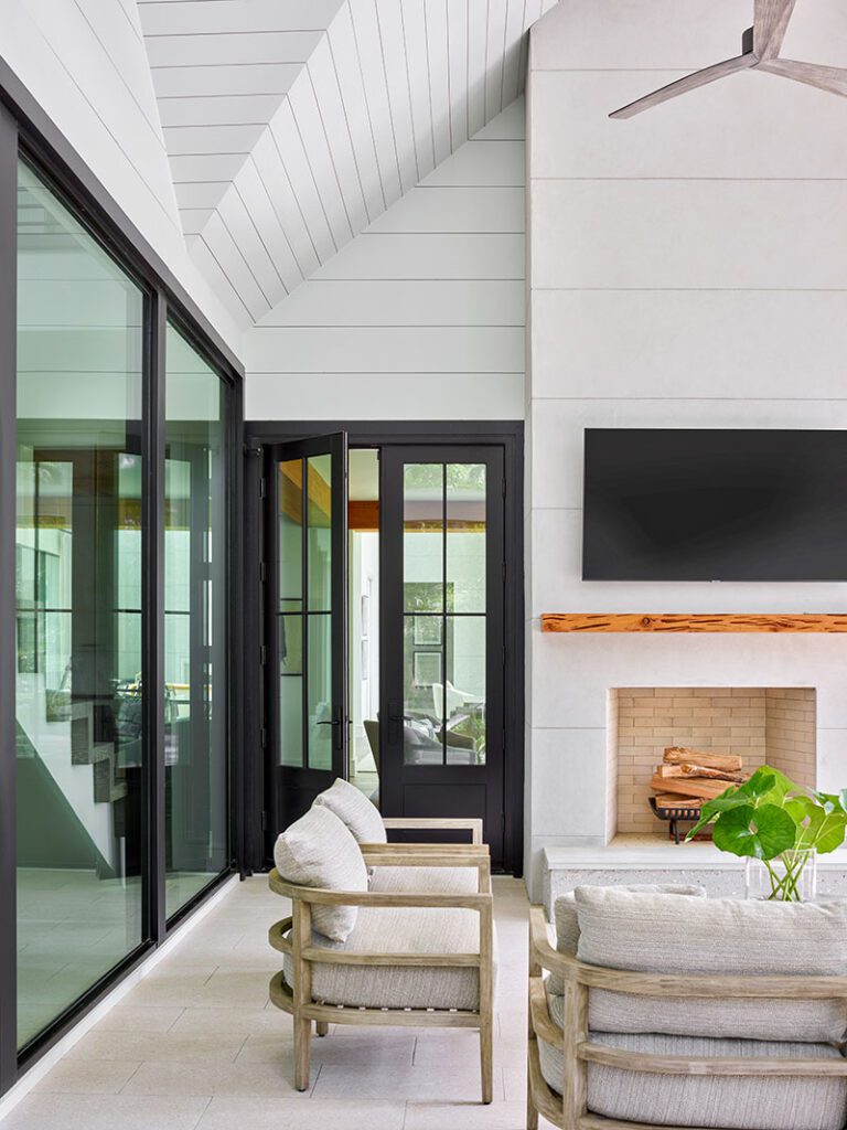
Sleek steel doors and windows, another slightly more contemporary touch, create an indoor-outdoor air.
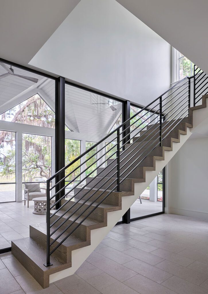



The shorter, two-story leg, which houses a guest wing and a two-car garage that is styled as one of the older sections of the farmhouse, offered another opportunity to modernize without compromise: The back-facing wall is all glass.
The farmhouse’s main staircase, which is illuminated by room-height windows, is a traditional-contemporary masterpiece. It floats in the space, its plain, industrial-style aluminum railing a counterpoint to its French oak treads.
The home’s interior, by Bill Mohr of Atlanta-based Stewart Mohr Designs, features a palette that is a study in restraint. Wide-plank French oak floors, which are so light in color they look as though they’re lime-washed, ground the white art-gallery-like walls and the plate-glass windows and their minimal frames.

Like the façade, key features of the interior, including the fireplaces in the living/dining area and the screened porch, are plastered in tabby stucco, odes to the residence’s supposed storied evolution.
The screened porch, one of Susan’s favorite spots, is clad in tongue-and-groove boards that rise to its cupola.
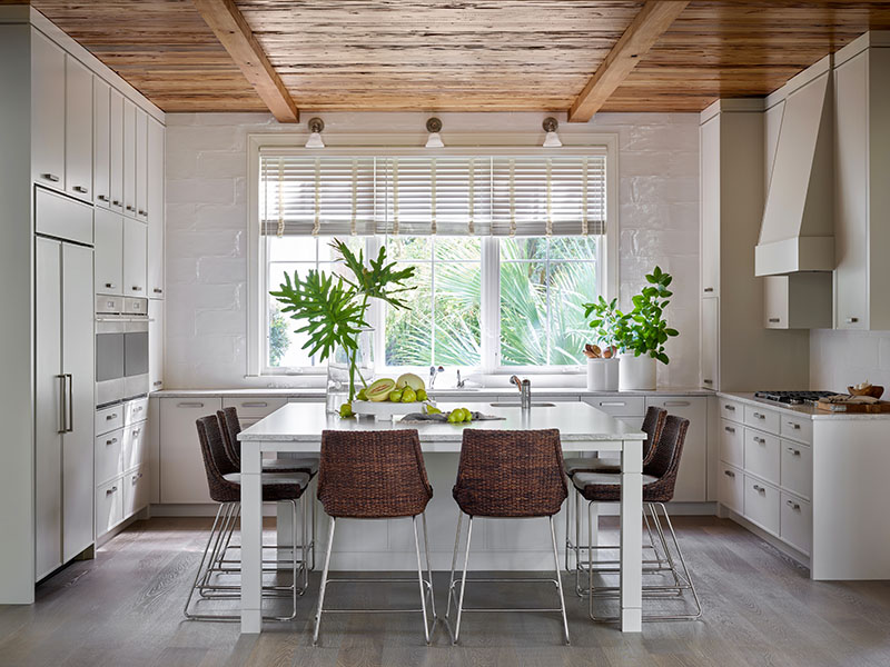
The kitchen, where the Smiths spend a lot of time, is a light taupe color with white accent tile. There is a trio of windows over the sink and a large central island that’s styled as a farm table, complete with a sink. The ceiling is clad in pecky cypress, the only element that was reclaimed from the original house.
“The juxtaposition between the modern and the traditional elements in the farmhouse,” Baydar says, “plays well together. It creates a pretty harmonious structure.”

The Smiths couldn’t agree more. Susan loves waking up each morning and viewing the old live oak and the marsh from her bed.
“It’s a beautiful, restful place,” she says.
And she’s most pleased by the fact that Jay, too, has fallen in love with the beach house.
“He loves it—maybe even more than I do,” she says.
Learn more about the project team
Architecture: Harrison Design
Interior design: Stewart Mohr Designs
