Three minutes from the center of a tiny town in the Hamptons lies an expansive home that’s all about a family’s interaction with each other—and their environment. Its owners, a New York couple who wanted to watch their children grow up on the two acres they’d purchased, turned to a pair of legendary modernists to make that happen.
It was an assignment that architect Peter Bohlin of Bohlin Cywinski Jackson, and landscape architect Ed Hollander of Hollander Design took to heart and executed flawlessly. It may be a weekend retreat, but they designed it for year-round use.


Photo by Peter Aaron/Esto
The home has well-designed indoor/outdoor areas, places to entertain and play.
THE COLLABORATION
The project was a team effort. “We were trying to create a setting for a jewel-like piece of architecture,” says Hollander. “Peter designed a sculpture, so the built areas and landscape are like two hands attached.”
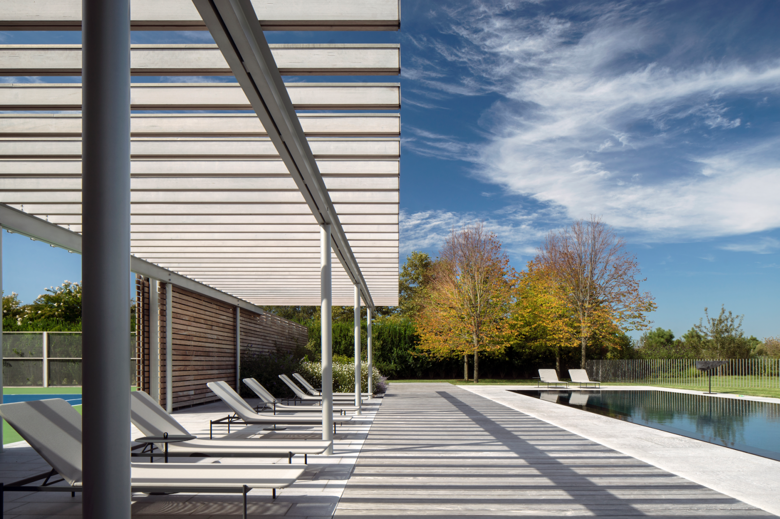

“The landscape and the home work hand-in-glove,” agrees Bohlin. “It’s the thing we tend to do—if you don’t do that, it’s kind of foolish.”


Rectangular in shape and located a block from the Atlantic Ocean, the post-agricultural lot offers all the advantages of being near the beach but few of the disadvantages. “It’s as though it’s on the ocean in terms of wind, salt, smell, and sound, but there are no waves pounding through the front door with every storm,” Hollander says.
THE CHALLENGES


There were challenges, to be sure, since the nearby village can limit a home’s footprint based on lot size. That affected the structure’s shape and its 8,000 square feet, including its ground-level living spaces and guest quarters and the children’s bedrooms and master suite above.
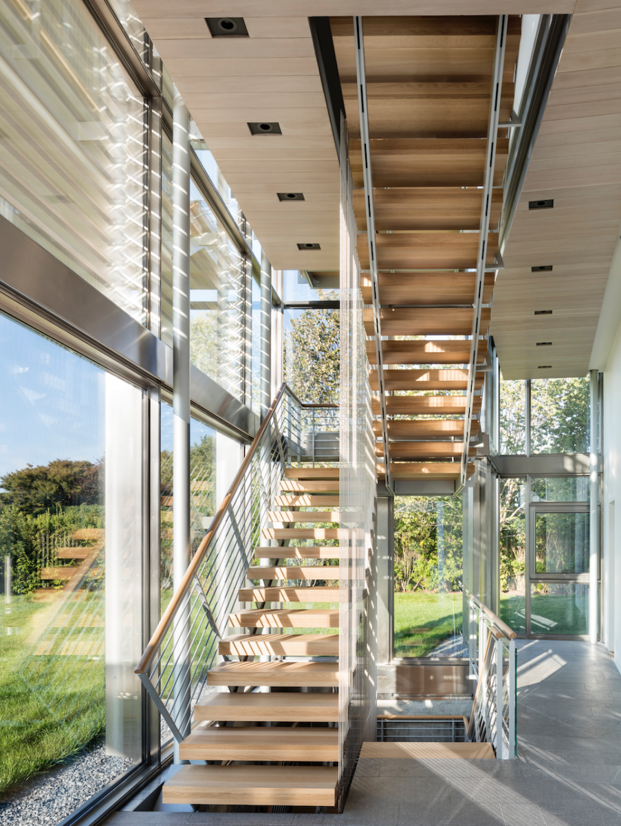
Bohlin designed transparent stairways for both the building’s east and west ends. At the west end facing the sea, the more formal main entrance is recessed, with sculpted teak walls, floor, and door (and custom-designed stainless steel handles). “The experience of entering there is quite different from the entrance to the east, which is more of a filter,” the architect says.
Although the site’s set back from the ocean, there are still commanding vistas to be had. Bohlin carefully aligned the master suite to take full advantage, placing it as high as possible on the east end. “We were mindful of the sun as well as the views, so the building twists slightly in shape,” he says. “We turned it a little to the southwest, where the master component is not only at the highest point allowed but also angled to the best views.”

That meant eschewing right angles at that end of the home. A less sensitive modernist might have lined it up in a direct rectangular fashion, but that wasn’t the solution sought by Bohlin—for two good reasons. “First, it would not twist to the best view of the sea,” he says. “And second, there would have been a harsher relationship between the study and deck in the master suite.”
So he turned it 15 degrees, made the master wider and pushed it toward the ocean. “That’s the kind of thing we do—it’s more nuanced and the shape is varied,” he says. “When you’re approaching the building up the drive from the west, you see the far end of the building coming into view and that’s a pleasing thing.”
Typical of Bohlin’s work, the overarching idea was to help the owners interact with their setting. By choosing not to create a plain orthogonal form, the architect gave them a far superior connection to their environment, inside and out.
THE LIGHT
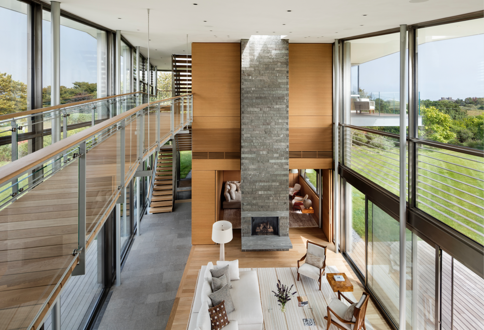

Bohlin paid special attention to how sunlight strikes the home in summer and winter and from morning until night. It pours in nonstop from both sides of the glass-clad structure. Above a double-height chimney in the main living space, a huge light box steers and splashes the sun’s rays down onto the masonry surface. “We’ve been testing that over the years,” he says. “It’s a great way to make those spaces much richer.”
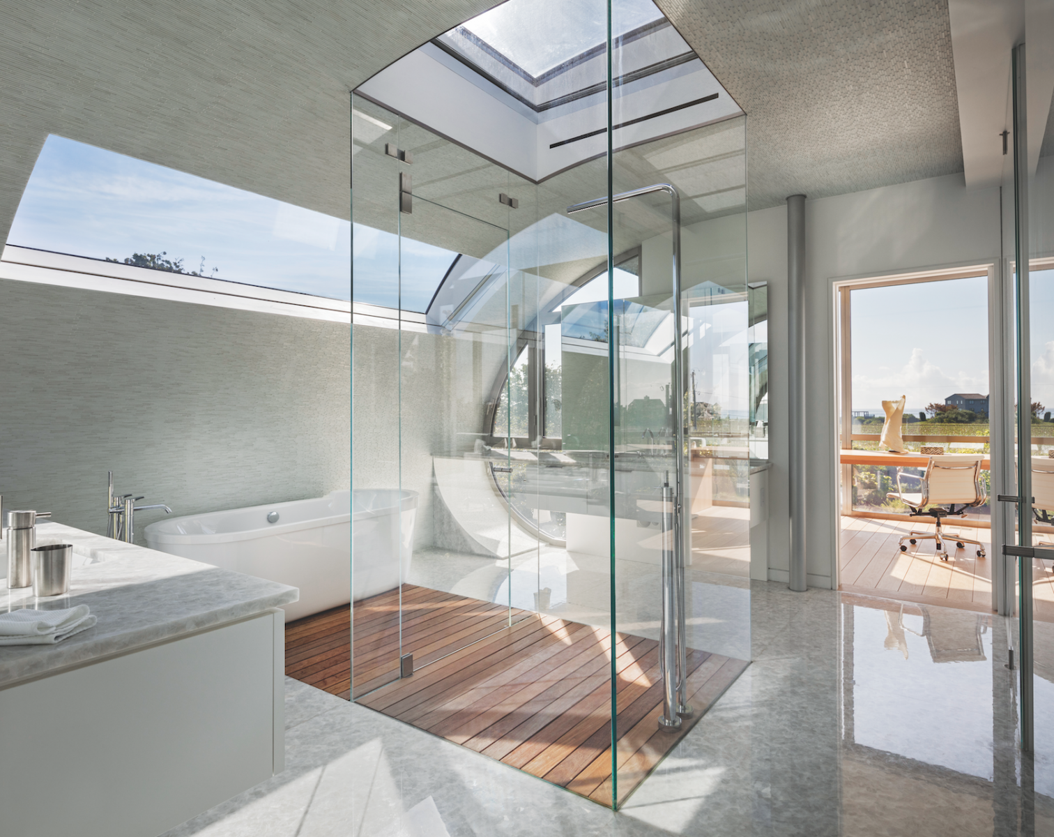
At the high point of the master suite is a brightly lit bath, flooded with sunlight from window and skylight. “In this case, there’s a fine quality of light for the glazed glass shower in the middle as it comes down over the tub and the tile,” he says. “The client and the interior designer, Tony Ingrao, picked out the tile together, and it glitters; it’s subtle, but it glitters.”
THE ARCHITECTURE
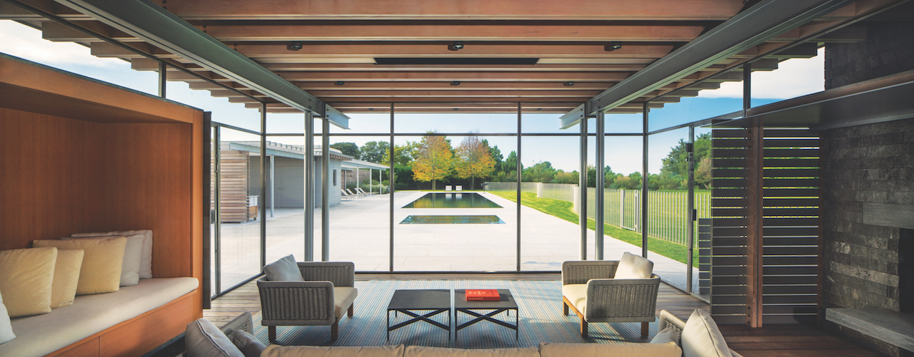

Bohlin achieved a house that respects his clients’ desires for privacy as well as openness to the surrounding land. Beyond that, it’s a home that addresses how people circulate through it and what they see along the way. “It’s about what you reveal and what you don’t; our buildings are like paths where you discover things,” he says.
In part, that means views of who’s where, especially the children. “The clients can look out along the length of pool and see the children as they’re growing up,” adds Bohlin.
Chosen materials throughout are all about lightness, from slender columns and taupe-toned Vals quartzite to the softly stained risers that seem to float up the stairwells.
THE LANDSCAPE


Landscape architect Hollander picked up on this lightness theme outside, starting with the pool area’s fence: “It’s a kind of almost erotically sinuous fence, a sweeping line separating the mowed turf from the flowering area and fruit-bearing trees,” he says. “It’s almost as if it’s alive as it meanders and snakes its way across the property.”
The idea was to create a pool fence that wasn’t just a static piece in the landscape, and one that complemented Bohlin’s equally sinuous design. “It’s about the collaboration between an architect and a landscape architect,” Hollander says. “It’s a direct response to the building’s curves and sweeps.”


Hollander approached the landscape overall by breaking it down into three ecologies. First there’s the site: what wants to grow in a place so close to the ocean? Then there’s the architecture: how to fit a house, pool, and tennis court? Third there’s the human ecology for a multi-generational family: how will each generation use it? “You need to understand those three components and from there start to design and lay it out,” he says.
Upon arrival, a boardwalk leads from the parking area to the formal entrance. To the west of the house is the tennis court, hidden on three sides by a privet hedge. To the west of the court is a vegetable garden and to the north are fruit trees and berry bushes, forming “an amalgamation of wildflowers and shrubs that birds live in and pollinators inhabit,” says Hollander.
On the eastern side of the house is the pool, anchored on one end by a square of four linden trees (mimicking the form of the home’s screened porch) and on the other by a lounge area. East of the pool is the children’s’ play area, which extends out past the fence as lawn. The planting choice of fescue satisfied the clients’ request for a totally non-toxic, tick-free landscape and is also sustainable, requiring much less water than bluegrass.
THE ELEMENTS

Each of Hollander’s projects is inspirational and different, growing organically from a particular combination of land, people, and architecture, and this one surely follows that strategic path. “The homeowners are wonderful and fun and Peter’s architecture is magical,” he says. “And for the landscape, the soil will grow anything and be mastered by the winds coming in off the ocean.”
Bohlin, who’s been designing homes from offices on both coasts for more than a few decades, agrees. “The climate, the sun, and the breezes are involved in all of our work, particularly our homes,” he relates.
In fact, he’s embraced them all here, with a home that deftly engages its environment—and its owners.
FOR MORE INFORMATION VISIT: bcj.com and hollanderdesign.com.
