After five decades of blurring the lines between indoors and out, Seattle-based architect Jim Olson now draws from a rich legacy of modern design.
So when a new client breezed into Olson Kundig’s Seattle office with a hand-drawn sketch for a one-room, light-filled cabin on Vancouver Island, Olson flipped through his mental rolodex to recall a few similar projects. One was a farmhouse wrapped in glass. Another was a residence called Earth House with chimneys at either end of a rectangular form.

Then there was Longbranch, the legendary masterpiece Olson designed for himself. He began work on it when he was 18 and steadily added to it year after year. It became a place to hone his skills and talents, to strive for perfection in line and space, and to merge into nature on a site overlooking Puget Sound and Mount Rainier.

Longbranch began as a living room, with a bath added later. Over time it became a 1,200-square-foot second home. Recently he added another 1,200 square feet for a master suite and guest rooms. “It started out for teenagers and now it’s for the elderly,” Olson says.
Before arriving at Olson’s office with his drawing, his new client had conducted his own due diligence. One of the homes he’d investigated was Philip Johnson’s Glass House in New Canaan, Connecticut, but the other was Longbranch. And he felt a strong affinity for it.

Olson looked at the sketch by the self-described frustrated architect and liked what he saw, especially the fireplaces on either end. “He agreed with the approach I was taking and then made it 100 times better,” the client says. “The lines are great and there’s symmetry. We got along great from the get-go.”
That’s in part because of their shared appreciation for what Olson created on Puget Sound. “At Longbranch, the cabin was built around a tree, and he did that here too,” says Will Kemper, project architect for the client’s new home. “There are feng shui qualities here, with the hill behind you and the water in front—you feel hugged and in safety, just like at Longbranch.”
The Site
The client and his wife already had a home on Vancouver Island’s Tofino Beach but he negotiated with his neighbor for a small, wooded oceanfront lot next door. “We agreed on terms—and to leave the trees,” he says. “I only wanted a footprint of 1,500 square feet anyway.”
A man of many appetites, the homeowner works in finance, collects art, and likes to cook. His Tofino restaurant Wolf in the Fog was recently voted the best in Canada. “He’s all into food,” Olson says. “He wanted a house where you could watch someone cook a great meal and sit in the same room and enjoy it.”

For the client, an avid surfer, the views from that room are especially appealing. “It’s amazing. It’s one of the best surfing places in North America year round with wetsuits,” Olson says. “You can surf in January and February because the water temperature doesn’t change. People are in the ocean in the middle of winter, even when it’s snowing.”
Just a quarter acre, the site is situated where Tofino and Chesterman Beaches are scooped out of the water like a giant scallop. “Big Sur? This is better,” says Olson Kundig interior designer Christine Burkland of the drop-dead gorgeous site.
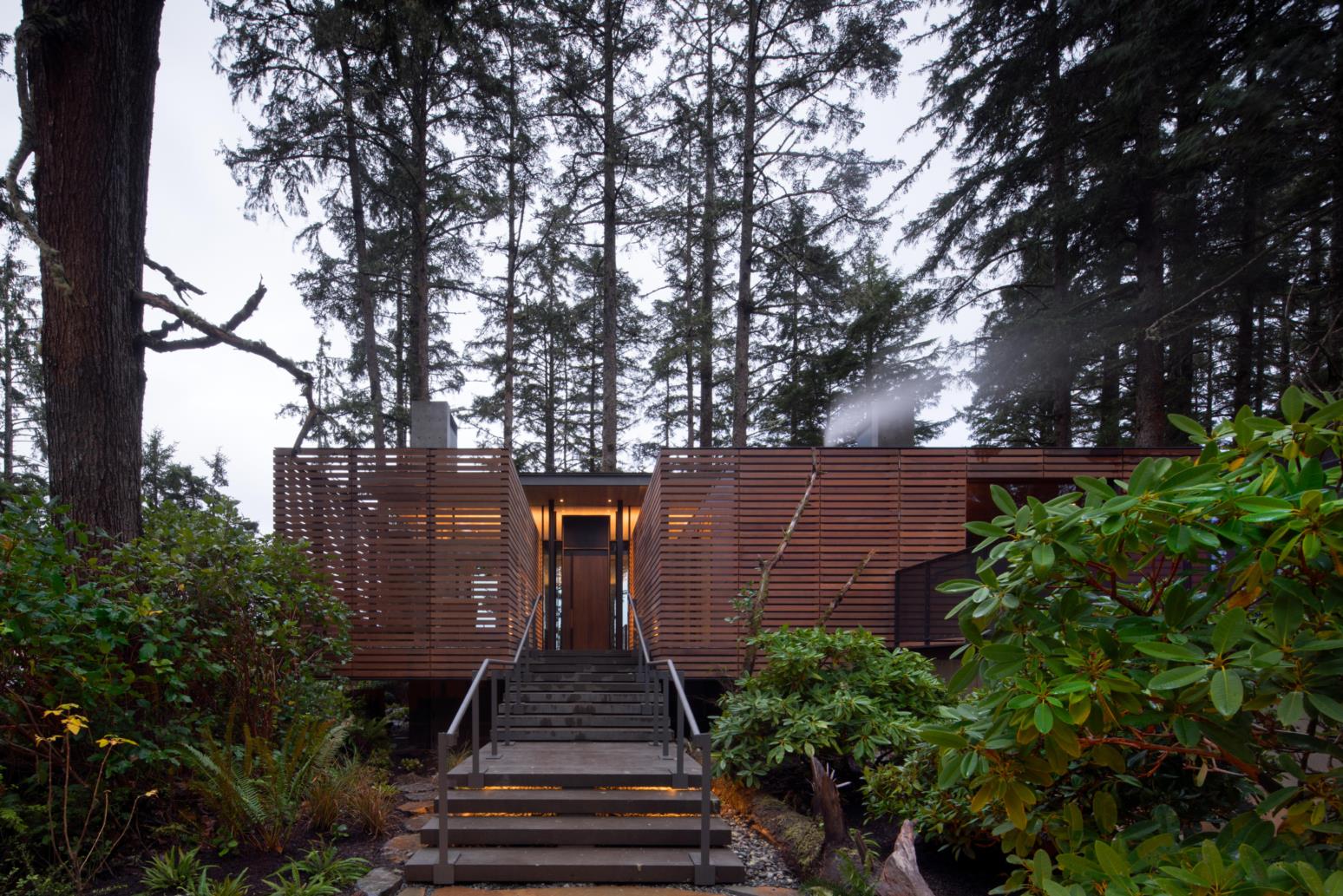
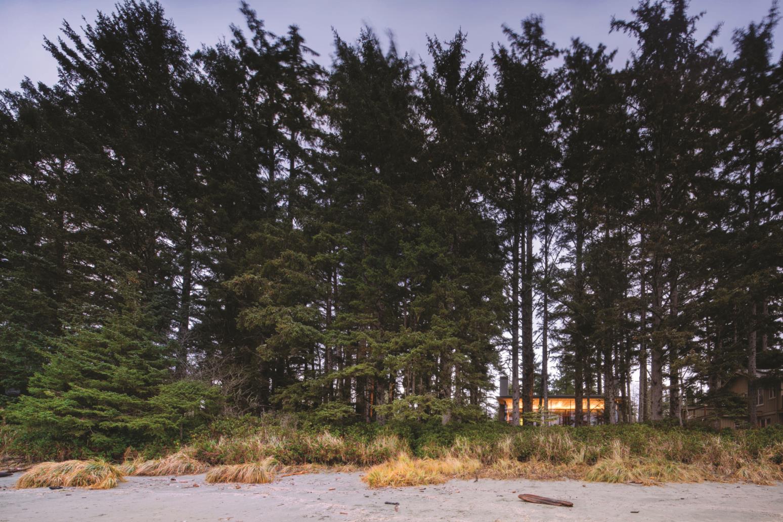
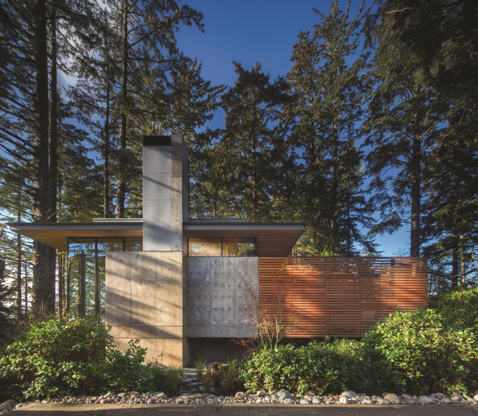
Olson nestled the new home into a forest of gnarled ancient-growth trees; then raised it over and cantilevered it above a six-foot-tall bed of native salal plants. “You feel like you’re in a boat, floating in a sea of salal,” Olson says. “It’s quite beautiful—there are winds year round and the trees are very weather beaten, with branches that look tortured because they’re sculptural and quite old.”

The Interior
The client’s original drawing called for a one-room house with a kitchen at its center. Olson modified that to place a bedroom suite behind a wall on one side. The couple entertains family (they have three children) and friends in the great room, but after dinner they all return to the main house on the adjoining property. “The kids can go back there and make a big mess and the parents have this little jewel of a house to themselves,” says Burkland.
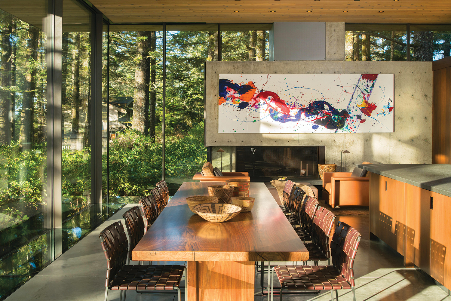

Its interior design reflects the owners’ tastes, with the twin chimneys tailored specifically to accommodate two contemporary works of art: one by the late California artist Sam Francis; the other by Argentine Diego Singh. “He’s a younger artist, so we have an older and a younger one,” the client says.
All of the furnishings, with the exception of the dining chairs, were custom designed by the architect and his staff. The client’s brother made the 12-seat dining table, with blackened steel base, from a single slab of Oregon walnut. Olson and Burkland handled the rest. “We’d sit down and work together with the artisans to make it happen,” Burkland says. “We made models and prototypes of the furniture and would sit-test them.”

The furniture is part of Olson’s vision for a house—open in front and grounded in back—that takes advantage of its site. On one end at the rear are two large leather chairs and an ottoman, and on the other a built-in sofa. Closer to the front are lighter elements like a leather chair with a canvas under-seat that snaps on and off. “They’re basic comfort things,” says the interior designer. “It becomes peaceful because it seems so right; it’s an understatement and not over-decorated.”
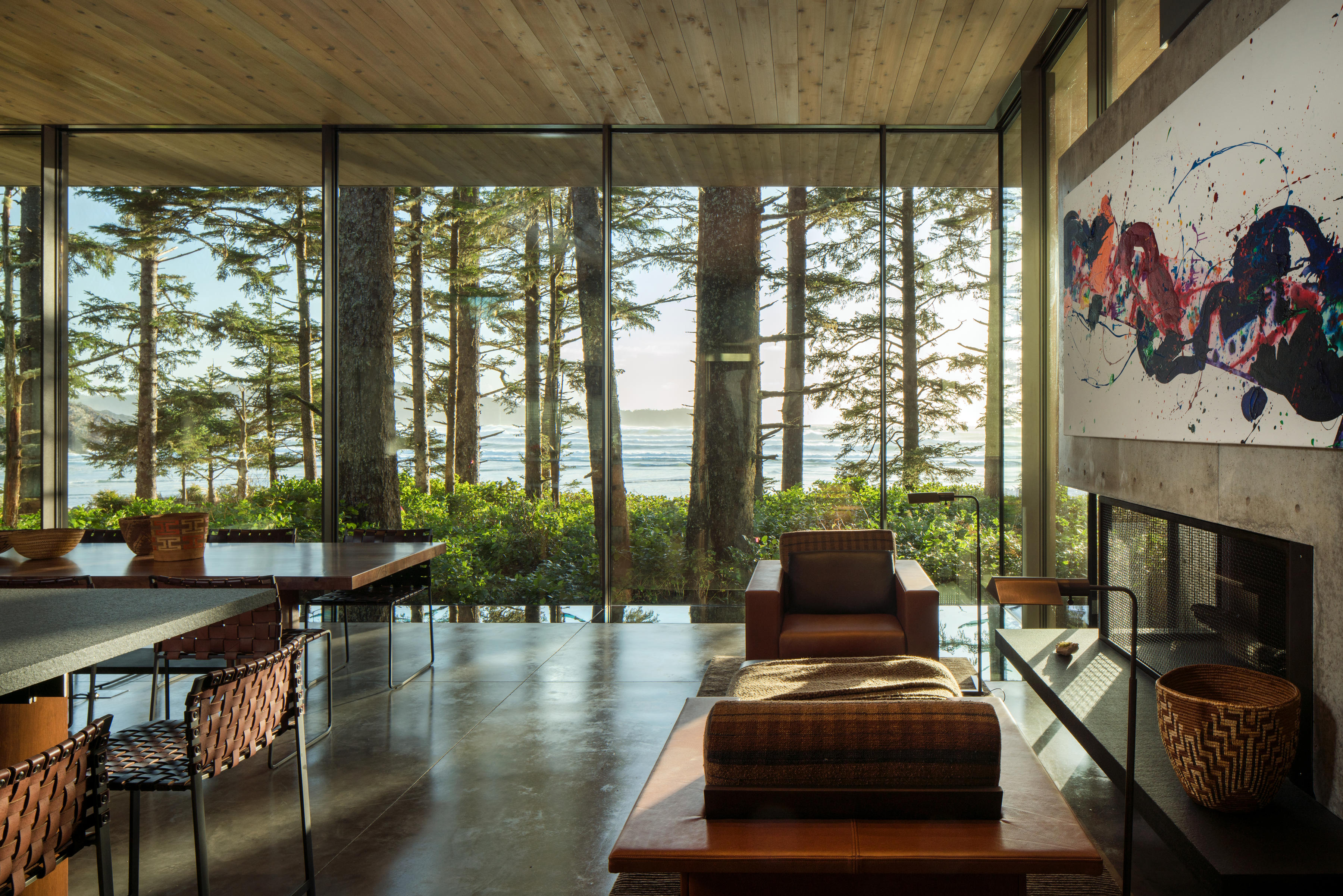

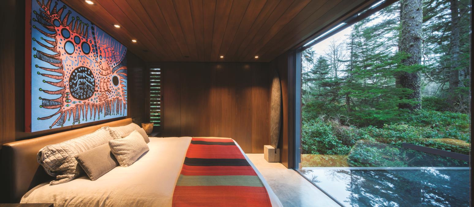
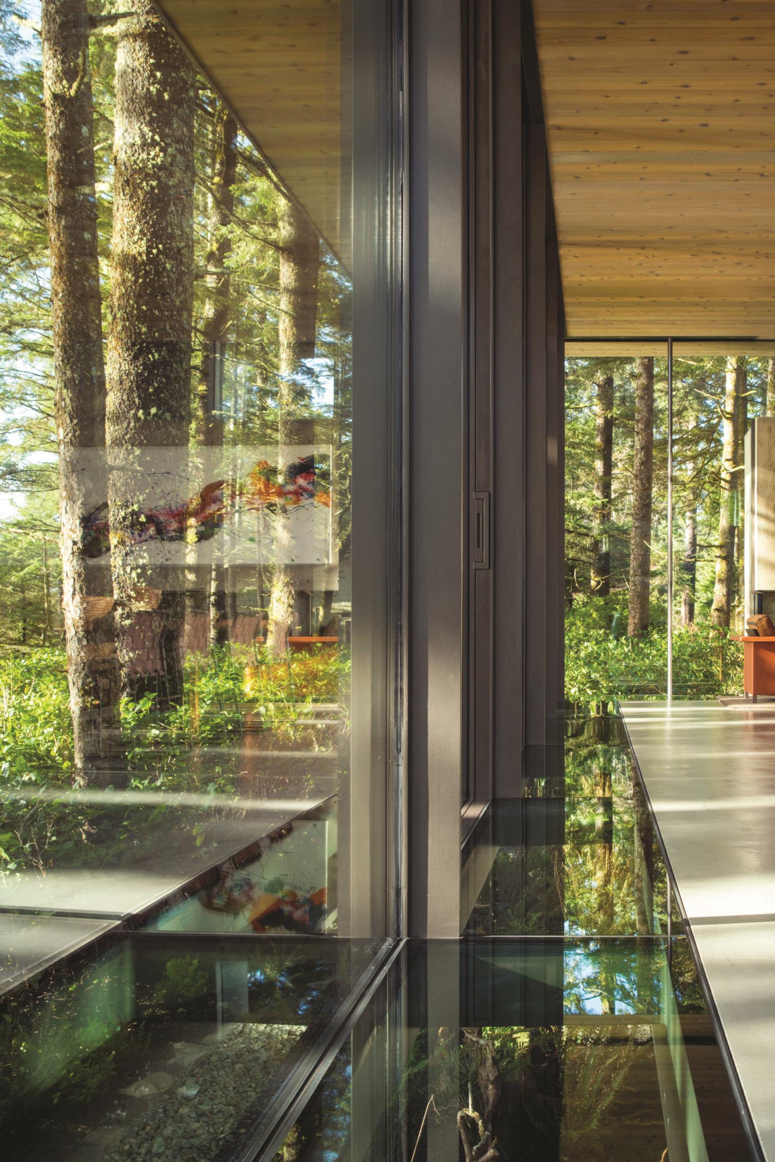
Clerestory windows offer views up to the forest canopy. Floor-to-ceiling glass opens out to sweeping vistas of salal and sea. And a band of glazed flooring on the great room’s perimeter adds a third dimension. “The glass floors make it seem like a magic carpet, like a concrete raft floating in the salal, heading toward the sea,” Kemper says.
Olson sees architecture, interiors, furnishings, and art as one unified entity blending into its site. “If you were going to build a little camp on the ocean and live there in the outdoors, you might build a room like this, solid and protected at the back, looking out at the ocean towards the south where the sun comes from,” he says. “The whole situation is based on what a primitive people might do to build a comfortable shelter but with modern architecture.”
The Materials
The architect’s approach here was intuitive as he minimalized the material palette. He wanted people to be as close as they could to the outside, unencumbered by architecture. “It’s there only to protect you from the elements,” he says. “You’re close to the site and protected and feeling natural.”
Achieving this goal meant collaborating with structural engineers to support a roof sans columns. Two concrete chimneys with a steel frame in between provide that support. “The effect is that windows and clerestory almost completely encircle the space,” Kemper says. “The chimney is 16 inches of concrete up to the clerestory and the rest is framed wall with decorative zinc paneling. It was fun—actually it was structural acrobatics.”
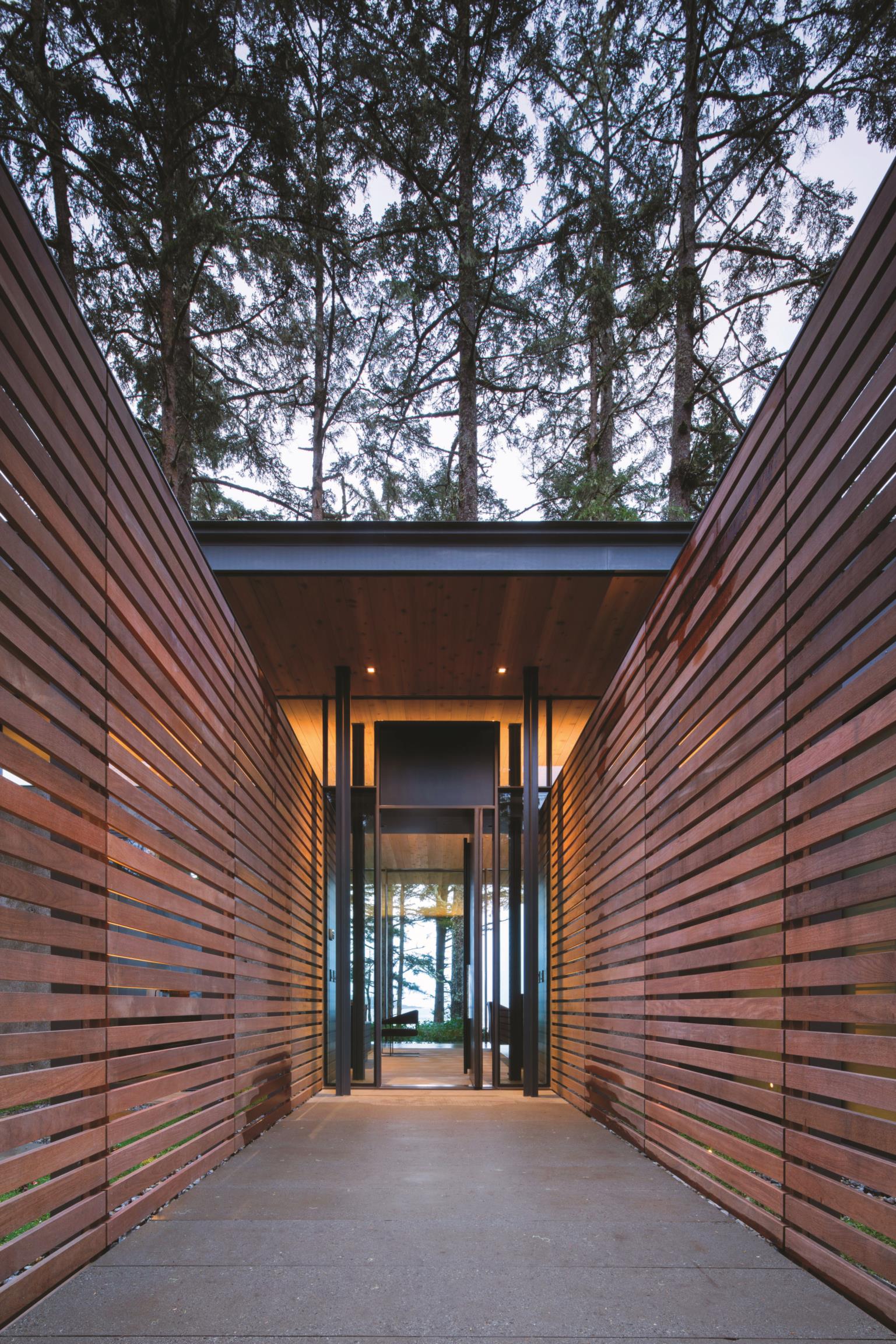
In addition to the concrete, glass, steel, and zinc panels, the architects used a variety of woods, including cedar for soffits and ipe for slats on the backside that keep the garden private without blocking light. Inside there’s plenty of walnut. “It has a dark feel, with very straight lines, and no knobs so it’s very smooth,” says the client. “The rawness of the concrete combines with the smoothness and richness of the wood, keeping it in the yin and yang of old nature and modern design.”
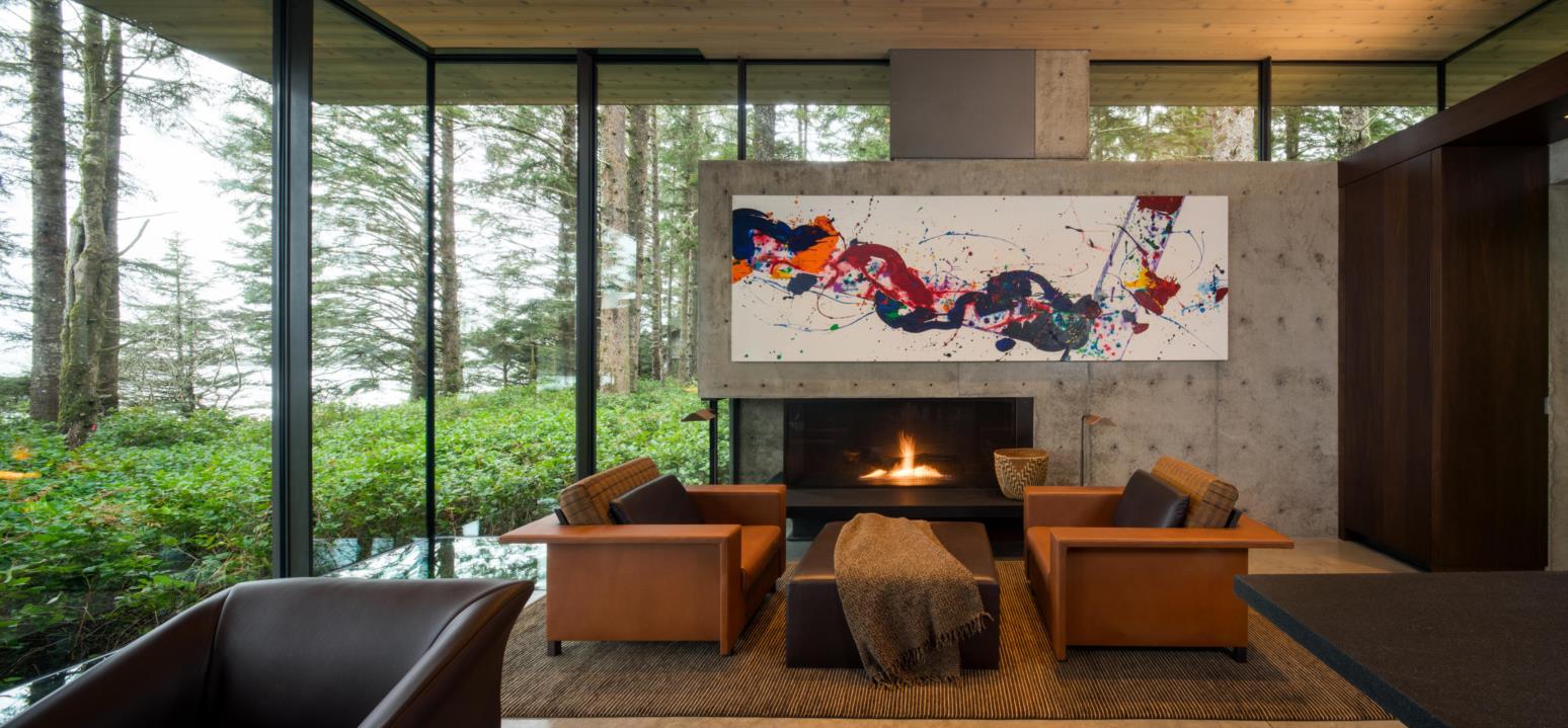

All in all, this architecture delivers an ephemeral experience just steps away from one of North America’s best beaches. “There’s no deck, but the glass bands inside make you feel like you’re on a deck or a cloud in nature,” the client says. “You see the waves, and then you open the glass and hear them. The whole structure is meant to give you that sense of floating.”
For more information, visit olsonkundig.com.
