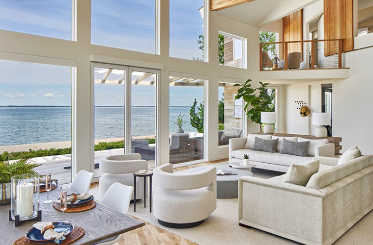
Having recently completed renovations, the owners of this Southampton, New York, summer home presented Elizabeth Gill with a beautiful, blank canvas to decorate. Taking cues from the contemporary architecture and dazzling water view, Gill created a modern retreat that invites relaxation. The vibe is both sophisticated and comfortable. “It’s an elevated take on a family home,” the designer says.

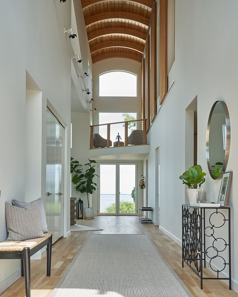
The house captivates from the first step into the foyer, which stretches straight back to the beach. Above, the barrel vaulted, double-height wood ceiling adds a church-like aura. “The space is grand, but spiritual,” Gill says. A Belgian, looped wool sisal runner leads the eye past a mature fiddle leaf fig, through tall glass doors, to the water. A bench with a rush seat and a sculptural, black iron console anchor the front of the hall, providing practicality without distraction.

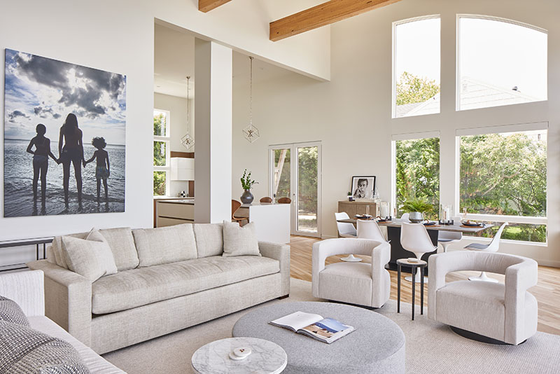
An expansive, two-story living space with slanted ceilings punctuated by rustic wood beams runs along the back of the house. A double row of oversize, plate-glass windows offers a seamless connection to the outdoors, where a sun-bleached wood deck and rosa rugosa run parallel to the house, just a few steps from the beach. Gill’s monochromatic scheme, like the landscape, is tranquil, textural, and timeless. “The design stems from the property itself,” Gill explains.
A creamy wool rug defines the seating area. “The larger the rug, the larger the space feels, so we went as big as we could,” Gill says. When selecting furniture, the designer balanced clean, contemporary lines with ease and comfort. She also stuck with neutrals. “We created excitement by varying shape, texture, and scale,” she says.



The centerpiece is a deep sofa upholstered in a tweedy, tone-on-tone neutral stripe. Its mitered side panels offer a touch of traditional luxury that holds the room; it’s juxtaposed with open-backed mod swivel chairs. The other sofa, done in cozy, ivory chenille, sits quietly against an ash console that adds warmth. “I don’t use bright white because it’s too austere,” Gill says. “I prefer warm whites, ivory, creams, and soft grays.”
In the dining area, midcentury modern–style tulip chairs surround a rectilinear table with a grayed oak top and a black metal base that refers back to the iron console in the foyer. “The pedestal base lets you fit in more seats, and the chairs are easy-to-clean,” Gill notes. Behind the table, a shagreen bar cabinet teases with a hint of glamour.


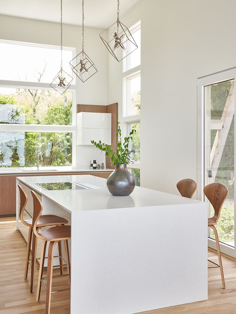
Off to the left in the kitchen, Gill chose another classic midcentury modern silhouette: curvy, molded plywood counter stools. That the walnut veneer differs from the wood tone of the cabinetry is by design. “It’s hard to match a wood finish; it can just look like you missed,” she says. “Here you get walnut on the surface, and a nice contrast of lighter plywood sides.”
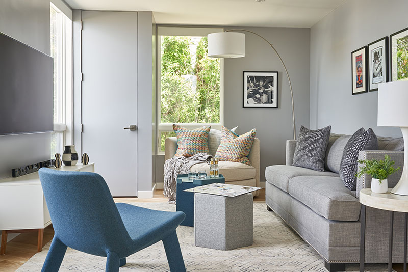
Gill goes a touch more subdued in the den with walls painted Behr Flannel Gray and marine blue accents. Again, she mixes shapes for interest. An upholstered chair with neotenic undertones is playful, as are the hexagonal ottomans, while the sleeper sofa with nailhead trim keeps the room grounded. Although the sofa is plenty plush, the big, round swivel is the seat of choice on family movie nights. “This is where everyone wants to sit,” Gill says.

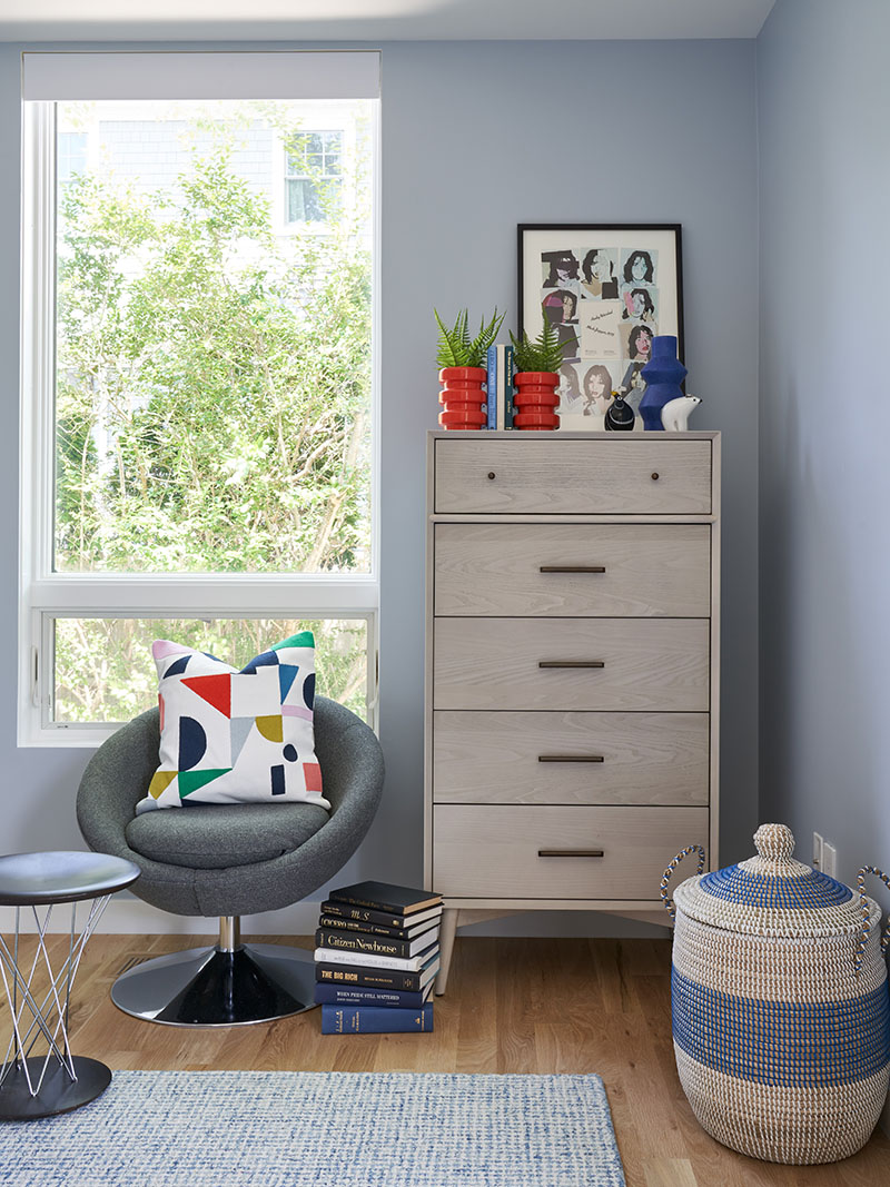
Gill injected more color in the kids’ room. “The clients don’t love color, but this room needed it,” the designer says. Urbane artwork in rainbow hues enlivens ice blue walls, a shade that repeats in the throw pillows and flecked wool rug. “I wanted to complement the rest of the house, so we did soft, cool colors with brighter pops,” Gill says.
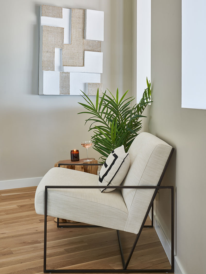
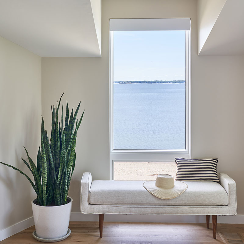
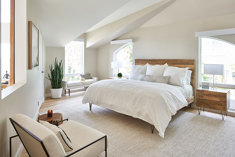
In the primary bedroom, Gill reverts to the home’s signature creamy palette. The aerie is a bit earthier than the public spaces, however, thanks to the couple’s raw mango wood bed and nightstands. Gill accentuated the organic feel with a tree trunk side table beside a lounge-y, iron-framed chair, and a large, lush snake plant that reinforces the vertical windows that look to the bay.
The room also boasts access to an asymmetrical mezzanine, dubbed the “reflection zone,” that overlooks the water on one side and the foyer and living space on the other. A pair of softly rounded swivel chairs with pleated backs is a favorite spot for morning coffee or a glass of wine. A stylized figure in lotus position sits on a low table. That the dark, angular form draws the eye upon entering the home is, like everything else, absolutely intentional. “It sets the tone that it’s time to unwind and relax,” she says. “You’re not in the city anymore.”
For more information, visit elizabethgillinteriors.com
