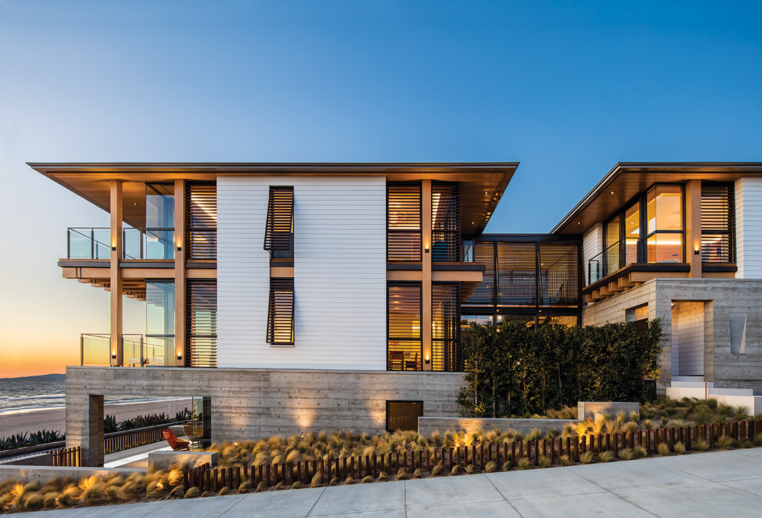
To compensate for the narrow, rectangular lots they’re usually set on, the Manhattan Beach homes that architect Grant Kirkpatrick designs are always at least three stories—high enough to glimpse the ocean over the roofs and around the corners of neighboring abodes. Lofty too are the goals he lays out for his Los Angeles firm, KAA Design. “We want to set a new bar for the West Coast—a benchmark for global perspective in a coastal context.”
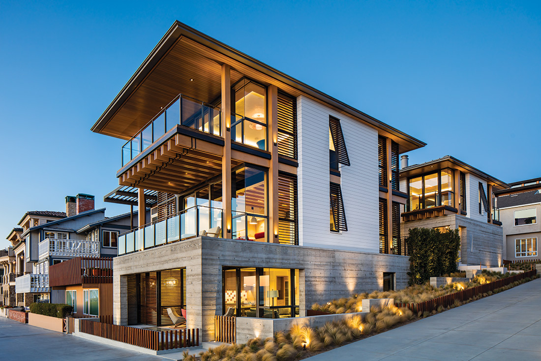

A case in point, this home is an apotheosis of sophisticated design in a coveted oceanfront location. Rising from the westernmost reach of a tightly built residential enclave, it sits directly on a portion of The Strand, a 21-mile long bike path running along the beach. Glorious panoramas of the ocean and pier abound from its middle and top levels.

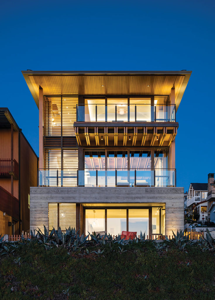
Responding organically to its surroundings, the house—two pavilions connected by a courtyard—is subtly reminiscent of a sea-going vessel perched on waves of seagrass. The board-formed concrete bases bring to mind bulkheads and piers, while Alaskan yellow cedar, commonly used in boatbuilding, was chosen for its ability to withstand the elements as well as for the classic way it weathers.
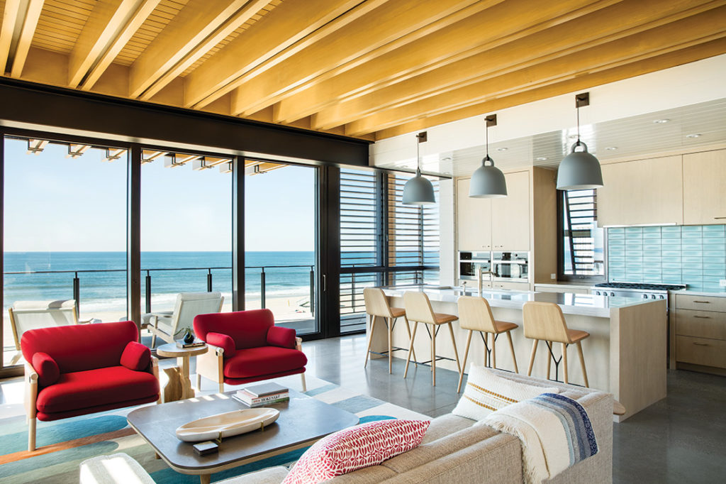

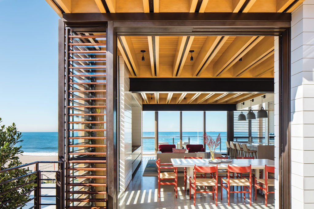
“Exposing the actual structure of the building is one element that gives it its timelessness,” notes Kirkpatrick, referring to the floor joists that go from one beam to another and two feet apart. Beautifully crafted, they have an unconcealed strip of steel inside for fortification that also gives each joist an aesthetically interesting stripe down the middle.
Albertini doors, windows, and other structural details feature bronze from Italy, which acquires an attractive patina over time. White shiplap siding on the pavilions offers a bulwark-like counterpoint to the other textures and rounds out the exterior palette.

“We mine what is unique about both the property and the client,” says Kirkpatrick, a longtime champion of contemporary architecture that celebrates an indoor-outdoor lifestyle. “Marrying the two things starts to generate ideas.” The homeowner has Swedish roots and, coincidentally, so does the interior designer, Santa Monica-based Tim Clarke, who collaborates frequently with Kirkpatrick. Hallmarks of Scandinavian style—simplicity, a connection with nature, timelessness, and coziness—steered design decisions like using natural wood, concrete and expansive windows, as did the lifestyle of the clients.

The well-traveled family, which includes children at schools in different parts of the world, wanted this to be where they would all come to be together. The idea of a sanctuary—a place that supports your spirit as well as your body—was ever-present during the design process, notes Clarke, who brought his signature coastal aesthetic to the project.
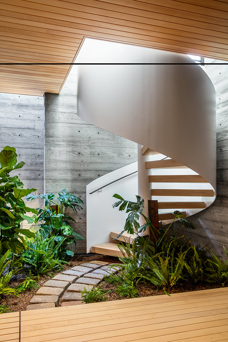
While the main common room is a courtyard-connected gathering space where the family catches up with each other, entertains, eats and just hangs out, the lower level is where they rejuvenate. Here, in their own wellness center, surrounded by aromatic cedar and lots of greenery, they enjoy a full-size lap pool (the wife’s special request), a hot tub, a sauna and a workout area.
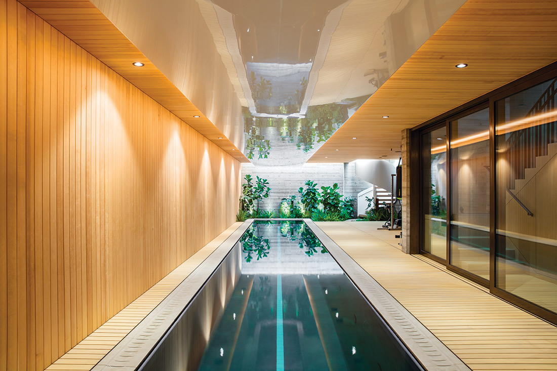

Invitingly sequestered, the spa’s only natural illumination comes from a skylight at one end where floating spiral stairs lead to the bright and open core living areas of the house, all in the pavilion closest to the beach. Here, again, a floating tread stairway takes pride of place—a well-trod artery connecting all four levels that is as artistic as it is practical. Its weightless quality complements the glassy upper levels of the house, where, as Kirpatrick puts it, “instead of doing doors and windows in the walls, the walls are made of doors and windows.”
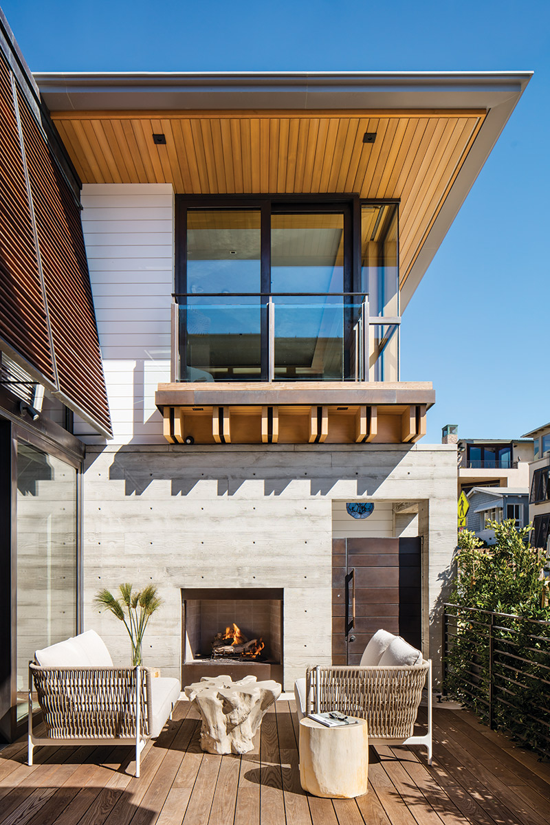

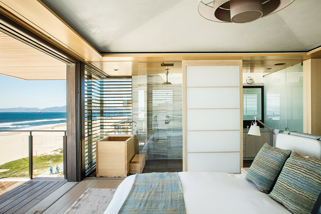
“Our responsibility was to take full advantage of the panorama, pier, and sunset,” continues Kirkpatrick, “and still maintain a semblance of privacy.” To this end, a series of bronze shutter elements that help control the sunlight and its glare off the ocean also buffer those inside from the hustle and bustle of The Strand without totally isolating them. Similarly, sliding, light-diffusing shoji screens in the master suite can be used to separate the bathroom, with its luxurious ofuro soaking tub, from the bedroom.
True to the coastal aesthetic of both California and Scandinavia, interiors were kept simple, uncluttered, and for the most part, neutral in palette. For example, says Clarke, the master bedroom’s plaster ceiling “is the palest shade of light blue, like a very early morning sky, calm and peaceful.” One exception and contrast to this is the Swedish-red upholstery on the vintage Wegner dining chairs and the club chairs by contemporary designer Monica Förster.

The rooms, which engender a sense of permanence and calm without sacrificing style, reflect the integrity of the architecture in which they’re contained. “We like to treat homes as sculpture,” says Kirkpatrick. “As the sea grasses grow up around it, this home will slowly and surely weather to produce different, stunning, and timeless effects from one year to the next.”
For more information, visit kaadesigngroup.com.
