You don’t have to be adventurous to work with New York-based interior designer Daun Curry—but it certainly helps.
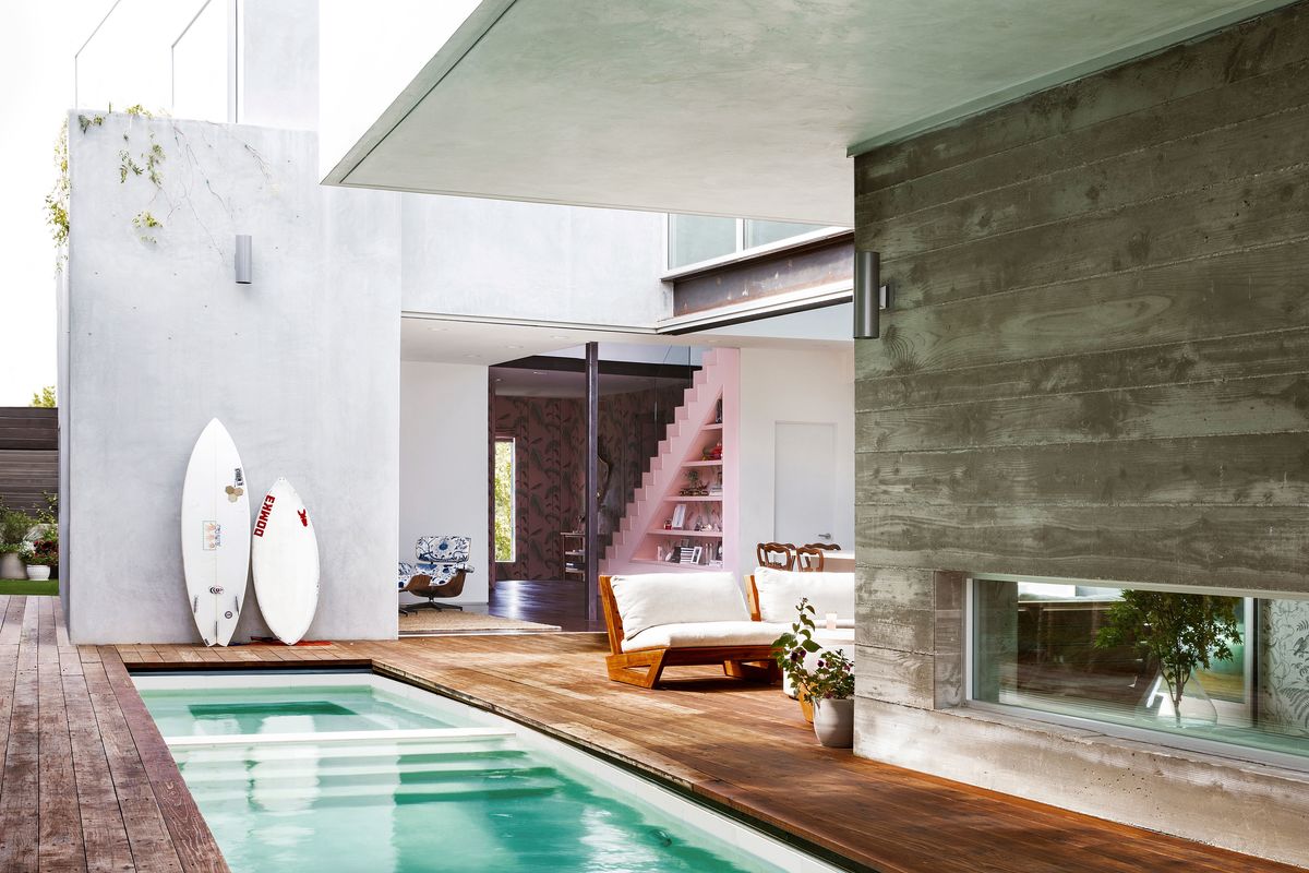
For a couple with two daughters in Venice Beach, that meant infusing a decidedly modern townhome with edited and unexpected touches of the traditional. “They’re fun,” Curry says of her clients. “They like to go with a concept if it’s cool.”
He’s a surfer and a snowboarder, and an early adapter of YouTube who’s now a star with a huge audience. “He took that platform and ran with it,” she says. “He’s smart about business decisions.”
His wife is a jewelry designer with a showroom and a lifestyle company. “She has a cult following, and she’s kind of a celebrity too,” she says.
Curry designed her client’s first jewelry showroom 12 years ago, and later, a second. She also designed the couple’s apartment in New York. Then they made the decision to relocate to California’s Venice Beach. “There’s a lot of activity for his work there, because it’s a hub for YouTubers,” she says.
But their new home there left them wanting, since their style is more New England traditional than Venice Beach modern. “She said: ‘You have to help me—it’s so sterile and cold.’” Curry says. “They loved their New York apartment and just didn’t love this house.”
Their interior designer responded to who her clients are— young, fun, creative people who seek stimulation—with the restrained touch of someone who’s mastered both contemporary and conventional aesthetics. “There was a certain amount of editing that had to go in,” she says. “I’m always trying to strike the right balance between modern and traditional elements, and have it feel right and make sense.”
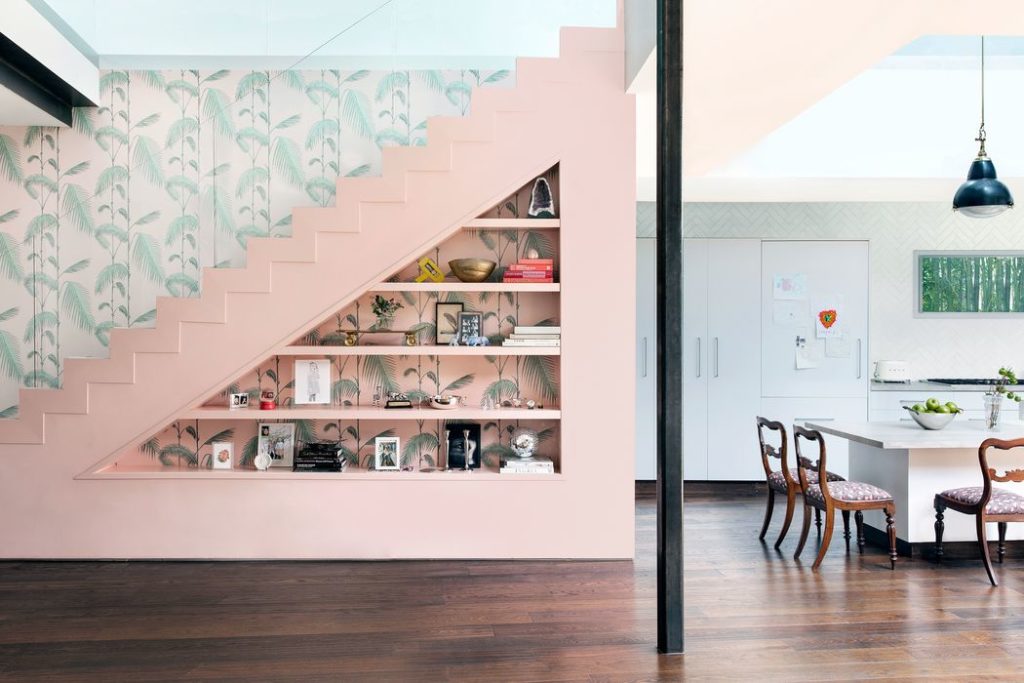
Curry’s first big move inside was to re-imagine and rebuild a contemporary stairway and its very severe wooden railing. “We didn’t change the location of the stairs, but we did put in new stairs and carved out a triangle of bookshelves below to warm it up,” she says. “It’s a space where they can put objects and family photos.”
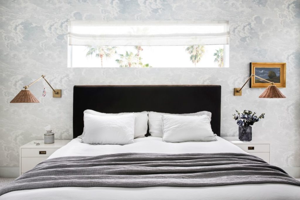
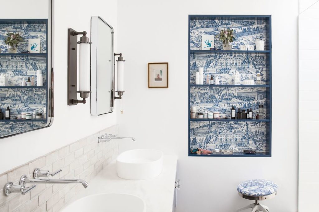
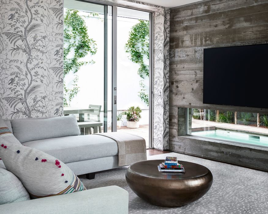
This is a couple that’s not afraid of color—and proved it with a new pink entry. And they love wallpaper with patterns—so it’s used (though sparingly) with pops in the bedrooms, baths, and TV room, including botanical prints like Brunschwig & Fils’ “Bird and Thistle” and Lee Jofa’s “Palm Leaves.”
Behind the kitchen counter are three backless modern stools—but in the dining area beside them are four heirloom South African chairs. “We tied them in as traditional elements and covered them in a more modern fabric,” she says.
Surely, the tour de force is Curry’s treatment of an Eames lounge chair and ottoman, overlooking a window to the pool area outside. She covered them in blue-and-white La Plata fabric she found in a designer showroom. “It’s Swedish linen in an oversized flower pattern,” she says. “We wanted a standout piece.”
Then again, this whole home’s an adventure in how to create a standout.
For more information, visit dauncurry.com.
