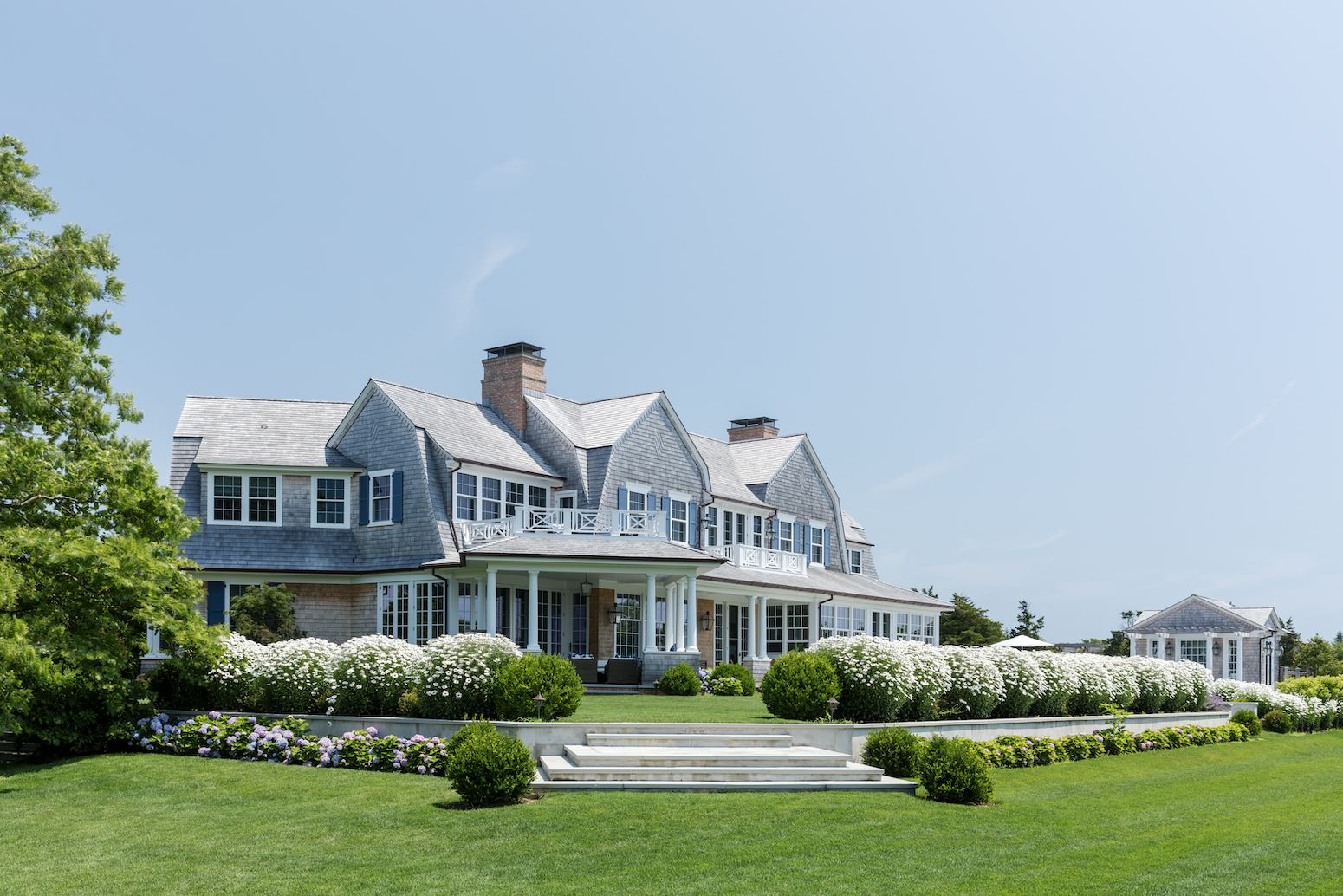
Anyone who’s ever acquired a summer house has this request: that it be completed by the start of the season. The notion of complete, however, can vary. For the owners of this Shingle style custom home designed by architect David Neff in Quogue, complete meant every last detail in place, inside and out. This included a thoughtful collection of art.

Katharine Earnhardt, founder of Mason Lane Art Advisory, had worked with the clients, a professional couple with two young boys, to build a collection for their TriBeCa loft, so she wasn’t exactly starting from scratch. “We looked at that artwork, which is vibrant and urban contemporary, to determine what we would do differently,” Earnhardt says. “In Quogue, they wanted a softer palette, fewer hard edges, and nothing metallic.”
Guided by the couple’s tastes and the overall scheme that interior designer Jennifer Garrigues presented, Earnhardt assembled a 40-plus piece collection with an ephemeral, not too serious feel. “I never want the art to match the throw pillows, but I’m not there to create a new vision either,” Earnhardt says. “I’m there to further the vision and make the design shine.”
That design, Garrigues says, is “clean, but not minimalistic, very child-friendly, and with a touch of simple glamour.” There’s lots of white, as befits a beach house, with plenty of blue, a color that both wife and husband love. “The house feels very open,” she says. “There are no mad, large-scale prints, but every room has a punch.”
Blue makes its mark from the start, with a fun, navy Dutch door and a white pitted iron bench upholstered in performance fabric with a mosaic-like pattern. Earnhardt subtly reinforces the decor and the coastal locale with Mike Solomon’s hypnotic painting made from watercolor on papers infused in resin that resembles reflections of water. “As the light changes, hexagons appear and disappear,” Earnhardt says. “It’s very dynamic and sets the tone without being a literal or cliché landscape which was very important to us.”

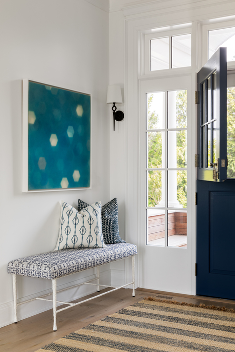
Entry 
Living Room
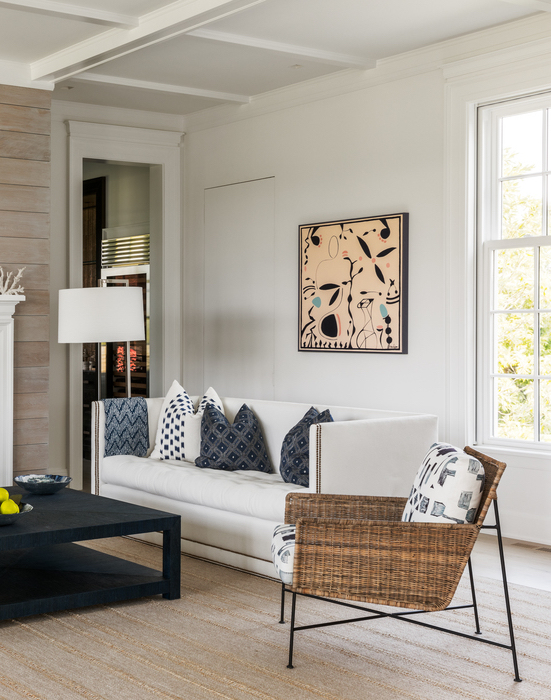
Just off the entry in the living room, whitewashed wall boards and a jute rug with a topstitched stripe establishes a neutral backdrop for crisp white sofas, tactile navy accents, and a hint of glimmer from a hammered metal drinks table with an iridescent shell top. Rather than add a piece that could be perceived as nautical, Earnhardt went for a composition of frolicsome forms reminiscent of Matisse’s cut-outs. The artwork by Paige Kalena Follmann counterbalances the room’s symmetry while echoing its airiness. Earnhardt also points to how the bits of black bolstering the room’s design. “Contrast helps a room feel energized and alive,” she says.
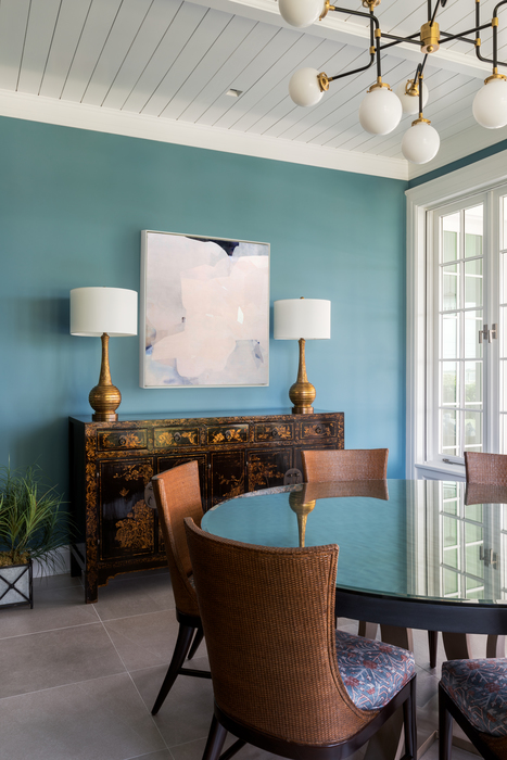
In the adjacent sunroom-turned-dining room, the art goes quiet so as not to distract from the antique Chinese buffet. Still, its layered mix of media—ink, silk, and beeswax on panel—ensures that Eric Blum’s abstract isn’t invisible. Earnhardt’s juxtaposition of contemporary against historic aligns perfectly with Garrigues’ approach. “I design like I throw a cocktail party, mixing the older generation with the younger one,” Garrigues says.

Dining Room 
Guest Suite
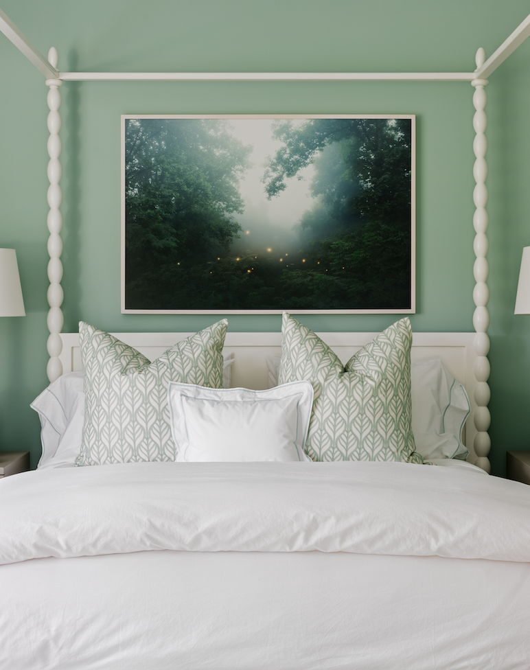
While one set of French doors opens to a covered porch, another pair leads to a languid green guest suite. Here, the art embraces the room’s hue. “It’s a hard color to work with if you’re fighting against it,” Earnhardt explains. A magical landscape photograph by Petros Koublis hangs over a Balinese-inspired canopy bed, providing a window to an otherworldly forest beset by fireflies. The choice adheres to Earnhardt’s practice of using less pricey pieces in secondary rooms and simultaneously broadens the spectrum of media and subject matter.
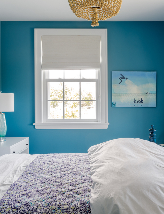
Earnhardt follows suit on the other side of the house by inserting a pair of llama prints in the playroom and a humorous piece portraying stick figures swimming in an upstairs guest bedroom with a view of the pool. “Diversity of media, subject matter, and style is important,” she says.

Guest Bedroom 
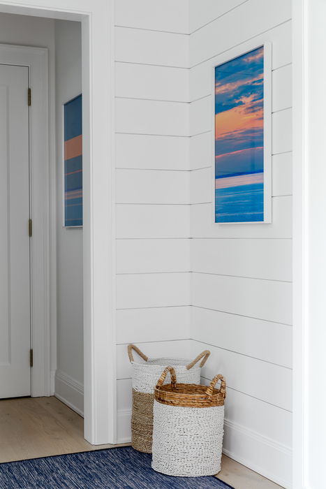
Second Floor Landing
On the second level landing, Eugene Healey’s abstracted, cerulean seascape with collaged strips of fabric lures people up the stairs. Its palette speaks to the couple’s love of blue while the medium injects textured richness into the spare space, as does the antique Chinese console table and glazed ceramic lamps. “It’s simple, but there’s a patina,” Garrigues says of the tableau. Earnhardt adds, “If this were a catch-all place with clutter, I’d have chosen more streamlined art.”
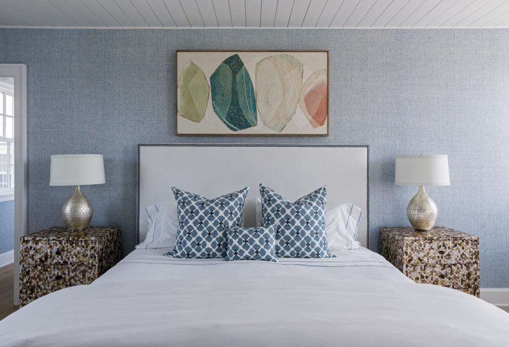

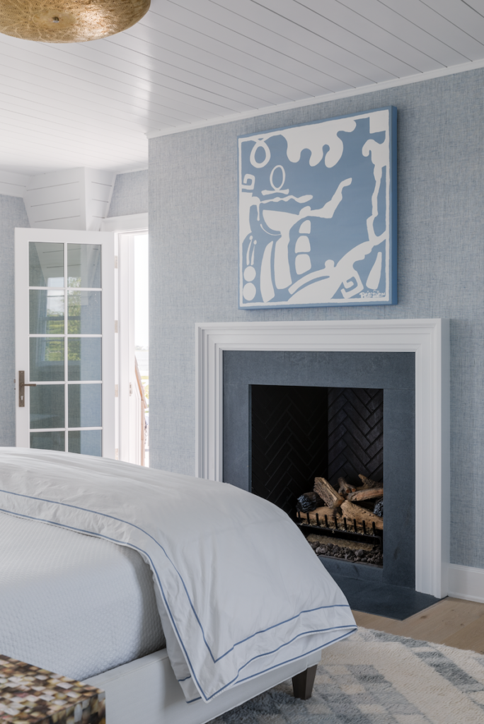
Down the hall, Garrigues created a serene primary bedroom suite where a white, nailhead-studded upholstered bed stretches out like a cloud against the chambray-colored grasscloth-covered walls. Karine Leger’s organic gems in dusky colors draw the eye up to the penny board paneled ceiling. Like the mathematically-influenced ombre oil painting by Nicky Broekhuysen over the dresser, Legere’s commission offers softness with a layered effect. And, as with so many other pieces in the collection, Earnhardt achieves her goal. “These works refer to what’s happening in nature without being a blatant reference.”
Architect: David Neff Architect, davidneffarchitect.com
Interior designer: Jennifer Garrigues, jennifergarrigues.com
Art consultant: Mason Lane Art Advisory, masonlaneart.com
Builder: Hamptons Habitat Fine Homebuilding, hamptonshabitat.com
Landscape designer: Elliott Templeton Landscape Design, templetonlandscape.com
