Let’s say you just bought a new, gambrel-roof, Shingle-style home on exclusive Mecox Bay in Bridgehampton, New York. It was designed as a spec house in the familiar vernacular to fit right in with its surroundings.
You’d probably want to go the traditional route with its interiors, right? Maybe a soft and muted look, just like all the other shingle styles built nearby in decades past?
Think again. You decide instead to work with Manhattan-based interior designer Jennifer Post because you want something altogether new and fun and bright and splashy and chic. You want a style closer to Miami Beach or SoHo than the traditional Hamptons.

Why Post? She’s got a reputation. One that’s built on bold moves and vibrant colors but also on eye-popping surprises and hard-to-find furnishings.
And here, in this nearly new six-bedroom home right on the bay, Post rose to the occasion—and then exceeded all expectations.
“They wanted it to be like no other house, but it looked like any other house,” Post says. “They wanted it to be special and just for them, to reflect their lifestyle and work with their contemporary art collection.”
COLOR PUNCH

What’s the first thing she tackled? Post looked down at the dark brown floors, shook her head, and dispatched them to the dustbin. “The only thing I did architecturally was stain the floors to a light gray,” she says. “It brought a contemporary feel to the whole house.”
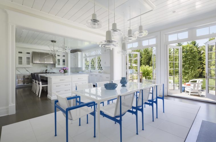
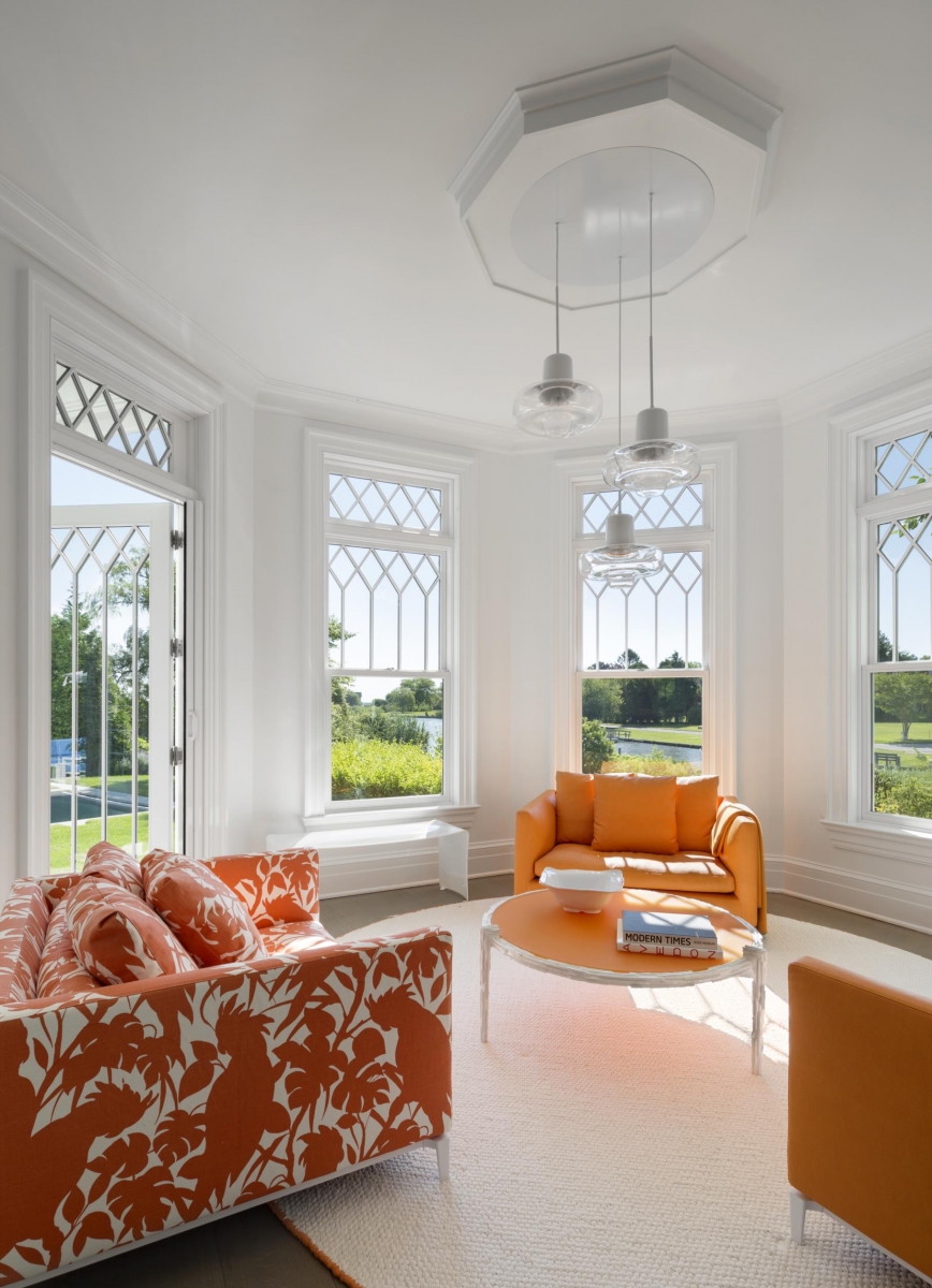
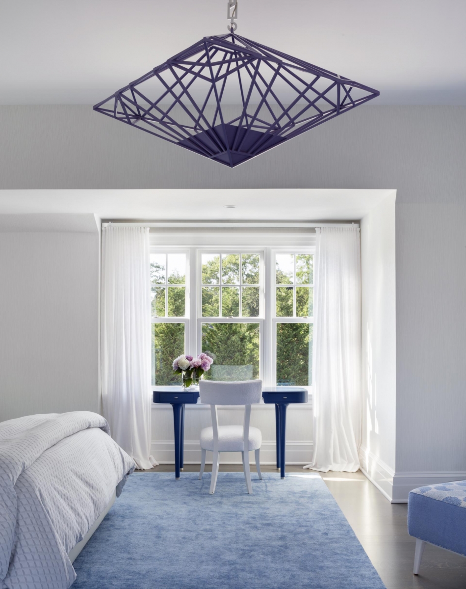
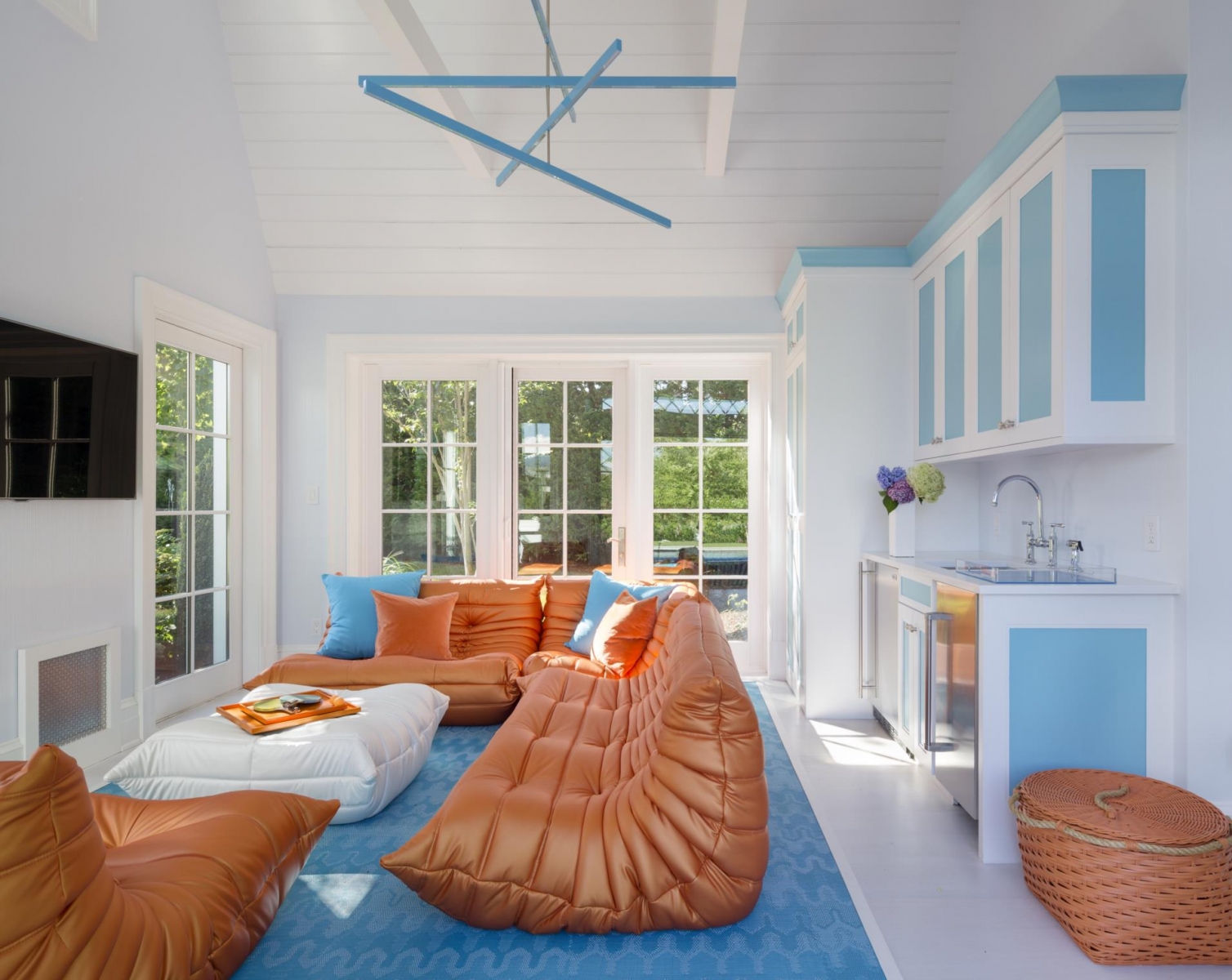
Then she got to work with some rollicking snaps and punches. She used crisp blues and oranges (her clients are diehard Knicks fans) in any way she wanted: on chairs, carpets, sofas, runners, and even tables. “Using the color is a surprise, especially in the dining room and kitchen, where the blue legs are unexpected,” she says. “And it’s harmonious, room to room, because there are no doors downstairs. It’s one big room where the colors sing together and talk to each other and speak the same language.”


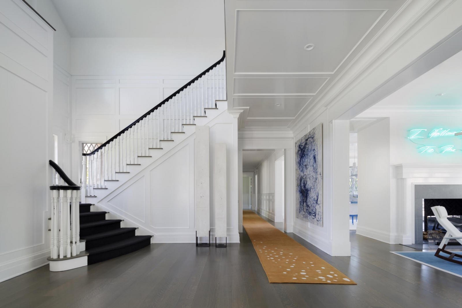
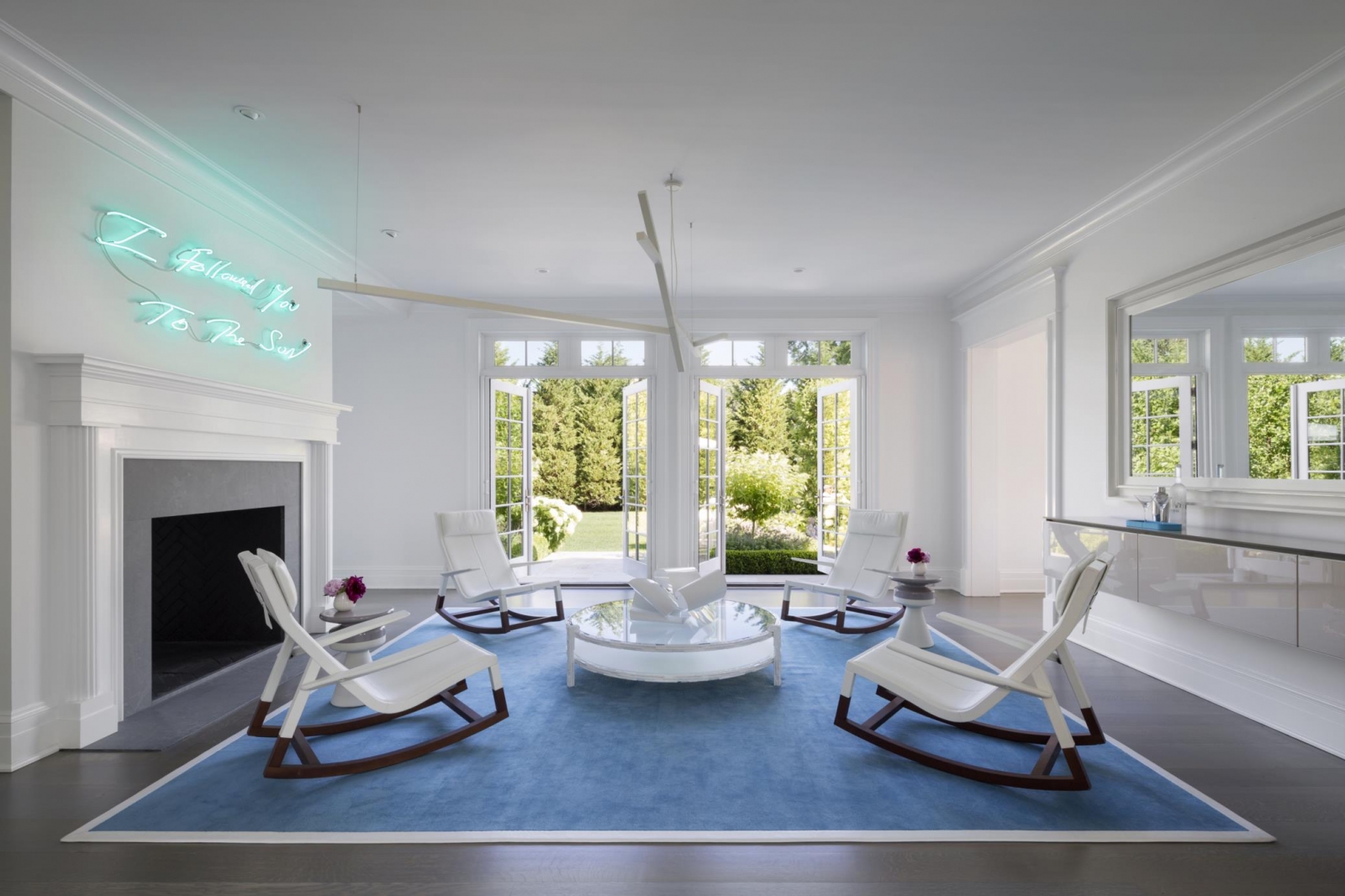
The vibrant idiom of Post’s design materializes in the most unusual ways, like in the first-floor gallery: a transition space between dining and living areas where four low-slung rocking chairs float on a Mediterranean blue carpet. “It had to be really sharp and playful and fun,” she says. “It’s for the teenagers and young adults who all meet there before going out to dinner.”
CLIENTS WITH VISION
Her clients were a newly remarried couple with four children: ages 27, 25, 20, and one high school junior. “The kids grew up going to the Hamptons,” says their 50-year-old father, a Manhattan-based financier. “We wanted a place to relax and play on the water; we use it from Memorial Day through Labor Day.”
Their assignment for Post? “To decorate it in a way that anyone could feel comfortable walking in with a towel from the pool, and
where we could always have friends over and where the kids could have friends over,” he says. “We wanted a place where you could spread out a bunch of people and not know they’re there.”

Moreover, he and his wife wanted it to feel like a young place: comfortable and relaxing yet clearly designed with a clue as to what’s new. “We wanted a vacation weekend place where you can leave your work and baggage behind,” he says. “It’s incredible for relaxing on the water.”
Its location helps a lot in that regard. The water at Mecox Bay is only three to four feet deep, so it’s perfect for kayaking, jet skiing, water skiing, or paddle boarding. “They have every toy imaginable,” Post says. “Once they get there they don’t have to go anywhere all weekend. It’s an adults’ camp and a kids’ camp too.”
It’s a tonic also, with the Atlantic just a kayak ride away. “The Hamptons can be a hustle-bustle type of place, but this is a peaceful enclave with about 100 homes,” the client says. “We’re at the very end of the bay, where it’s protected from storms and hurricanes and just minutes away from the ocean and beach.”

A BUILDER WHO COLLABORATES
The couple was wise enough to call in the 7,500-square-foot home’s original builder, John Nocera, who’s not only experienced in working with well-known Hamptons architects but who literally knew where all of its construction bones were buried. After all, he’d been deeply involved in engineering its birth in the low-lying wetlands site.
“We had to get creative with retaining walls. The house sits on 196 pilings, sunk 16 feet below grade,” Nocera says. “It was built at the existing grade and 32,000 yards of fill elevate the site.” The home was already Energy Star-compliant, with geothermal heating and cooling, spray foam insulation, and a solar compensation of 10 kilowatts.
He accompanied its new owners on a walk-through before the purchase, and once the deal was done, he teamed up with Post to execute their vision. Nocera prides himself on attention to detail, something that’s de rigueur for Post. “She would relate something to us about how to handle a situation, and we worked it out, and that’s how we worked as a team to make it all happen,” he says.

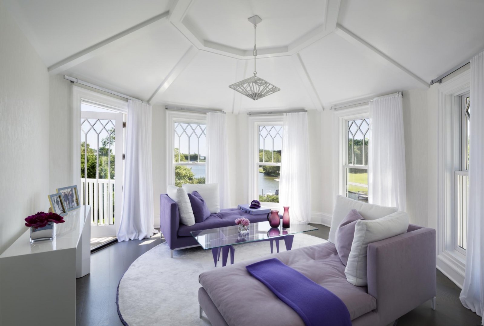
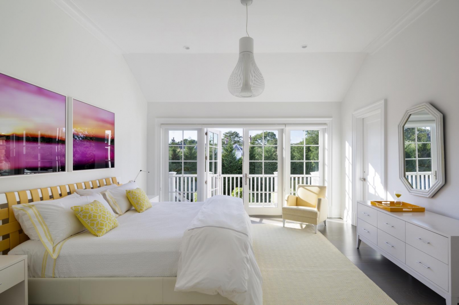
The original layout had two master suites but the teams converted one into an entertainment room with a TV and four sectional sofas (“parrot blue” is how Post describes them), which can be joined up into square beds for sleepovers. The remaining master suite is the builder’s favorite space. “It’s on the second floor overlooking the water, the deck, and the pool,” he says. “There’s a phenomenal master bathroom with a freestanding shower and tub.”
THEATER ALL AROUND

Punctuating all of the spaces in the home is the owners’ modern artwork collection, selected with guidance from New York art consultant Ann Cook. “What we tried to accomplish was to bring a contemporary feel with things that relate to Jennifer’s vision,” the client says. “The neon piece above the mantle in the room with the rockers makes a statement—that art was purchased with the house in mind.”
If it all adds up to a very bold theatrical look and feel, that’s no coincidence. During her undergraduate years at the University of Cincinnati, Post studied filmmaking and theater. “When I got to New York, I worked in theater design and studied perspective, volume, and massing,” she says. “As soon as you open the curtain of a theater, the audience knows what the whole play will be about. And that’s how I know what you’ll feel about this house.”
Thus, the rocking chairs. “You walk in the front door and see them,” the husband says. “I wouldn’t think in my wildest dreams of putting four rockers in the front room.”

But then again, he’s into finance, not theater or interior design. Still, he and his wife deserve credit for trusting Post with creating their home’s no-holds-barred interior while respecting its familiar, traditional exterior.
FOR MORE INFORMATION, VISIT jenniferpostdesign.com
