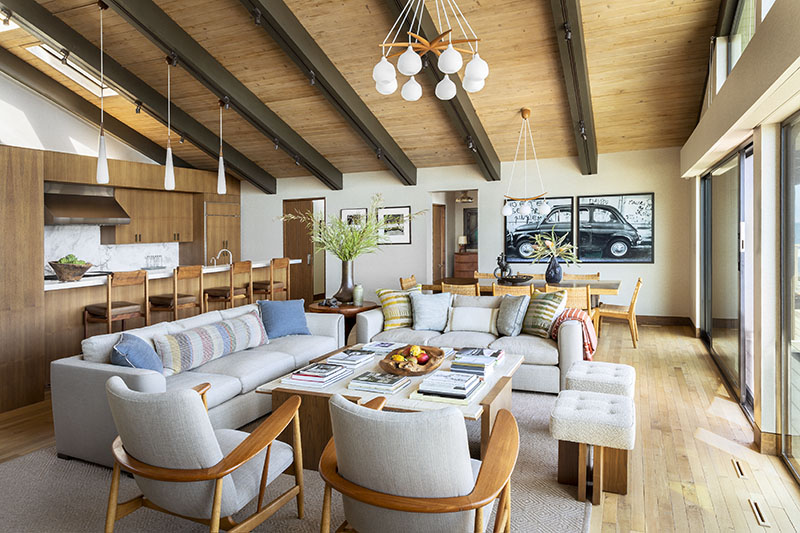
A neglected 1970s beach house in Malibu now has a sleek new look, thanks to the collaborative efforts of interior designer Madeline Stuart and architect Paul Williger.
“It was a hot mess,” Stuart says. “Our assignment was to use our instincts and take a funky, beaten-down house and create something marvelous.”
The trick was to hang onto the midcentury magic, and get rid of the superfluous. “The architecture drove the design,” she says. “It was an opportunity to explore and respect the 1970s-era quality of the house—to honor the best parts and cast aside the funky parts.”
Los Angeles–based Stuart has been in business more than 30 years, working on interiors and ground-up projects. She creates a one-of-a-kind vocabulary for each. “For me, it’s fun to work in all these different styles, whether Art Moderne, Spanish Revival, or Usonian,” she says.
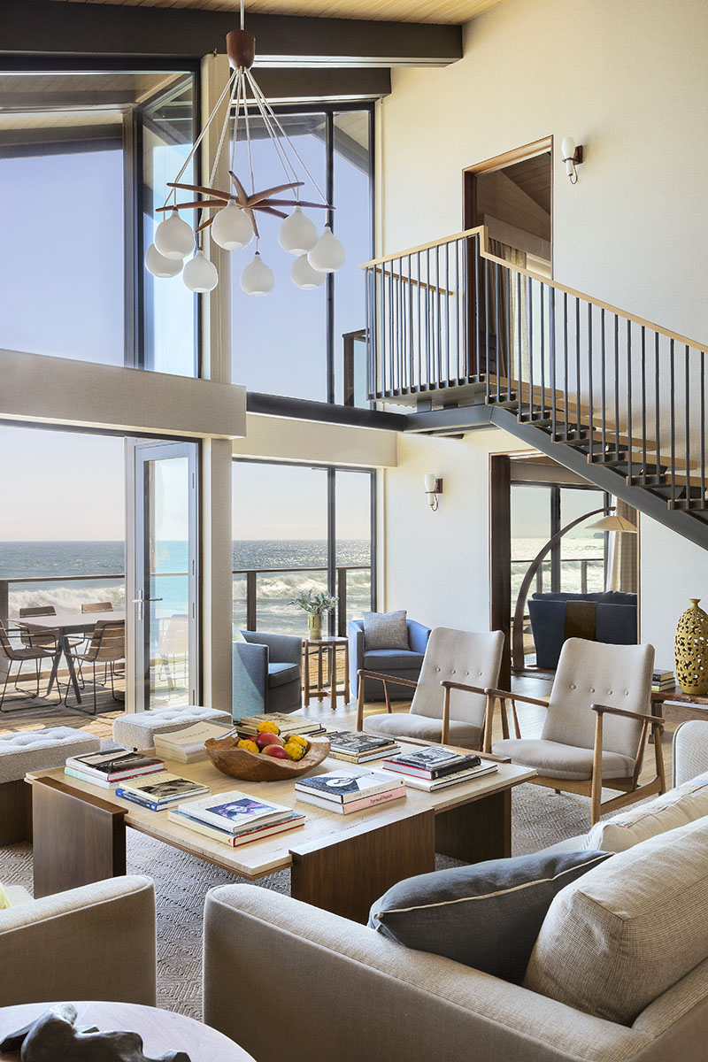

Here, the client was retired and had moved from Brentwood to Malibu for his main home. “Once you move out there, you don’t go back into town,” she says. “You put up with the highway and the traffic and the weather—he’s up for the challenge and loves it on the ocean in his outpost.”
Stuart brought Williger on to help with architectural details—he worked on the stairs and windows, while she took care of the millwork, furnishings, and fixtures. They took the interior of the 3,500-square-foot home down to its studs, added more glass in the living room, and captured more of the sky to enhance the view.
“There are new stairs when you walk in, with open risers,” Williger says. That means the primary view today looks straight through the risers to the ocean.

Decking runs along 80 feet of the home’s beach frontage, with shades to screen views to adjacent property. “Everything is cheek-by-jowl,” Stuart says. “You have to get to know your neighbors, because you’re going to be up close and personal with them every day.”
The house is 3,500 square feet on two stories, with three bedrooms, three baths, and a powder room. “It’s one level down to the beach and one up to the primary bedroom,” Williger says. “There are two secondary bedrooms—one is accessible from inside and the other has a separate exterior entrance also.”
The first-floor entry opens to the kitchen, living room, and dining area. The ceiling in the living room is high, so Stuart added vintage Danish light fixtures to bring the room down to human scale. Modern sofas ground the space, and other pieces are light on their feet.
She eschewed drywall for the most part, using textures and woodwork instead. “I love all the textures—the cork and woven matting and fabrics especially,” Stuart says.
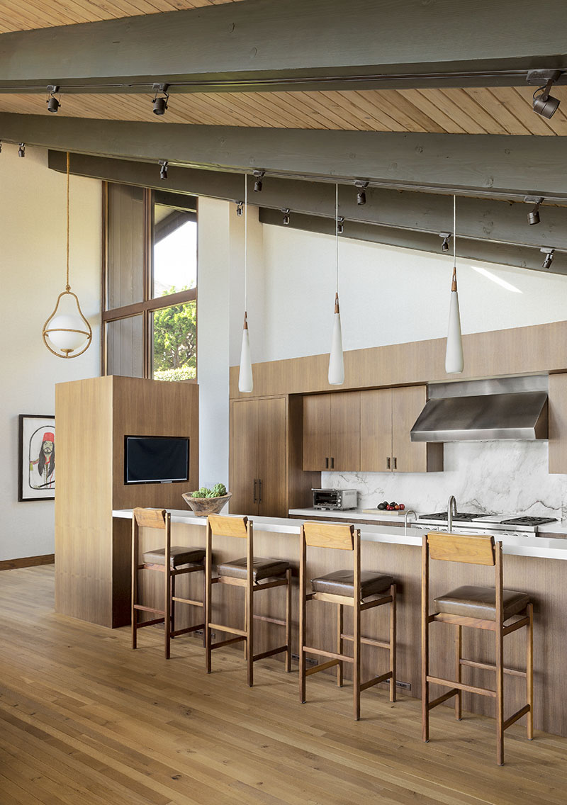

They tore out a wall that divided kitchen and living room, including a fireplace and enormous flue that ran up to the ceiling. “No one cried bitter tears when we took that down,” she says. “We kept the ’70s vibe without being ironic about it.”
They retained the existing beams in the living room, but added new wood there and in the kitchen. “We got a greater range of wood tones,” Williger says. “The whole kitchen is in walnut, with lighter oak floors that are more interesting and add a visual variety.”
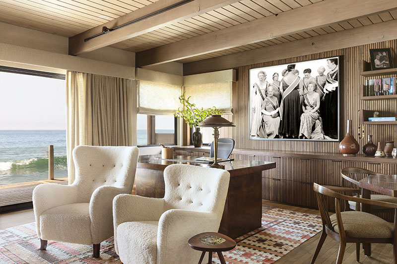
The client’s office is next to the living room, and because he spends a lot of his time there, Stuart and Williger were careful to create a warm, enveloping space with walls, cabinetry, objects, and books. “We wood-paneled the office, with vertical slat patterns in walnut,” he says.
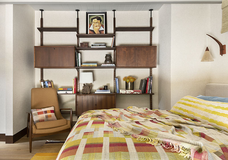

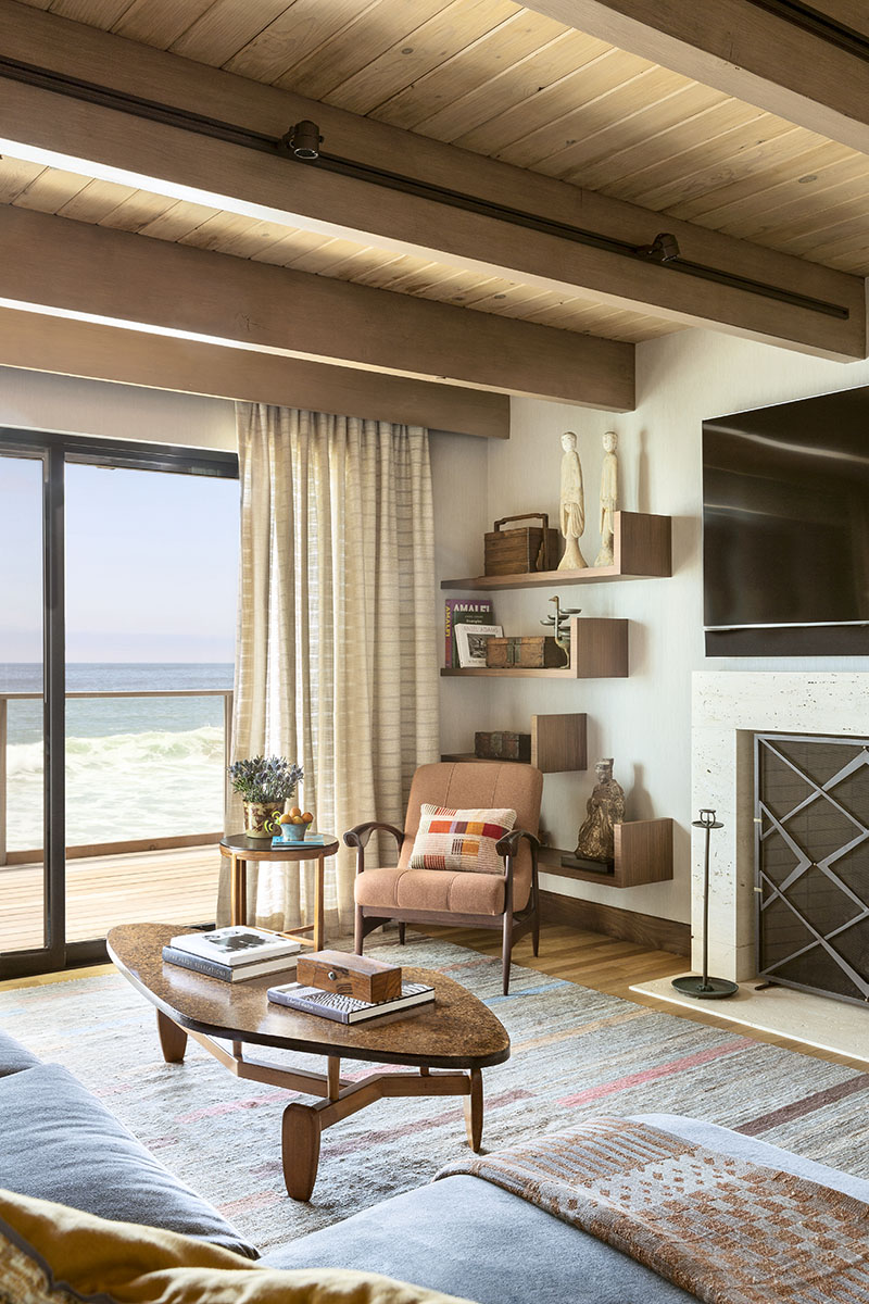

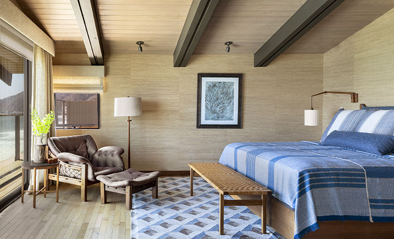

The designers understood that although this home is on the ocean, it’s not a weekend house, but the client’s main home, for his family and grandkids. “Still, it’s a beach house,” Stuart says. “But it had to be fabulous and bulletproof.”
Besides, this is Malibu. “The minute I come through Lincoln Tunnel and I’m on the highway, my pulse quickens,” she says. “The light is different, the colors are more vibrant, and there’s something about the proximity to the ocean that’s life-affirming.”
Then there’s the vista from the home’s deck. “You get a view up the coast all the way up Malibu to Point Dune as it curves out into the ocean,” Williger says. “And that’s where you get the sunset.”
Sure, Brentwood has its charms—but none to match that one.
For more information visit willigerarchitect.com; madelinestuart.com
