Photographs by Nat Rea
Something about this particular stretch of coastline caught Liz’s fancy. A dedicated runner, she had passed by it almost every morning for years as she traveled her usual route. “There are about ten houses on the little portion of beach,” she says, “and I ran always hoping that maybe, someday, I could find a house there.”
She and her husband Richard had already made perfectly pleasant digs for themselves and their children, about a mile away in the same picturesque town on Cape Cod’s eastern edge. But the prospect of a truly waterfront location—with nothing obstructing sightlines straight out into the Atlantic—beckoned.
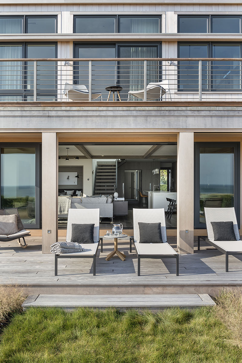

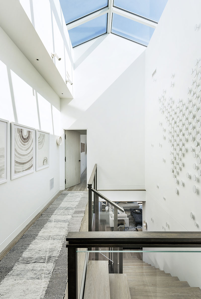

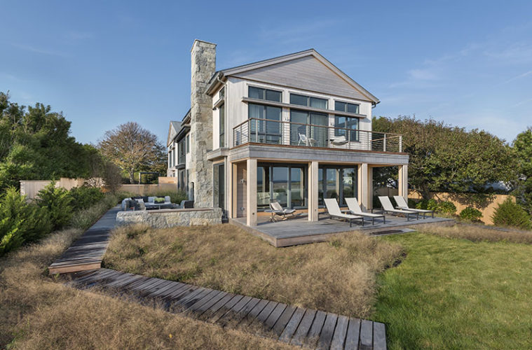
Stacked porches facing the water and a massive skylight atop the central stair both serve to maximize light and views at this seaside dwelling. Photo credit: Nat Rea
Eventually a home on the coveted street came up for sale—but concerns about coastal erosion convinced the couple to withdraw their bid. Then they heard through a college friend who lived across the way that a second property, next door to the first, would soon be coming onto the market. This time they pounced.
The lot now firmly in their grasp, Liz and Richard initially planned a quick, cosmetic update to the 1970s-era structure already in place. It soon became clear, however, that a great deal of work would be needed, and at best they would still end up with a clutch of indifferent, low-ceilinged spaces—certainly not a result worthy of the glorious site.
Enter architect Kent Duckham, interior designer Lindsay Bentis, builder Steven Overstreet, Paul Reidt from the custom cabinetry firm Kochman Reidt + Haigh, and landscape architect Stephanie Hubbard. This team had worked harmoniously with the family before—in fact, Liz had been Bentis’s very first client, and the two had since collaborated on several additional projects. So the couple decided to bring the group in as a unit and start over from scratch.
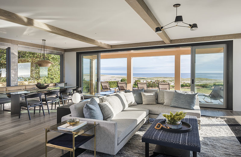

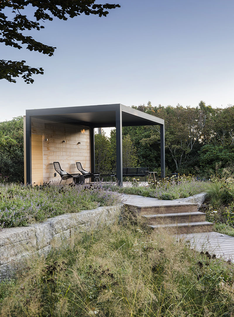

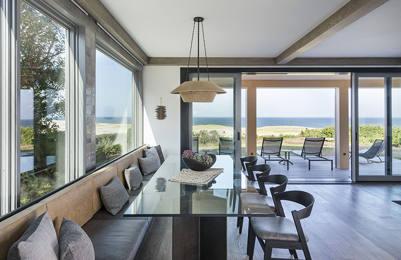

A sequence of outdoor “rooms,” including a striking modern pergola, encircles the home. Inside, understated furnishings are carefully kept below eye level, to form an elegantly textured frame for the scenery. Photo credit: Nat Rea
Duckham jumped straight into organizing things on the fairly narrow parcel of land. “We were basically stretching the original footprint,” he says, ending up with “two main bodies, front and back, with a linking entry piece where the house steps in and the materials change. The little projecting canopies over the windows give a more 3D mass to it, while protecting the windows from light.” Although the overall effect of the building is contemporary, it “isn’t entirely modern,” he avers. “It has a bit of the Cape vernacular, with the details reduced down to their raw essence.”
Detailing in the home’s interiors was likewise kept unfussy, with no ceiling moldings and a plain half-inch reveal used to delineate baseboards and door and window casings. The principal rooms are oriented toward the ocean-facing end of the house—and the scenic panorama framed by a sliding glass window-wall.
In evolving their vision for the project, Bentis and the homeowners were inspired by the bright openness of beachfront houses in southern California, particularly Malibu, working to reinterpret those models in a way that would seem authentic when translated to the very different topography of the Northeast.
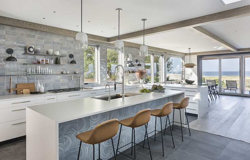

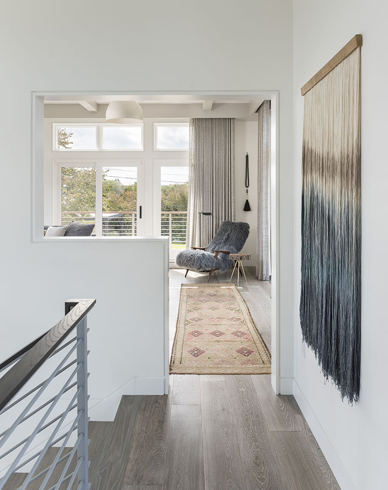

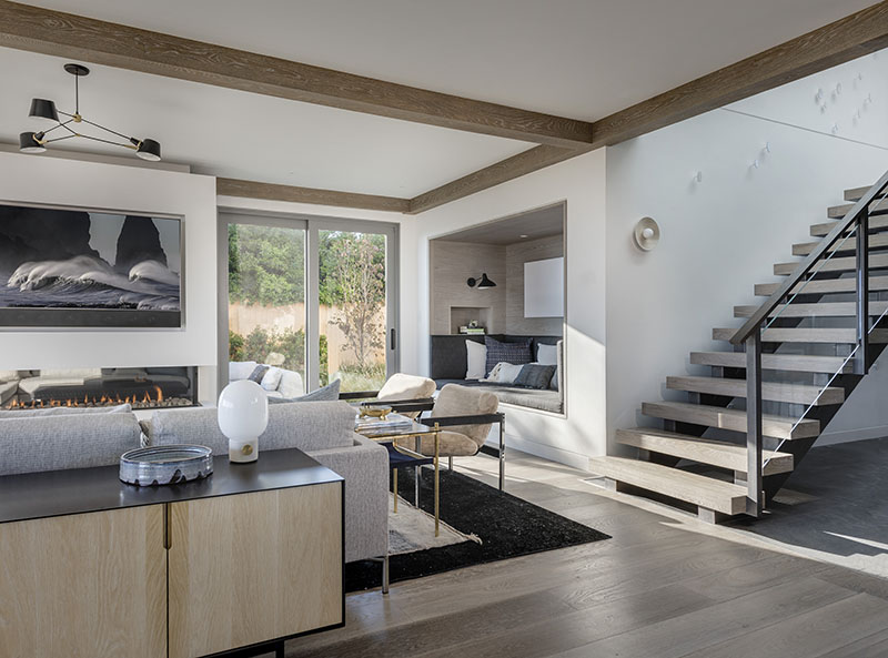

Rather than pops of brighter color, textures come to the fore in creating visual interest against a background of sand, stone, and driftwood hues. “The lines are clean, but the materials used are earthier,” according to Bentis, intended to evoke an organic feel. Even the tile in the kitchen and baths was chosen for its distinct variations in shade and surface finish: “We wanted it to be like a watercolor painting,” she says.
An imposingly sculptural stair flows up through the vertical core of the house, capped by a roof-ridge skylight that spans the entire length of the upper hall and sheds illumination deep into the interior spaces. Bentis worked with artist Carolina Sardi to devise a subtle installation of metal disks—white on white—that dapples one wall with shadows that slowly shift as the sun moves throughout the day.
Built-in storage cabinets in almost every room, all sheathed in the same custom-finished West African tay wood, also make a significant contribution to the home’s Zen atmosphere. Lighting fixtures are simple but striking, furniture is low-slung, and fabrics and floor coverings alike are designed to stand up to water and hide footprints and sand.
Outside, the same kind of quiet diversity pervades the landscape. Rough is played against smooth; sheltered nooks coexist with broad vistas. A rectangular pergola accommodates comfortable seating perfect for relaxation. Native plantings and restored coastal meadows alternate with stone walls, bluestone plank paving, and boardwalks that crisscross the property. There are both open and covered porches facing the ocean, an outdoor kitchen, a grand outdoor living room complete with massive stone fireplace, and more, all geared toward maximizing enjoyment of the spectacular setting. “The spaces transition from one to the other,” says Hubbard. “Turn the corner, discover something new.”
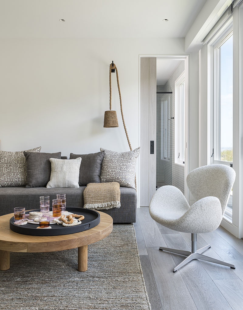

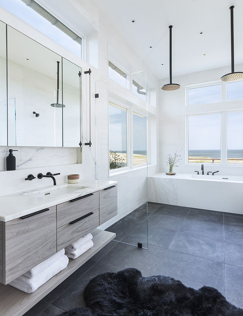

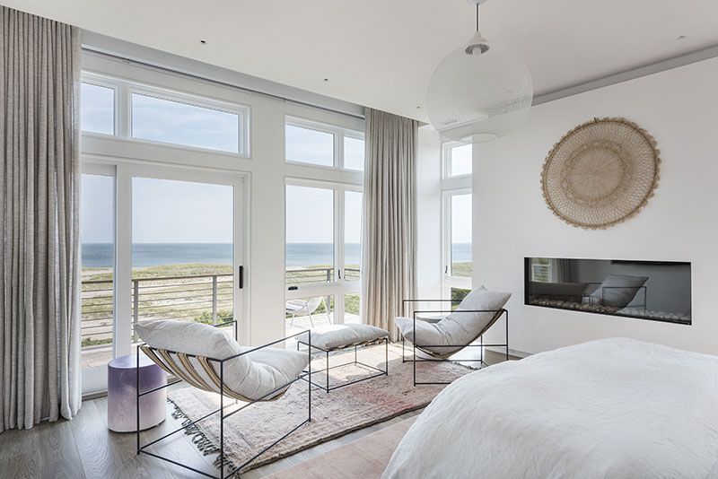

A unified set of basic shapes, clothed in a consistent palette of blacks, whites, grays, and soft browns, is used throughout the house, contributing to its overall feeling of harmonious calm. Photo credit: Nat Rea
In the end, the home’s most notable characteristic is its exquisitely unified vibe, both indoors and out. Everything feels cohesive, even while there is much variety in the areas meant for different purposes. The members of the design and construction team attribute the project’s success to the openness of their interactions. As Duckham puts it, “It’s a treat to work in that kind of collaborative effort with everybody at that level. No ego clashes—everybody was just building on ideas, just going with it.”
As for the owners, they’re equally delighted on a day-to-day basis. “I love walking around the place and just looking at it,” says Liz. “It’s like a work of art. Everyone gave it their best, and that’s reflected in how it turned out.”
For more information, visit Kent Duckham Architecture & Interiors, kentduckham.com; Lindsay Bentis, threadartanddesign.com.
