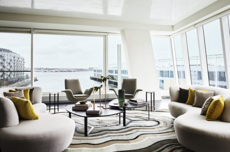
Set majestically in the seaport, The St. Regis Residences, Boston, is one of the city’s most luxurious developments. Designed by Elkus Manfredi Architects, the towering glass structure, which opened in 2023 and houses 114 condos on 22 floors, looks like a boat afloat with sails fully unfurled in the wind.
With units starting at $1.85 million, the development offers everything residents desire: a health club, a lounge and library, a swimming pool, a Jacuzzi, a business center, a spa. And a model unit by Boston-based Eric Roseff Designs that embraces and elevates the architecture’s aesthetics and showcases the spectacular views center stage.
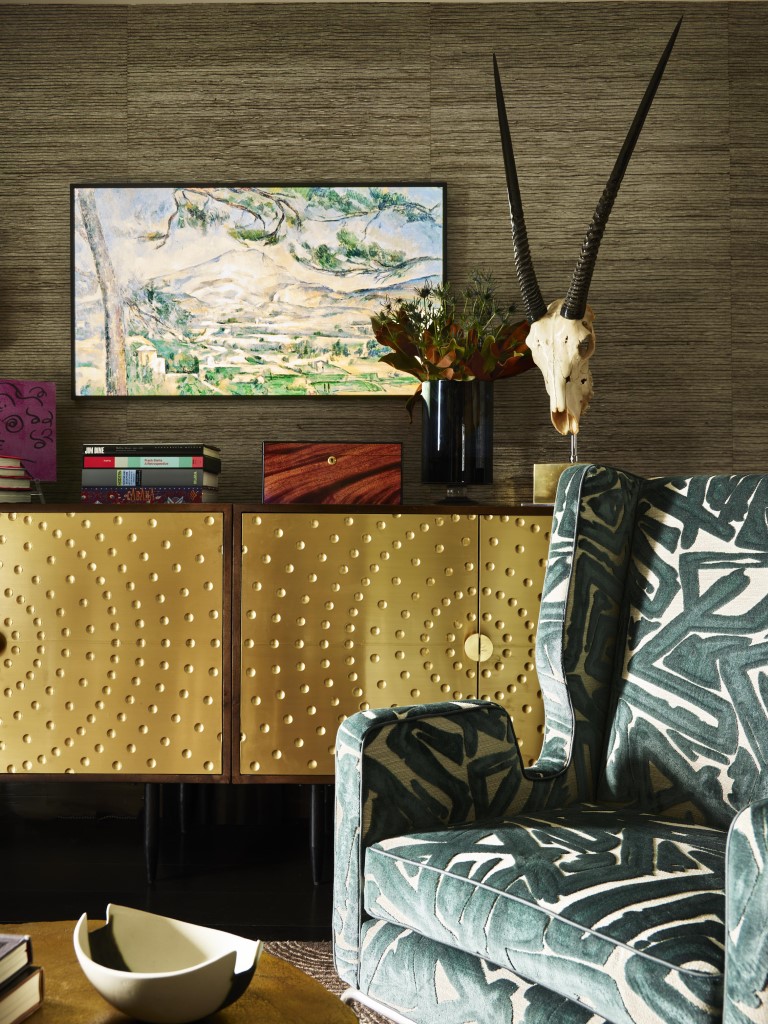

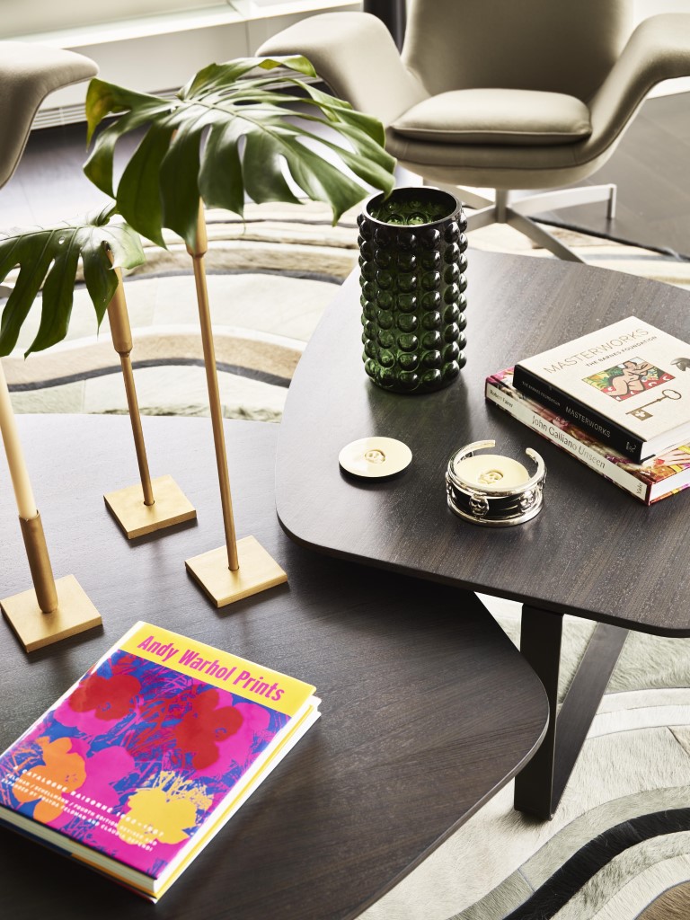


“Most model units are neutral and vanilla white,” says Roseff. “I wanted people who see it to feel like it’s someone’s home done thoughtfully over time. I’ve added a lot of personalized pieces to make it cross the finish line.”
The resident he envisioned, well-traveled and sophisticated, enjoys entertaining, collecting art and dining out. “I thought of the owner as a couple or a single person who had left a larger home in the suburbs and really embraced city living,” Roseff says. “That’s why the dining area is small, and there’s only one TV.”
Although the developers gave him carte blanche, there were inherent restrictions. Because of the building’s shape, every unit has a different, unconventional configuration.
“With many angles, simply lining a piece of furniture up along a wall creates a challenge,” he says of the 2,589-square-foot unit that has three bedrooms and 3.5 baths. “It took a lot of custom engineering to design everything, including custom window shades and draperies. And because this is a model unit, I couldn’t add built-ins or change any major components in the kitchen or baths.”

To accentuate the unit’s sharp angles, Roseff selected furnishings that are soft and sculptural and upholstered them in neutral fabrics so they don’t distract from the views.
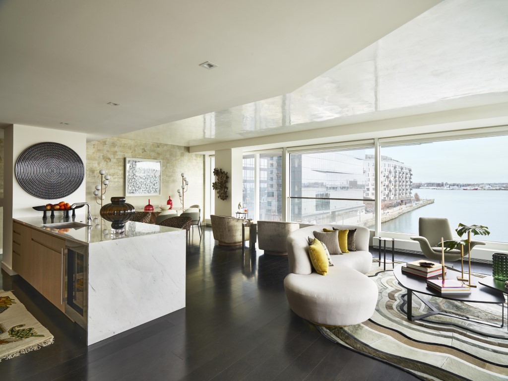
“The visual interest comes from texture and shape, not color,” he says, adding that the ceilings are mirror-like Venetian plaster, a reflective treatment that subtly merges indoor and outdoor spaces. “The color comes from the artwork and curated accessories, including pillows and glass vases. When you walk in, your eye goes where it should—straight to the outside scenery.”
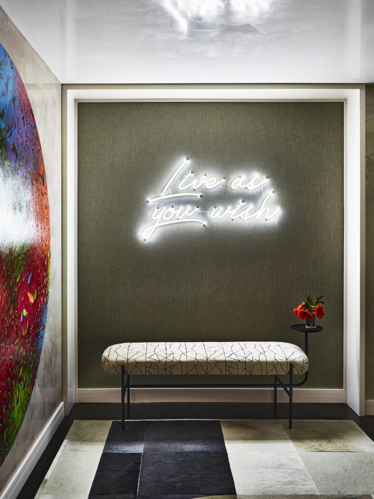
Roseff boldly throws his first curve in the entry, where a large circular artwork by Shay Kun dominates. It’s a preview of the main living space, which is defined by an irregularly shaped custom rug, designed by Roseff, that resembles ocean waves. The room is appointed with a pair of 1970s Vladimir Kagan sofas that look as though they want to embrace each other and a pair of similar- vintage chairs whose wing-like arms conjure images of seagulls in flight. The center coffee/cocktail table is equally dynamic: Its two pieces pull apart, creating separate servers as needed.



Next to this grouping, Roseff created a conversational setting by pairing two 1970s swivel chairs, upholstered in velvet, and a swiveling mushroom ottoman from the same time period.
“A majority of the upholstery throughout the unit is solid-color fabric instead of patterned,” he says. “The fabrics are textural, and some of them, such as that on the swivel chairs, have a sheen that looks different in different light as you walk around them.”
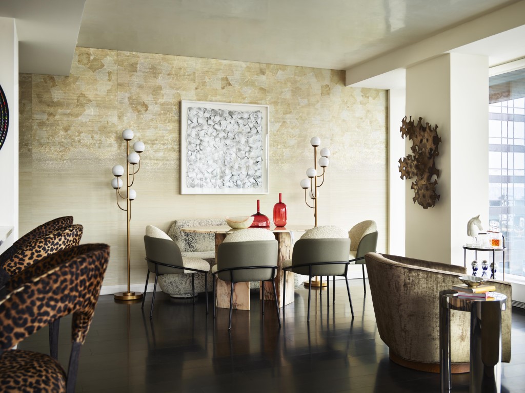
The curvaceous theme continues in the adjoining dining area, where four round-back chairs and a custom dining banquette cozy up to an oval-shaped Italian marble table, another vintage piece. The wall, papered in the same ombre silver silk and metallic leaf mural that runs from the foyer to the windows, shimmers in the glow of the globes of a pair of floor lamps.
Roseff reserves deeper colors for the more private spaces. In the den, for instance, dark-teal drapes, offset by a virtually invisible Lucite desk in the window, create a cozy setting. The guest room pays homage to the water: Its deep blue painted walls match the drapes, creating a cocoon complete with a daybed that overlooks the seaport.
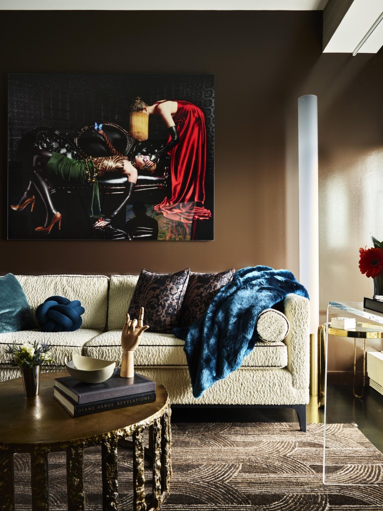

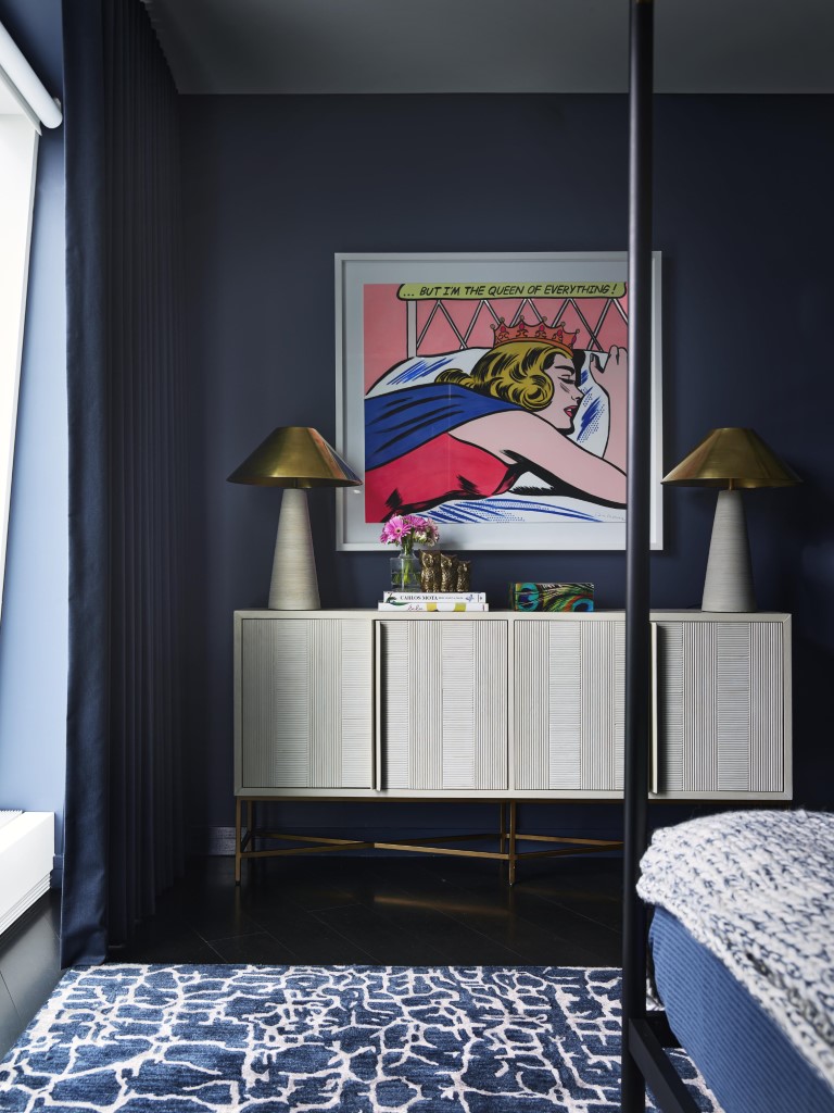

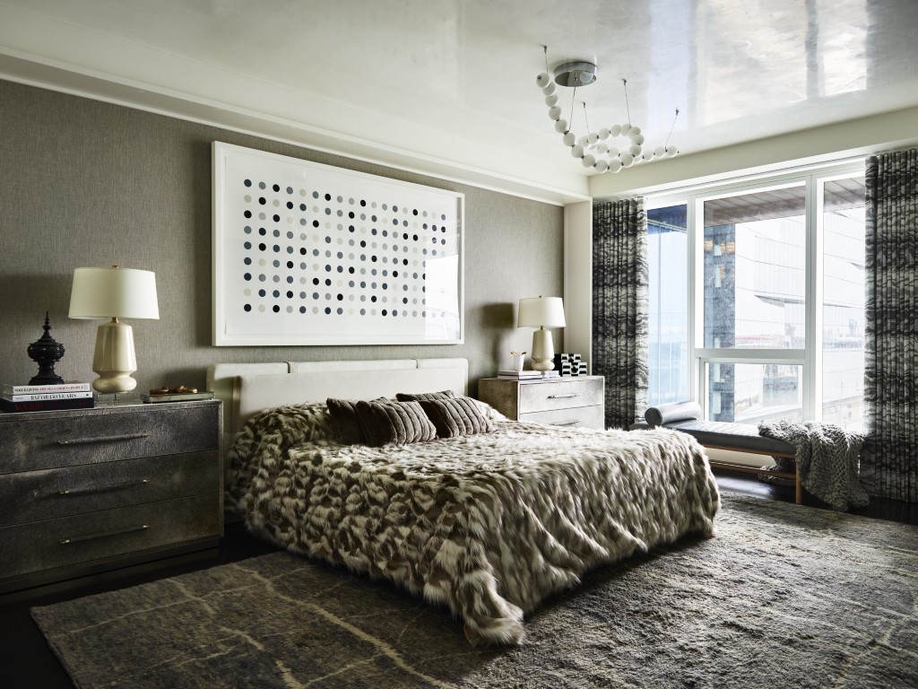
Artwork that looks like a changing, curated collection ties everything together. “I chose many pieces that people maybe haven’t seen before,” Roseff says, adding that the work over the bed in the primary suite is by Damien Hirst. “Or artists people may not be familiar with.”
(He counts himself in the latter category: He created the eight circular paintings that line the hallway.)
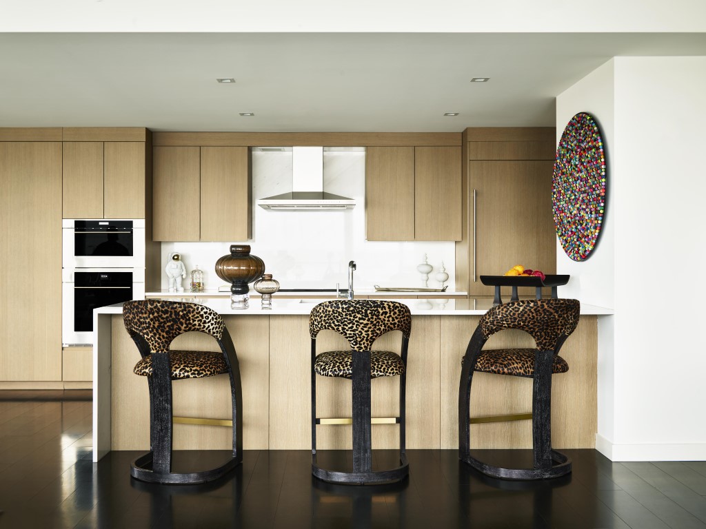
From the circular coin-painting in the kitchen and the round portraits in the hallway to the sphere-like globes of the ceiling fixture in the primary bedroom, every aspect of the unit becomes one great big design loop that amplifies the illusion of a place that’s well loved and well lived in.
“Several people who have toured the unit have asked who lives here,” Roseff says. “That’s the greatest compliment.”
