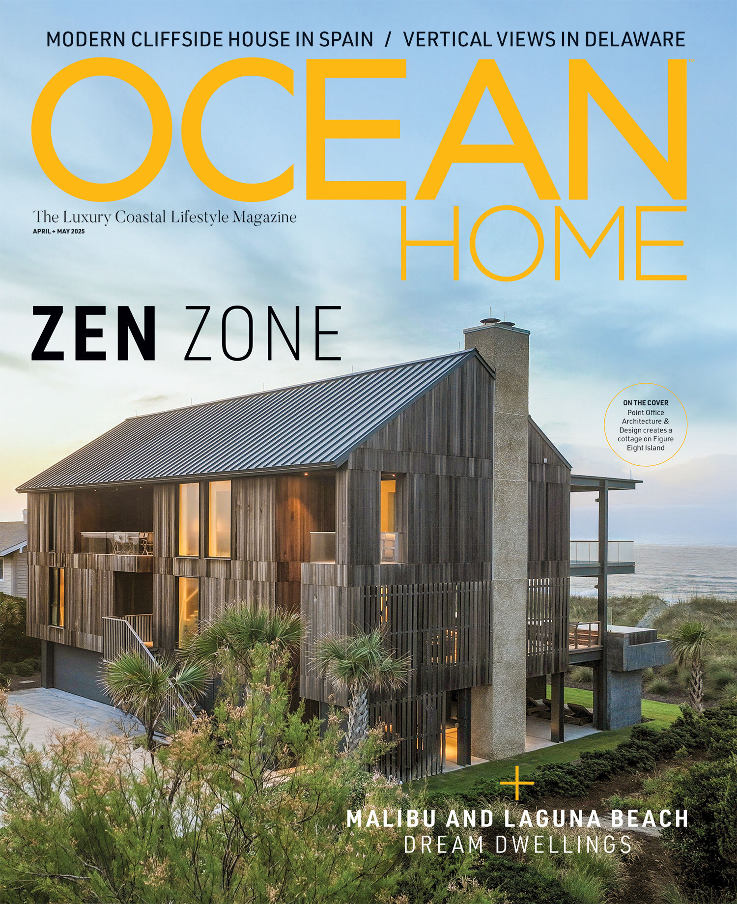
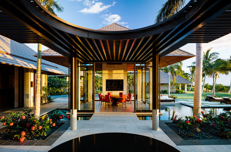
On Hawaii’s Big Island, architect Mark De Reus looks back to an ancient culture for inspiration.
(Above) For a home on the leeward side of Hawaii’s Big Island Architect Mark De Reus sought to lose the distinction between interior and exterior spaces—while creating a strong sense of order and spatial relationships.. Photographs by Joe Fletcher
A shared appreciation for Bali and its ancient culture drove the design of a home on the leeward side of Hawaii’s Big Island.
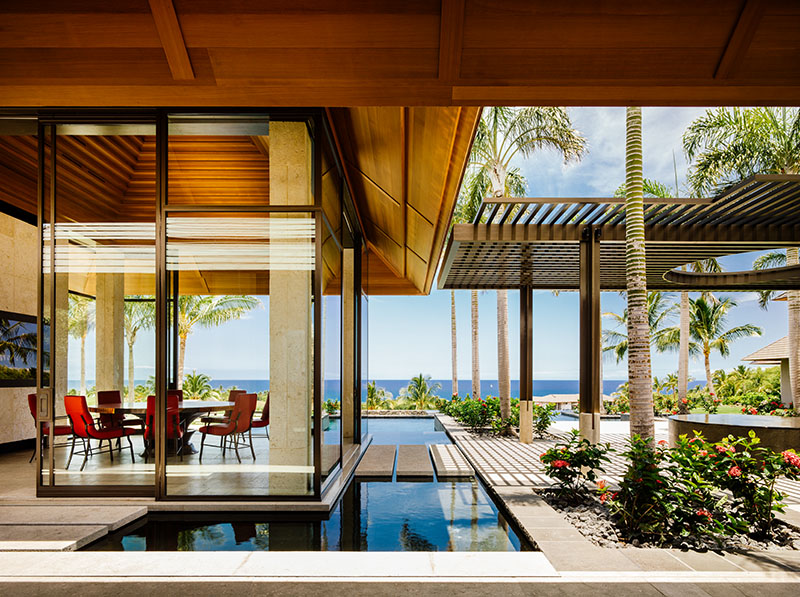

The dining pavilion seems to float over a raised reflecting pool.
Architect Mark De Reus and his clients, a Texas-based couple, are aficionados of the artistic sensibilities of Bali’s Majapahit Kingdom, one that spanned the years from 1293 to 1500 A.D.
“The design of the home was inspired from some aspects of the architecture in Bali —and Balinese culture from Java,” De Reus says. “It was a culture that was highly sophisticated and thriving in all senses— music, art, and architecture.”
Because it was designed for a double lot overlooking the Pacific Ocean, De Reus could break the 6,700-square-foot home up into six separate pavilions—all with ocean views. One’s the main gathering pavilion, one’s for dining, and one’s for outdoor living. There’s also a prime bedroom pavilion, a family bedroom pavilion, and a guest bedroom pavilion.
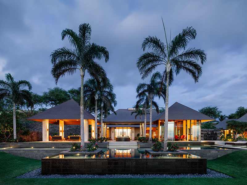

The pavilions’ hipped roofs are clad in copper shingles.
“In the tropics, you don’t need hallways and corridors,” he says. “The leeward side of the island is fairly arid—with 13 inches of rain a year—so it’s much easier to have natural ventilation in the spaces.”
The leeward side has another advantage. Two huge mountains—Mauna Kea at 13,796 feet and Mauna Loa at 13,679 feet—separate the windward side of the island from the leeward—so it’s never been hit by hurricanes in recorded history. “On the windward side, yes, but not on the leeward,” he says.
His clients knew the island and Polynesian culture well. She had spent time at the nearby Mauna Kea Beach hotel—a midcentury modern structure built by Laurence Rockefeller in the mid-sixties—when she was growing up. And she had lived in Tahiti. “It’s a different region of Polynesia, but similar—and she had traveled to Bali a lot,” he says.
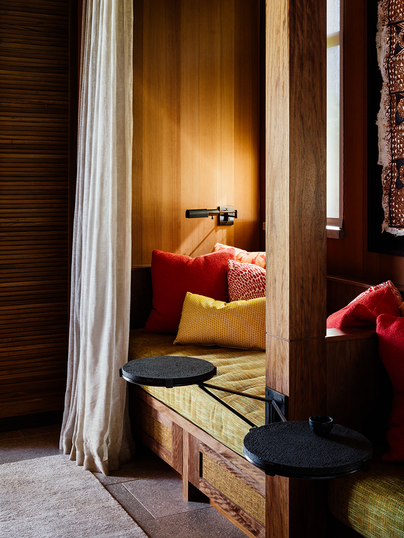

The prime bedroom offers a separate space for a daybed.
The home’s dining and outdoor living pavilions, with an axis mundi between—together with a linear lap pool—are aligned geometrically, and form the center of this home-as-village. “It’s an axis mundi connection between heaven and earth,” he says of his Balinese slice of tropical modernism. “It sits behind a long lap pool, so there’s a connection there.”
The axis mundi sets up an ordered layout of the pavilions. “It gives them a reason and rationale so the indoor and outdoor spaces are related,” he says. “Actually, one of the more exciting parts of design is working out the spatial relationships in the way the buildings are organized.”
This particular property within the overall development was allowed to rise two stories high, so its pavilions’ hipped roofs, clad in copper shingles, reach skyward. And the stepped interior wood ceilings of the outdoor and dining pavilions refer back to Balinese Majapahit artistic sensibilities. “The property is big enough to stretch out across it, and then there was the luxury of having those higher roof types—which means higher ceilings,” he says.
The prime pavilion is larger in scale than the family and guest pavilions, and was designed in a cruciform shape, with a sleeping area in the center. “Then there’s an office area and a small living area to each side, so it’s nice to be in a different living area where you have space to go to and shut the door,” he says. “In it there’s a big daybed, called a punee in Hawaii, for sleep or work or reading at 2 a.m.”
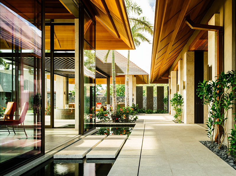

Pavers are limestone from Turkey, in a light sage color with small, fossilized shells embedded in them.
The dining pavilion, which is taller than it is wide, features wooden columns and walls clad with Turkish limestone in a grayish-green color and embedded with tiny seashells. “Because of the height, you look up to the sculpture of the ceiling—and feel like you’re in a glass box with a really gorgeous hat on,” says interior designer Jacques Saint Dizier. “And the water element is so important—the dining room has water surrounding it, so it feels like a floating pavilion.”
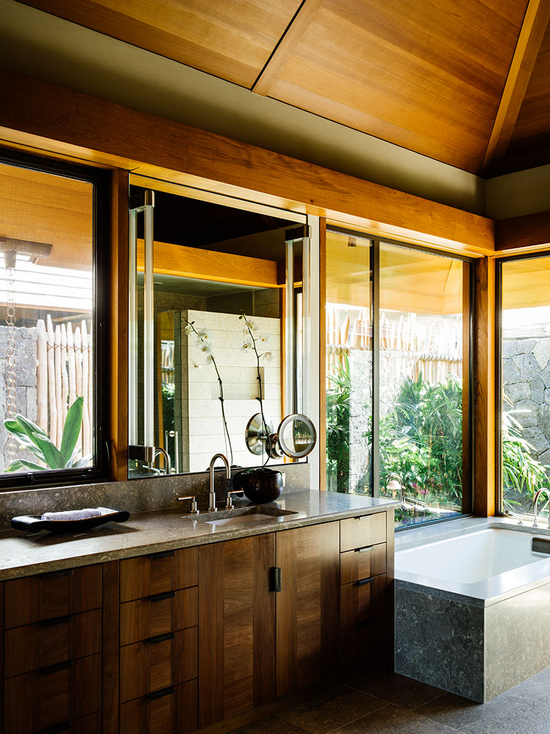

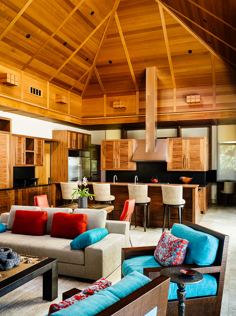

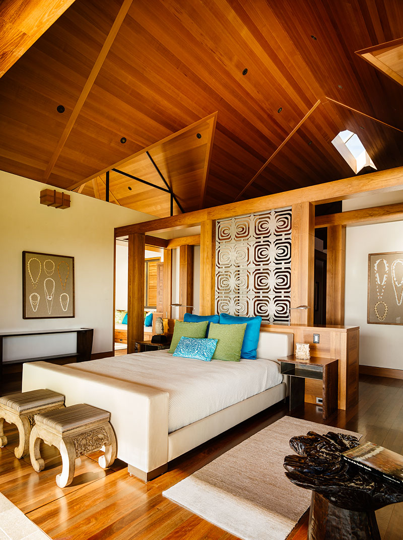

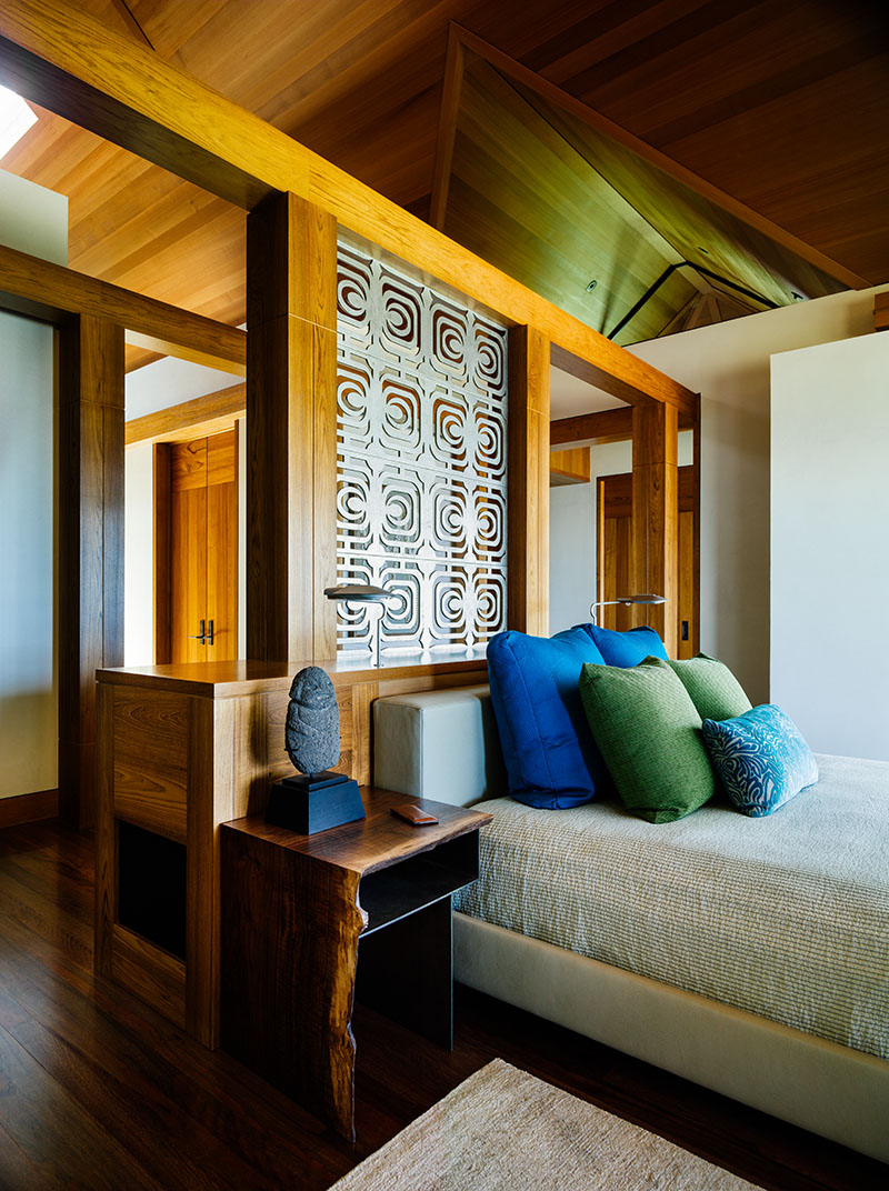

Clockwise from top left: Doors and trim are teak. Ceilings are cedar. The prime bedroom is a cruciform, with the sleeping area in the middle. It includes an office area and a small living space.
Saint Dizier was recommended early on to be interviewed by the clients, and flew to Los Angeles to meet with the wife. “She wanted a lot of strong color,” he says. “And serendipitous things like dining chairs with coral-colored leather, the exact color of flowers blooming around the dining room.”
The dining table is a solid, 87-inch by three-inch slab of cypress, now sitting on a bronze base designed by De Reus. “It was salvaged and we had it worked on by a great woodworker who kept as much of the thickness as possible,” Saint Dizier says. “There are tribal carvings around the edges, and bronze divot-filled spaces that look like lava flow.”
The table took three years to complete, but the clients were patient. “They were like: ‘Do it right, and we’ll be behind it,’” he says. “I’d like to have one more client like that before I die.”
Luckily, the team were fortunate to have this once-in-a-lifetime opportunity.
For more information and inspiration visit dereusarchitects.com
