How do you turn a Mediterranean, stucco-style three-story in Manhattan Beach into a modern showstopper that would feel as equally at home in coastal California as in Sydney, Australia? Luis Murillo makes it look easy.
Taking cues from the wife’s New Zealand roots and the couple’s time together in Australia, the LMD Architecture Studio principal streamlined the exterior, opened up the interior, and suffused the entire structure with warmth, employing a palette of plaster, blackened steel, and natural wood. “They wanted modern lines, simple materials, and lots of natural light,” Murillo says, noting that they were inspired by the indoor/outdoor lifestyle prevalent Down Under.
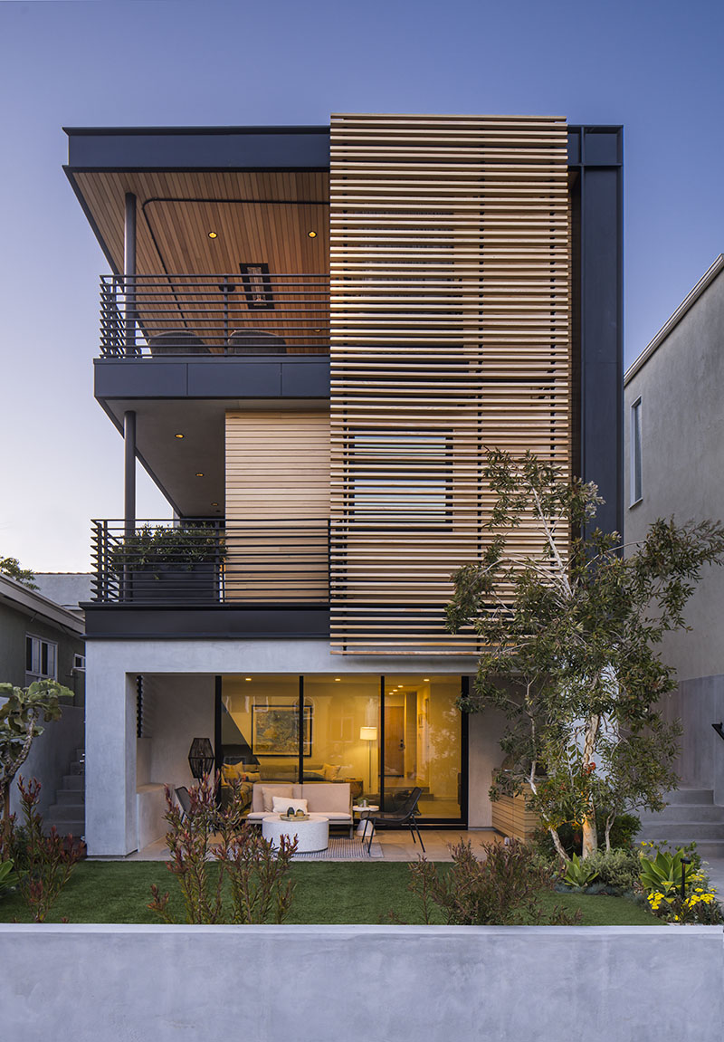

The home is an ode to indoor/outdoor living. There’s a patio off the ground-floor den, a balcony off the second-floor primary suite, and balconies off the front and the back of the third-floor gathering spaces. All enjoy privacy and perks, be it an outdoor kitchen, lush greenery, a spa, or an ocean view. “The owners were more interested in creating integrated indoor/outdoor spaces than they were in maximizing indoor square footage,” Murillo says.

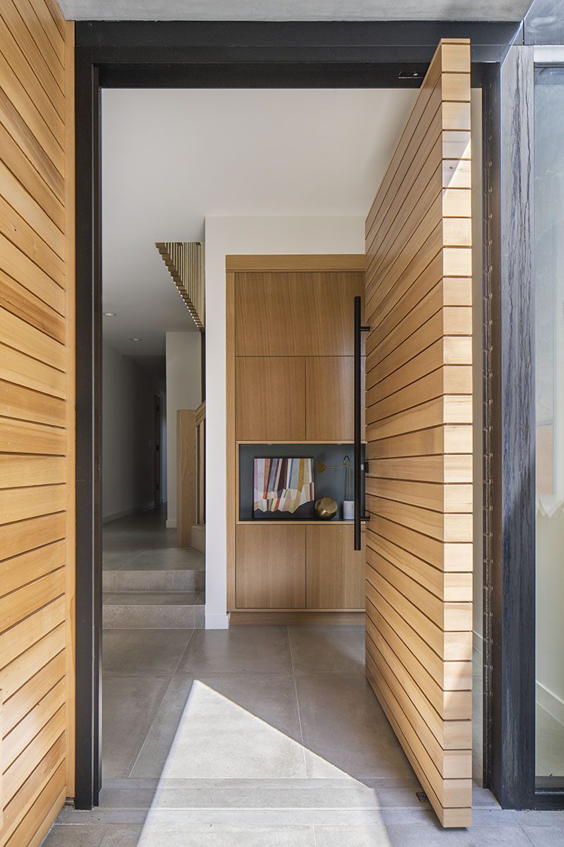
Strategic plantings draw visitors up exterior stairs along the east side of the house for entry on the middle level. Here, a slatted cedar door pivots and large-format, porcelain tiles flow seamlessly into the foyer. “The floor-to-ceiling door appears to be a continuation of the horizontal siding, as though it’s a moveable wall” Murillo says.
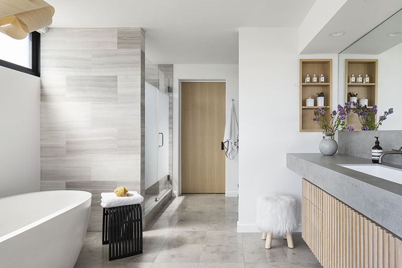
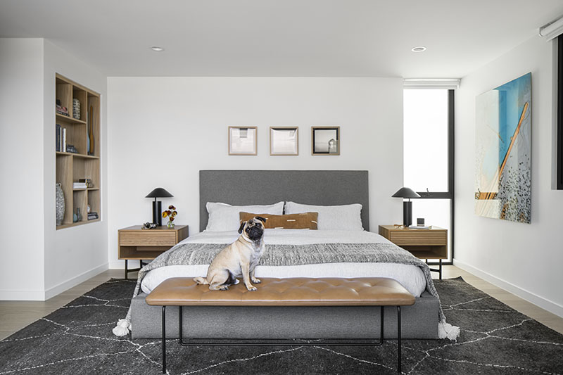
A sleek built-in with forest green and ochre-colored niches, compliments of interior designer Kellie Eserts, is the entry’s focal point. The children’s bedrooms are at the back of the house, and the primary suite, which boasts a boutique hotel-style soaking tub that is visible from the bed, overlooks the ocean.

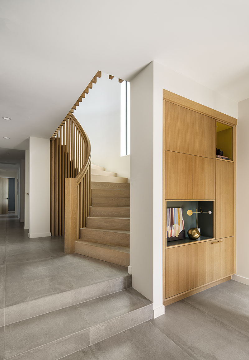


Rather than demolishing the dark stairway to the third floor, which would have pushed the project from remodel to tear-down territory, Murillo opened up the surrounding walls, designed a graceful, modern rail, and created a two-story lightwell to draw in southern sun.

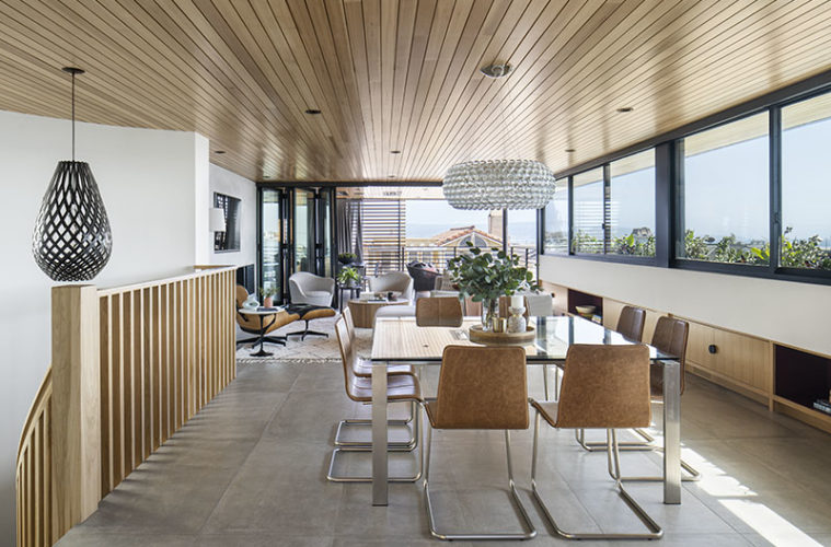
The top floor is the heart of the home. The curved stair leads into the dining area, in the center of the linear floor plan, where the owners’ existing glass table keeps the space feeling airy. Open and closed rift white oak storage compartments disappear into the walls, punctuated by half-moon, black iron pulls. “It’s the only hardware, so we made a shape,” Eserts says. “When schemes are simple, every decision must be intentional.” Above the built-ins, a ribbon of six windows stretches across the western façade, where foliage peeks up from outside. “A view with greenery is rare in Manhattan Beach,” Murillo says. “We created a long ledge for planters.”
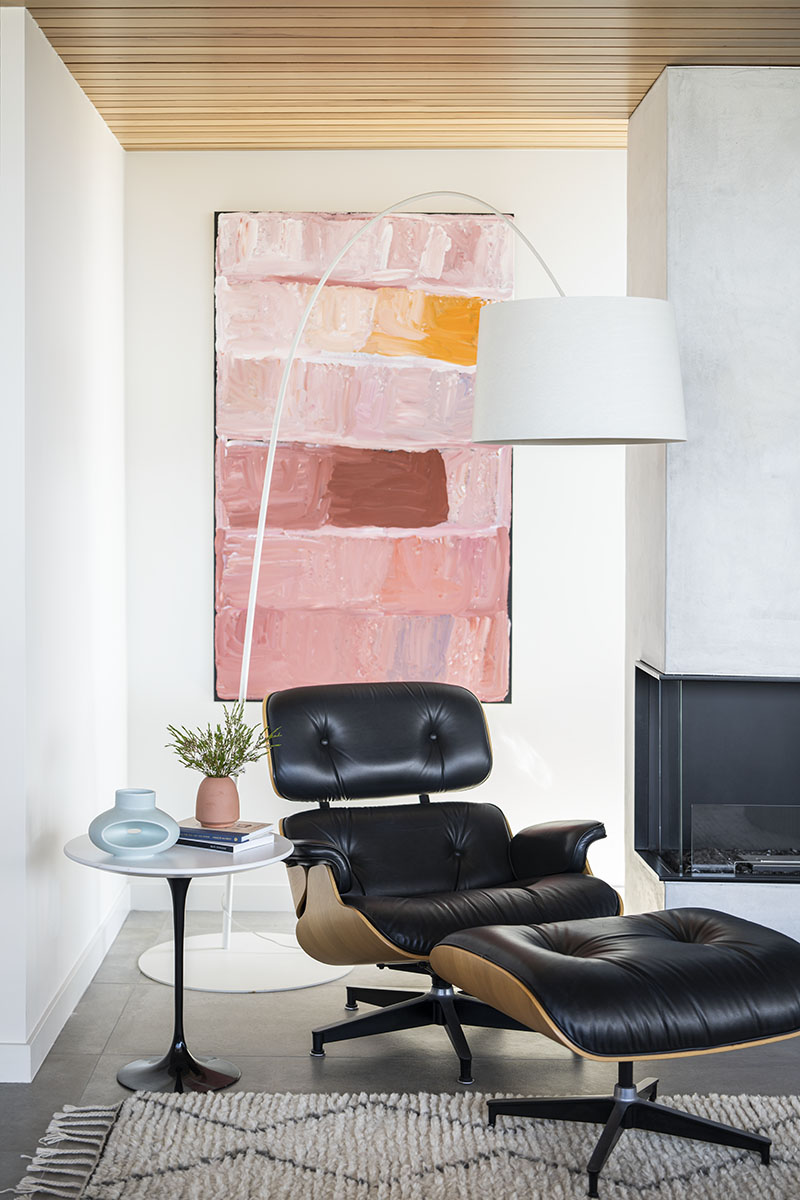

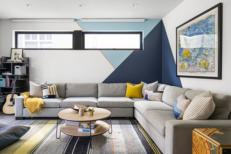
The windows are also the backdrop to the living room, where a sectional that fits the whole family is oriented toward a gas fireplace with a plaster surround and an integrated TV. An abstract painting by Aboriginal artist Kudditji Kngwarreye enlivens the wall behind the Eames lounge. Bifold doors open the space to the ocean-facing balcony, where the family entertains often, and the slatted cedar screen on the home’s front façade provides privacy.
The hemlock ceiling, meanwhile, runs north-to-south, piercing the exterior on both ends of the house, accentuating the indoor/outdoor connection. It also adds texture and warmth, and imbues the Australian vibe the clients craved. “To be an effective architectural element, a material needs to be carried in and out,” Murillo says.

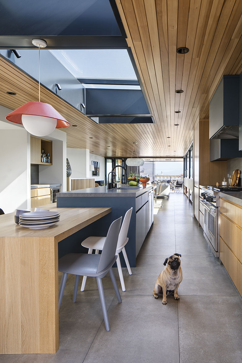
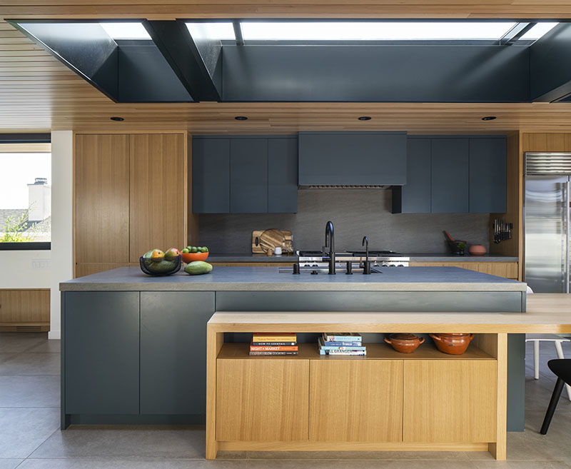
Inky blue paint punches up the palette in the kitchen. The dark, slab-front upper cabinets and matching hood sit back between the refrigerator and towers made from sandy, rift white oak. To keep the presentation clean, the team used a charcoal-colored composite for the backsplash and countertops. “We went to numerous stone yards, but the stone slabs all seemed too busy,” the designer says. Matte black faucets tie to the windows and help illustrate the owners’ allegiance to simplicity. “They’re classic modernists who don’t follow trends,” Eserts asserts. “They didn’t want to hide the fridge or use any brass.”

The center island sits under a skylight that brings light into the middle of the floorplan. A rift white oak bookcase that morphs into a breakfast table wraps the island, breaking up the block of blue with a playful geometry. “It’s a nice, artistic moment that you see coming up the stairs,” Eserts says. The opposite wall is packed with function, including a wet bar, a walk-in pantry, a powder room, and a desk.
Finally, past the kitchen is another covered balcony, this one with lounge chairs and a spa. “We reduced the interior square footage up here 20 percent to create the front and back decks,” Murillo says. “When you open the doors, everything flows.”
Learn more about the project team
Architect: LMD Architecture Studio
Interior Designer: Kellie Eserts Interiors
Contractor: DMiles Group, Inc.
Landscaper: Jones Landscapes
Millworker: SMI Custom Cabinets and Millwork
