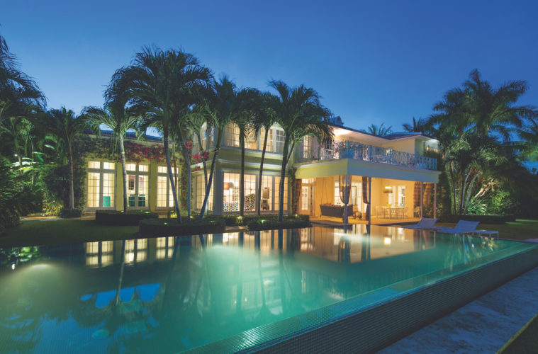
There’s no question that Richard Yulman’s newly redesigned home in Miami Beach is drop-dead gorgeous. New York-based architect and interior designer Suchi Reddy saw to that.
The only real question lies in pinning down a single architectural style for this 1939 Sunset Beach gem. It was built by a Cuban sugar magnate, so it shows some Caribbean influence. Its time frame for construction was the late Art Moderne period. But there are some snippets of Art Deco slipped in too, and even a bit of Hollywood Regency.

So it’s a hybrid – a mixed bag, really. But it offered the distinctive kind of character that appealed to the client. More important, when Yulman bought the home, its Miami Beach location would provide a much-needed change of scenery. He was a retired executive who’d spent 25 years in nearby Coral Gables with his wife – until she died a few years before. “I didn’t want to stay there,” he says. “I decided I wanted to move to Miami Beach.”
A realtor helped him locate the new house – a refreshing, one-of-a-kind alternative to those he looked at elsewhere. “There are architectural features here that are very unusual for a Miami Beach house – they’re not cookie cutter,” he says.
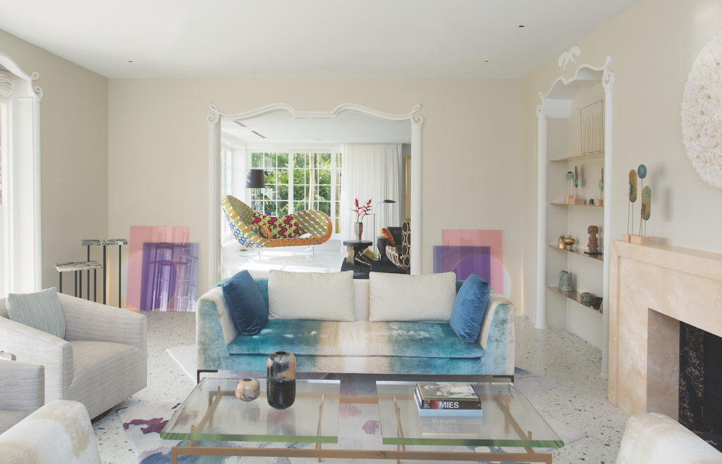

Few of its doorways, arches or window frames match. Rather, each curves and curls along its own specific contours. “It’s not your regular finish,” he says. “I don’t think it’s Cuban, but I do think it’s Art Deco – but not much.”
Yulman possessed a well-honed sense of design, so he approached the gifted New York architect about renovating the home, one that had been altered inside and out a decade before. Outside, the landscape redesign was fairly successful. But inside? Not so much. Still, Yulman looked on the bright side. “I’m just happy it still exists after all these years,” he says.”Houses get knocked down regularly in Miami, to put up new homes.”
Reddy flew down from New York City, where she’d just redesigned Yulman’s daughter’s apartment on the Upper West Side “She wanted to see the house before she committed,” he says. “She loved it and we went from there.”

Yulman asked the woman who’s designed retail interiors for Jimmy Choo and Henri Bendel for her vision of the home’s 12,000 square feet. “She said: ‘Give me some time and we’ll have a meeting in four or five weeks,’” he says. “I trusted her and her people – and they executed very well. We had a lot of fun doing it because it was great stuff and a fabulous house.”
Reddy was sensitive to Yulman’s position and lifestyle, and sought to enhance them both. “He wanted to start over, and the beach was a completely different feeling,” she says. “He was looking for interesting, exciting and livable spaces where he could play with his grandchildren and enjoy the life of the tropics.”
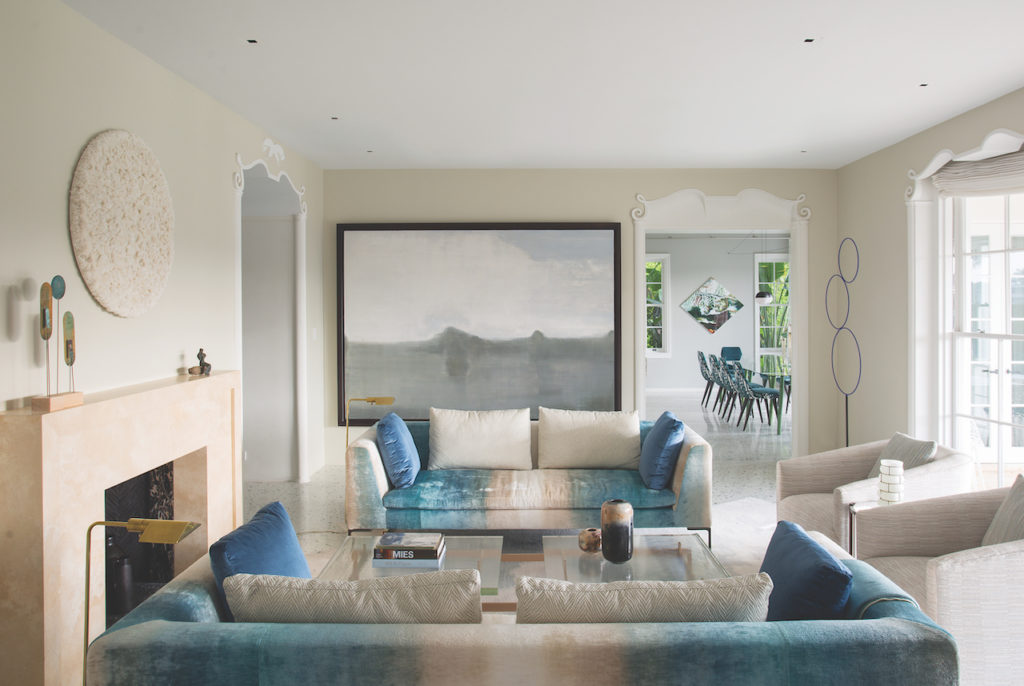
Reddy was impressed by the natural light pouring into the structure from nearly floor-to-ceiling windows, each wide open to the landscape. “With all the light and the vegetation, we really designed it like a painting composed in different sculptures and color,” she says. “But the light that came in really was the first thing I looked at.”
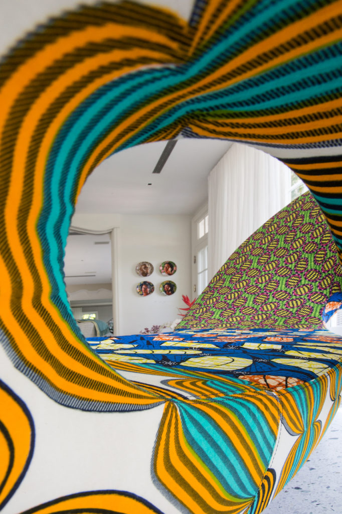

She wanted to create a language of design throughout the house, one that was colorful and exciting but serene and drawn from the nature of the site itself. She delivered whimsical pale blues at the entrance, but to showcase Yulman’s collection of African art, she designed a bright, bold gallery with large patterns and prints. They reflect the striking, green-hued light pouring in from a corner of the garden.
Because Yulman had requested a sophisticated, fun environment where he could entertain, she treated each room as an individual space with its own function and personality. The idea was to create distinct places that would simultaneously grab people’s attention and be comfortable to live in. ““Each room has a different mood in a different space,” she says.

That applies to the landscape as well as the interiors. “The pool at night-time makes a beautiful place to be – we wanted to make it a serene and romantic place,” she says.
Yulman was pleased to find that the layout of the house was already aligned to accommodate visiting family members – with a complete bedroom wing on the second floor. “There are back stairs for breakfast,” he says. “My daughter and her children are in a part of the house where I don’t go, unless it’s to see them.”
The architect’s biggest challenge was deciding how to blend a modern design into existing interiors and materials – to find a contemporary balance without drowning out the original motif. “It’s very much like designing the interior of an Italian palazzo,” she says. “You introduce new things and keep what makes sense and at the same time, offer comfort.”
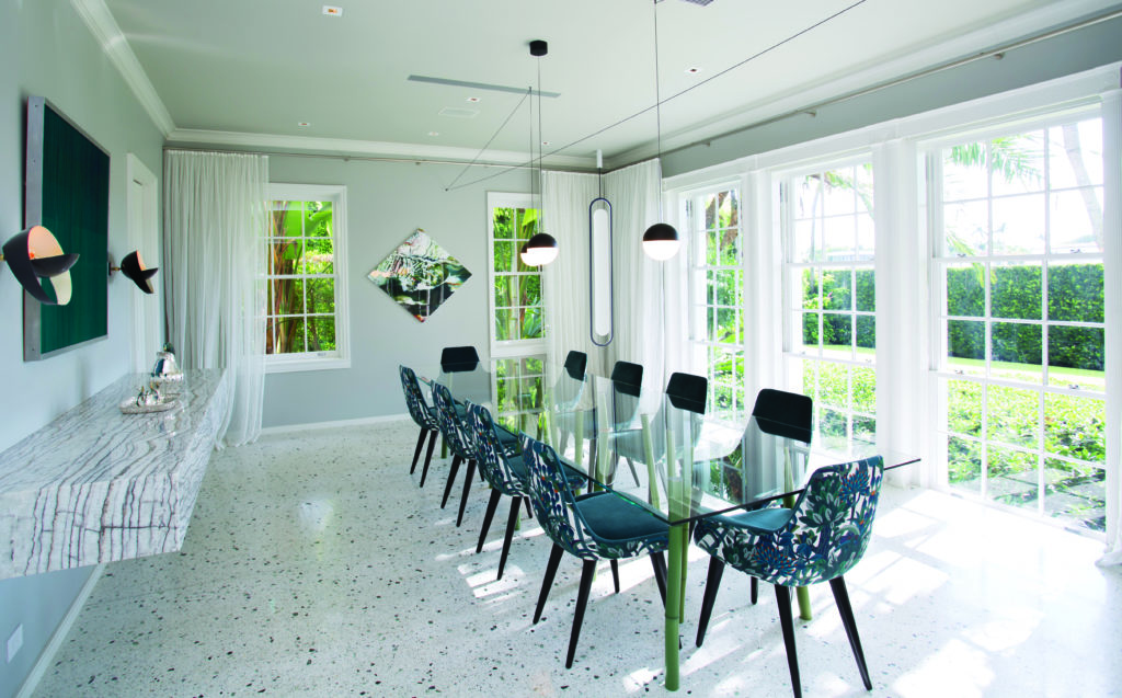

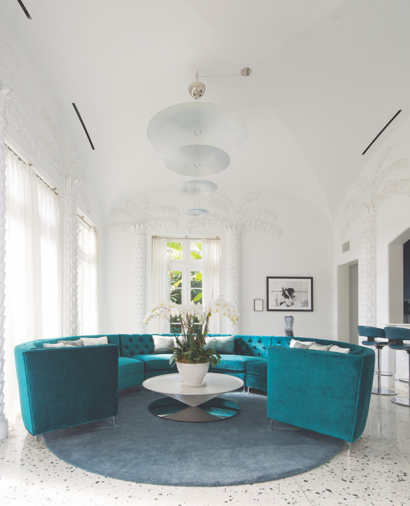
There were classical materials like existing, refinished terrazzo floors, natural woods – and especially, the plaster palm trees on the walls of the living room. “We decided to make the most of it all – we played with the whiteness of the texture,” she says. “And in the arches and the doorways, we kept the details.”
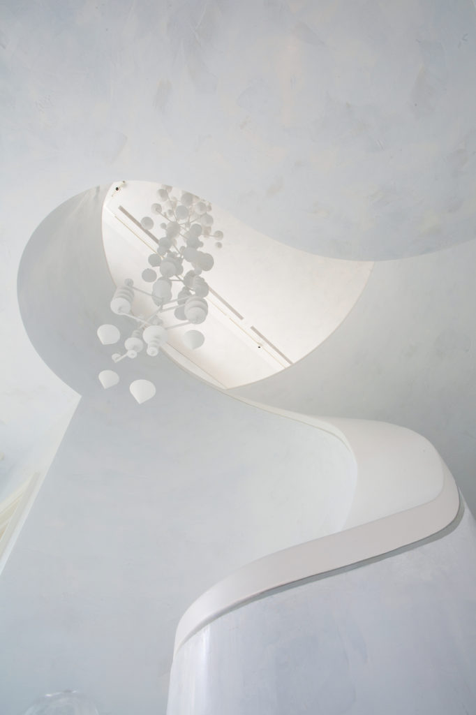
For a central spiral staircase, she removed a recently added Lucite railing, then solidly shaped a new one to emphasize its natural curves. She commissioned a sculpture for its center, then complemented existing artwork elsewhere with pieces from New York and Miami. “I like a back-and-forth dialog between art in a house, and I achieved that here,” she says.
Actually, what’s she’s achieved is an updated modernism that reaches back to the home’s late 1930s roots. It’s an aesthetic carefully aligned with the home’s traditional scale and proportion – an enlightened, updated take on all that came before it.
Little wonder then that this home goes by the name of “Sweet Spot.”
