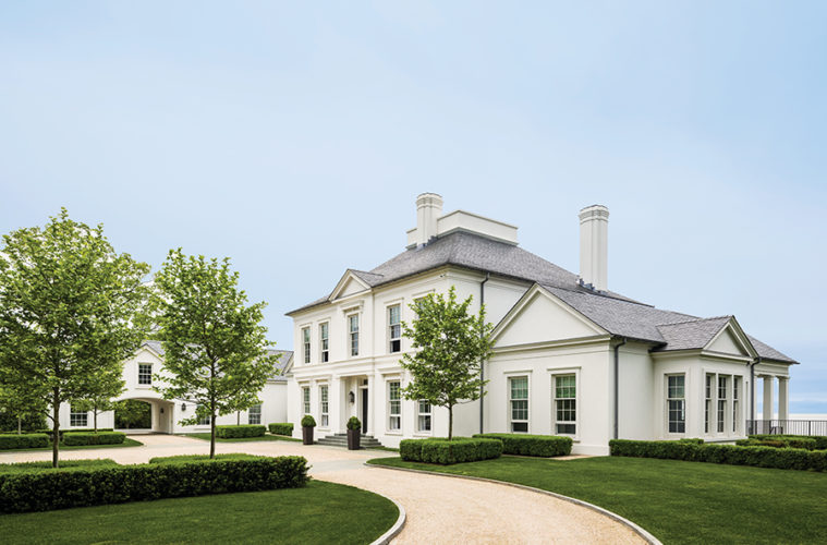
Mark Finlay, principal of Mark P. Finlay Architects, is a master of the waterfront home, but make no mistake, his oeuvre is nothing if not diverse. In designing this 12,000-square- foot Regency style residence for a cosmopolitan couple with four grown children, Finlay took cues from his client’s Norwegian heritage. “The home is very much a reflection of the clients’ backgrounds and tastes,” says the Fairfield, Connecticut-based architect. “The restrained aesthetic draws on northern European architectural principles.”
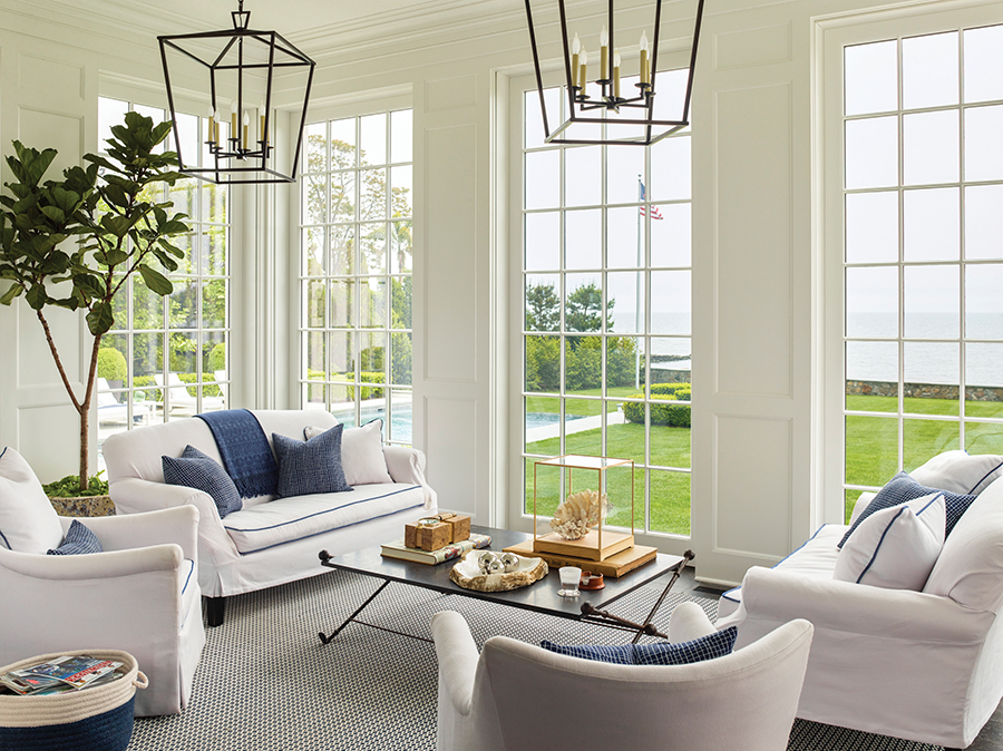

Every aspect of the house, which has a smooth white stucco façade and sits on the shores of the Long Island Sound in Southport, Connecticut, is carefully considered. Finlay, along with the firm’s director of interior design, Tina Anastasia, and landscape designer James Doyle of Greenwich-based Doyle Herman Design Associates, created a property that both embodies the homeowners’ vision, and melds form with function.
A Grand Arrival

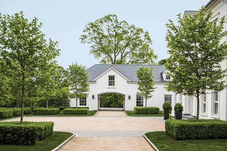
An allée of cherry trees lead visitors down a gently swooping driveway on the half-acre double lot, slowly revealing the water view for a statement arrival. Doyle says, “We talked about this important sense of disclosure from the beginning.” Doyle and lead landscape architect Cheryl Brown, echoed the straight lines of the home’s architecture in their symmetrical landscape plan, but when it came to the drive, a curve was crucial. “The graceful turn is a function of getting from A to B,” Doyle says. “It’s how we were able to achieve the reveal.”

Overall, the scheme is crisp and clean. “The northern European sensibility continues in the landscape,” says Doyle. The well-organized, hard-lined arrangement of the oil and stone courtyard, bluestone paths, and boxwood shrubs is in perfect harmony with the architecture. While the color palette of the plantings is monochromatic, a variety of texture, heights, and forms add interest. And, here and there, boxwood globes counterbalance the linearity. Brown says, “We used a lot of restraint.”
A Formal Façade

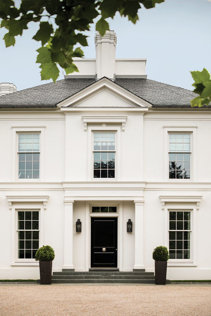
Despite the ample square footage, this is no sprawling compound. Rather, the home’s front elevation is absolutely orderly. The central portion is tall and strong, with a flared hip roof that lightens the impact. A double row of windows that measure nearly the same size—a whopping seven-feet tall—references European architecture. “Windows are exaggerated vertically,” Finlay says. “but there are hard horizontal lines to help make the massing of the house not feel so big.”

Symmetrical one-story wings are set back, reverential in their understated simplicity. And the glossy black door is framed by two uncomplicated columns. The effect is dignified and precise. “Norwegian architecture is about scale and proportion,” Finlay says. “We kept it simple and classic.”
Defying Convention

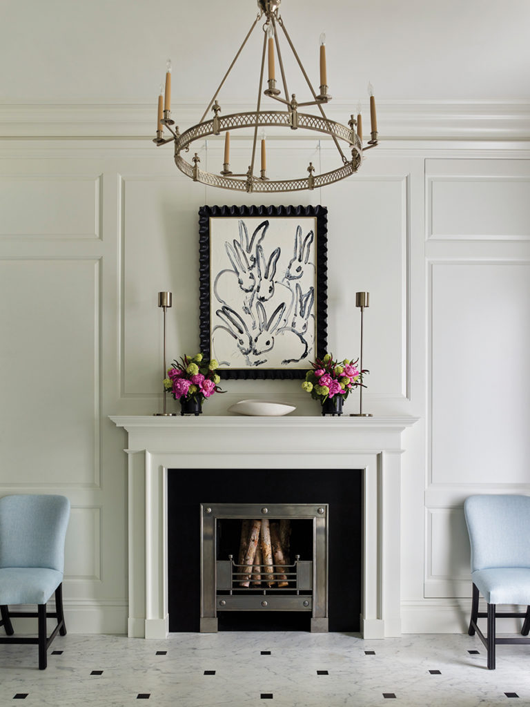
While there is a distinct formality inherent in the architecture, when it comes to the interior plan, rigidity falls by the wayside. Yes, beyond that grand black door lies a formal foyer complete with marble tile floor punctuated with absolute black cabochons, but the eye is drawn through the space to the water view out back. “When you enter the house, the water becomes part of it,” Finlay explains. “You go from formal to informal on the same axis.”

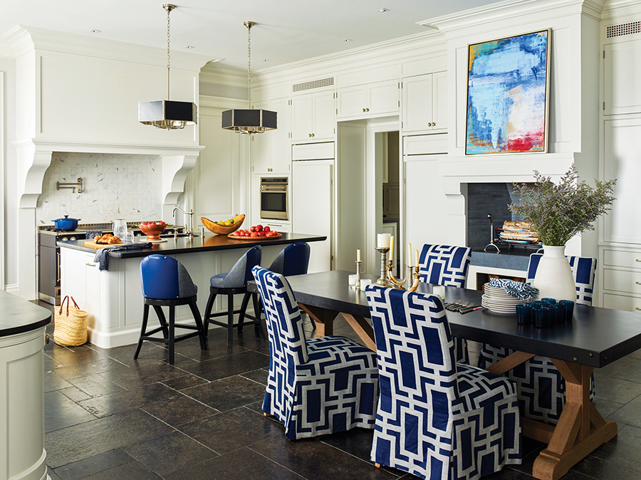
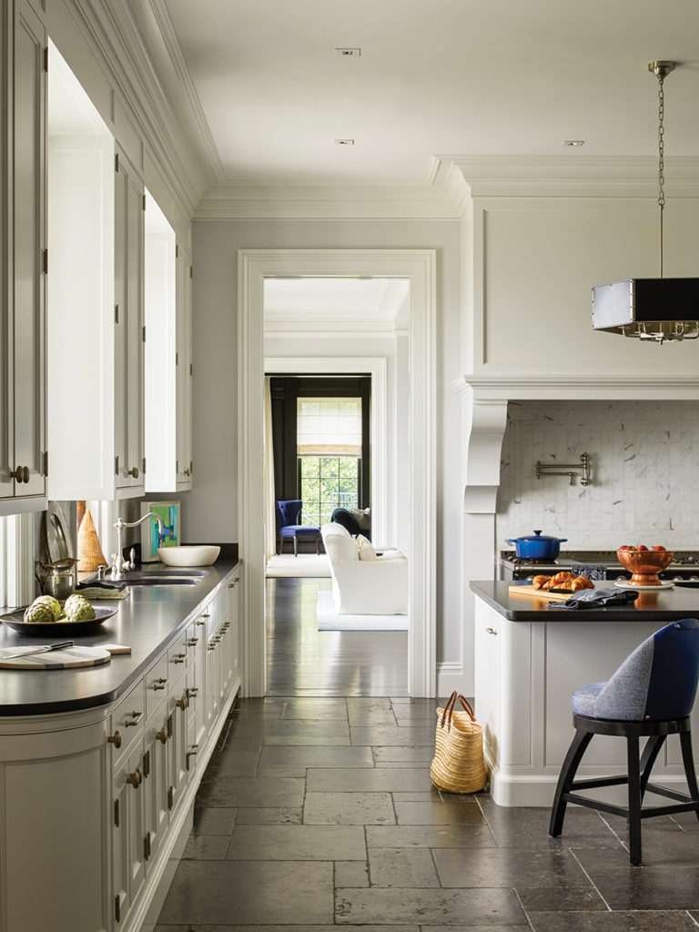
There is no central staircase around which rooms are organized. Instead, Finlay implemented a more Northern European arrangement in which wide, welcoming rooms open one to the next. “You walk though rooms to get to rooms,” he says. “You’re always moving through it, and so you use the whole house.” Three large spaces—kitchen, great room, and library—unfold across the back of the house, all with spectacular water views and access to central patio and lush lawn out back. “The plan of the house is everything,” Finlay says.
Sophistication with Ease
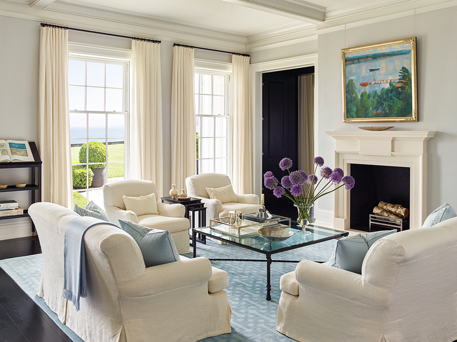

The interior architecture —classically molded trim, painted paneling, and windows that reach up to 11-foot-plus high ceilings—is set off by high contrast finishes. Dark floors ground the space and light walls keep it light and airy. “The clients love the high contrast of black with creamy white,” Anastasia notes.

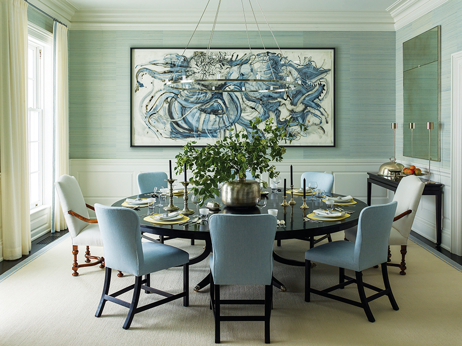
It’s an elegant backdrop to unfussy furnishings, as fitting for a home designed as a family gathering place. From the great room to the sunroom to the master suite, relaxed silhouettes and intimate seating arrangements invite one to stay awhile. Soft blue accents are woven through the rooms to reflect the coastal locale. Even the formal dining room, with its pale blue grasscloth wallpaper, swirling abstract artwork, and simple drapes, has an air of breezy inclusiveness that’s practically beachy.
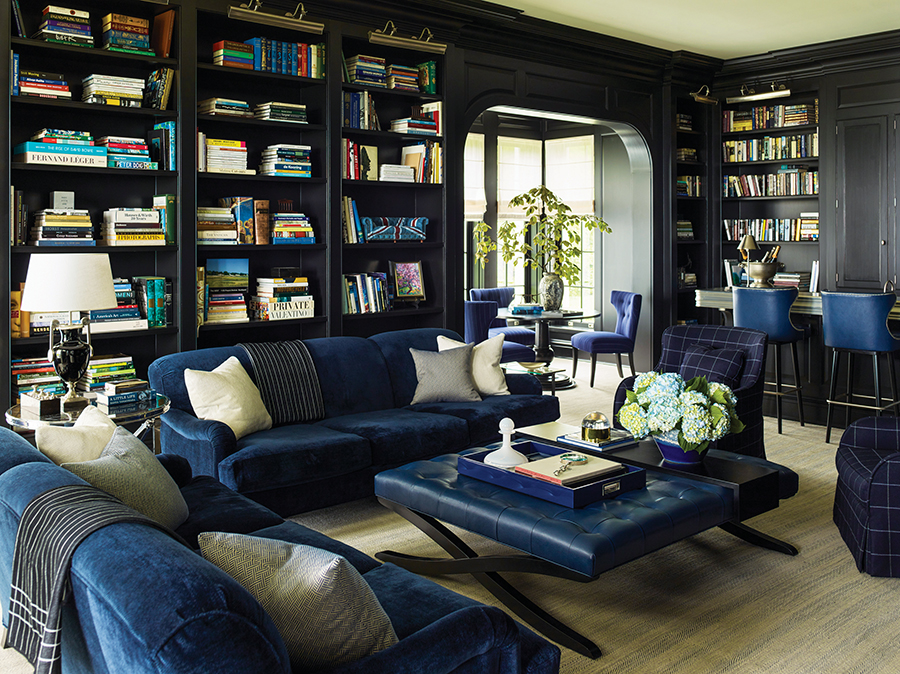

The library is dark, dramatic, and even more alluring. Built-ins and paneling painted pitch black line the room, brightened by the homeowners’ extensive collection of books that encompass a multitude of topics, from fashion and film, to art and architecture, to mythology and music. Luscious royal blue velvet-upholstered sofas are at once tailored and all-encompassing, windowpane plaid swivel chairs are conducive to conversation, and a tufted leather ottoman begs occupants to put up their feet. “The client wanted it be upscale,” Anastasia says. “But also, comfortable and usable.”
Relaxing Out Back
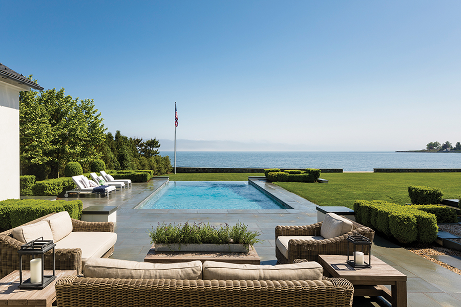

The back of the house is designed for relaxation and outdoor entertaining. Indoor rooms flow easily to well-defined outdoor areas paved in oversize bluestone. A covered dining patio opens off the library, which occupies the west wing, while the enclosed sunroom opens off the kitchen, which occupies the wing flanking the east side. In between, a double patio is bisected by horizontal pavers, on perfect axis from the front door. “The path is not just functional, it is integral to the design,” says Brown. “It is a strong visual experience that takes you from the interior to the exterior.”
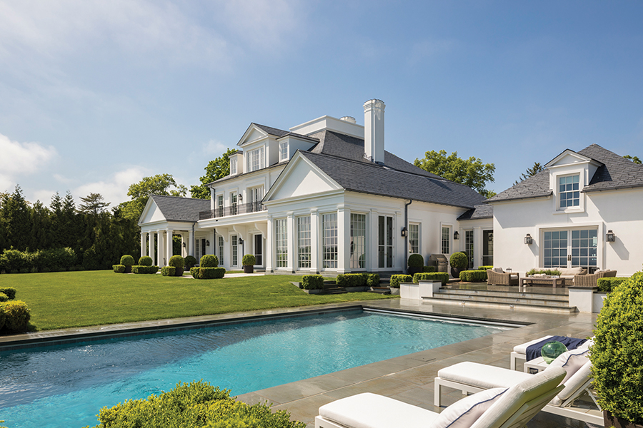

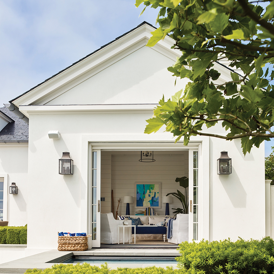
A smal breezeway adjacent to the mudroom on the east connects the main house to the auxiliary spaces tucked behind the garage. An exercise room opens onto a seating patio that leads three steps down to a crisp rectangular pool set long to the view. The adjoining pool house is the epitome of casual chic, with tongue and groove paneling, slipcovered furniture, and navy accents that lend nautical flair. Its sliding doors open directly onto the spa. Finlay says, “You can jump right in.”
