When a couple with strong family ties to Virginia Beach began looking at architects to design their new oceanfront home, finding the right local firm proved to be a challenge.
Luckily, there were family ties to New York, too. “Her father said: ‘I know Bob Stern!’ and made the introduction,” says Gary Brewer, a partner in Robert A.M. Stern Architects’ Park Avenue office.
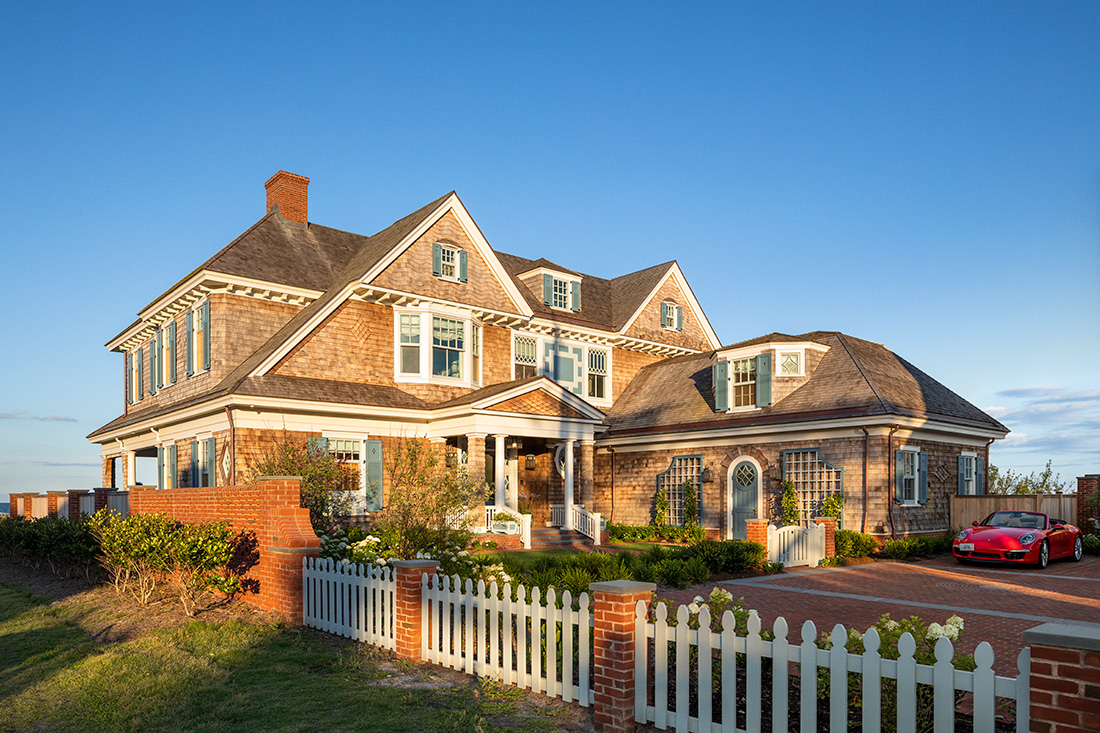
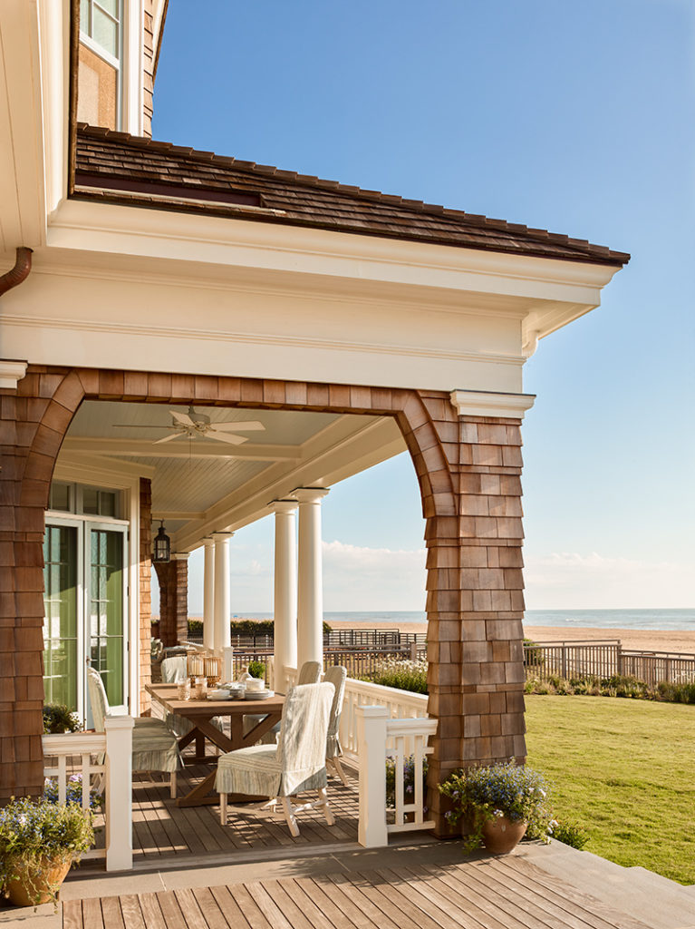
The result is a design for a home on the Atlantic that’s a legacy not just for the clients, but for the resort town as well. Snugged into a tight, 100-by-150-foot, double lot one block east of Atlantic Avenue, it’s a two-story, 7,000-square-foot affair that looks much smaller.
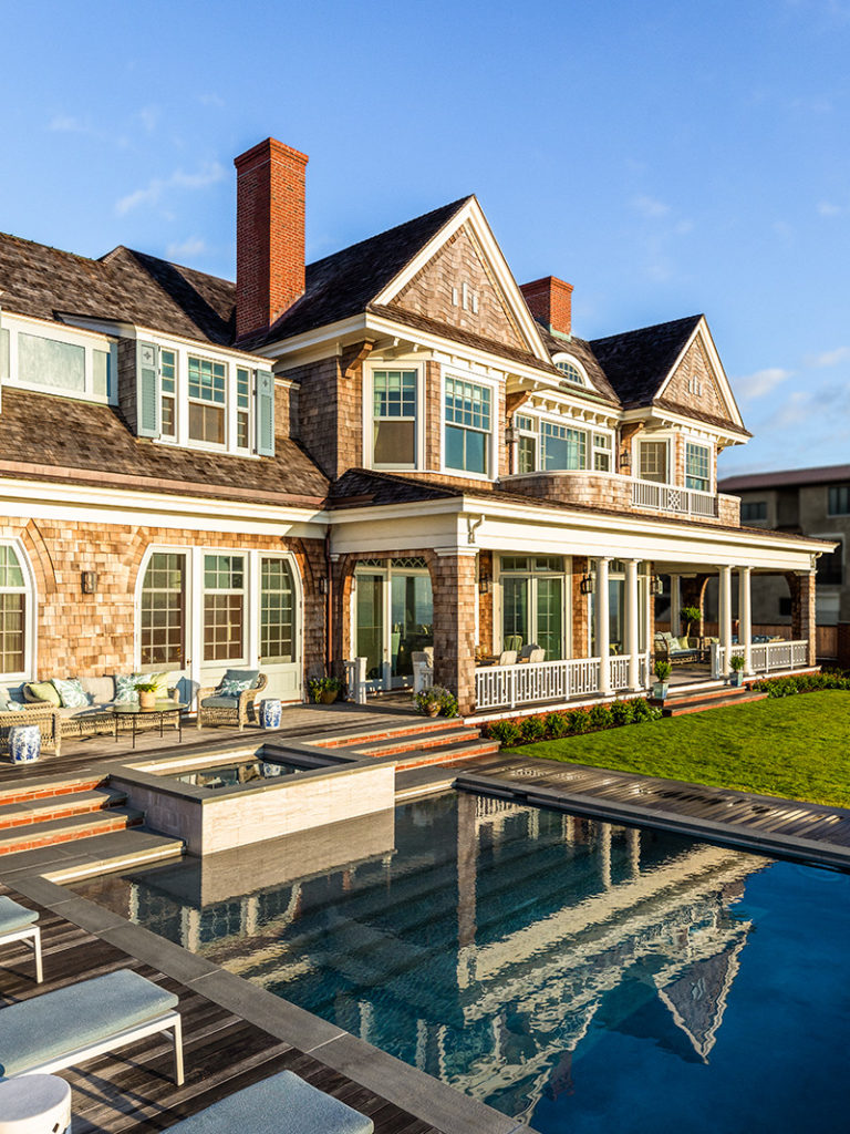
That’s because of a smart and sensitive architectural sleight-of-hand from Brewer and his design team. “When you look at the house from both sides—the ocean and the street—it looks like a one-story house with a roof on top with rooms in it,” he says. “The reason we did that is not only aesthetic, but also to bring the scale down to fit with the neighbors.”
Those neighbors to the south include a 1960s-era cottage with a future as a likely tear-down. To the north is public beach access, and another house 100 feet away. Both views presented challenges to the architects, the clients, and the neighbors.
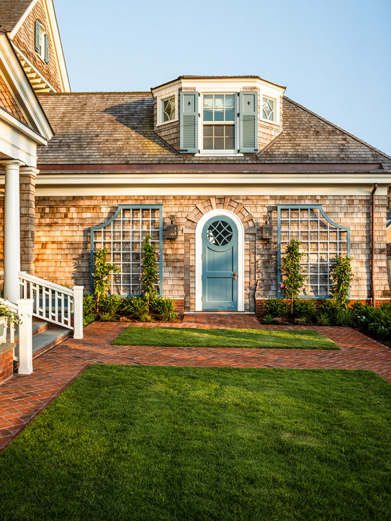
“It’s visible to the neighbors, so we had to devise ways to make it appear smaller,” he says. “The massing looks like a smaller house with a wing, and it’s chock-a-block full of wonderful detailing that helps to bring it down and nestle it into the neighborhood.”
The architects so successfully slipped the new Shingle style home into its site that people thought it had been around forever. “A passing couple asked the contractor when he’d started restoring the old house,” he says.
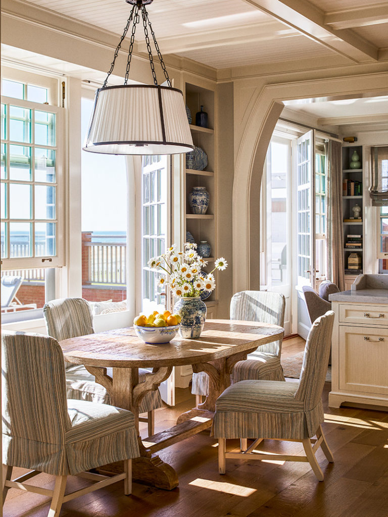
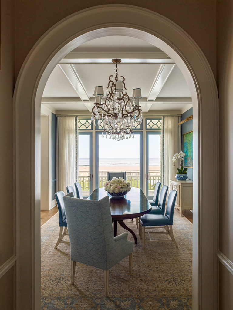
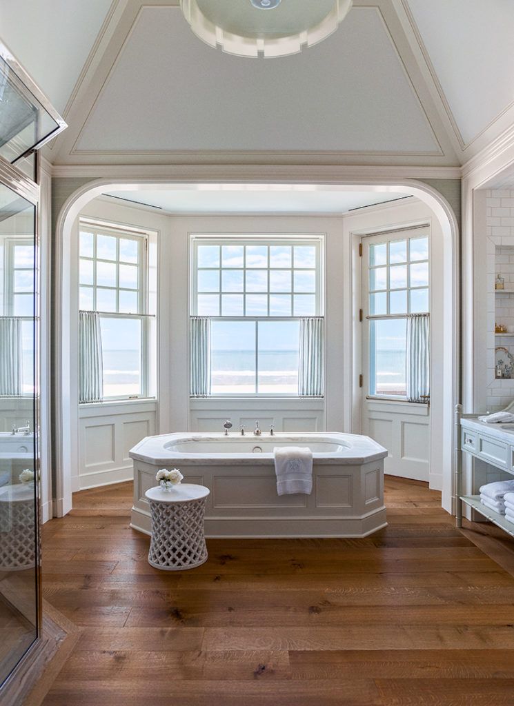
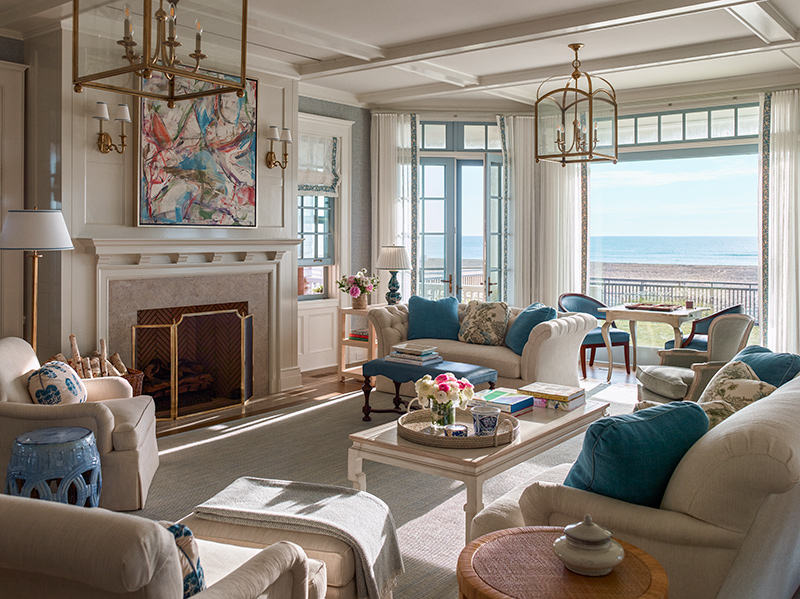
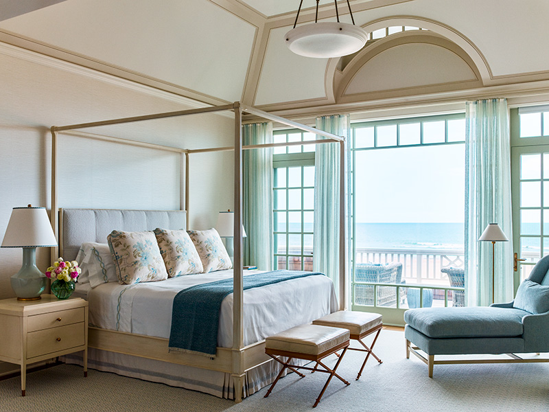
Their assignment from the clients was to come up with a floor plan that was livable for a large family when college-aged children were visiting, but also just the two of them. The ocean played a big role in all of that. “With a site like that on the water, the client was dreaming of being on the ocean, and wanted the beach to be part of their lives, not just when they’re outside, but when they’re inside,” he says. “There are large windows and doors to take advantage of the view from the inside.”
Landscape architect Ann Stokes, principal in the Norfolk, Virginia, firm that bears her name, worked overtime to make those views possible, and shield the owners from unwanted eyes. “Our mandate was to make it fit in that tight lot next to public access—to make it comfortable and be sure the client has plenty of privacy,” she says.
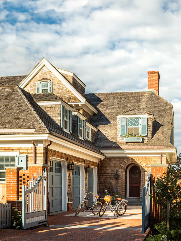
Stokes’ team designed the hardscape and landscape from the base of the house out, including the entry court, the garage, the grill terrace, the swimming pool, and the plantings. They created a welcoming environment that doesn’t overwhelm the client with maintenance issues, and provides them experiences in their garden and landscape year-round.
“We were very mindful of having walls that are fairly tall, but have them step down, with lower walls and fence mitigating the scale,” she says. “The parking court provides a layer of separation between the public sphere of the street and the private sphere.”
The walkway to the house is an intentional layering of hardscape and four layers of salt- and wind-resistant plantings between the street and the house. “On the north side, there’s no fence for that section of the front wall,” she says. “Then there’s a low wall and cedar fence between piers.”
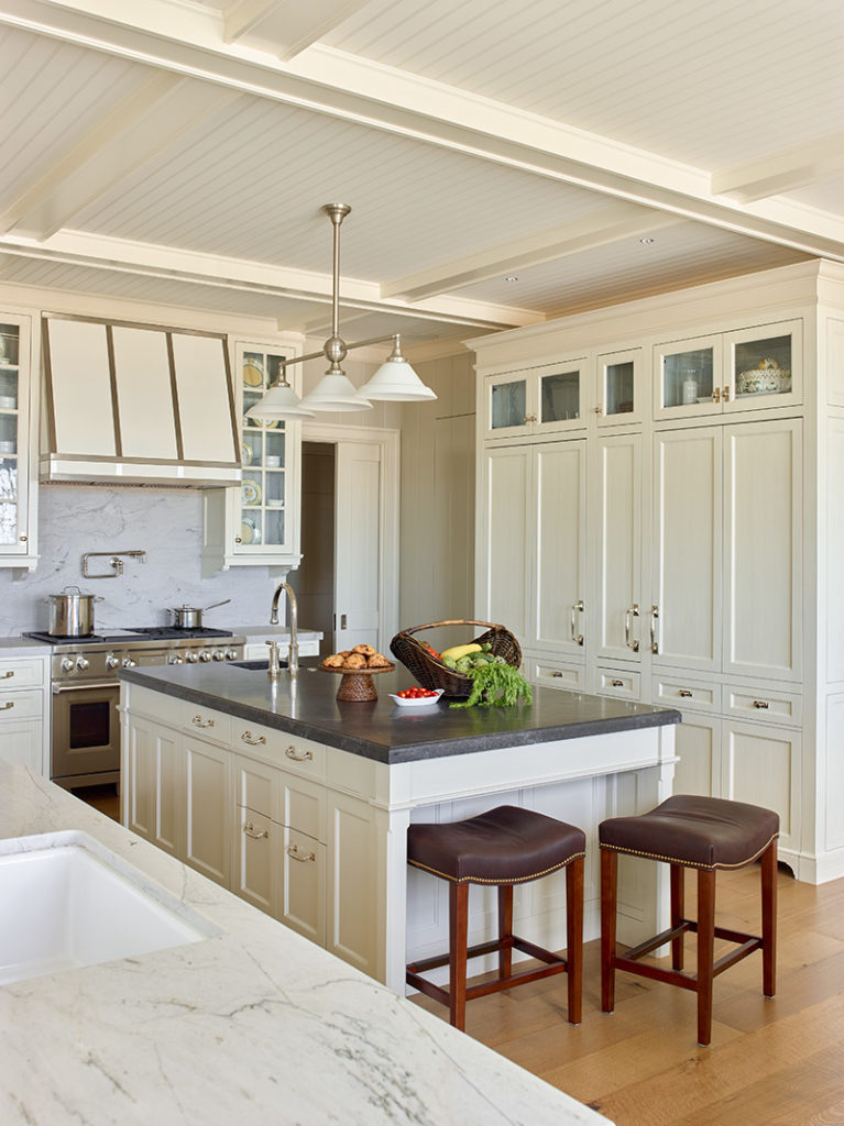
Inside, Boston-based interior designer Manuel de Santaren—who’d worked on four projects for the family over the years—was basically given carte blanche. “I approached it sensibly, knowing it was a year-round house and not just for the summer or weekends,” he says. “I created an environment that’s casual but elegant—they can entertain with a barbecue in the backyard overlooking the beach, or host a formal dinner party.”
He created a procession from room to room, for an easy flow from one space to the next. “It was important that every bit of space speaks to each other,” he says. “You open the pocket doors from the kitchen to the family room, and there’s a consistency in tone and color and texture—nothing feels out of place.”
The landscape drove his choice of colors, with the living room, dining room, and kitchen picking up changing tones in water and sand outside. “It’s creamy white, not bright white, with varying shades of blue to pull it all together,” he says.
Blended into its environment, nestled into its site, and built for privacy and views, this home benefitted from a dream team of designers—inside and out.
For more information, visit ramsa.com; manueldesantaren.com; columns.com; apsla.net.
