An out-of-date, 1950s Laguna Beach home has been recast from a less-than-stylish, imposing structure into a graceful, Cape Cod–like residence.
It took a dedicated team of architects, interior designers, and landscape architects to make that happen for their Arizona-based clients, a family of five in search of a summertime retreat.
Architect Chris Light, principal in the Newport Beach firm that bears his name, led the charge. “They were looking to purchase this property on the ocean, and I toured it with them and their real estate agent,” he says. “We talked a lot about its potential.”
Light was familiar with the complex Laguna Beach zoning restrictions imposed by both the city and the California Coastal Commission. “I explained what they could and couldn’t do, and they talked about what they wanted to do and see,” he says. “It seemed like a good match, and I started working on floor plans and elevations.”
The original, 4,000-square-foot house boasted good bones and a traditional form, all on a 5,500-square-foot lot. The architect took it down to footprint and walls, then rebuilt atop its rock-solid foundation. “The lower part is bedrock, which is unusual to find these days,” says landscape architect Mike Dilley at MDZA Landscape Architecture in Laguna Beach. “It sits on rock and not on sand.”
The three-level home rises from beach to courtyard and then to upper levels. “You park and enter the courtyard, and then you’re into the main floor of the house on the ground level,” he says. “Then you’re just a few steps down to the beach, and that’s the most engaging part—the interface with the water.”
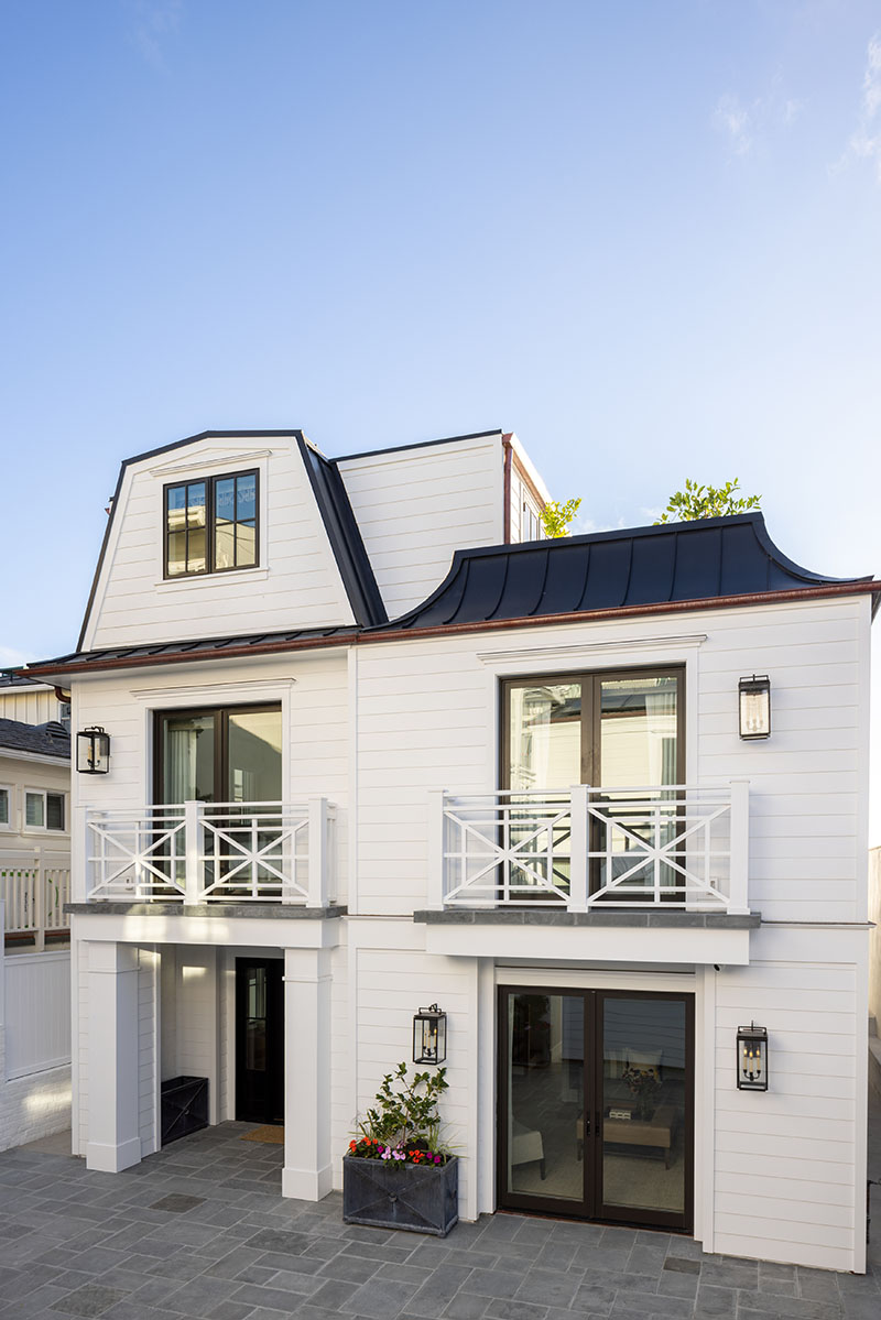
Dilley’s been practicing landscape architecture on high-end residential homes for more than 30 years now. He specializes in exteriors, infrastructure, lighting, planting, and designs for fireplaces, barbecues, and outdoor dining areas. But he’s also got an eye for a lasting material palette. “We used bluestones for paving, and the planters were made in Detroit with galvanized ironwork,” he says. “It’s very classic, and much more of a timeless house because of that.”
Timeless is the keyword for this project, from both architect Light and interior designers from Laguna Beach-based Fullen Enany Design. Founded 20 years ago, that firm works mostly on custom homes in Dana Point, Corona del Mar, and Newport Beach. For this project they tapped into the talents of a trio of interior designers, including founder and owner Michael Fullen, owner and interior designer Omar Enany, and interior designer Kelsey Bigelow.
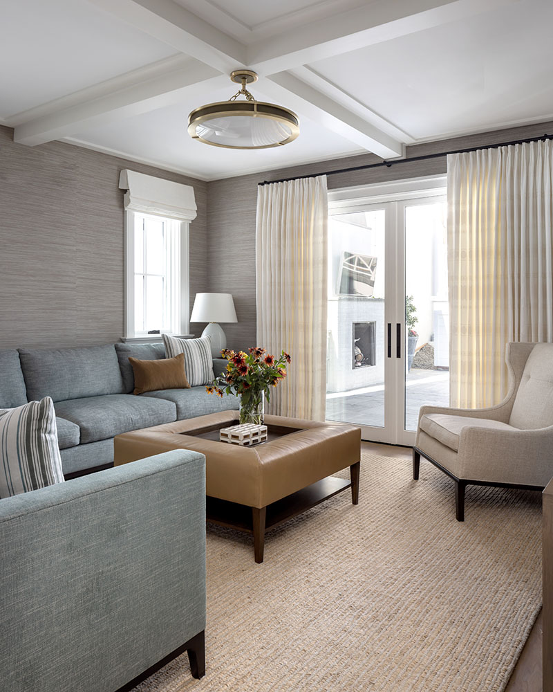
The three were tasked with creating a conservative home on the often uber-modern California coast, and establishing the tone of the new house with harmonious intent. “They gave us architectural plans, and we had a couple of interviews,” Enany says. “They said they wanted a more traditional interior because it’s traditional on the exterior.”
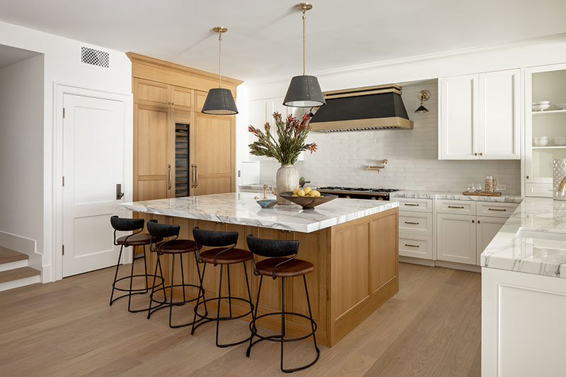
It may be a three-story affair, but atop the home’s roof deck sits an office and bath. Below is the second floor with master, laundry, and three bedrooms, and the ground level offers kitchen, dining area, family room, and patio.
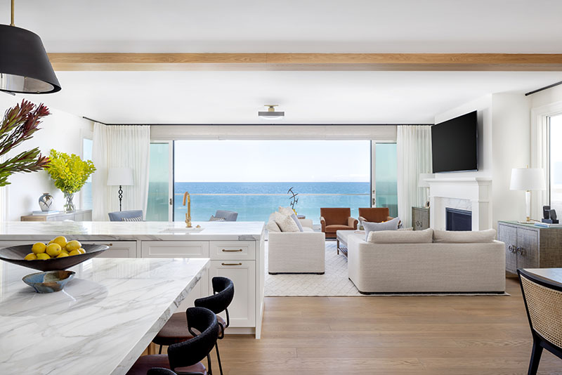
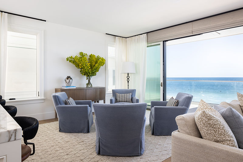
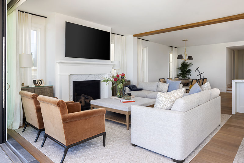
Aligning it all to the human scale was a paramount goal—especially on the lower level. Rooms are comfortably sized, with openly proportioned seating. “We maximized the space—there are different seating groups to accommodate everybody,” Bigelow says.
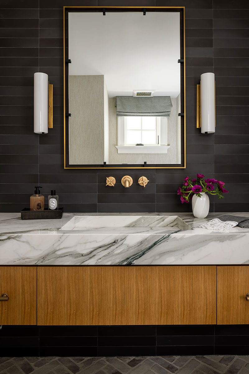
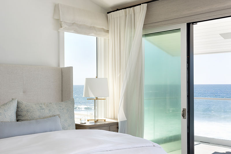
The color palette is fairly neutral, with beige and off-white tones, white oak floors, and white marble. “It’s clean and minimalistic,” she says.
Interestingly, their clients chose not to fill their walls with works of art. “They thought the ocean was enough,” Fullen says.
Light’s major architectural challenge was to open up the narrow spaces inside so that the family’s living experience didn’t feel tunnel-like. “The biggest thing I do is scale spaces together so there’s not a giant living area and small bedrooms,” he says. “I try to proportion it so overall it’s a big house, but the rooms all feel related to each other.”
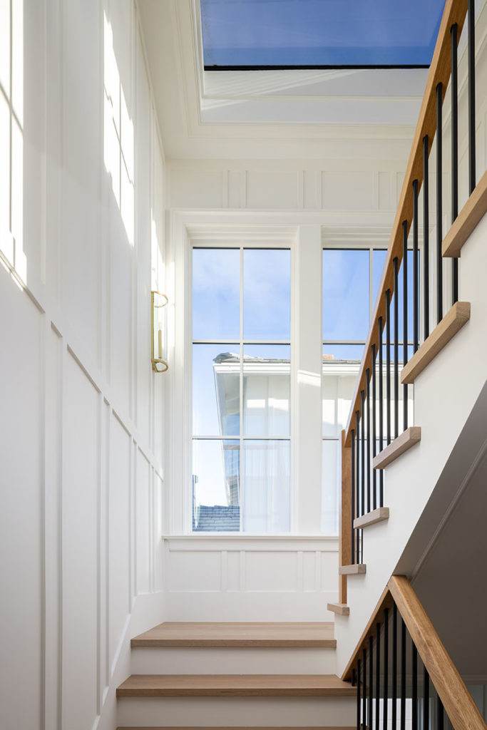
He opened up walls and reconfigured the interiors with a two-story stairwell and the entry on one side. “We pulled the walls down so it feels like you’re circulating into a great room,” he says. “We opened up the kitchen, dining room, and living room instead of leaving them all separate, like they were.”
By adopting the Cape Cod style outside, Light broke up the middle portion of the entire compound with a different slope of roof, also articulated for a more human scale. “It looks now like it’s been there forever—and has been nicely taken care of all that time,” he says. “We didn’t make it look like it flew down from space and landed there, or even like it’s a redo or a remodel.”
Instead, it looks timeless on its oceanfront site. And that, Light says, is the goal of all his architecture.
Learn more about the project team
Architect: C. J. Light Associates
Interior design: Fullen Enany Design
Landscape architecture: MDZA
