For Andrew Kotchen, the project’s design emerged early on, during the initial site visit.
Visiting at the request of his clients, pre-purchase, Kotchen saw right away that the Nantucket property—set back from the ocean and shielded from view by the surrounding natural landscape—represented a unique opportunity to push the boundaries of modern architecture on an island known for its historic Greek Revival and Quaker homes.
Kotchen had lived and worked on Nantucket before founding Workshop/APD with co-principal Matt Berman. Since its launch in 2000, the New York City–based firm has grown to include 85 architects, interior designers, and product designers: an impressive multidisciplinary team that adapts easily from luxury penthouses to relaxed seaside retreats.

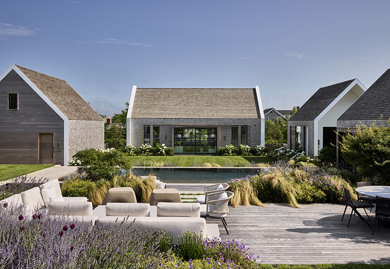
Nantucket’s famously strict building codes regulate the overall height, roof pitch, cladding, and even trim colors on new construction and renovations, with the goal of protecting the town’s historic character. Since the clients’ chosen site is well screened from public ways, Kotchen and team enjoyed more design latitude than usual. Taking full advantage, he dreamed up a uniquely modern series of pavilions encircling a vibrant courtyard garden.

“Our clients ultimately hire us for our modern point of view, executed through a progressive vernacular voice,” explains the design principal. “This site presented us with an opportunity to create something exciting—something completely different—and we were fully onboard.”
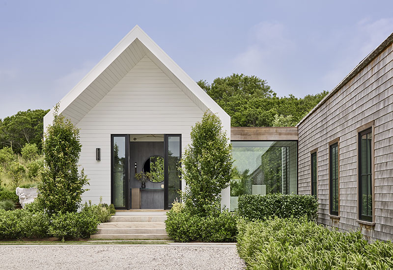
The home’s layout defines indoor-outdoor living, with light-filled glass spines connecting the living and sleeping pavilions (uniting them as one “home”) and maximum glazing framing courtyard views. Meanwhile, along the perimeter, the structures appear quieter and are purposefully restrained, with smaller window penetrations. Overall, the pavilions’ shingled, gable forms refer to the island’s earliest Shaker structures.
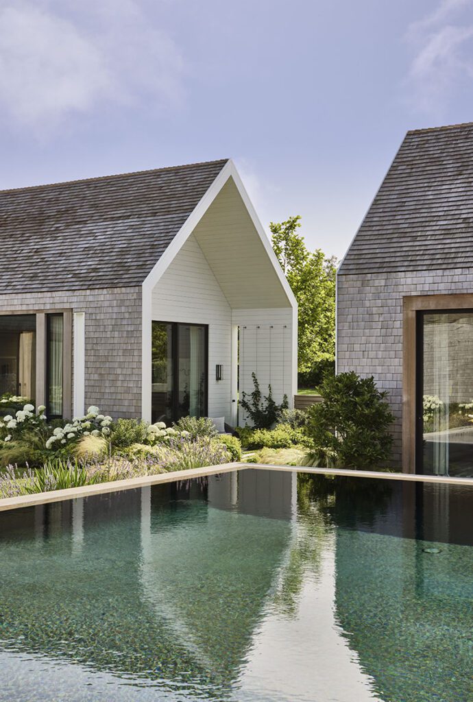

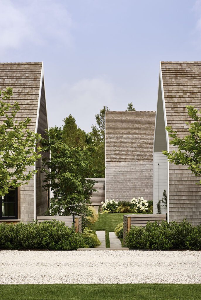

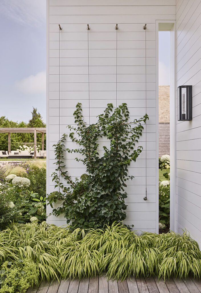

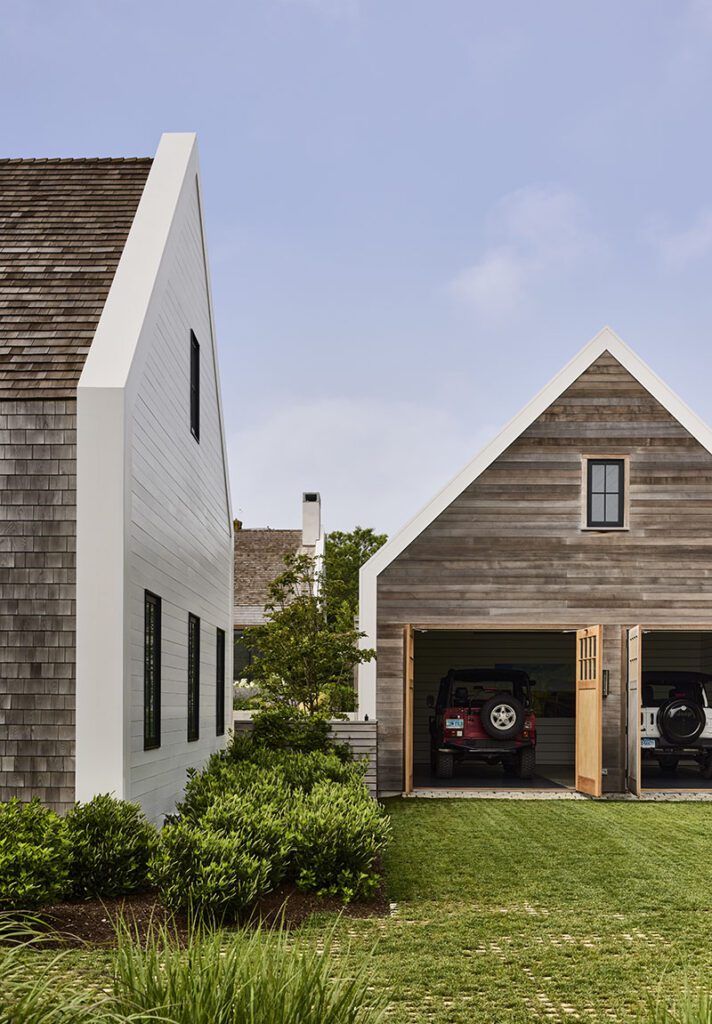

“We reduced the elements to their simplest forms; it’s almost as if we draped a blanket of shingles over each building. The magic is that the pieces feel recognizable but different—that’s the balance we were striving to achieve,” notes Kotchen.
The primary pavilion—the largest of eight total—houses the kitchen, dining area, and living room. From this 80-foot axis, two wings, one containing the primary bedroom suite and another the teenage boys’ bedrooms and media area, flank either side of the courtyard. Three additional standalone pavilions—a studio/work space, guesthouse, and garage—dot the property’s northern end.
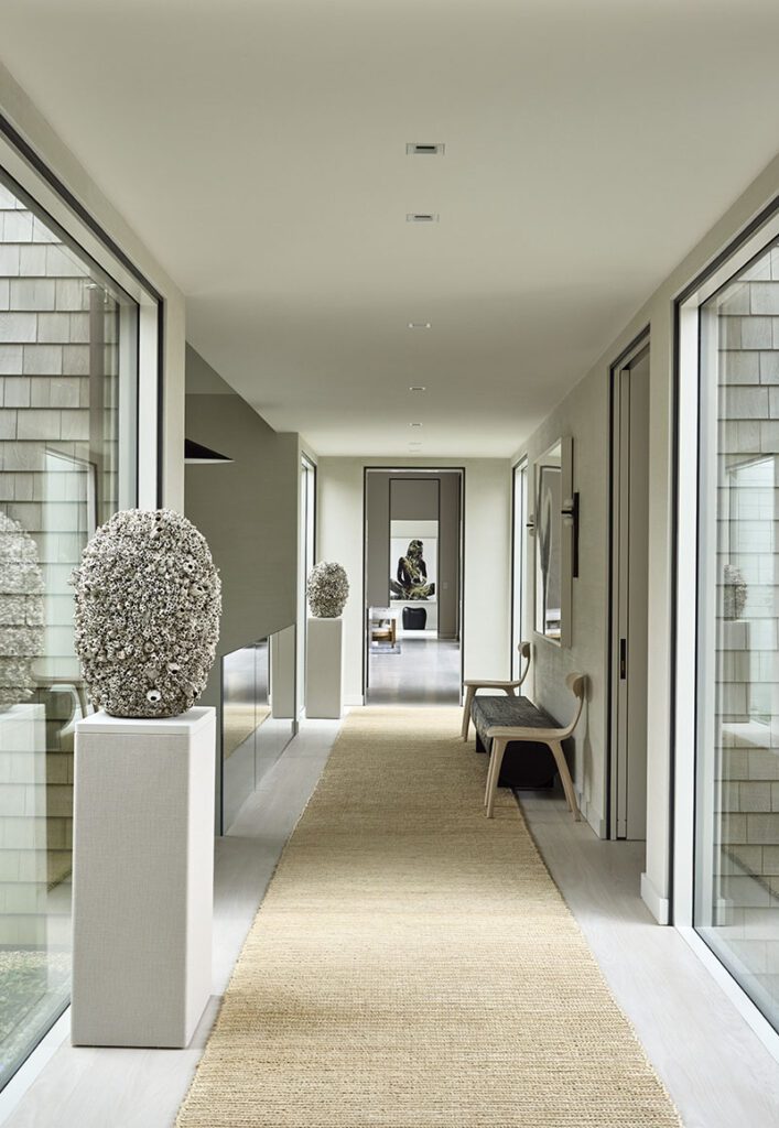

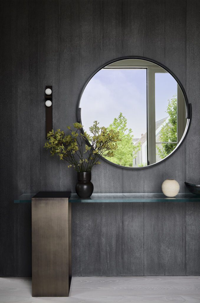

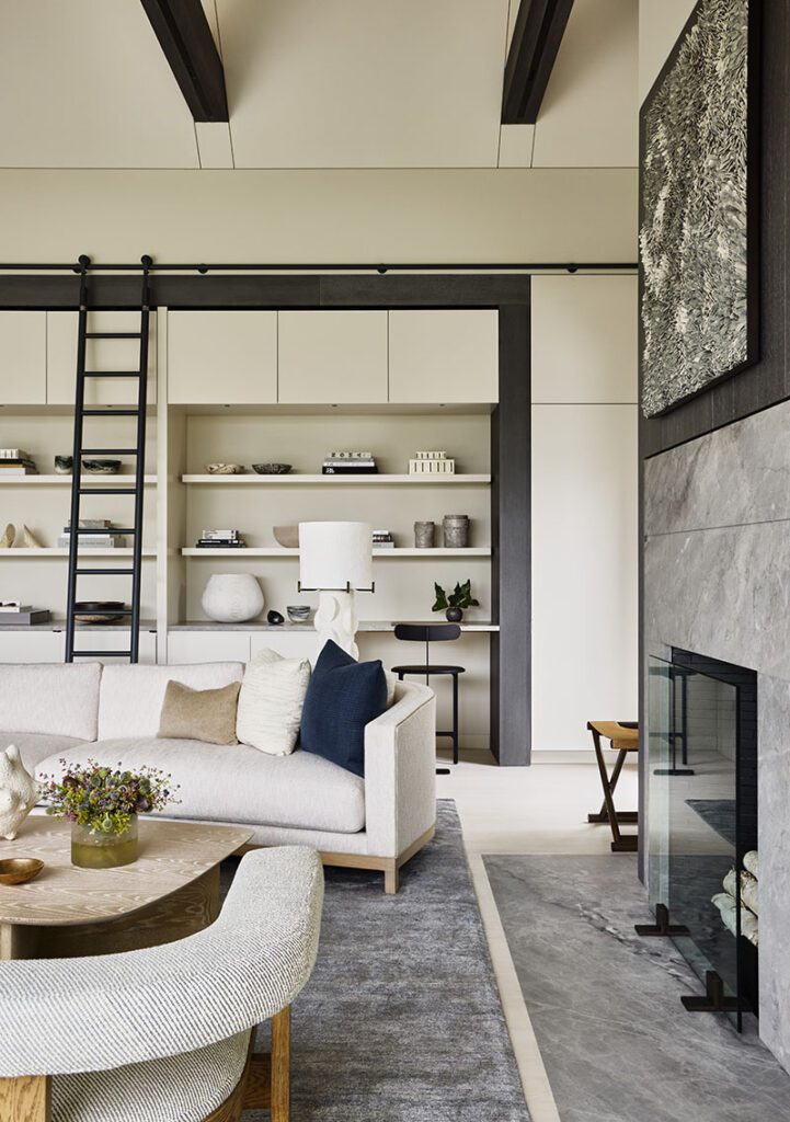

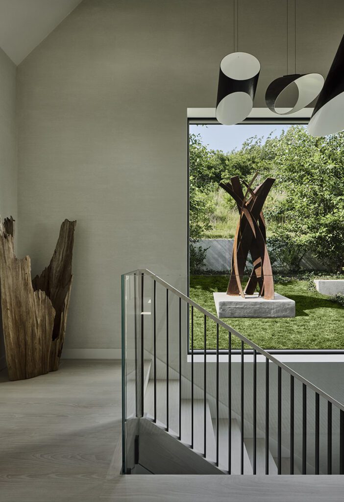

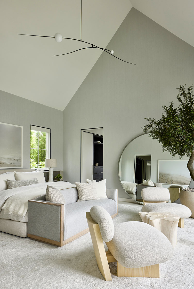
Inside, cool, minimal interiors stand in direct contrast to the bright hues of the garden outside. Neutral tones (what Kotchen jokingly refers to as “50 shades of beige”) predominate. The palette, a mixture of wood, natural stone, and dark metal, is luxurious but still approachable.
Oriented on a theme of “livable modernism,” most furnishings are custom made and thoughtfully curated for each space. “Our goal is to recommend pieces that tell a story, that ultimately feel collected,” says Kotchen of his team’s ability to complement architecture with a bespoke approach to interior design.
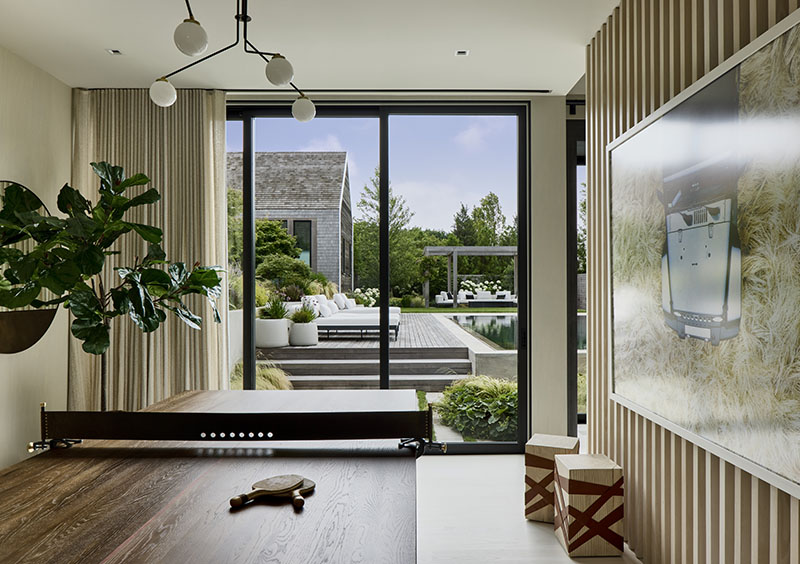

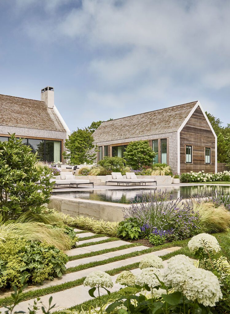
On summer days, the primary pavilion’s 40-foot folding door opens to create a decadent indoor-outdoor experience. Just beyond, al fresco spaces for dining and lounging step down to a zero-edge pool; its black interior finish maximizes the water’s reflective qualities. Sandy beige Phoenician granite and weathered ipe decking keep the poolscape feeling light and bright.
Minimalism defines the kitchen, awash in honed Blue de Savoie marble. A 15-foot Borgo sofa by Dmitriy & Co. lines the island’s back side. “We decided to completely rethink island seating here, opting for a softer choice than stools,” says the designer. An artistic assembly of intertwining Elma chandeliers by Trueing matches the Usona Home dining table’s scale.

While contributing visual interest via form or texture, the furnishings ultimately defer to the property’s centerpiece landscape by island-based Miroslava Ahern. “I would describe it as a seaside garden with lots of movement. It’s filled with traditional island plantings executed in a very clean, unique way,” says the landscape architect.
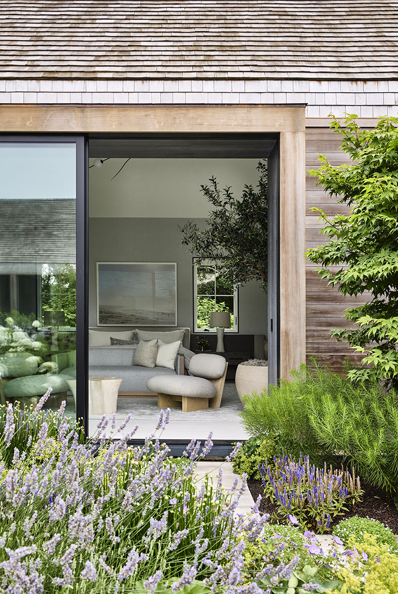

Beach grasses, hydrangeas, allium, Veronica, Russian sage, “Rozanne” geraniums, and Japanese maples thrive within an overall sea of green. “Every specimen has something special to contribute, whether via bark, shape, or blossoms,” Ahern says. “You can have a beautiful house, but the landscape must support it—a unifying language is key.”
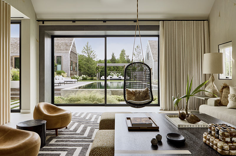

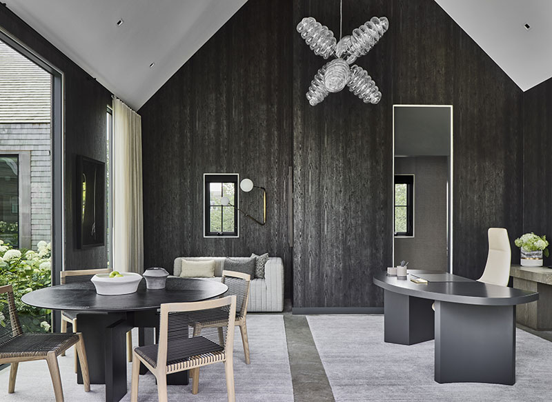

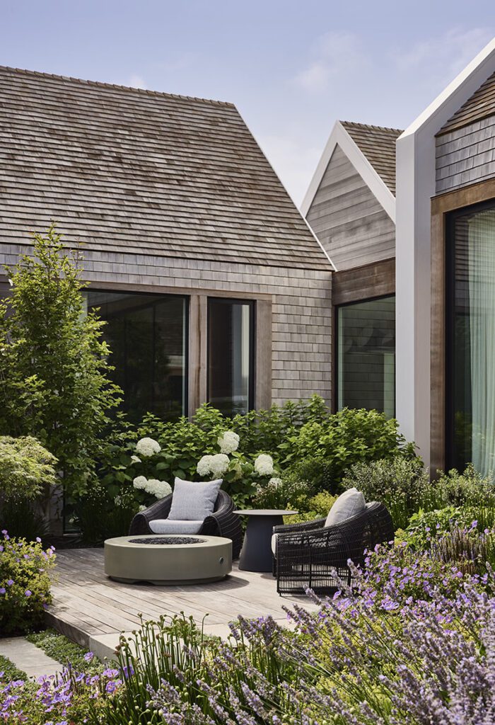

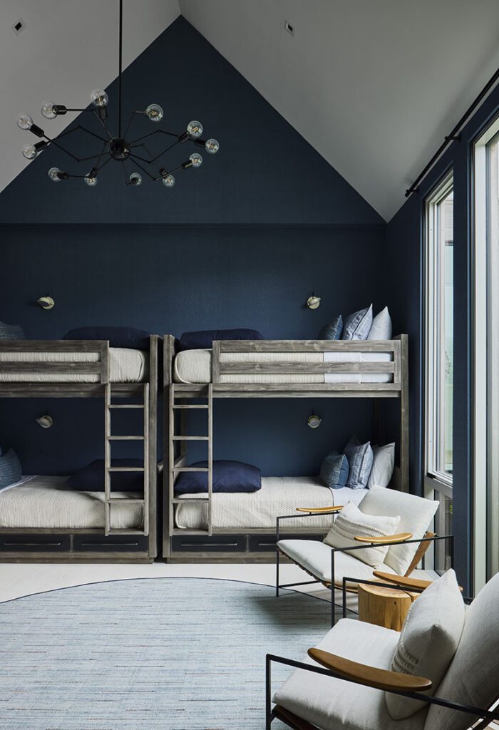

The completed compound reacts to site and lifestyle while expressing timeless modern forms. “That became the project’s story: a home that’s contextually relevant to place but with a stronger point of view,” says Kotchen.
“A courtyard-style home like this, with everything on one floor and pavilions requiring a certain amount of circulation, is a leap of faith initially,” continues the designer. “But our clients love the process of journeying both between and through the architecture. At the end of the day, our goal is to create experiences, and that’s exactly what this house delivers.”
Learn more about the project team
Architecture and design: Workshop/APD
Landscape architecture: Miroslava Ahern
