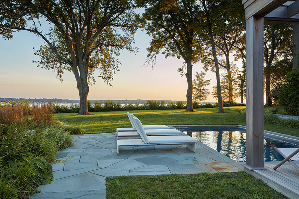
Architect Greg Ehrman lives on Martha’s Vineyard and many of the residential projects he’s worked on over the years as a partner at Hutker Architects have been located there or on Cape Cod, a 45-minute ferry ride away. So when a commission from a young D.C. family for a second home on Gibson Island, Maryland, came his way, Ehrman was intrigued. “The ‘language’ there isn’t so different from the architectural vernacular we find here in New England,” he notes.

On the western shore of the Chesapeake Bay and accessed by a private causeway, Gibson Island—only two miles by three miles in size—is remarkable in that two-thirds of its acreage is devoted to open space, natural woods, a bird sanctuary and recreation. It’s a place where residents get around by golf cart, even those not headed to the community’s nine-hole course. Kids thrive in and on the water, an estuary filled with brackish–both fresh and salt—water.

When Ehrman scouted the building site, he wrestled first with a long-abandoned 1960s-era home on an overgrown lot with no discernible driveway. Although it was auspiciously perched on a 60-foot bluff above the water, the hulk of a house totally blocked the blue-ribbon view. Ehrman explains his strategy once that house was razed: “Rather than having to move around [a new house] to get those beautiful westerly views of the Magothy River, I wanted those arriving to experience the view through the center of the property.” Now, they do.
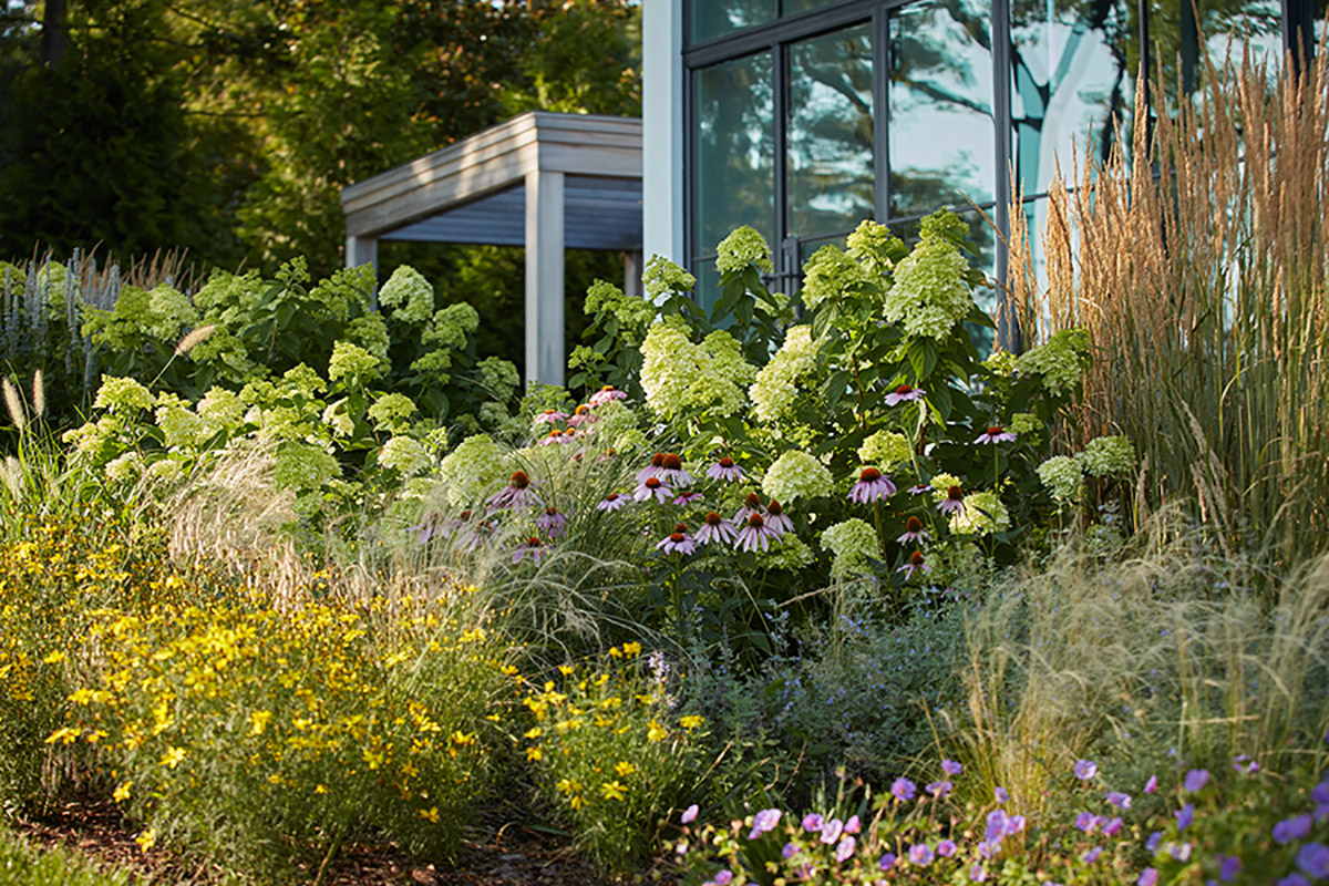

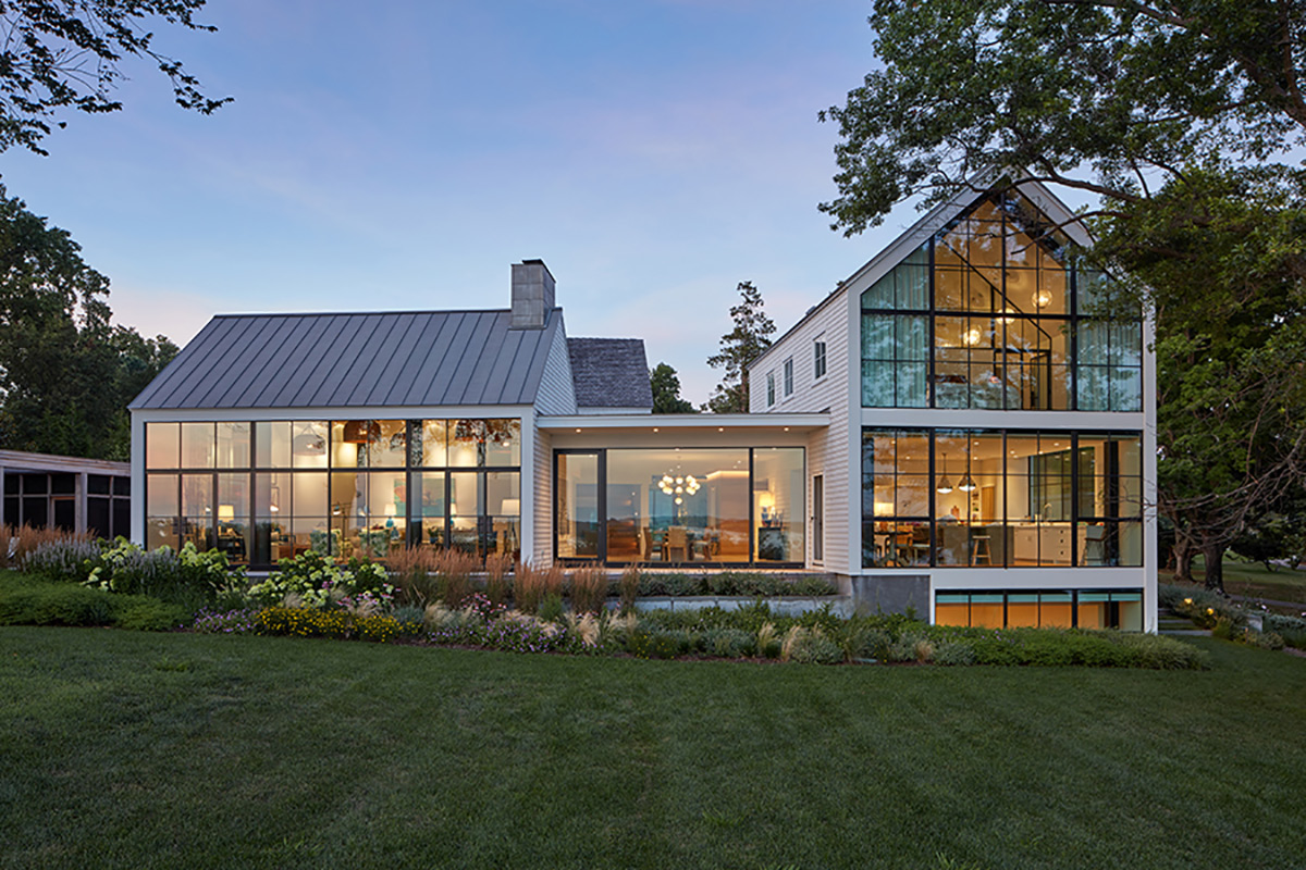
Deconstructed into a quartet of buildings, the house has a central flat-roofed area wrapped in glass that permits views of the water upon arrival. This space, serving as a dining room, functions as the central hub of the house around which stand four distinct gabled volumes: a generous living room with tall cathedral ceilings, a barn-like garage cum bunkroom, a kitchen with master suite above, and a two-story wing with three bedroom suites plus a family room. A detached screen porch and pool pavilion extend the year-round home’s livable space during warmer months.
“We have three kids and we knew that this house was going to be the hub of a lot of indoor-outdoor activity,” says the homeowner, who was drawn to Hutker-designed projects she noticed during family vacations on Martha’s Vineyard. “The firm’s casual aesthetic and how their houses take advantage of the sun and water views meshed with what I envisioned for Gibson Island.”
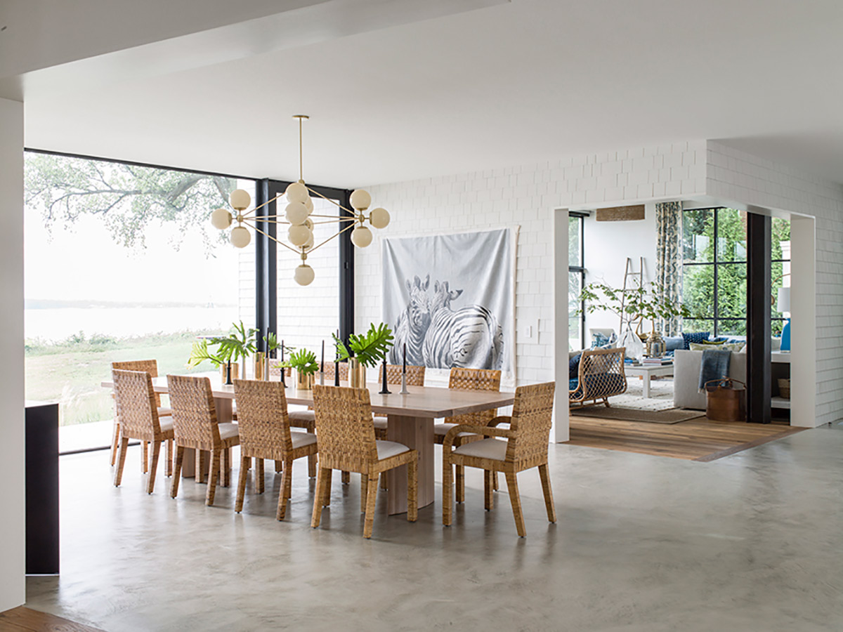

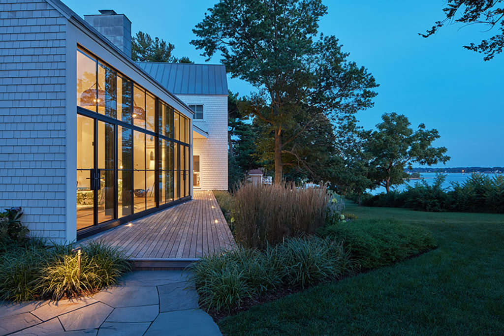
Primarily built of wood, metal, and glass—textures and surfaces that respond well to the environment—the house is one with the pristine landscape. Half whitewashed shingles and half naturally weathered cedar, the modern barnlike façade of the garage fits the more restrained aesthetic Ehrman wanted for the public-facing sides of the house: “Here, the apertures are more discrete and the architecture, at first glance, more traditional,” he explains.
In dramatic contrast, the entire water-facing side of the house is glass, a portion of which has steel windows on two levels. Certain design decisions, such as a vertical column of glass in one volume that allows a peek at one of three stairwells, ease the aesthetic transition from front to back, from traditional to modern, from opaque to transparent.
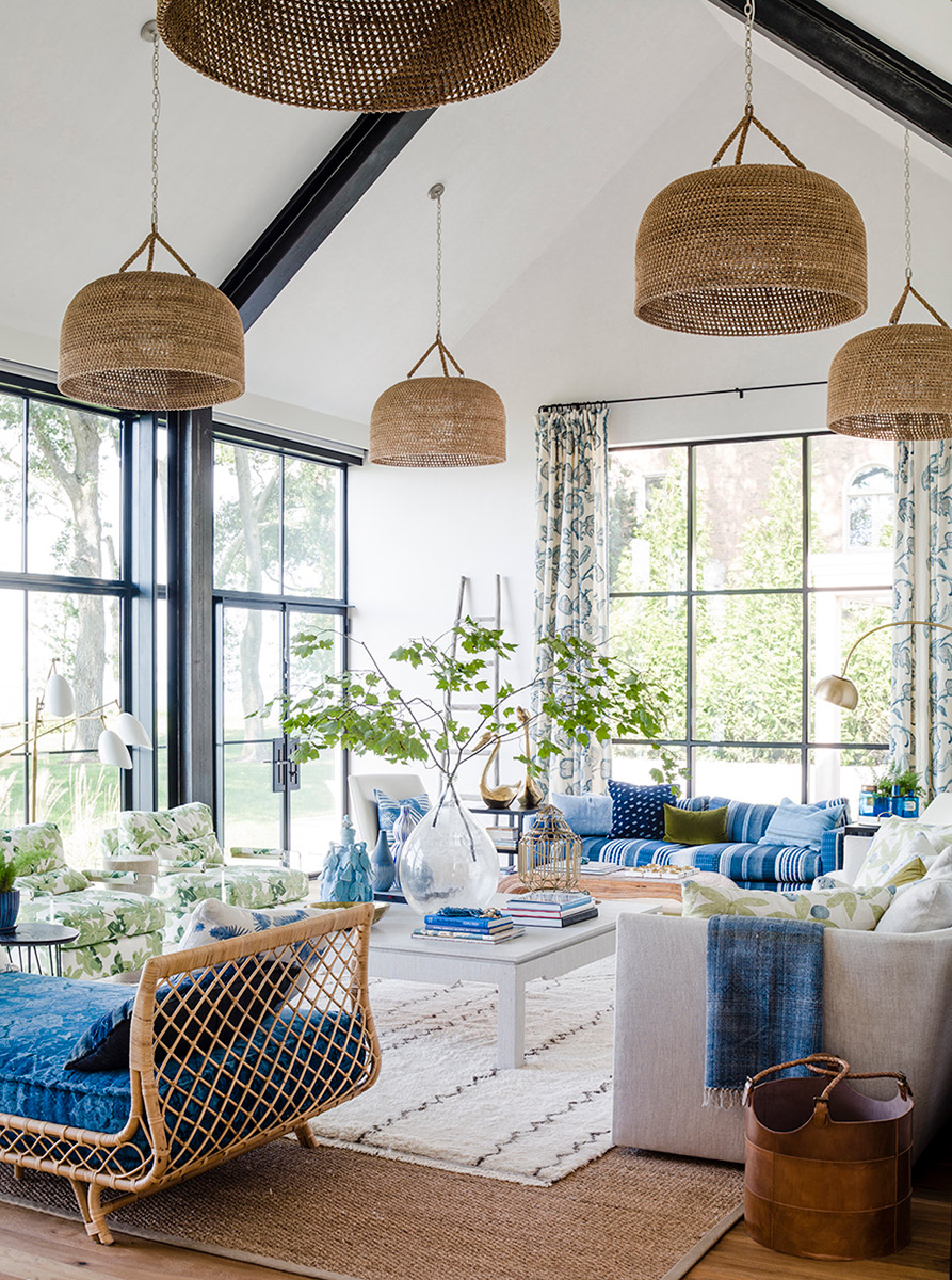

The overriding indoor-outdoor theme is further manifest by carrying the exterior building materials into the home. “Certain times of the year, you can even smell the cedar inside,” notes Ehrman of the whitewashed shingles used both outside and in.
He adds that along with the continuity of textures, “The play of natural light throughout the day creates a dynamic interior environment that changes minute by minute.” Now, instead of being forced to navigate around the periphery of a house, “You’re seeing and moving through it.”
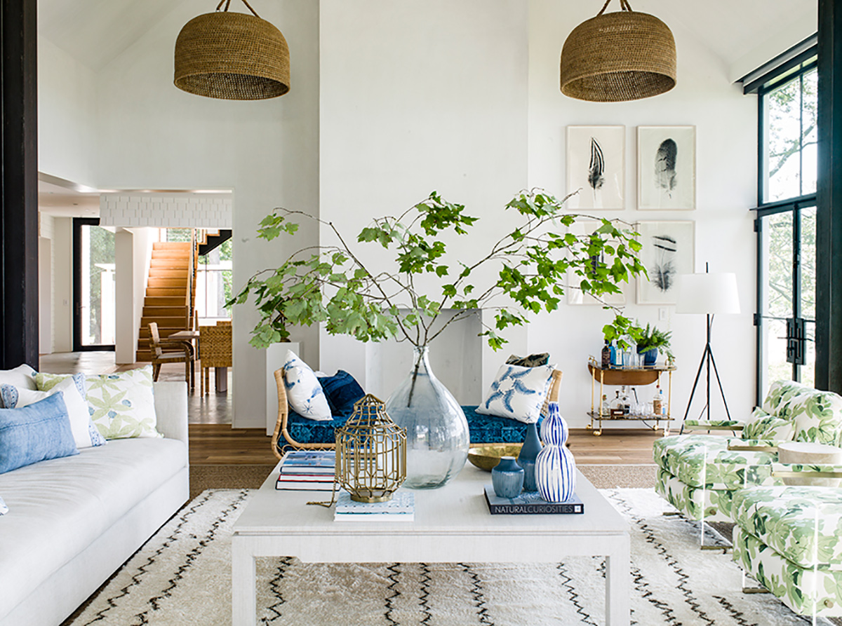

For interior designer Lauren Liess as well, blurring the line between outside and inside was fundamental. “We pulled the color palette, blues and greens, straight in from the views and used a lot of natural materials and objects like coral, stones and plants,” says Liess, author of the recently released Down to Earth: Laid-Back Interiors for Modern Living. “The architecture is so good that a part of me wanted to do nothing other than a natural palette, but we really wanted the house to have a little fun with itself and felt that color and pattern would only add to its personality and charm.”
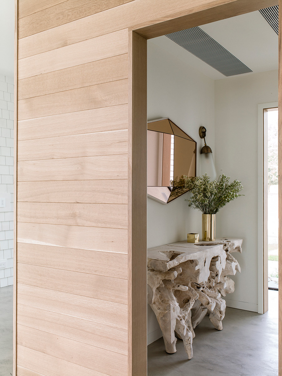

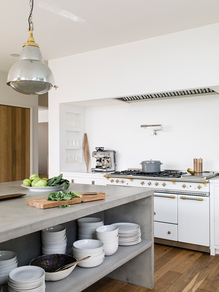

Connecting the house to the family was as important as tying it in with the land. Ehrman’s design strategy developed from conversations with the homeowners about how they live now and how that lifestyle will evolve in years to come. “Sometimes it’s about what kind of light they like in the morning, who goes to bed late, who gets up early,” says the architect. “These stories and life patterns become the genesis for where we end up.”
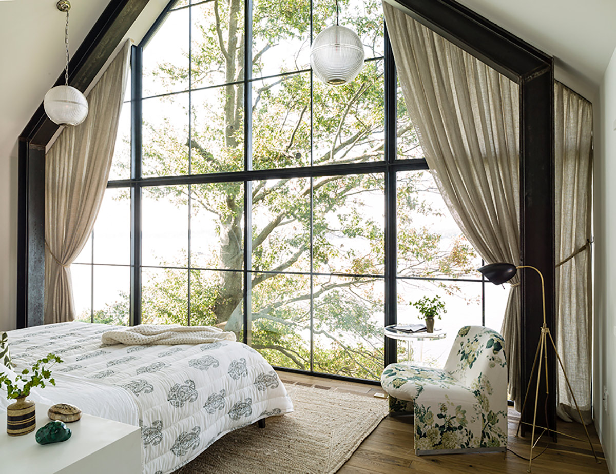

Seemingly floating in the treetops, the homeowners’ master bedroom suite with a private stairway is truly a parents’ sanctuary, which they appreciate now that their kids are growing older and need less of their attention. Its counterpoint is an eight-bed bunkroom above the garage where their two sons invite friends for sleepovers. The building volume now housing guest accommodations will transition to family suites years from now for grown kids and grandchildren. “A good home will live well and support a family for generations,” says Ehrman.
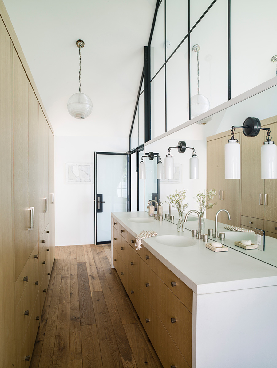

A house that serves a family for years and years to come is not only appealing emotionally and practically, but it is also sustainable. In fact, says Ehrman, “To ‘build once well’ is the most sustainable proposition of all.”
For more information, visit hutkerarchitects.com | laurenliess.com
