Diana Byrne’s clients loved the Greenwich home they built on the shore of the Long Island Sound, but more than ten years in they were ready for a refresh. “The most dramatic opportunity was in the views,” says the principal of DB Design. “We opened select windows to highlight water vistas and welcome sunlight.”
While she retained elegant dentil moldings and arched openings, Byrne streamlined other architectural accents including built-ins, fireplace surrounds, and staircases. Lightening the floors and painting everything white modernized and brightened the interiors, which she punctuated with contemporary furnishings, sculptural lighting, and abstract artwork.

The team started in the husband’s office. “The mahogany woodwork was beautiful, but too much of a good thing,” Byrne explains. Collaborating with architect Doug Patt and Prutting + Co. Custom Builders, Byrne removed a wall of bookshelves and French doors in favor of a floor-to-ceiling slider. Now, the mahogany-paneled walls pop against new, gray limestone floors. “It’s still cozy but it doesn’t feel dark or heavy-handed,” the designer says.
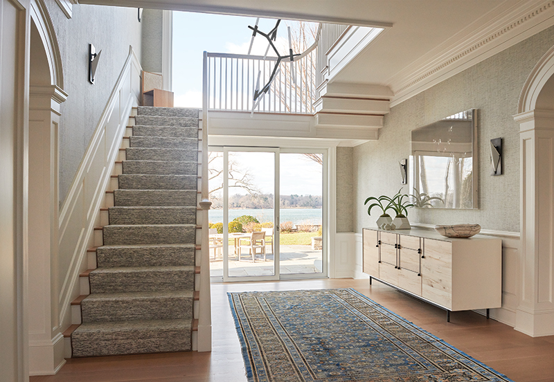
An airy piano hall leads from the office to the entry where Byrne and Platt exchanged French doors for large windows and an oversize slider. “Once we got a taste of the view, we wanted to open up more walls,” she says. Paring back the details on the floating staircase—a feat Byrne admits was probably trickier than rebuilding it from scratch— further cleaned up the space. A Lindsey Adelman branch chandelier is the finishing touch. “Lighting changes everything,” she says. “This makes a graphic statement without taking up too much visual space.”
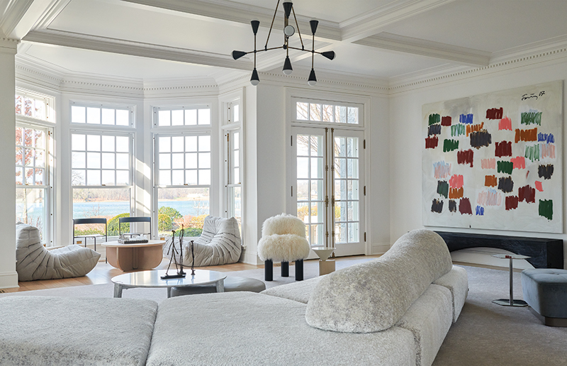

For the living room, Byrne devised a spare, conversational scheme ideal for entertaining. “We took away what was irrelevant to open the room and focus on the view,” she says. A curvy Edra sofa can be configured this way or that to make room for parties that spill from the dining room. Two Ligne Roset Togo chairs face each other in the window so guests can enjoy the view and still feel a part of the action.
The owners can similarly adapt the dining room thanks to a trio of square tables. “They entertain a lot so they needed options,” Byrne says. A vintage Murano glass chandelier balances the straight lines of the furniture and feels like it’s original to the space.
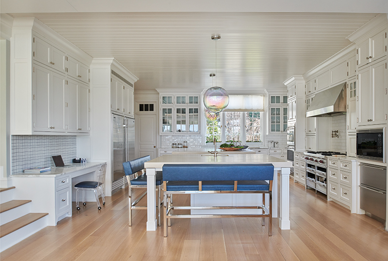
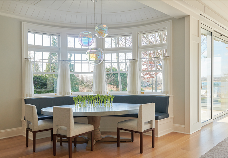
For everyday meals, the family gathers at the zinc-topped table hugged by a navy vinyl banquette in the breakfast nook. Guests perch drinking wine and kids do homework at the kitchen’s chunky, oak-topped island with polished nickel benches. Dreamy, iridescent glass globes float above both areas. “They’re modern and soft and keep your focus on the view,” Byrne says.

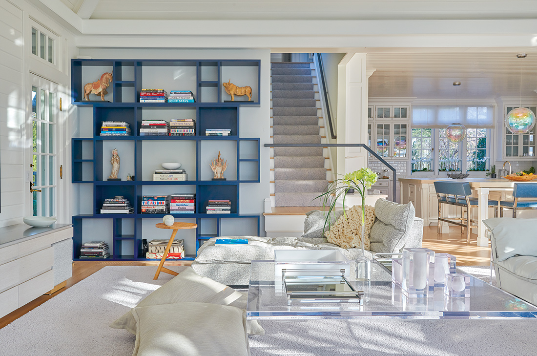
Just around the corner, Byrne exposed the back stair, increasing transparency between the kitchen, family room, and bedrooms upstairs. The tweak created a fun design moment: a minimalist, blackened-steel rail. “Black touches are grounding and add warmth,” Byrne says. A navy bookshelf by Dune picks up the sharp form and ties to the color of the seating in the kitchen.
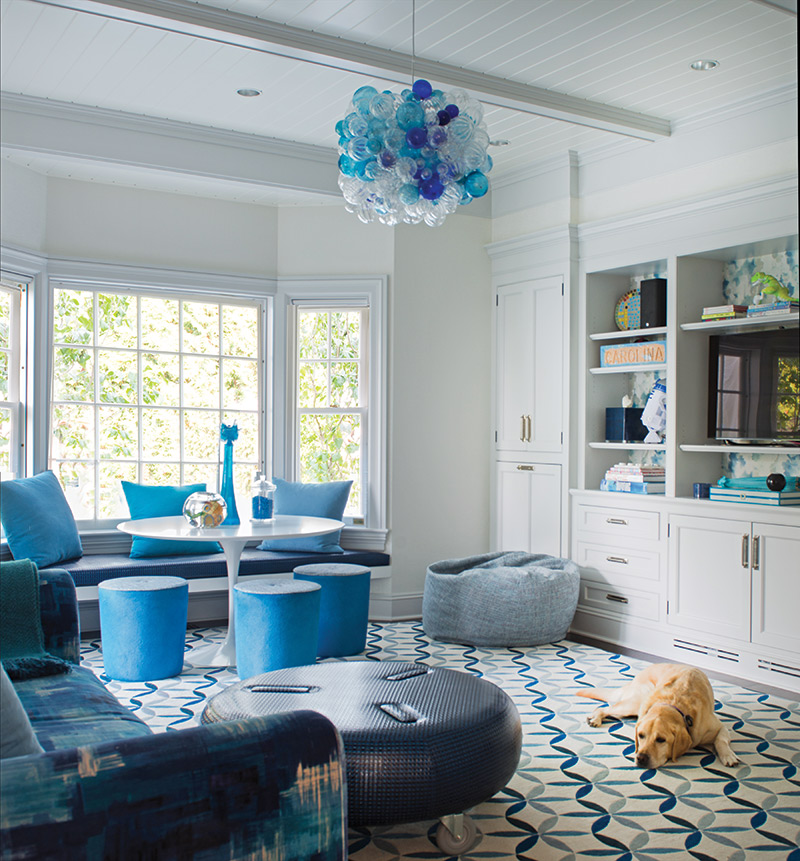
Byrne also pulled blue into the nearby playroom which caters to the couple’s three teenage daughters for art projects, homework, and such. A tri-color bubble chandelier (no tossing balls here!) provides a cluster of color at the top of the room while a patterned rug adds energy underfoot. Watercolor wallpaper behind the built-ins and patterned velvet upholstery are playful layers. “I used a wacky pattern on the sofa instead of the pillows,” Byrne says.
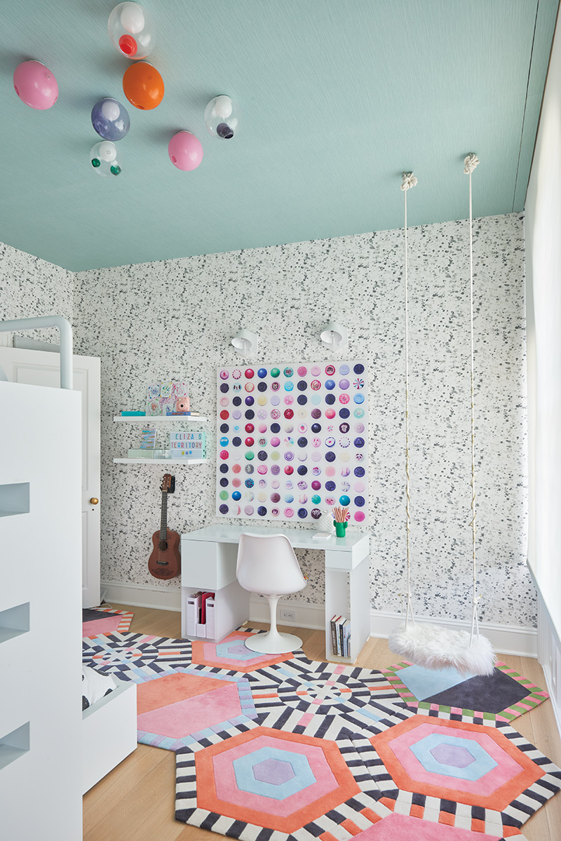
The fun continues on the second floor. Décor for the youngest is particularly spirited with a geometric, honeycomb rug, splatter wallpaper, and a sheepskin-covered swing. The eldest’s room boasts a curtained nook with a water view and the middle daughter’s room revolves around a bed inspired by George Nelson’s Marshmallow sofa. “It’s important for teens to have optimistic spaces,” Byrne says.
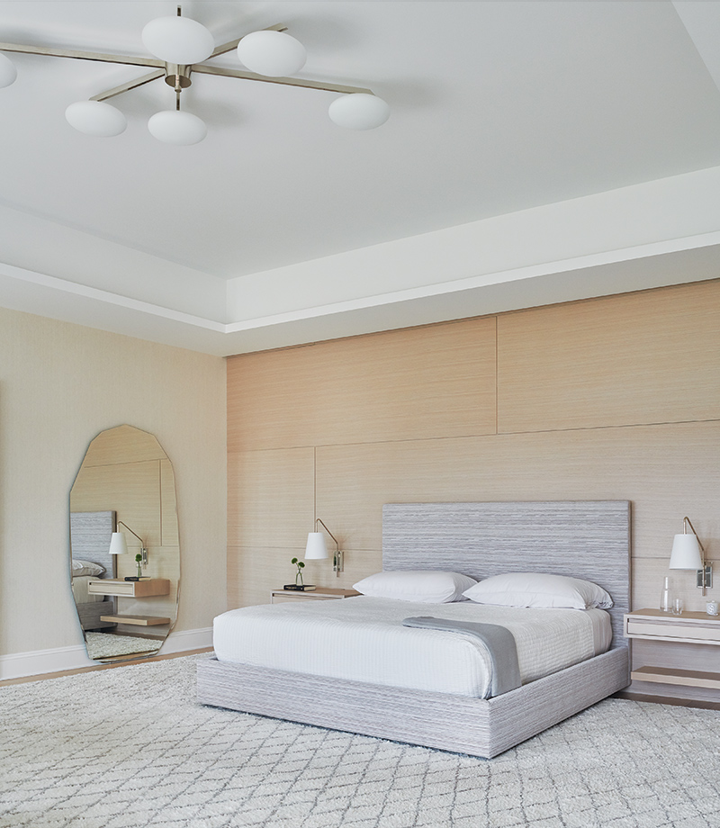
On the other hand, the primary suite is a study in serenity. In the bedroom, Byrne simplified the tray ceiling, refurbished the fireplace with statuary marble, and installed white oak wall panels. “The materials speak for themselves,” she says. Expanses of plate glass now offer water views from the soaking tub and walk-in shower in the completely reimagined bath. Here, Byrne notes, “you can just exhale.”
For more information, visit dbdesigninc.com.
